Tag: eroded
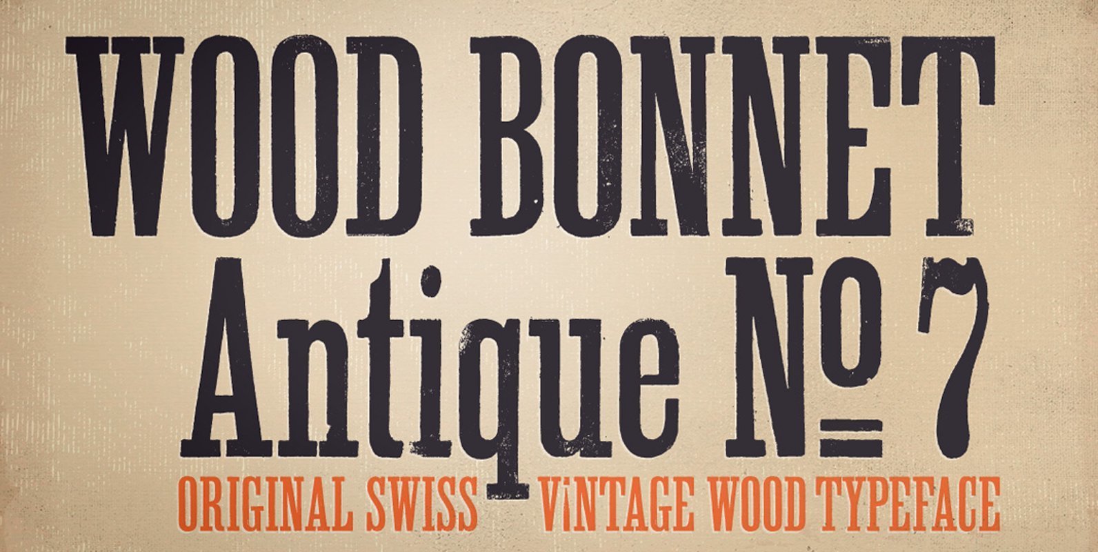
Wood Bonnet Antique No7 Font
Wood Bonnet Antique No.7 is based on real vintage wood type blocks from Switzerland. The very distressed letters give a warm analogue vintage charm on printing. The font offers up to four glyph variations of all the Latin base letters,
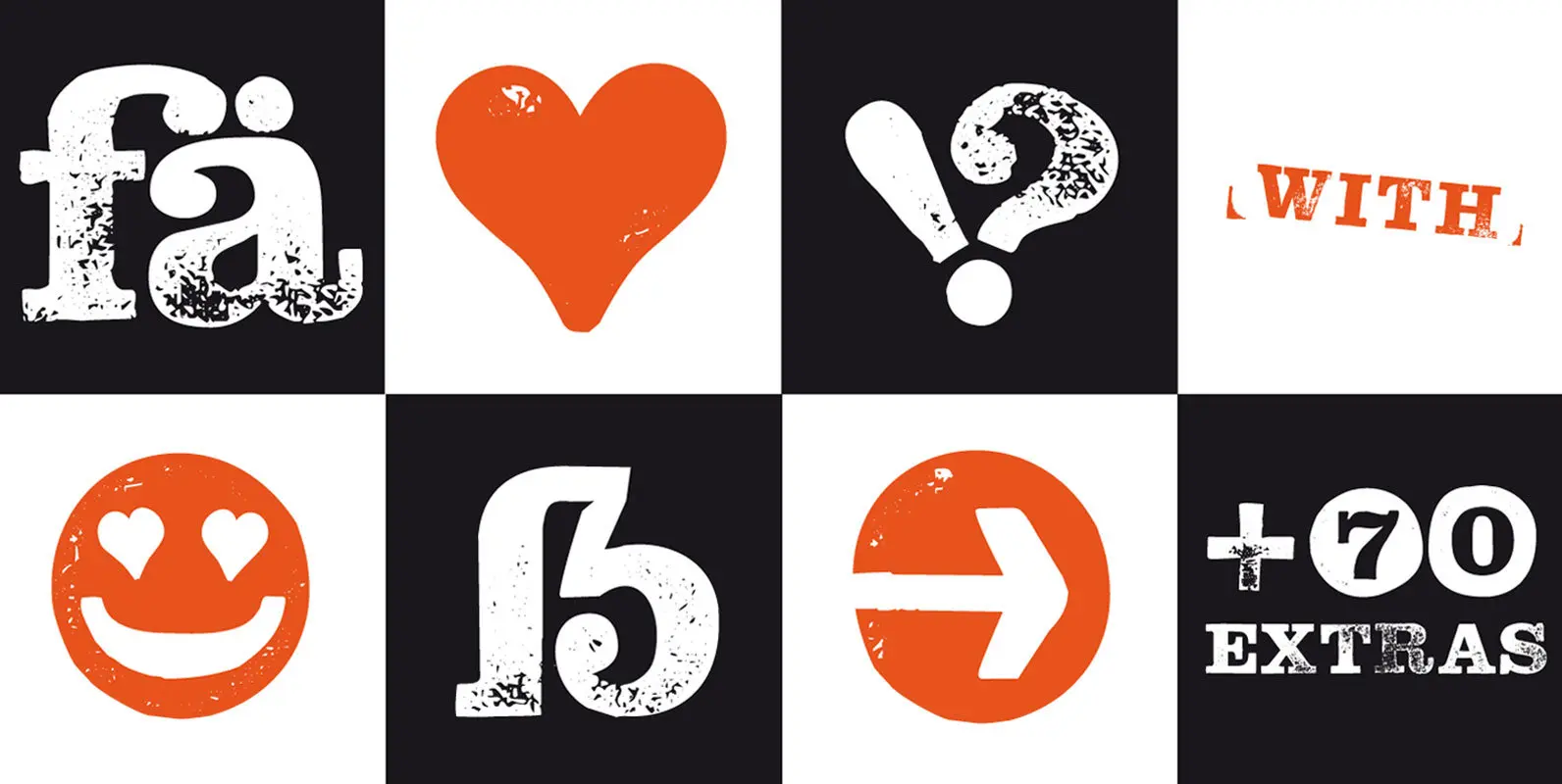
Hand Stamp Slab Serif Rough Font
The typeface “Hand Stamp Slab Serif Rough” is designed for the Typo Graphic Design font foundry in 2017 by Manuel Viergutz. The display font with a classic slab serif type for headlines, based on real rubber stamp letters for a
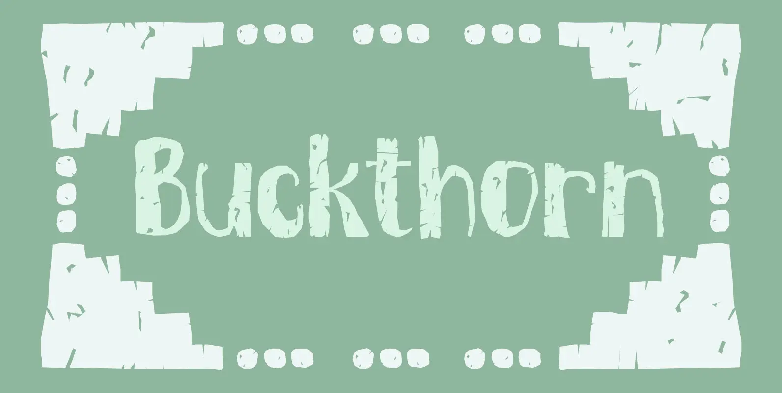
Buckthorn Font
Buckthorn is a genus of about 110 species of shrubs and small trees, native to North America and Asia. Its uses are varied: it is used for dye, oil, printing ink and oil. That concludes the botany class for today,
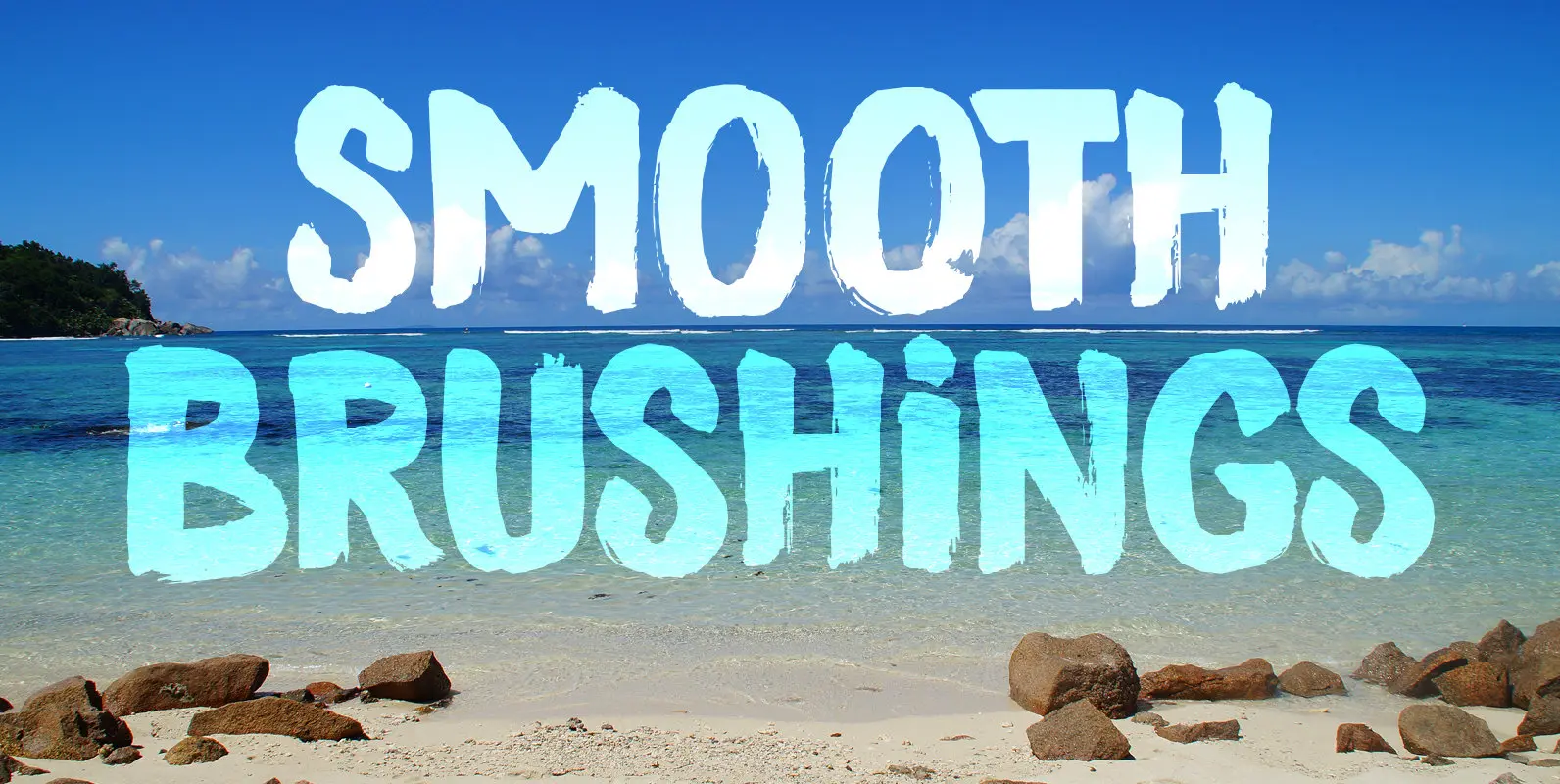
Smooth Brushings Font
When I was painting this font, I suddenly had the movie Cool Runnings (1993, directed by Jon Turteltaub) in my head. I had to name the font, so I came up with Smooth Brushings. Of course, this font has nothing

Scurvy Dog Font
Aye, me lovelies, this be Scurvy Dog, a grand font! The letters were etched into a dead man’s chest with a blunt rapier, pickled in brine and covered in spew. Ye could be using this crafty penmanship for yer logs
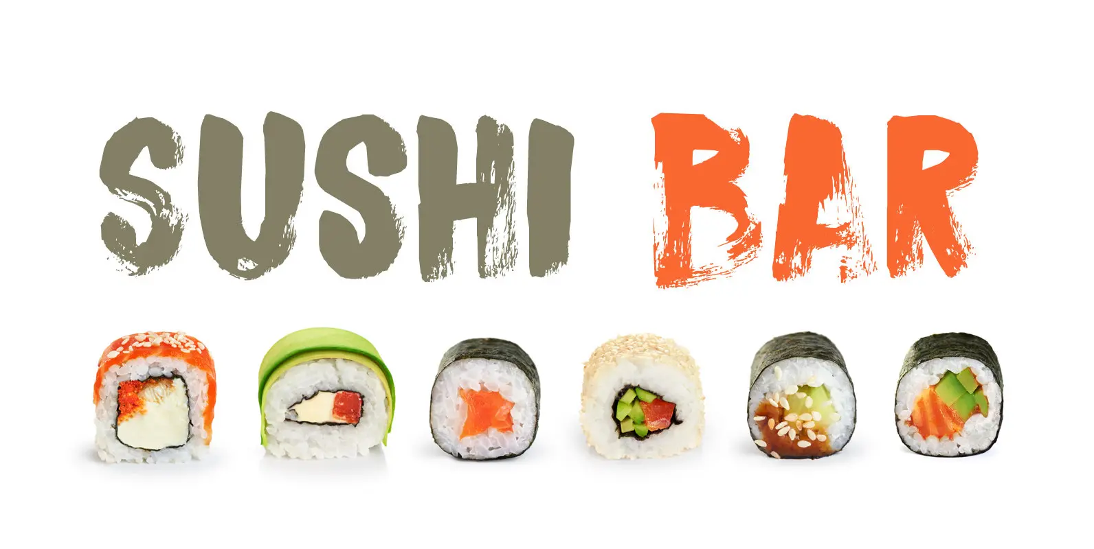
Sushi Bar Font
Since I am still in a Japanese mood, I decided to name this font after my favourite pastime in Japan: hunting for the smallest, nicest sushi bar in town. After all, there’s just nothing like eating freshly made sushi and
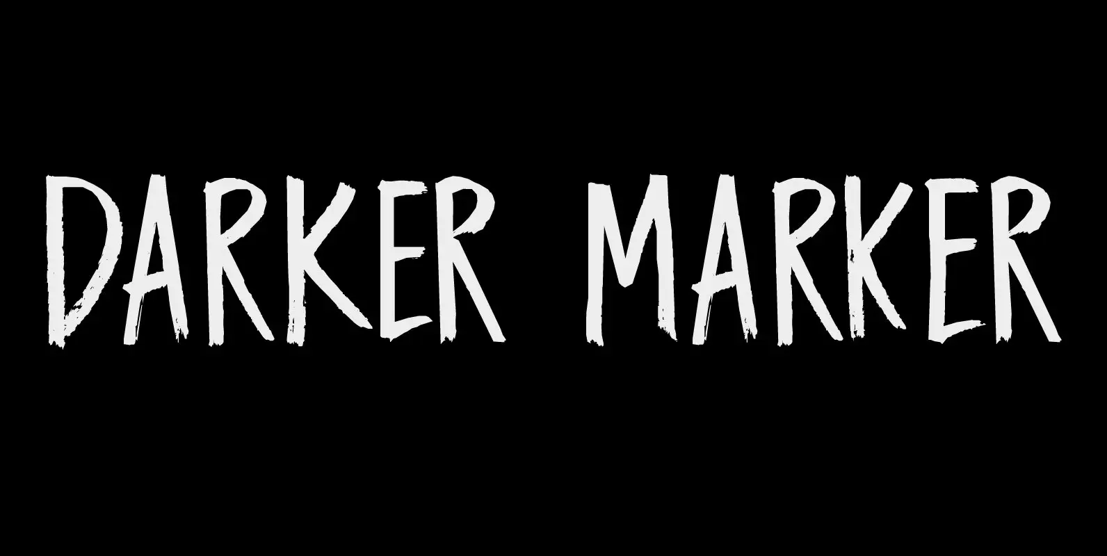
Darker Marker Font
Darker Marker is just what the name suggests: I found a very big fat marker in a local stationary store, bought it, came home and went to work on this font. Darker Marker is a very clear, very easy to
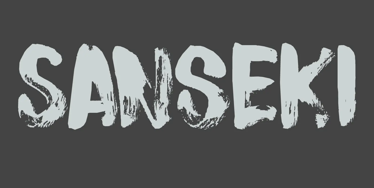
Sanseki Font
The term Sanseki (Japanese for Three [Brush] Traces) is used to describe three famous Heian period calligraphers: Yaseki, Gonseki and Saseki. Not that I would ever dream of comparing my messy brush-work with theirs, but the name stuck and I

Brush Crush Font
I bought a few new pencils and I tried them out using Chinese ink and quality French watercolor paper. The result is Brush Crush – a very nice brush font. Brush Crush would look perfect on packaging, book covers, posters
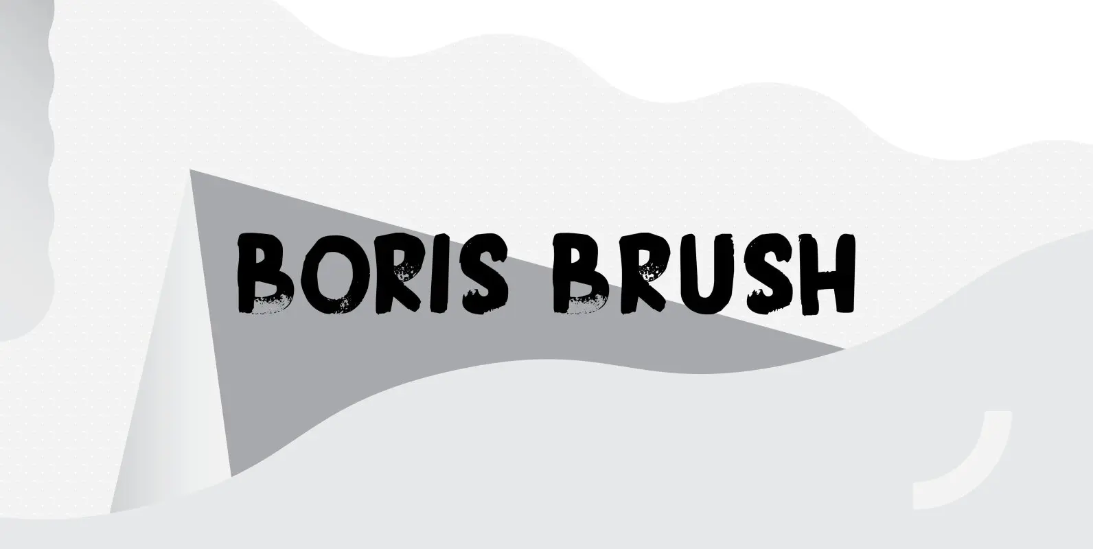
Boris Brush Font
Boris is my son: he was born on January 7th and he is as cute as can be. Boris Brush font is a very loud, very useful brush typeface, which I created using some fine-haired brushes and black paint. It
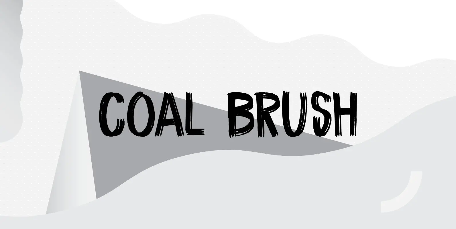
Coal Brush Font
Coal Brush is a bit of a misleading name. It looks as though it was made with a brush, but it was, in fact, made with a almost dried out old marker pen. But a font named ‘dried out old
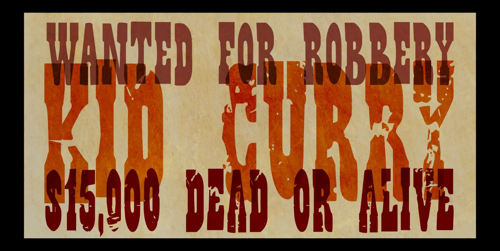
Wild Bunch Font
The Wild Bunch, also known as the Doolin–Dalton Gang, was a gang of outlaws that terrorized Kansas, Missouri, Arkansas, and Oklahoma Territory during the 1890s. They robbed banks, killed lawmen and held up trains. Of course its members were hunted
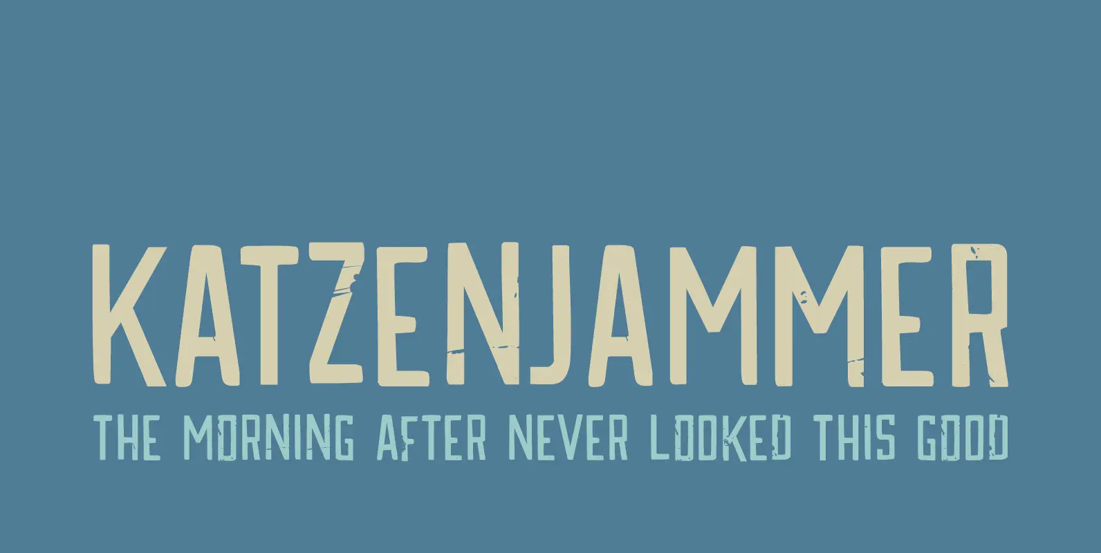
Katzenjammer Font
Katzenjammer is a German word meaning ‘Cat’s Wail’ – it is used to describe a hangover. Katzenjammer font is a slightly eroded, squarish typeface, which would be ideal for headlines, packaging, posters and websites. This all caps font comes with
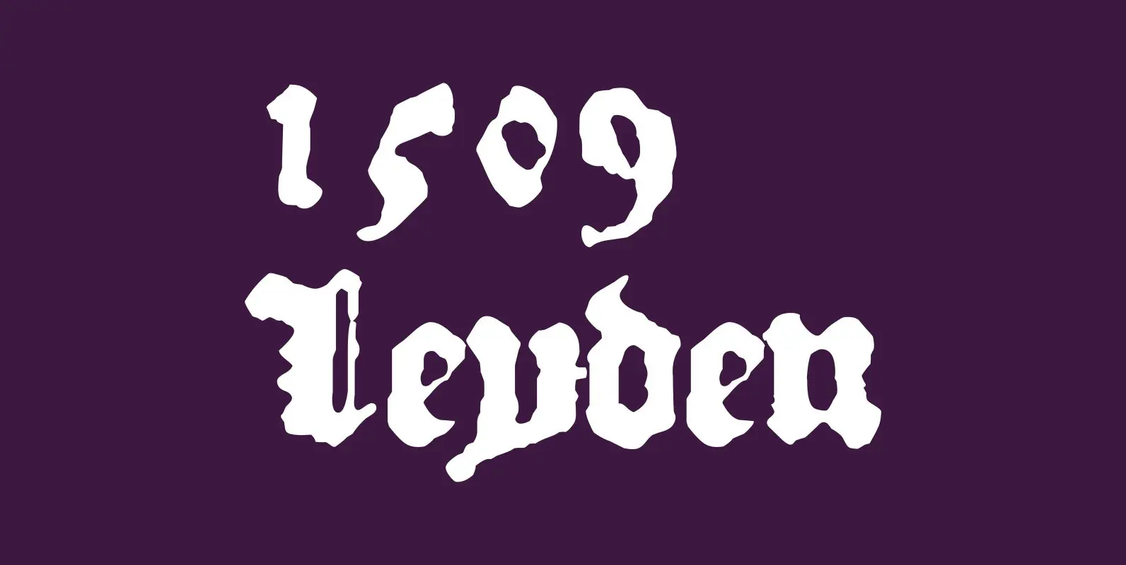
1509 Leyden Font
This blackletter font was created inspired from the set who was used in Leyden by Jan Seversz to print “Breviores elegantioresque epistolae […]”, by author Francesco Filfelo, circa 1509. The original font contains all lower case characters, excepted w, eth,
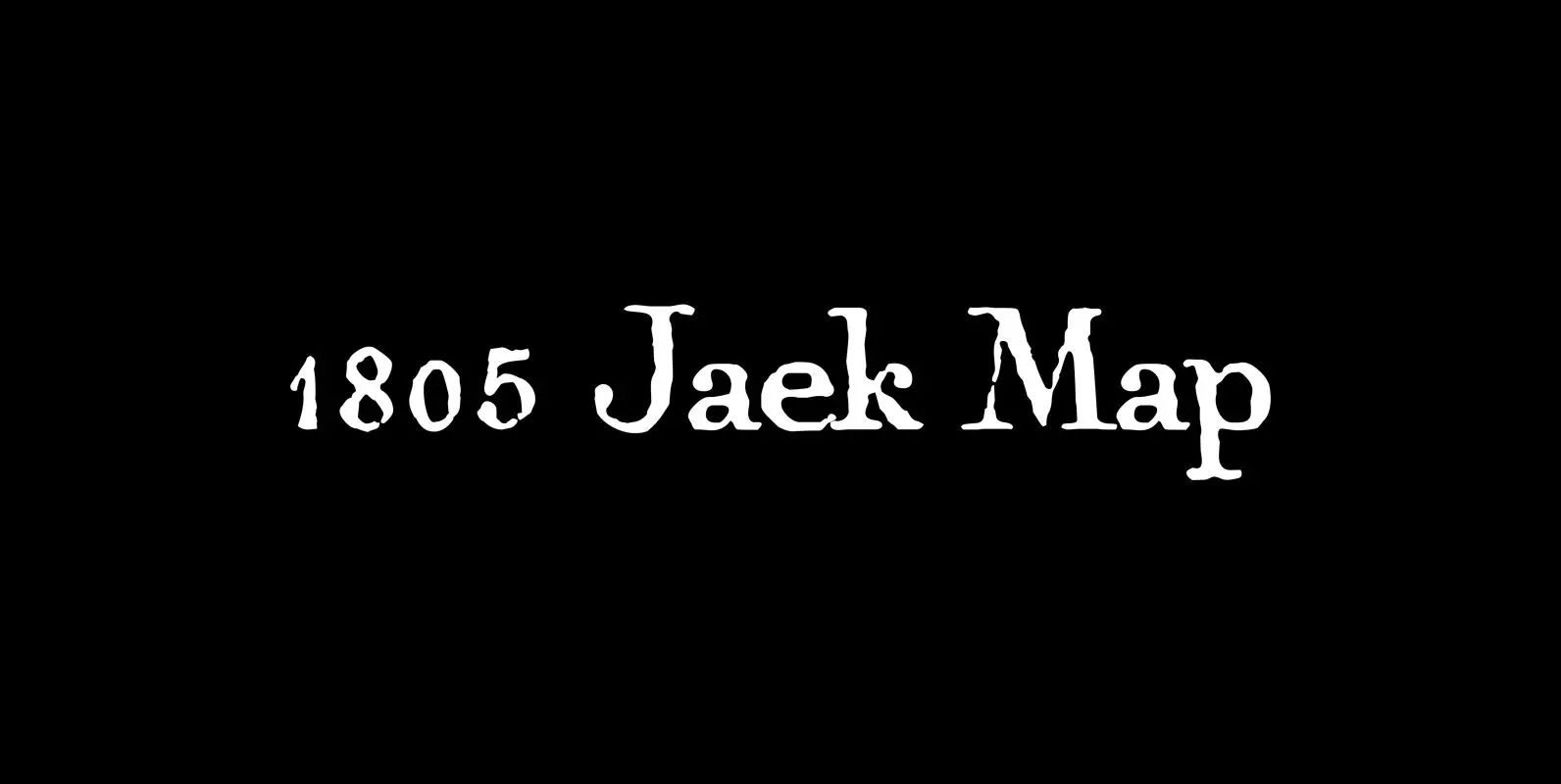
1805 Jaeck Map Font
This “Pro” font is mainly inspired from the engraved characters of a German Map depicting Germany’s roads and parts of surrounding lands, edited in Berlin probably in the end of 1700’s. The engraver was Carl Jaeck or Jaek (1763-1808). The
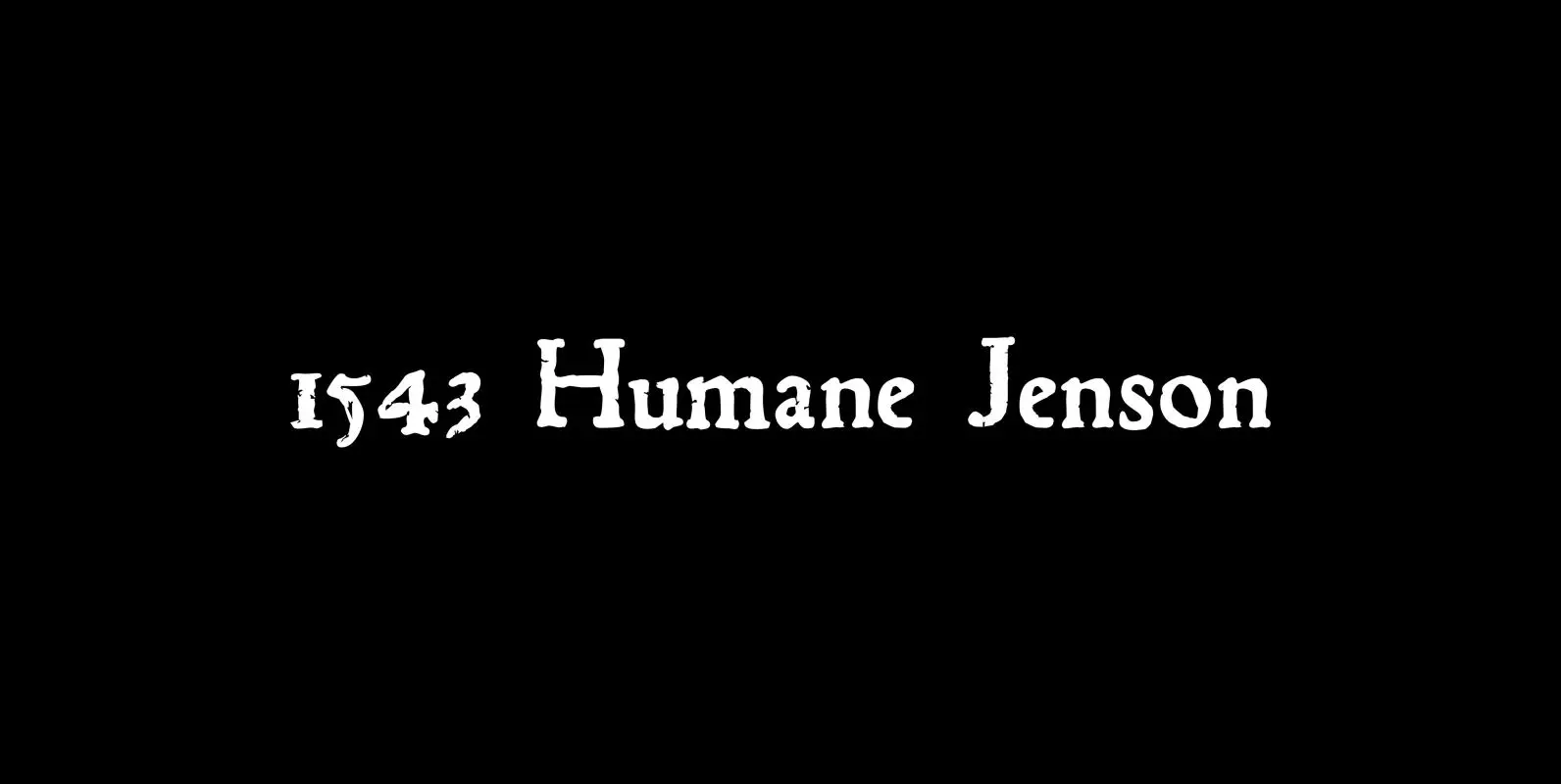
1543 Humane Jenson Font
In 1543 the well-known “De humani corporis fabrica” treatise on anatomy by André Vesale, was printed by Johann Oporinus in Basel (Switzerland). Various typefaces were used for this work, mostly in Latin but including Greek characters. Its Jenson-type font was
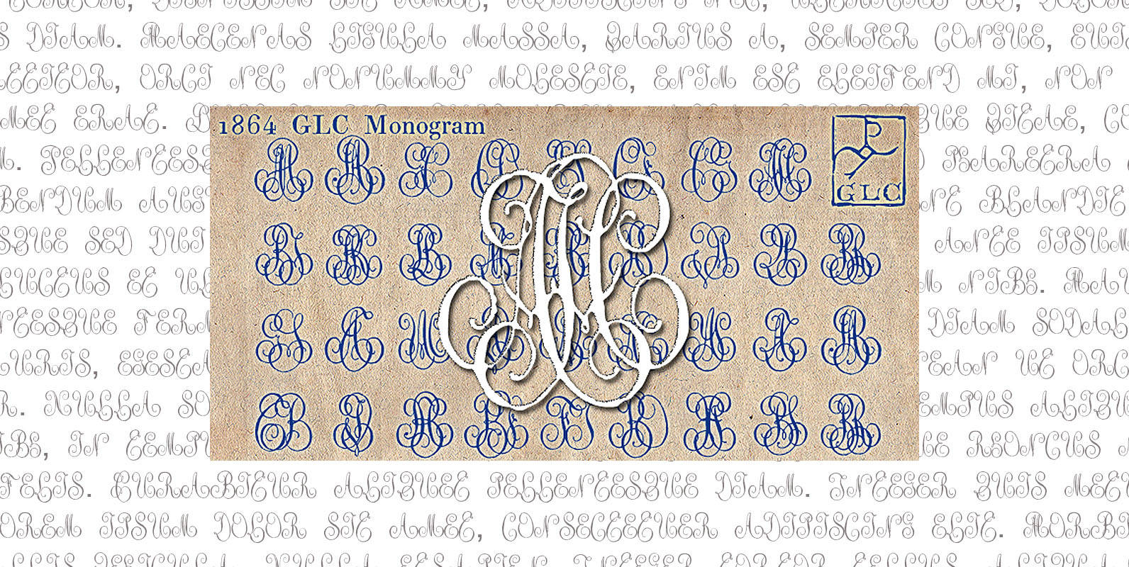
1864 GLC Monogram Font
This family of two characters monograms and initial letters was inspired from a French portfolio containing about two hundred examples of ” Chiffres à deux lettres ” destined to engravers and jewelers, published in Paris in 1864, drawn by French
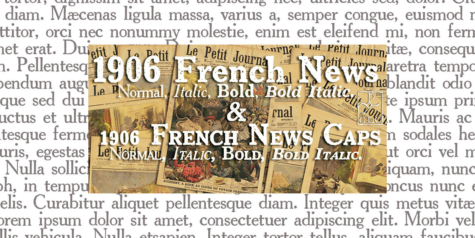
1906 French News Font
We have created this family inspired from the numerous derivatives in use for newspapers since the middle of 1800’s to the years 1970’s, inspired from the well known Clarendon. Mainly, the patterns are these used to print “Le Petit Journal”,