Tag: education
Copacabana Font
Copacabana is heavily based on one of my favourite typefaces Goudy Old Style Italic. It is sharper and more clearly defined than Goudy yet still retains it old style characteristics. The face is slightly angled so is basically upright whilst
Business Penmanship Font
Business Penmanship is an ode to the business handwriting from the era penmanship was a highly-valued part of business education and practice. In the early 1800s, Platt Rogers Spencer (1800-1864) created what would become the most widely accepted and prized
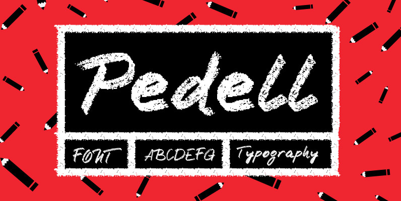
Pedell Font
Pedell is a new profonts script which simulates handwriting with chalk. Up to now, this type of design had not been available in profonts library of script fonts. Pedell was designed by German type designer Ralph M. Unger. It is
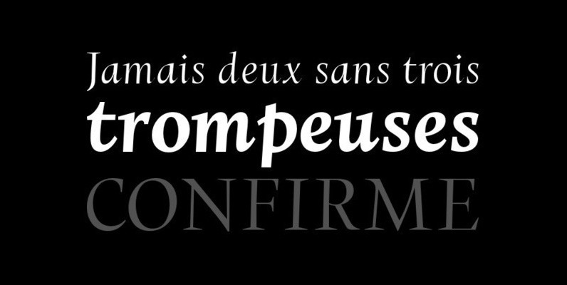
Bookmania Font
Bookmania (2011) is a revival of Bookman Oldstyle (1901) and the Bookmans of the 1960s, but with all the features you would expect in a modern digital font family. Feature Summary: – 5 weights: Light, Regular, Semibold, Bold, and Black

Brigade Font
In searching for a Roman to use there were bits of Bembo,Times,Garamond etc., that I liked and bits that I did not. So I set out to take the best bits of all my favourite Romans and tried to create

YWFT League Font
You’ve been working hard, and your team is really looking good this year. We’d like to invite you to join the League. YWFT League, that is. Inspired by high school and college football jerseys, YWFT League is in keeping with

Justine Font
Justine, while a playful, swirly, girly font is a complete font with the full character set, including a euro sign. This font was inspired by Justine Childs handwriting. Justine the person is just as cute as the font. Published by

Akagi Complete Font
Akagi started as a rough sketch while on a really long plane ride to Tokyo in 2007. I wanted to develop a sans that was a complete departure from my successful Aaux Pro (now Aaux Next) sans serif family. Whereas

Astoria Font
Based heavily on Gill Sans especially in the mid weights, Astoria has a subtle top left serif which makes it not quite a Roman and not quite a Sans. Designed specifically as a text face it still works very well
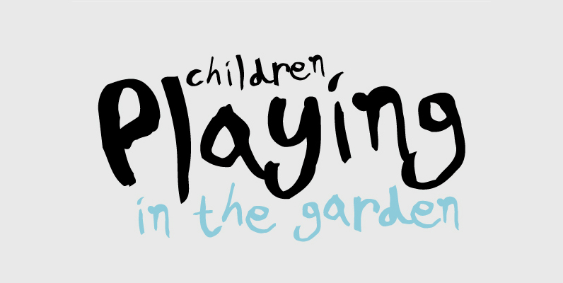
PF Kids Pro Font
This is not just a typeface inspired by a kid’s first attempts to write. This is in fact how exactly a kid writes. Alexandros Papalexis was born again kid when he became a father. This series came about while designing
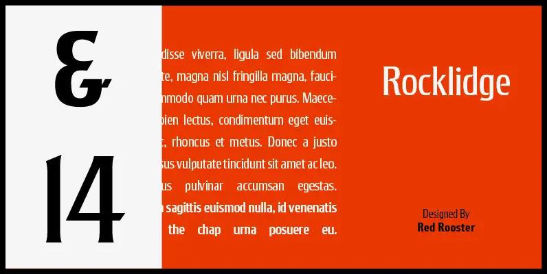
Rocklidge Pro Font
Designed by Steve Jackaman & Ashley Muir. This design was inspired by the 1965 VGC typeface, Jana by Richard D. Juenger. Originally available as a single weight, Rocklidge now has five weights and contains all the high-end features expected in
Cynapse Font
Several years ago I was faced with a project that required very small type to be used in a directory. In general, there was a need for a lot of ‘fine print’. Faced with this, all of the tests I