Tag: economical
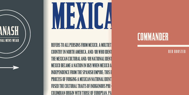
Commander Font
Designed by Steve Jackaman, Commander is an original decorative type design published by Red Rooster. Published by Red RoosterDownload Commander
Chinon Font
Chinon is a font design released for the Mecanorma Type Collection. Copyright 2004 Trip Productions BV. Published by MecanormaDownload Chinon
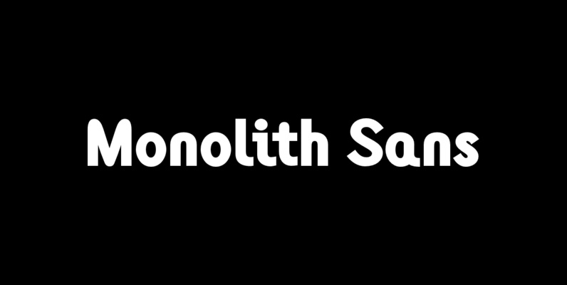
Monolith Sans Font
Designed by Tony Mayers in 2004, Monolith Sans is a unique and modern sans-serif type design. Published by ABCTypesDownload Monolith Sans
Monolith Roman Font
Designed by Tony Mayers in 2004, Monolith Roman is a unique and modern serif type design. Published by ABCTypesDownload Monolith Roman
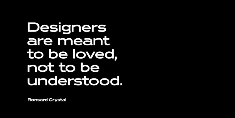
Ronsard Crystal Font
Designed by Steve Jackaman and Ashley Muir. The original Ronsard Crystal began its life as a single-weight photolettering font in the 1950s. We lliked it so much, that we decided to design four traditional weights to go with the original
Titanic Condensed Font
Designed by Steve Jackaman, Titanic Condensed is based on an early wood type design. An original creation. Published by Red RoosterDownload Titanic Condensed
Directors Gothic 220 Font
Handcrafted by Lettering Inc as part of its core library of typefaces in the 1930s, Directors Gothic was dramatically expanded throughout the lifetime of the company and remains a timeless classic. Inspired by the Art Deco movement popular at the

Aquarius Font
Designed by Steve Jackaman, Aquarius is based on the popular 1968 VGC typeface drawings. Published by Red RoosterDownload Aquarius
Triple Condensed Gothic Font
Designed by Steve Jackaman, Triple Condensed Gothic is based on an early wood type design. An original creation. Published by Red RoosterDownload Triple Condensed Gothic
Directors Gothic 250 Font
Handcrafted by Lettering Inc as part of its core library of typefaces in the 1930s, Directors Gothic was dramatically expanded throughout the lifetime of the company and remains a timeless classic. Inspired by the Art Deco movement popular at the

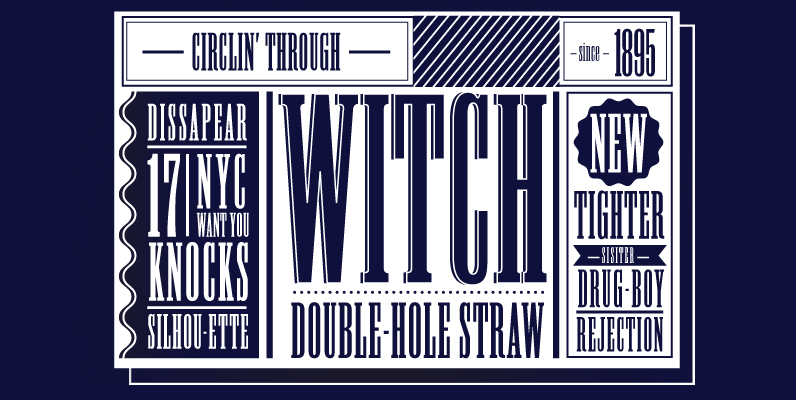
Generation Uncial Font
Generation Gothic, has already proved to be very popular with leading magazines including Later, Computer Arts, Ultimate Golf and Spark Magazine. This collection introduces complementary Generation Headlines which seek attention and create impact; Generation Uncial (which isn’t just for mystics
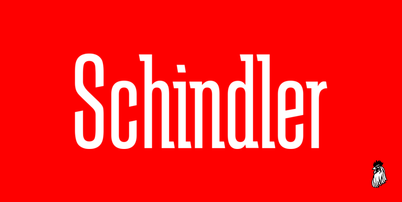
Schindler Font
Designed by Steve Jackaman, Schindler is an original font design released by Red Rooster. Published by Red RoosterDownload Schindler
Generation Gothic Font
Generation Gothic, has already proved to be very popular with leading magazines including Later, Computer Arts, Ultimate Golf and Spark Magazine. This collection introduces complementary Generation Headlines which seek attention and create impact; Generation Uncial (which isn’t just for mystics
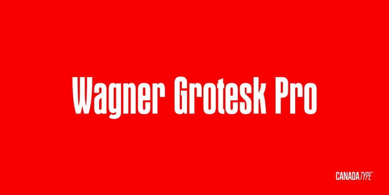
Wagner Grotesk Pro Font
This is the elaborate digital version of Edel Grotesque Bold Condensed (also known as Lessing, Reichgrotesk, and Wotan Bold Condensed) a 1914 typeface by Johannes Wagner, which was later adopted by pretty much every European type foundry, exported into the
Astoria Font
Based heavily on Gill Sans especially in the mid weights, Astoria has a subtle top left serif which makes it not quite a Roman and not quite a Sans. Designed specifically as a text face it still works very well
Directors Gothic 210 Font
Handcrafted by Lettering Inc as part of its core library of typefaces in the 1930s, Directors Gothic was dramatically expanded throughout the lifetime of the company and remains a timeless classic. Inspired by the Art Deco movement popular at the
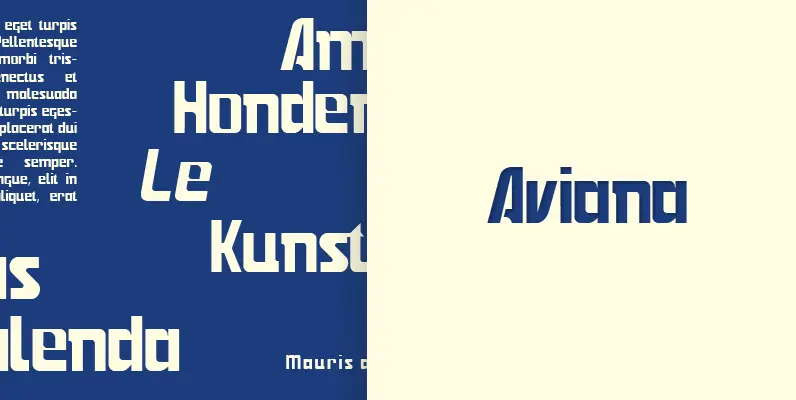
Aviana Font
Designed by Karl Nayeri, Aviana is a font released for the Prime Graphics Type Collection. Copyright Prime Graphics. Published by Prime GraphicsDownload Aviana
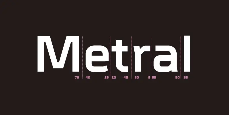
Metral Font
A geometric sans serif with a precise fabricated appearance. Smooth corners are mixed with subtle angles to form a strong, legible typeface ideally suited for a wide range of applications. Details include 6 weights with italics, an extended European character