Tag: copy
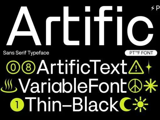
Artific Font
In the design world where creativity meets clarity, there arises a need for meticulously designed elements that seamlessly blend style with functionality. One such cornerstone of the digital and graphical design sphere is the typeface one chooses to communicate the
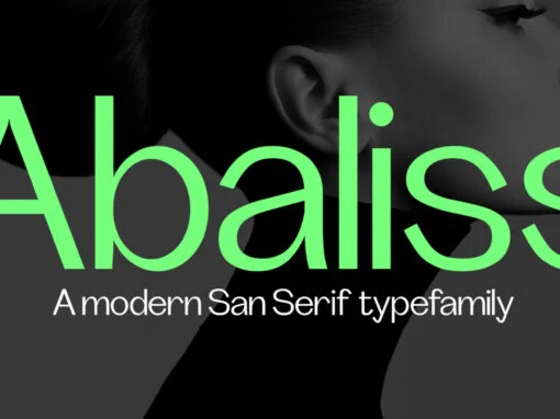
Abaliss Font
Abaliss Sans is a contemporary typeface with strong stylistic geometric contrasts representing the shifting contemporary aesthetics. Its distinctive stance and wide-open counters allow the right visual consistency for branding and communications projects. Its minimal design is great for logos, titles,
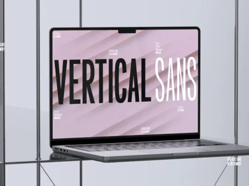
Vertical Sans Font
Vertical Sans is an extremely condensed sans set in 3 weights offering a balanced, stylish font perfect for branding and communications projects. Published by Paul Henry RobbDownload Vertical Sans

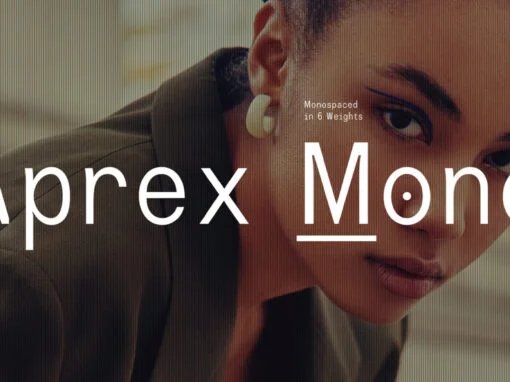
Aprex Mono Font
Aprex Mono is a Monospaced stylized industrial version of the Aprex Sans typeface, with multilingual support. The font is inspired by a basic sans serif glyphs structure, concerning the balance and optimization that bring a clean typeface, versatile for both
Aprex Mono Font
Aprex Mono is a Monospaced stylized industrial version of the Aprex Sans typeface, with multilingual support. The font is inspired by a basic sans serif glyphs structure, concerning the balance and optimization that bring a clean typeface, versatile for both
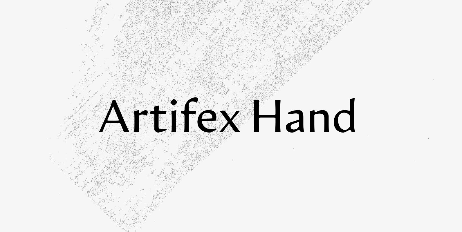
Artifex Hand CF Font
Artifex Hand is a humanist sans-serif cut of the original Artifex. Designed for flowing, easy-to-read text in Latin, Cyrillic, and Greek scripts. Soft details and moderate contrast let Artifex Hand excel in text and display settings. – Eight weights and
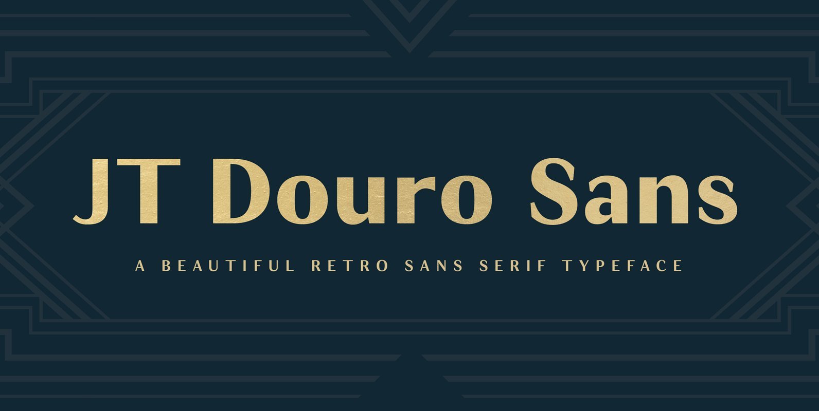
JT Douro Sans Font
Inspired by the art deco movement in France at the turn of the last century and in United States in the 1930s. Boasting over 500 glyphs, with its multiple ligature sets and alternatives, this is a wonderful typeface to use
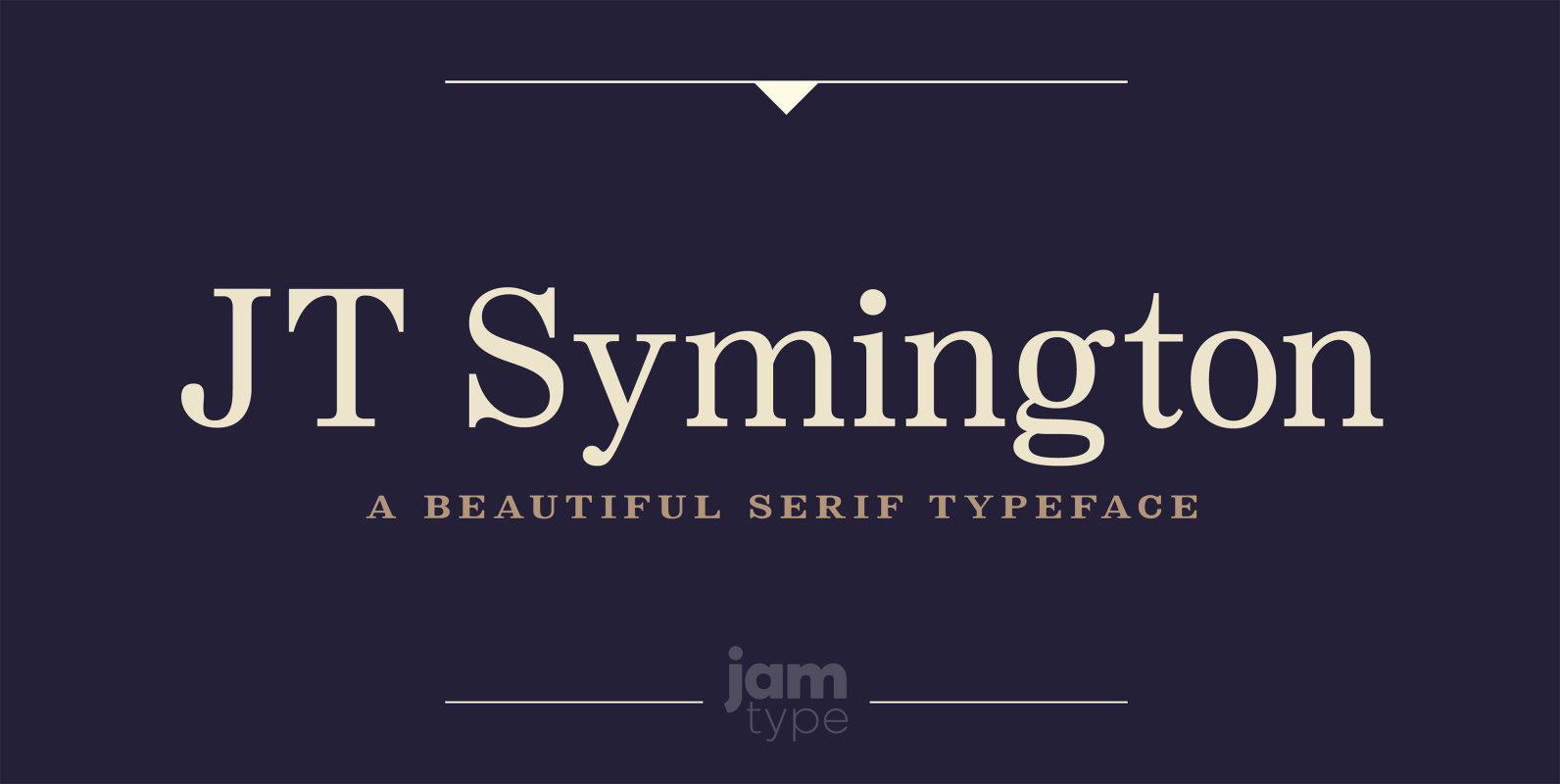
JT Symington Font
JT Symington was inspired by the classic serif typefaces of the 20th century. Its well defined serifs make it well suited to headlines as well as large chunks of body copy. Published by JAM Type DesignDownload JT Symington
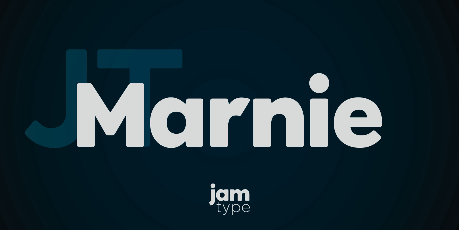
JT Marnie Font
The design is influenced by the geometric style sans serif faces which were popular during the 1920s and 30s. The JT Marnie font family is well suited for headlines and small blocks of text, particularly in advertising and packaging. Published
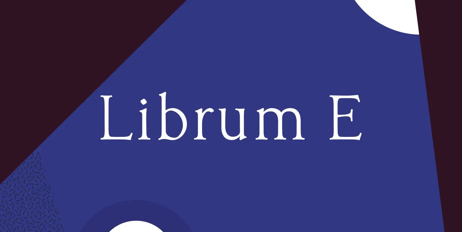
Librum E Font
The major focus of my life and ministry at this point is book design. In the brave new world of 21st century self-publishing a new paradigm has arisen: the indie small shop. One of the problems is that all books

Librum Font
This is the serif text family for the book design group of font families which David designed in the process of writing “Practical Font Design With FontLab 5”. The letterspacing is set wide for body copy use. The main purpose
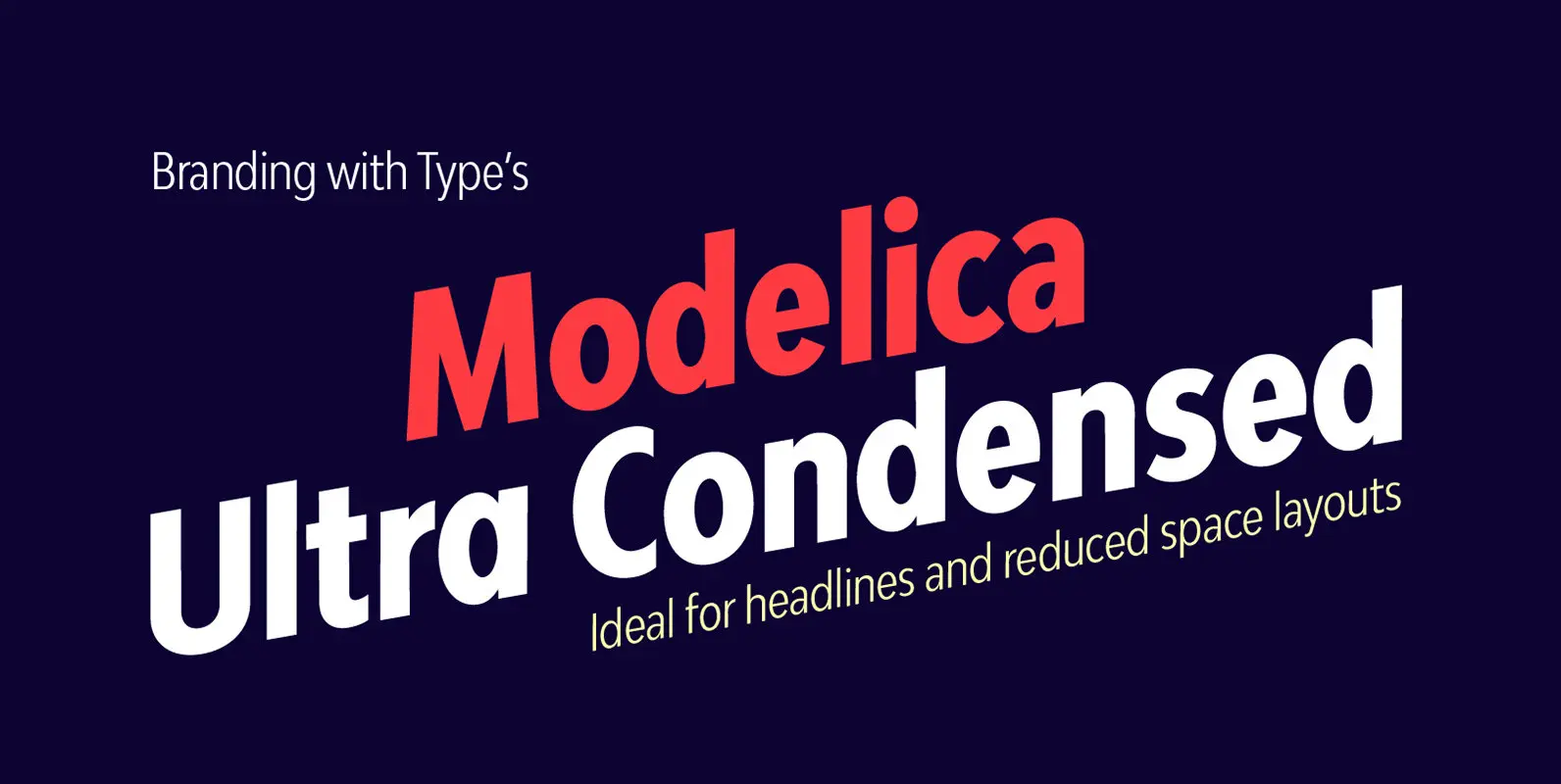
Bw Modelica Ultra Condensed Font
Designed by Alberto Romanos, Bw Modelica is a minimal, robust, reliable & pragmatic geometric sans. Its clean shapes and generous x-height makes it a very competent face for both, display and body copy purposes. It’s available in four widths, each
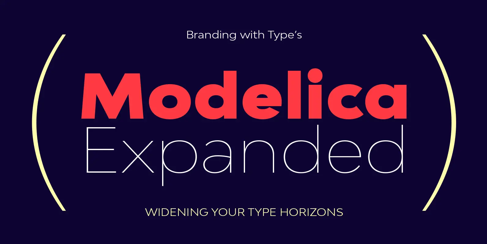
Bw Modelica Expanded Font
Designed by Alberto Romanos, Bw Modelica is a minimal, robust, reliable & pragmatic geometric sans. Its clean shapes and generous x-height makes it a very competent face for both, display and body copy purposes. It’s available in four widths, each
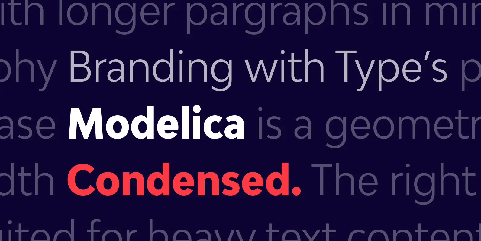
Bw Modelica Condensed Font
Designed by Alberto Romanos, Bw Modelica is a minimal, robust, reliable & pragmatic geometric sans. Its clean shapes and generous x-height makes it a very competent face for both, display and body copy purposes. It’s available in four widths, each
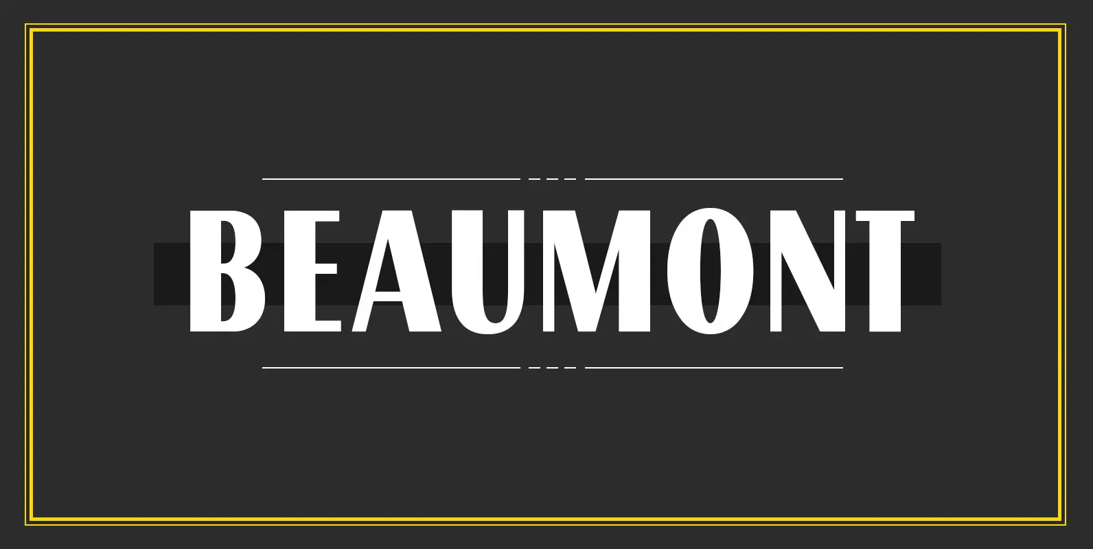
Beaumont Font
Beaumont is a modern take on classic 1920’s type, playing with stroke contrast and art deco forms. The result is a 10 font family, providing options for setting readable body copy or high impact display headings. With full multilingual character
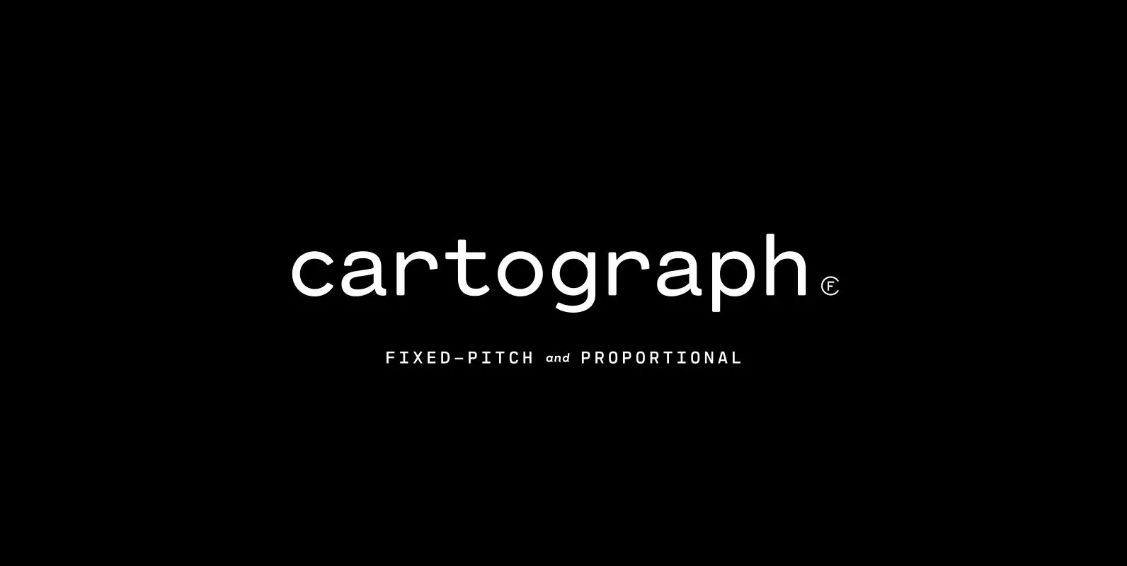
Cartograph CF Font
A monospaced typeface with character and warmth, Cartograph© CF is a handsome font family featuring a lush, cursive italic, code-friendly ligatures, and a proportional set accessible via OpenType. A tribute to the utilitarian beauty of terminals and typewriters, Cartograph excels
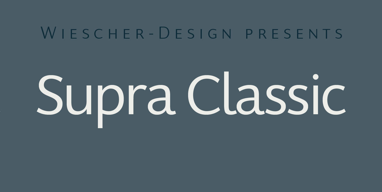
Supra Classic Font
“Supra Classic” designed by Gert Wiescher in 2014 – has 10 weights with corresponding italic cuts. The designs elegant contrast in the up- and downstrokes makes for better legibility and a pleasing personality. The dominant x-height with its high ascenders
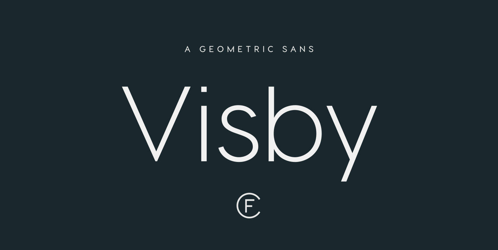
Visby CF Font
Friendly and charismatic in lowercase; sophisticated and authoritative in uppercase. Visby is a geometric font family inspired by the stark beauty and crisp air of the Arctic North. Hard lines and sharp corners mesh with smooth, rounded forms, while subtle