Tag: content
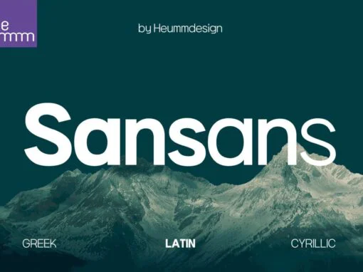
HU Sansans Font
HU Sansans is a sans serif font design published by Heummdesign Published by HeummdesignDownload HU Sansans
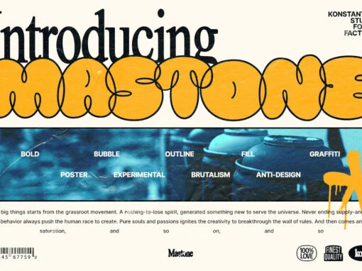
Mastone Font
Introducing Mastone – a bold, fresh take on typography! Inspired by the bubble typography trend and a mix of y2k culture, streetwear visuals, and brutalism plus an experimental touch of bubble throw-up graffiti styles, this font is sure to make
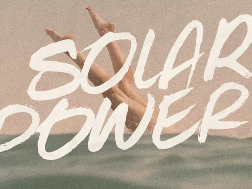
Solar Power Font
Solar Power is an organic handwritten brush font that’s perfect for your brand content. This font features two sets of uppercase characters so you can achieve a natural hand drawn feel with your design. Solar Power is ideal for marketing
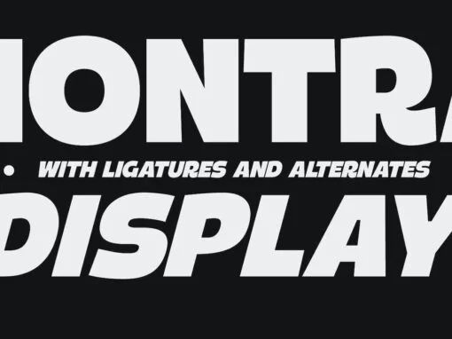
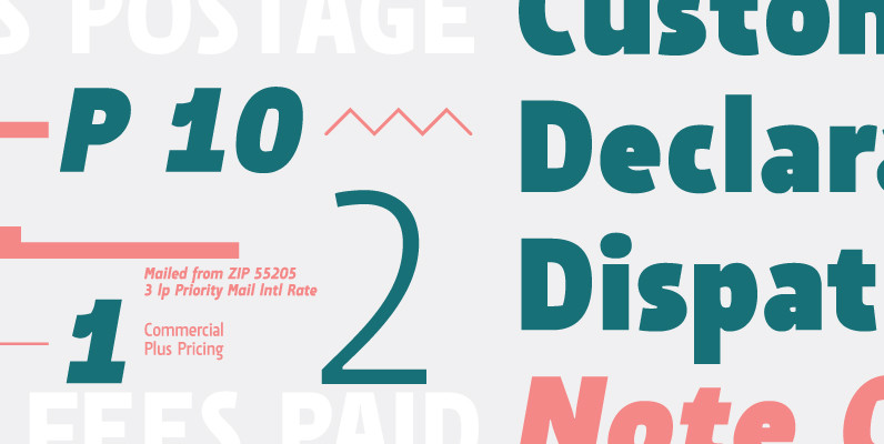
Montra Font
Montra is a striking & bold sans serif display font that is perfect for making a big impact! This product is filled with alternate characters & ligature options which makes it the perfect choice for a variety of work like
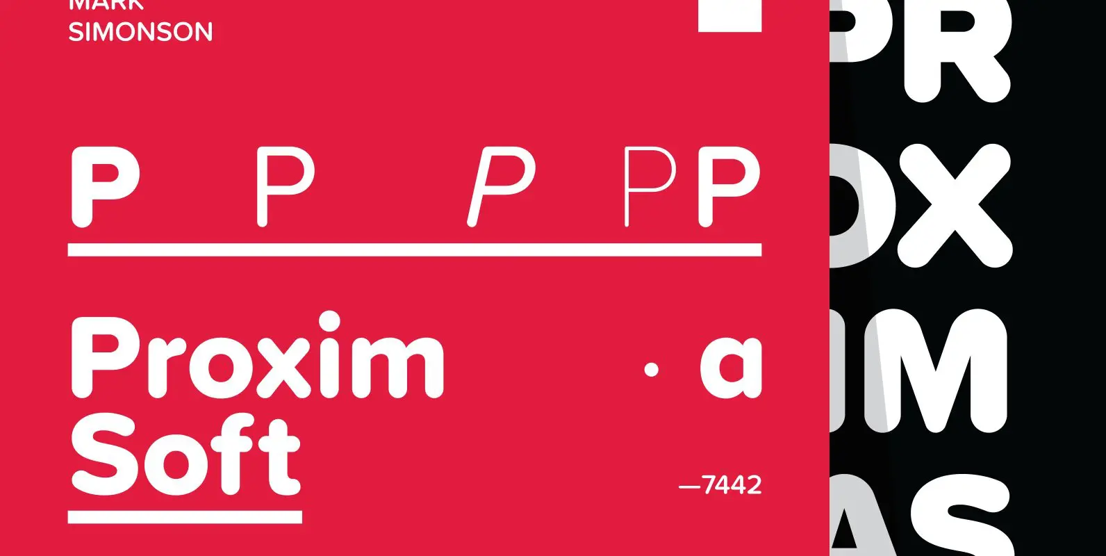
Proxima Soft Font
Proxima Soft (2017) is a rounded version of Proxima Nova. With the same forty-eight styles (eight weights in three widths, plus italics), Proxima Soft fits the bill when you want something a bit warmer and more playful than its older
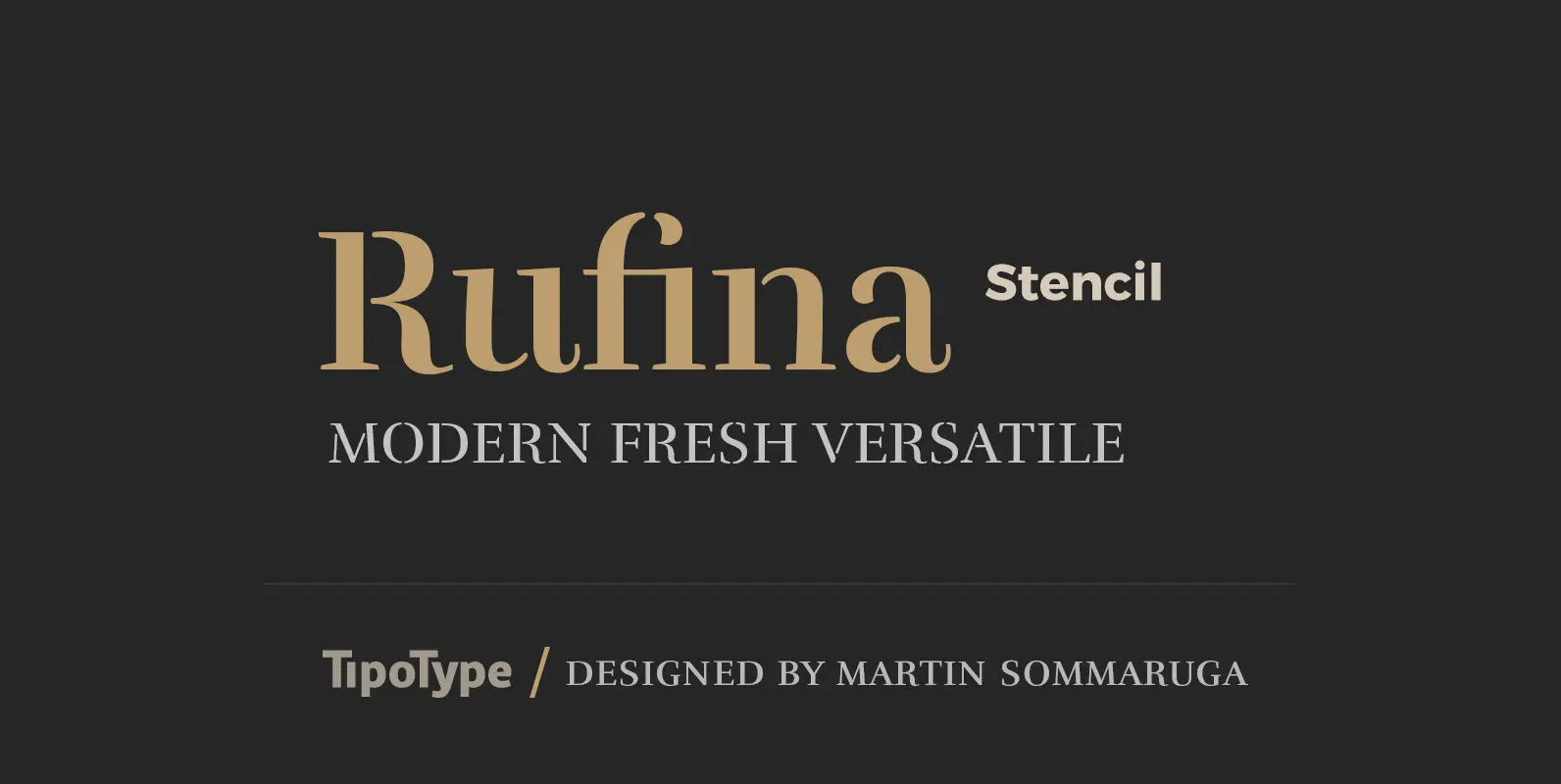
Rufina Stencil Font
Simplicity, delicacy and elegance are the words that best characterize Rufina. Based on an idea that was conceived long before its “birth”, Rufina was created from dark-text on light-background combinations. Refined and at the same time distant, Rufina seduces the
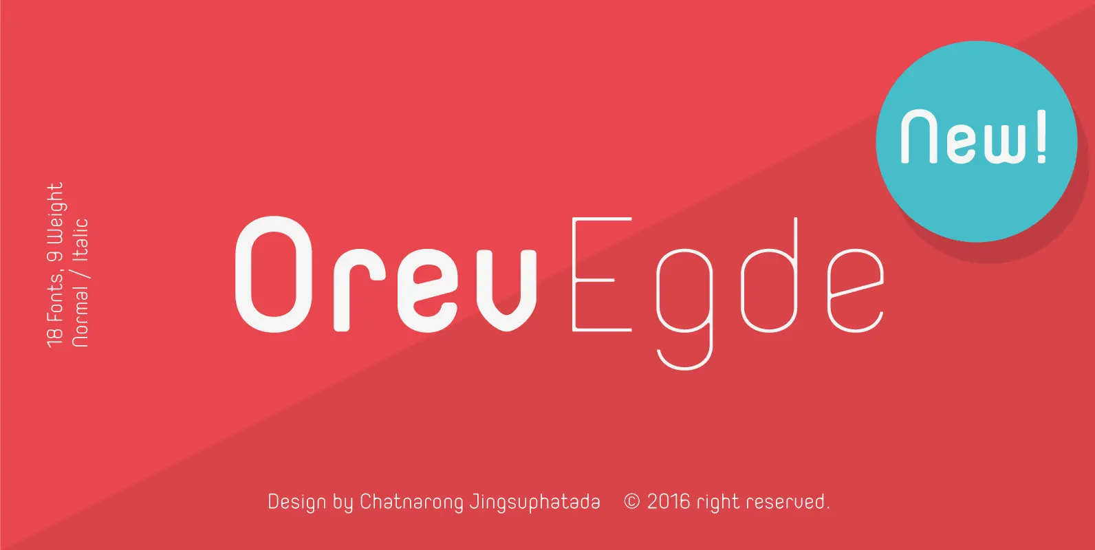
Orev Edge Font
Orev Edge is altered modified from the form of the original “Orev” typeface. We added curved line in both inner and outer edges, including the structure of typeface. Import to be more friendly, the font family has smoother terminals that
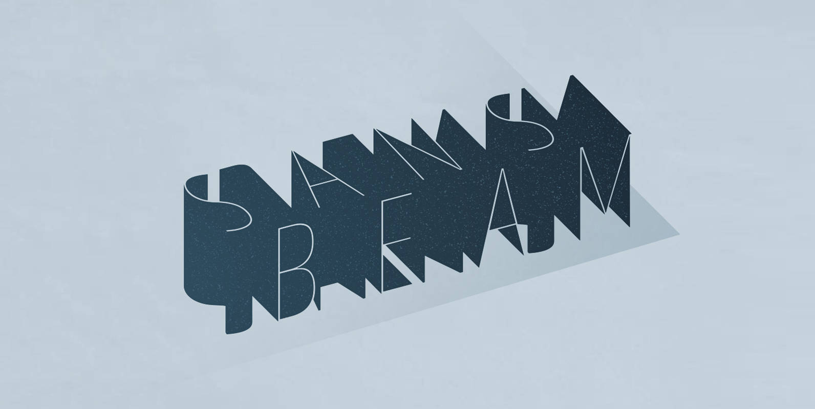
Sans Beam Font
After releasing Amsi in 2015, this year Sans Beam is now ready to launch with the design that support many different usability from Headline to Body text, and specifically designed to be compatible with other font families of Stawix Foundry.
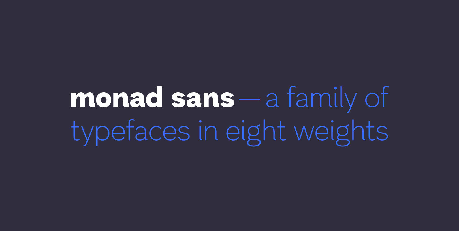
Monad Sans Font
Monad Sans is a typeface that builds on traditional and modern grotesques — aspiring to be a modern workhorse, rugged but not wooden, geometric yet limber. Available in eight weights, it has a medium x-height and generous character width. The
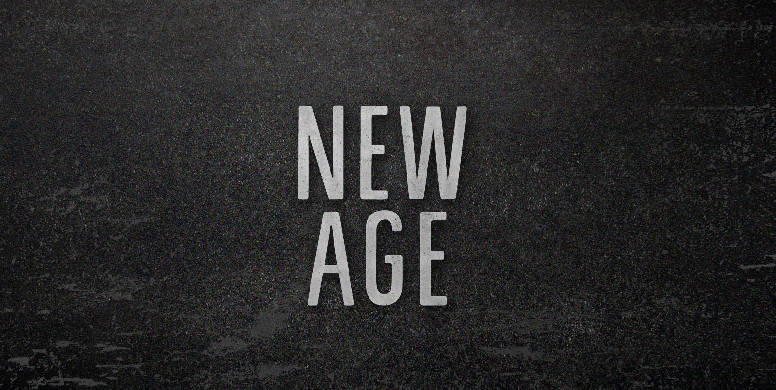
New Age Font
We never tuned into robots. They didn’t come to our commune to kill, but to commercialize. We were living in a New Age and it wasn’t new enough. As fast as we dropped out of being drones, real drones took
Estilo Pro Font
Five years later, DSType proudly introduces Estilo Pro: the Ultimate version of Estilo. Now with sharp edges and five weights, from Hairline to Bold, Estilo Pro includes an extraordinary set of features like Alternate Characters, Initial Swashes, Ending Swashes, Ligatures,
Solido Condensed Font
Solido is a very versatile and usable type system with five widths: Solido, Solido Constricted, Solido Condensed, Solido Compressed and Solido Compact, in a total of 35 fonts with many of alternate characters. Published by DSTypeDownload Solido Condensed

P22 Late November Font
P22 Late November is a new font family from Norwegian type designer Torliev Sverdrup. The font is a transitional Antiqua-inspired type design great for text and display uses Late November is a transitional Antiqua-inspired type design. Says Torliev: “I started
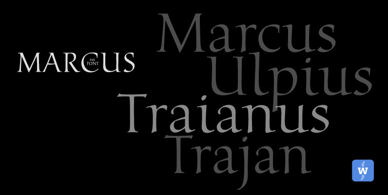
Marcus Font
Marcus, the font, was named after the Roman Emperor Marcus Ulpius Traianus (Trajan) born 18 September 53 in the Roman province of Hispania Baetica (in what is now Spain), a province that was thoroughly Romanized, in the city of Italica.
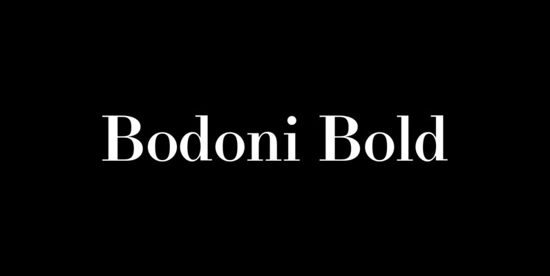
LTC Bodoni Bold Font
Bodoni Bold was drawn by London based type designer Dave Farey for Lanston Type during one of his alter-ego bouts as Giambattista Bodoni in the early 1990s. This font presents the unusual opportunity to use a Bodoni as body copy.
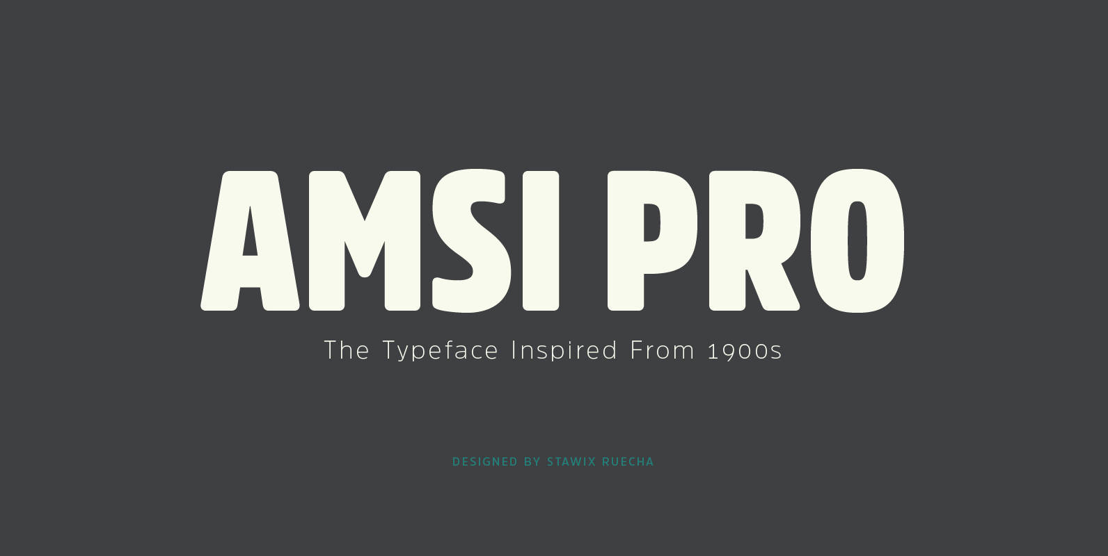
Amsi Pro Font
An unexpected encounter at ArtBasel that uses Block Berthold Condensed as their co-operated logo. It is purely a personal impression towards this particular font. Following the research, it turns out that this font has been around for approximately a hundred
Suomi Sans Font
There are many sans serif typefaces with calligraphic tendencies, but Suomi Sans is different: the outside forms are fairly basic, fairly narrow sans serif style, but the counter forms have a strong calligraphic flair with accented upper left and lower