Tag: compressed

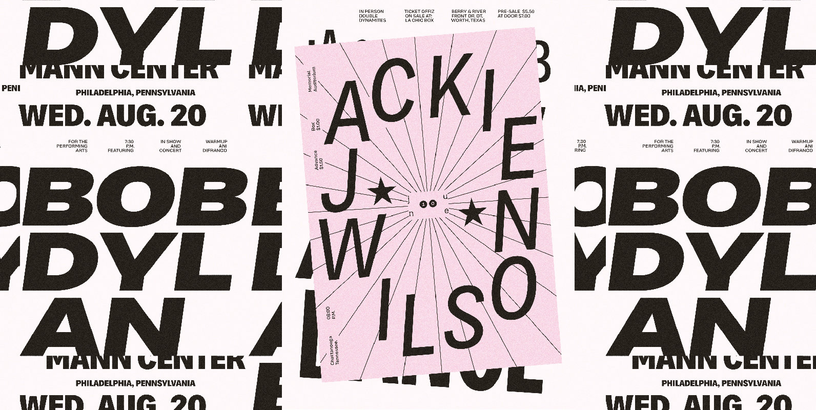
Barbarossa Font
Birthed from leftover “bits” while crafting a logo. Intended for singular word accenting. Great for logos, headers, and accent typography. Go Big! Published by Weapon of Choice TypeDownload Barbarossa
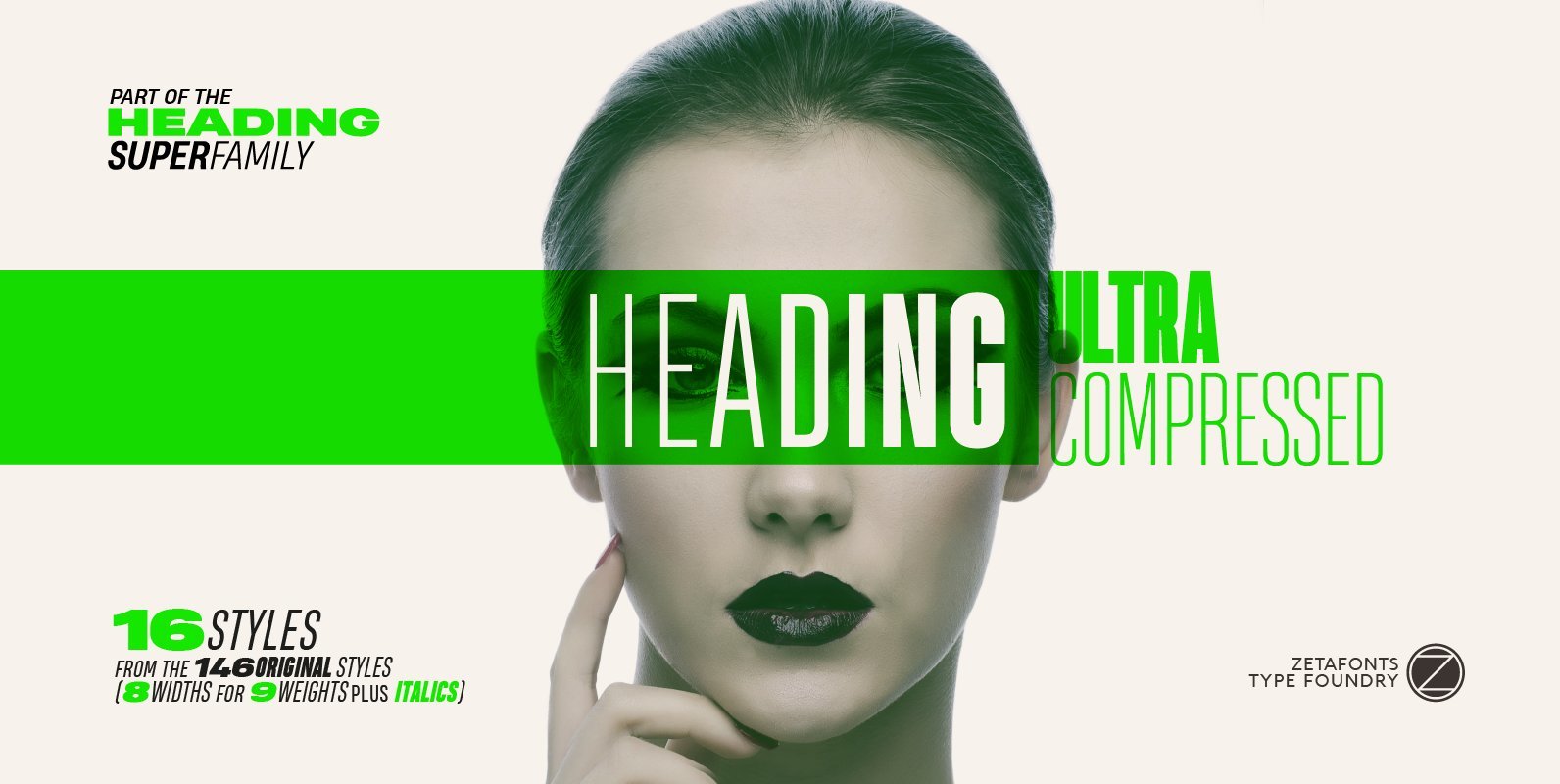
Heading Pro Ultra Compressed Font
Heading Pro Ultra Compressed is a variant of the original Heading Pro typeface designed by Francesco Canovaro for Zetafonts. Each Heading Pro typeface includes over 800 characters with coverage for 100+ languages using latin, cyrillic and greek alphabets. A full

Vin Slab Pro Font
Vin (translated from Ukrainian as “he”) is a superfamily consisting of three distinctly masculine typefaces with pronounced vertical stems and rounded corners. All three typefaces feature very large x-height for even more expression and assertiveness. Vin Slab Pro is a
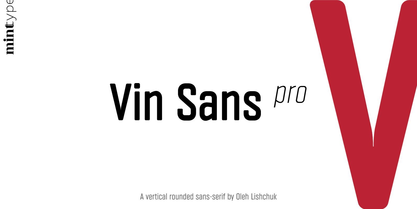
Vin Sans Pro Font
Vin (translated from Ukrainian as “he”) is a superfamily consisting of three distinctly masculine typefaces with pronounced vertical stems and rounded corners. All three typefaces feature very large x-height for even more expression and assertiveness. Vin Sans Pro is a
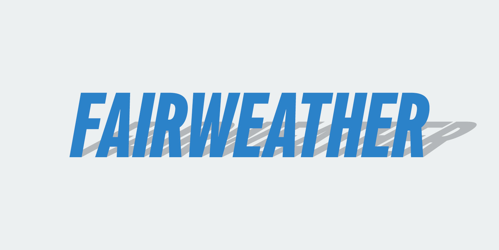
Fairweather Font
Fairweather is a fresh air. Clear, transparent, and lucid as if it is the spring and autumn sky. By designed condensed, legible and perspicuous, Fairweather is perfect for titles and captions. But “Title and Captions” are the just examples. Very
Bruta Pro Font
Bruta is a contemporary sans-serif grotesque typeface, conceived to become the Swiss army knife of your font library. Inheriting the modernist approach of the grotesque fonts, Bruta aims to be a rational and neutral typeface suitable for a wide range
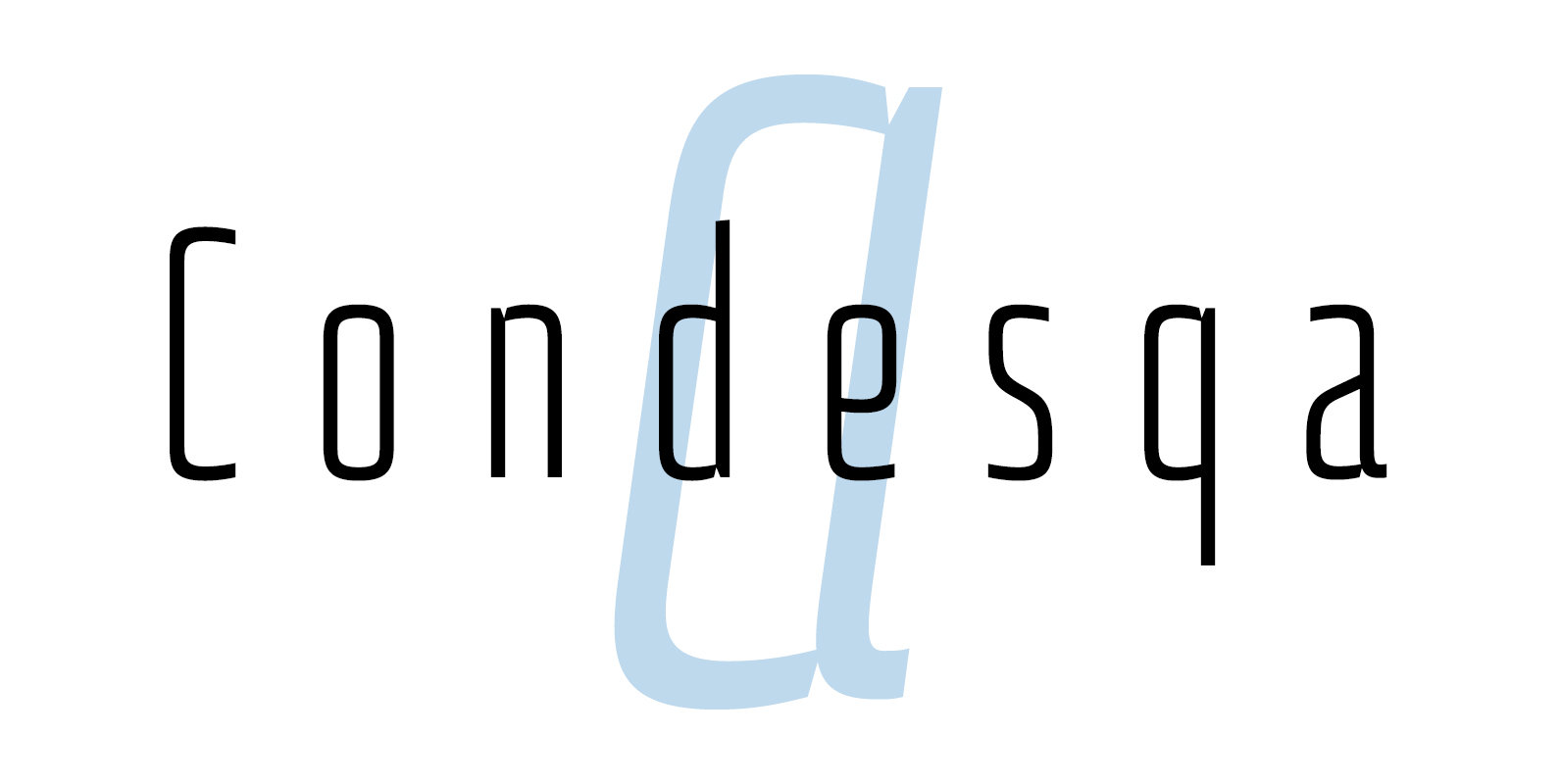
Condesqa 4F Font
Condesqa 4F is a sans serif font design published by Sergiy Tkachenko Published by Sergiy TkachenkoDownload Condesqa 4F
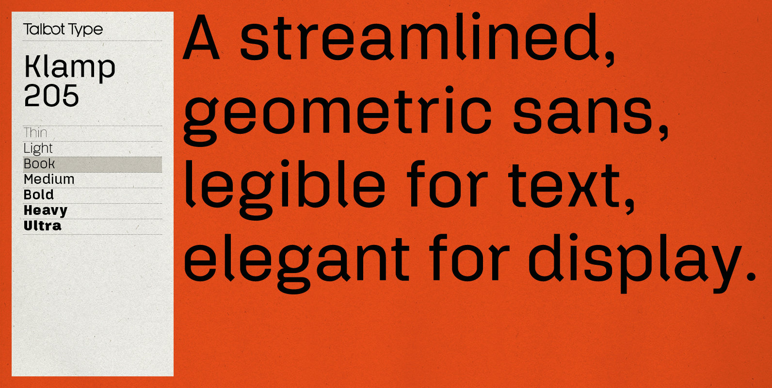
Klamp 205 Font
Talbot Type Klamp 205 is an elegant and streamlined, geometric sans-serif. A legible text font, its narrow proportions mean it’s economical with space; while at larger sizes it makes a confident, modern display face. Klamp 205 is available in a
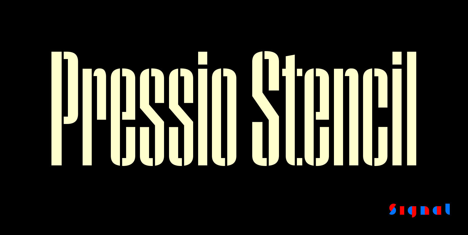
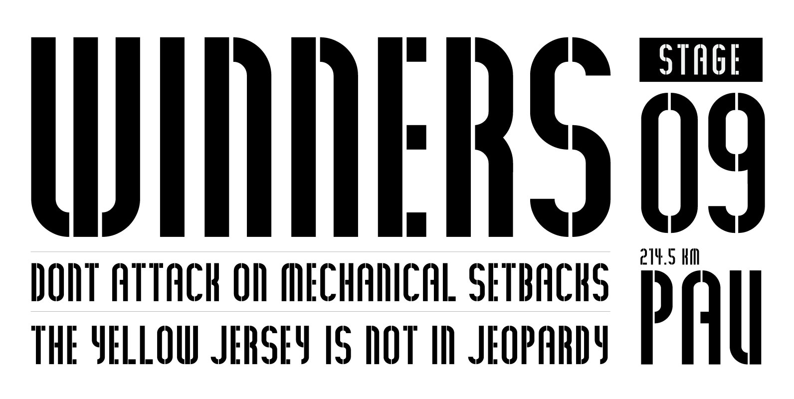
Pressio Stencil Font
Pressio Stencil brings Pressio's square counters and super elliptical curves to the stencil genre. The result is Mid-century Modern with a touch of packing crate. With four widths and five weights, it's far more versatile than most stencil families. The
Colosseum Font
When angles (and lack of) are important, this font was inspired by ancient roman architecture where strength and support were achieved through angles. This typeface benefits from large usage. In fact, many national magazines have turned to Colosseum over the
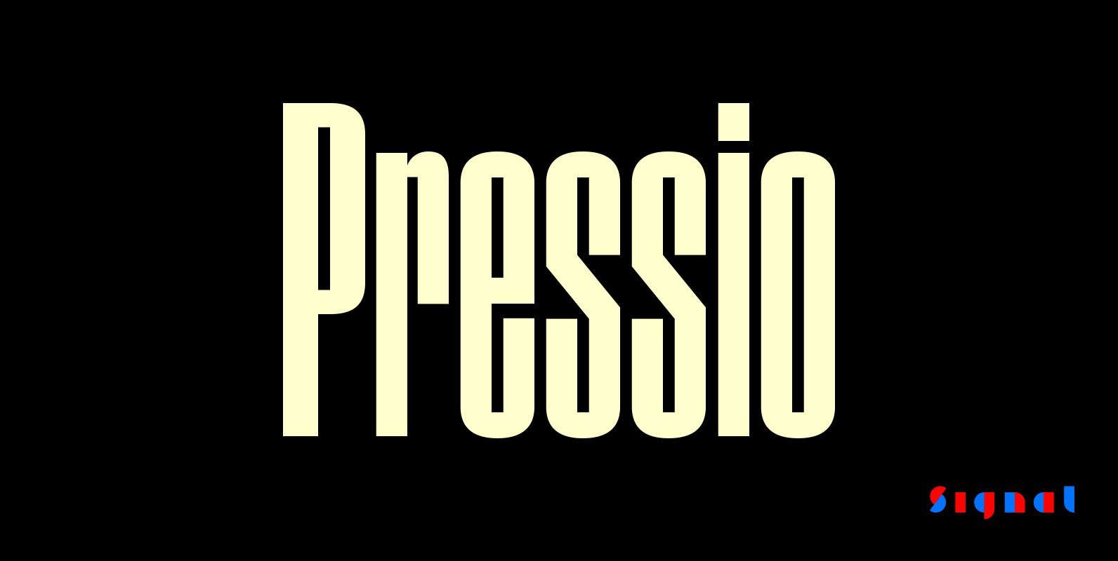
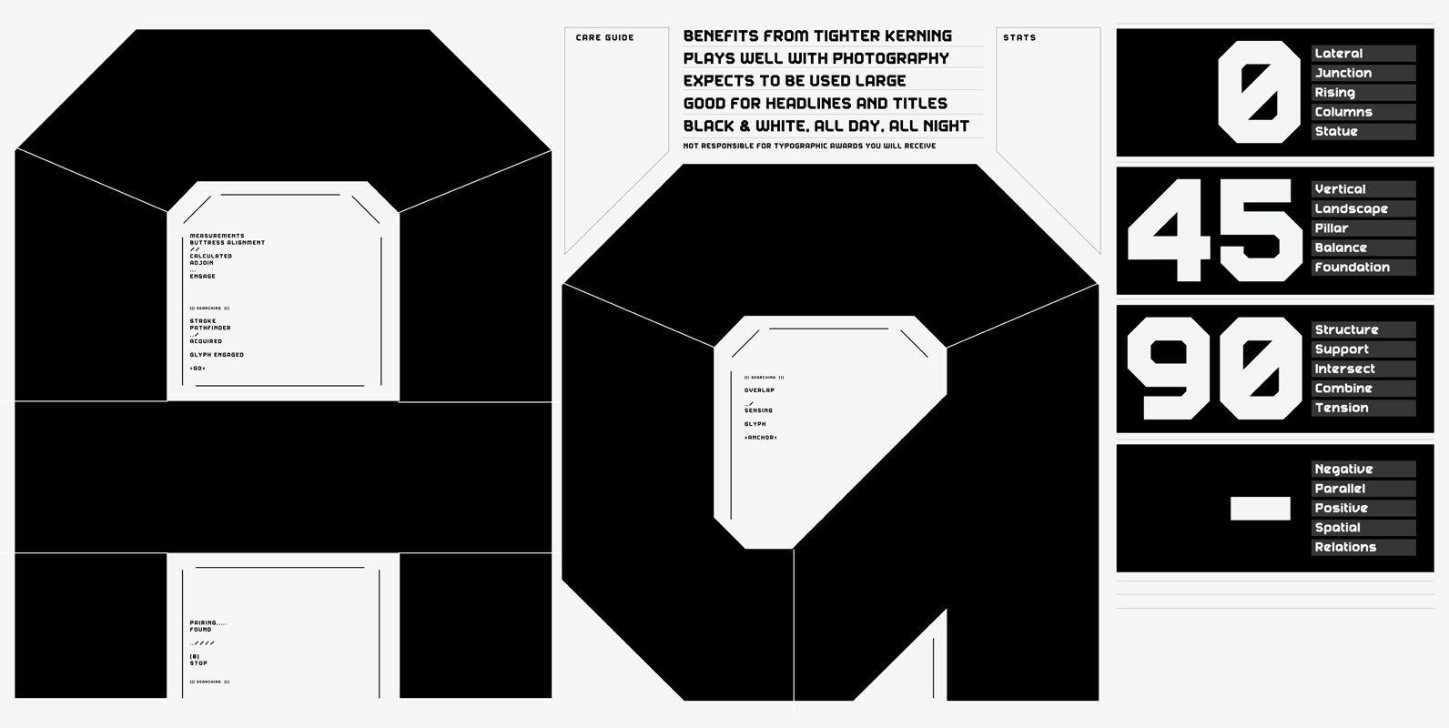
Pressio Font
Pressio is a study in doing things backwards. It began with the weight that’s usually drawn last: the ultra-compressed black. This was squashed down vertically in increments to make the compressed, condensed, and regular widths, then hollowed like a dugout

Tusker Grotesk Font
Tusker Grotesk is a headline typeface designed for robust and high-impact use. The initial inspiration for Tusker came from postwar typefaces like Haettenschweiler, Impact and Helvetica Inserat which use very high x-heights. Other influences in the condensed end of the Tusker family are
Rittenhouse Bold Font
Stenciled, condensed and bold where your labeling, signage and headlines need a slightly softer and refined feeling. Benefits from large display usage, so please, GO BIG. Published by Weapon of Choice TypeDownload Rittenhouse Bold

Hammerhead Font
Hammerhead is a clean and simple style type design published by Mcraft. Published by McraftDownload Hammerhead
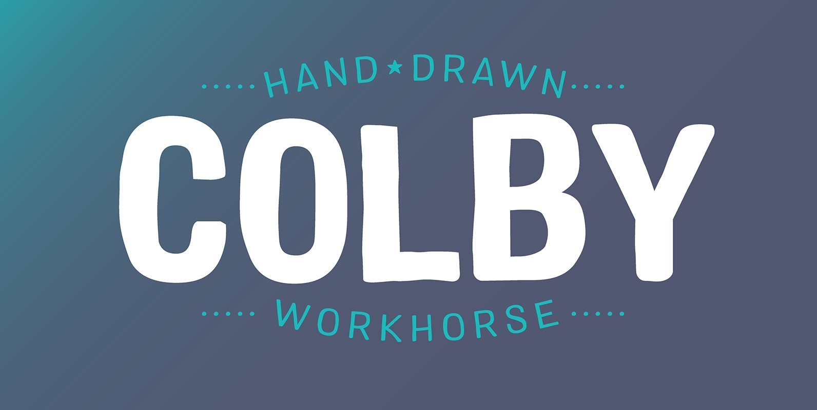
Colby Font
Colby is a hand-drawn workhorse sans serif family. It consists of a wide range of weights and widths for a variety of applications. Colby balances the quirkiness of hand-drawn letters with the legibility of a clean sans serif. This combination
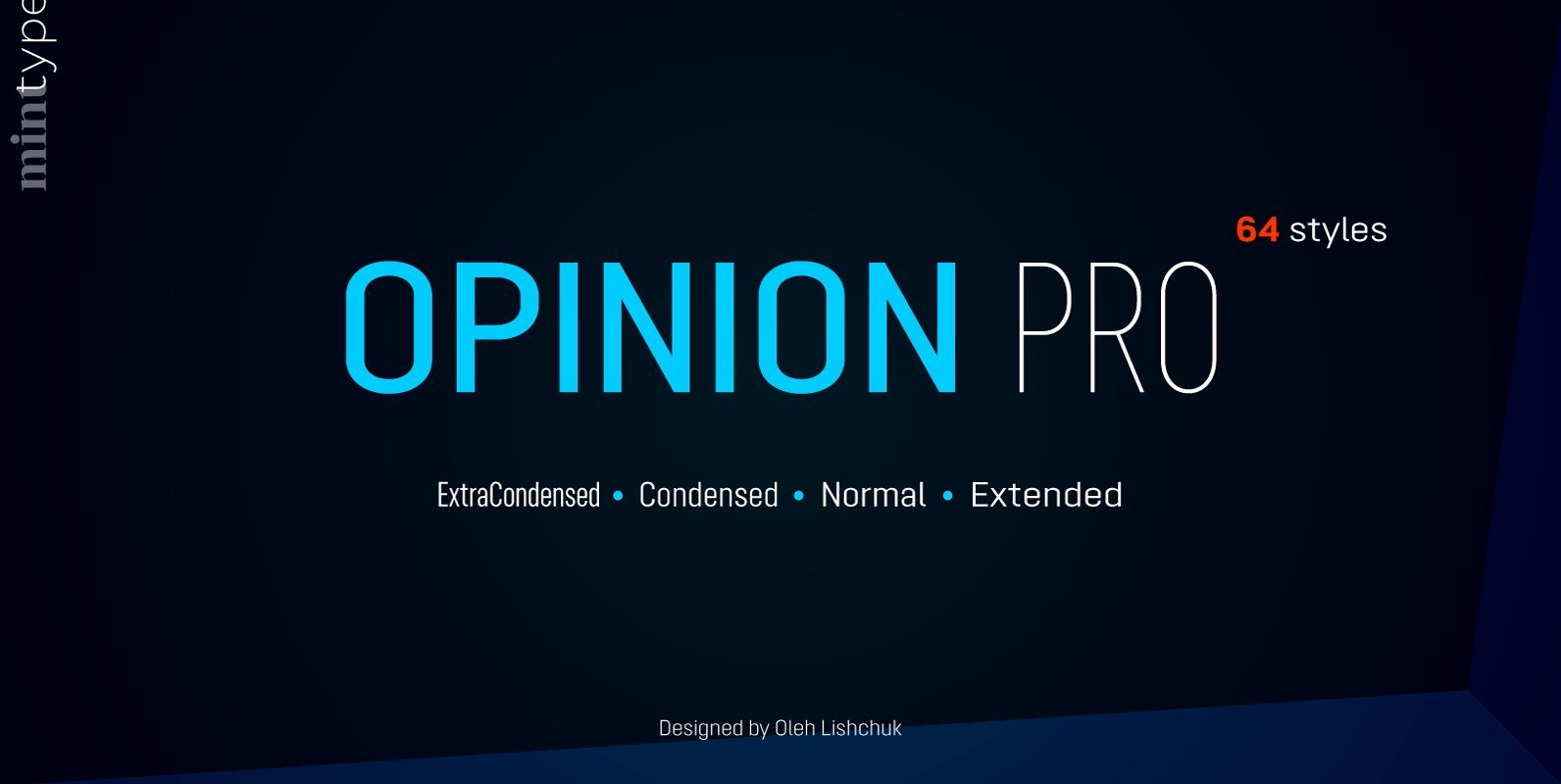
Opinion Pro Font
Opinion Pro is a geometric sans-serif typeface with extra-large x-height that comes in 64 styles. It is composed of 4 width variations, each in 8 weights with respective italics. Its rigid curves with pronounced vertical stems makes it useful as
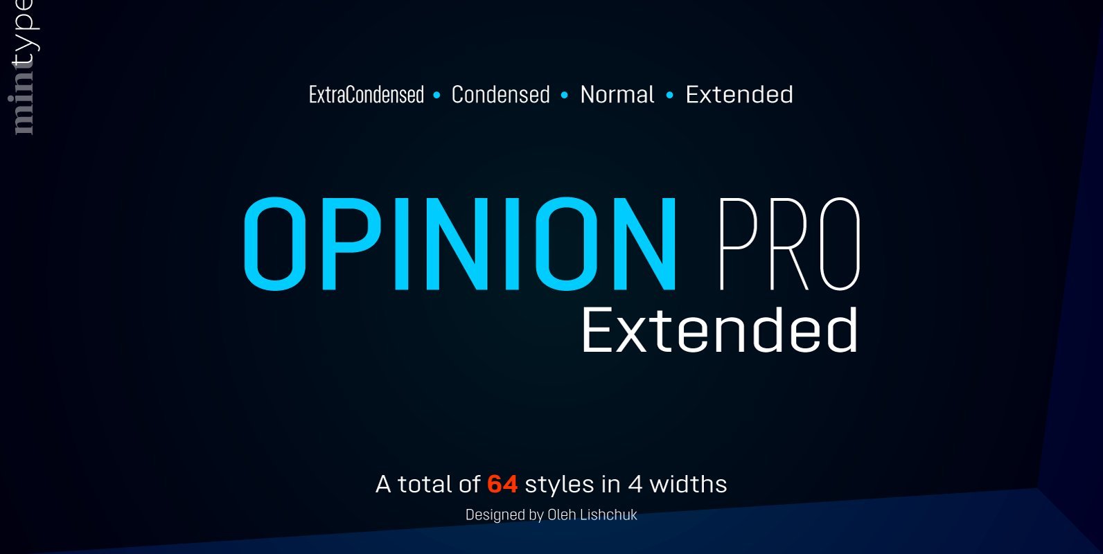
Opinion Pro Extended Font
Opinion Pro is a geometric sans-serif typeface with extra-large x-height that comes in 64 styles. It is composed of 4 width variations, each in 8 weights with respective italics. Its rigid curves with pronounced vertical stems makes it useful as