Tag: comfortable

Bream Font
This is the display version of Librum. Librum means “book” in Latin, which I thought was appropriate. Bream is Latin for proclaim—appropriate for display work. The fonts are very close to Librum-Book and Librum-Italic, with the same OpenType features. The

Librum E Font
The major focus of my life and ministry at this point is book design. In the brave new world of 21st century self-publishing a new paradigm has arisen: the indie small shop. One of the problems is that all books

Librum Font
This is the serif text family for the book design group of font families which David designed in the process of writing “Practical Font Design With FontLab 5”. The letterspacing is set wide for body copy use. The main purpose

Bookish Font
This all started with a love for Jenson I know there’re hundreds of variations a on that theme. But, that is where I began, several years ago. How far it came, as usual, as I wandered through the vagaries of

Contenu Publishing Suite Font
Contenu is the new book font family designed for an upcoming book on book family design. The name is French for content and this is what the family is designed for: text, body copy, and book layout. If it has
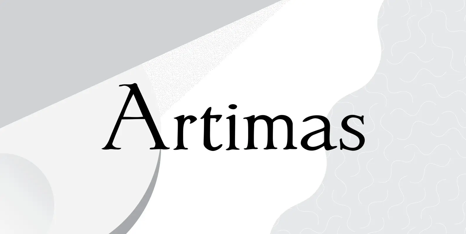
Artimas Font
The Artimas family is the new book design font family developed out of Aramus. These new serif typefaces are readable and graceful — part of my development of a series of book families. Aramus was very popular for a single
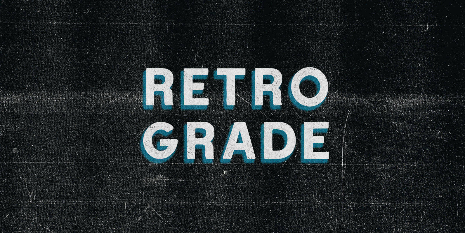
Retro Grade Font
I failed fourth grade until my teacher got sick of my ’80s TV references and knocked me all the way back to Retro Grade. I started down the corridor and my heart sank as I sauntered past the reality-artificiality barrier.

Cold Crush Font
“Where did it all go wrong?” is what Chris would have thought if he could have thought around the screaming pain in his shattered femur. Jumping out of a helicopter on skis had seemed like the ultimate ride until the