Tag: classical

Sonata Pro Font
profonts Sonata and profonts Concerto are closely related to each other. In fact, the only difference between the two related fonts is in the upper case characters. profonts Concerto’s upper cases are more complex, swashier than those in profonts Sonata.

Balladeer Font
Balladeer is an elegant, classical script design coming in three styles as Light, Medium and Bold. Published by URW Type Foundry GmbHDownload Balladeer
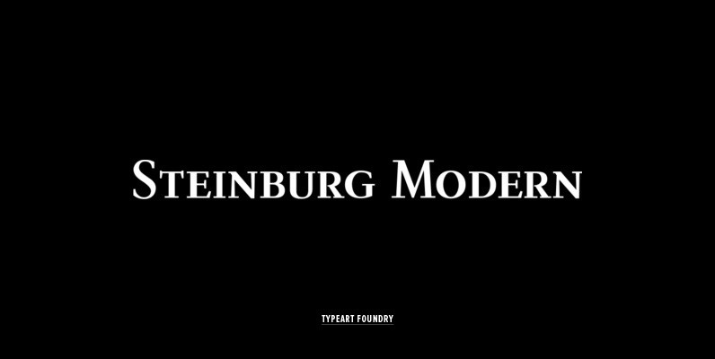
Steinburg Modern Font
Steinburg Modern™ is largely a variation on a Garamond-styled typeface with differences in some character designs and in the overall character proportions. In addition, the curved brackets that were a distinctive part of Garamond’s 16th century design are perhaps the

Vienna Font
The Vienna Workshop (Wiener Werkstätte) produced a tremendous variety of art from the turn of the century until the beginning of World War II. This set, which includes three typefaces and a collection of graphic extras, draws on both the

Dominante Pro Font
Dominante was originally designed by Johannes Schweitzer in 1959 for Ludwig Published by URW Type Foundry GmbHDownload Dominante Pro
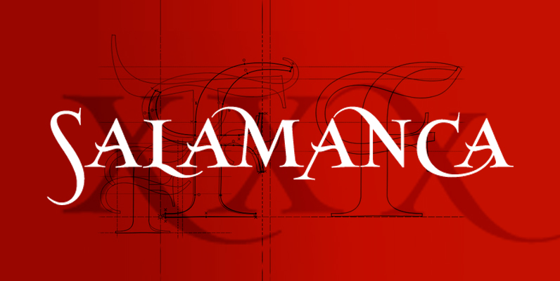
SalamancaTF Font
SalamacaTF is a fun to use typeface. With the OpenType options or the glyphs palette you make your own special typo’s. The font is based on the wall typography of the city of Salamanca. Published by TypeFaith Fonts Download SalamancaTF

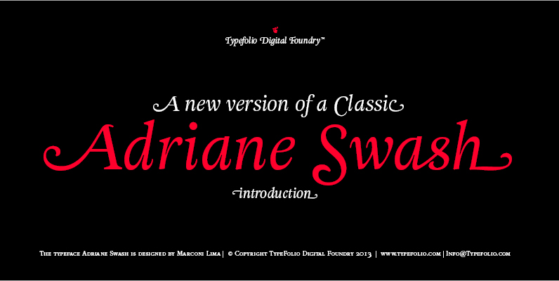
Adriane Swash Font
The Swash version of Adriane Text features of the best characteristics of this lineage without losing the strong personality and elegant design featured in your text styles. Adriane Swash brings a fancy look to this classic style. The family comes
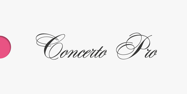
Concerto Pro Font
profonts Concerto and profonts Sonata are closely related to each other. In fact, the only difference between the two related fonts is in the upper case characters. Concerto’s upper cases are more complex, swashier than those in Sonata. One is

AQUUS Font
AQUUS is a contemporary all-caps display font that refines the elegance of a classic Didone with experimental interventions. Geometric elements and subtle details are found in its letters, many of which connect to ligatures. Most alternate glyphs can be switched
Classic XtraRound Font
Classic XtraRound is a companion typeface to Classic Round, designed by Ben Blom. Although Classic Round has a lot of roundness, Classic XtraRound has more. Classic XtraRound has maximum roundness — no sharp corners, anywhere. Classic XtraRound has maximum roundness
Filo Pro Font
Filo Pro is a very beautiful and highly legible typeface family as regular, medium and bold. It is a quite characteristic, modern interpretation of the humanistic serif. The serifs of Filo Pro are not too dominant, and its forms are
Classic Round Font
Classic Round. It’s classic. It’s round.Classic design; present-day roundness. Versatile. Soft. Warm. Peaceful.For text and display use. When using Classic Round in small text sizes, it will be a reliable and legible workhorse. When using it in big display sizes,