Tag: Canadian
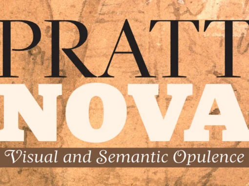
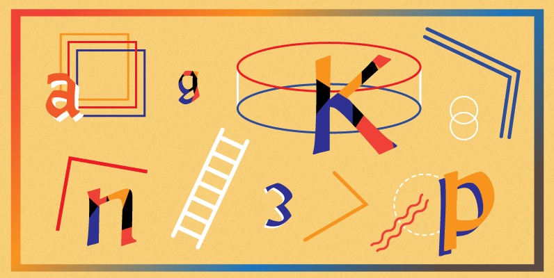
Pratt Nova Font
Shaped by constraint to accommodate a large character count, Pratt Nova has massive form: semi-condensed, large x-height, short descenders and capitals. And yet it transcends its restrictive origins in abundance, expressing a spirit of visual and semantic opulence, equipping the
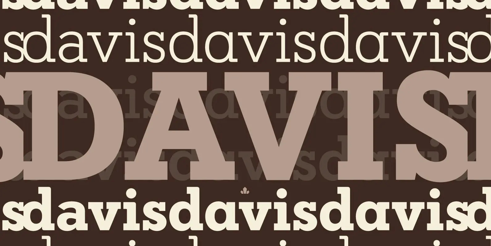
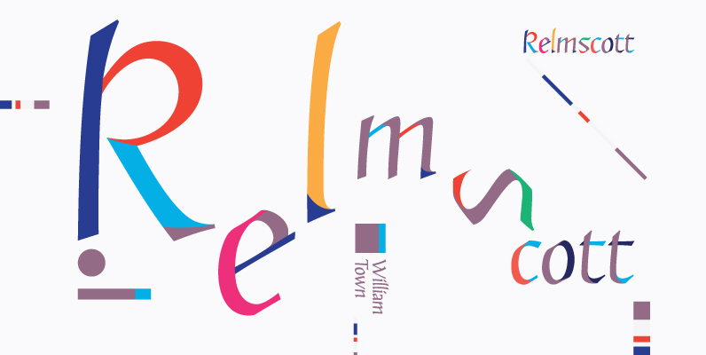
Davis Font
P22 Blox is a modular system of shapes that can build letterforms and abstract patterns. Created as a working prototype for the letterpress P22 Blox project from P22 Analog and Starshaped Press, this system of shapes presents a unique approach
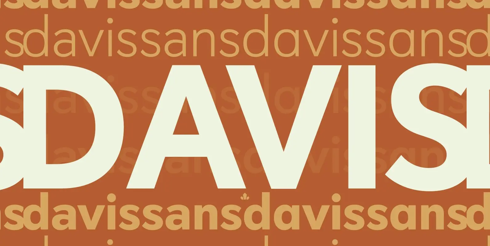
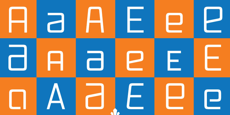
Davis Sans Font
Over the past couple of decades, the many applications that joined print as media requiring design solutions have combined to necessitate a visual evolution that favours controlled optical geometry and careful counter-space consideration over ornamental features traditionally associated with print
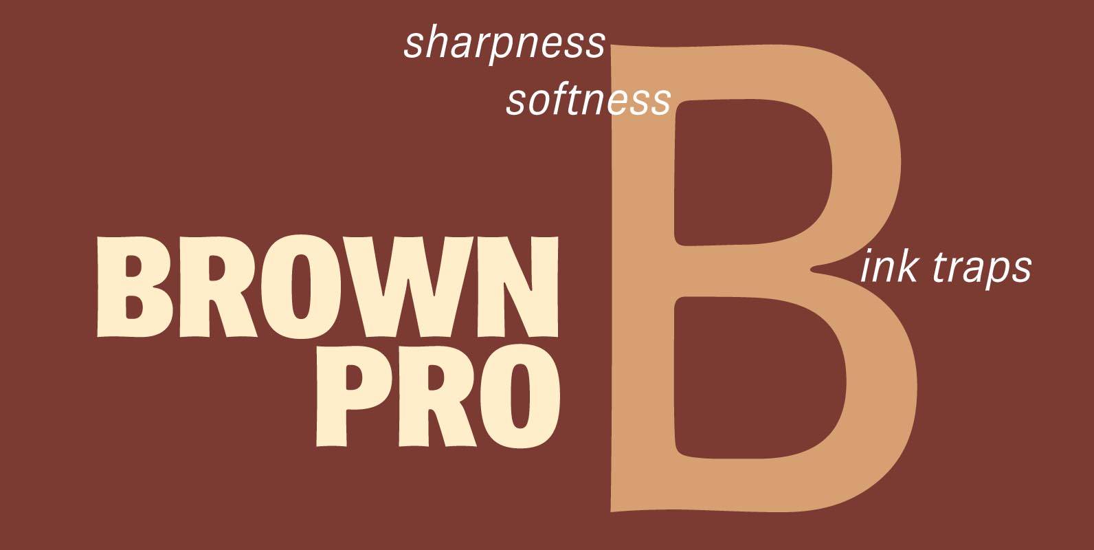
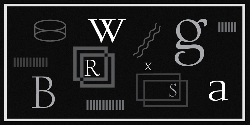
Brown Pro Font
At text size, Brown is a classic grotesque, distinguished by its semi-condensed proportions (especially in the capitals, which harmonize well with the lining figures) and with an exceptional clarity in certain high-resolution media, such as offset printing, achieved by micro-detailing.
Alexander Quill Font
Alexander Quill was originally designed in the early 1980s to be cut in 14 point for casting into foundry type for the setting and printing of limited edition books at Pie Tree Press, Jim Rimmer’s private sanctum. This alphabet exhibits
Fellowship Font
Named in tribute to the members of the American Typecasting Fellowship, this font is an original expression of Jim Rimmer's left-handed calligraphy. It was designed and cut in 24 p in the early 1980s, then cast as foundry type on
Cotillion Pro Font
Cotillion is an original design Jim Rimmer finished just before the turn of the century. Alongside its evidence of Jim's nostalgia at the deco type designs he was exposed to as a child, it distinctly shows a type designer who
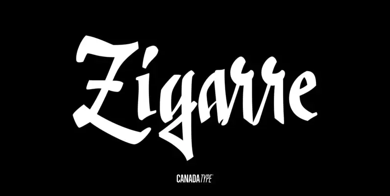
Zigarre Font
Though Zigarre can easily be categorized a brush script, Jim Rimmer actually drew it using a big marker. Jim's original face, inspired by inter-war German poster lettering, was a rough one, with the marker's juicy ink roughing it out all
Tabarnak Font
Tabarnak started out as an assessment and correction of an old concept by George Wilkens. The original idea was for a bold upright alphabet reminiscent of Oz Cooper's work, but ornamented with some shocard/signage traits. That idea was radically redrawn
Vox Round Font
Vox Round is the softer version of the Vox family. The original brief for Vox was a extensive monoline typeface that can be both precise and friendly, yet contain enough choice of seamlessly interchangeable variants for the user to be