Tag: british

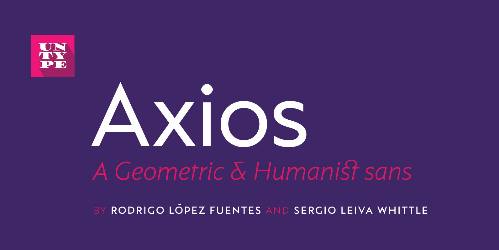
Axios Font

Axios was designed, on one side, due to its rational intention of searching the beauty on the purity of its forms, assuming the language of the early XX century geometric sanserifs. But its structure foundations are deeply attached into the

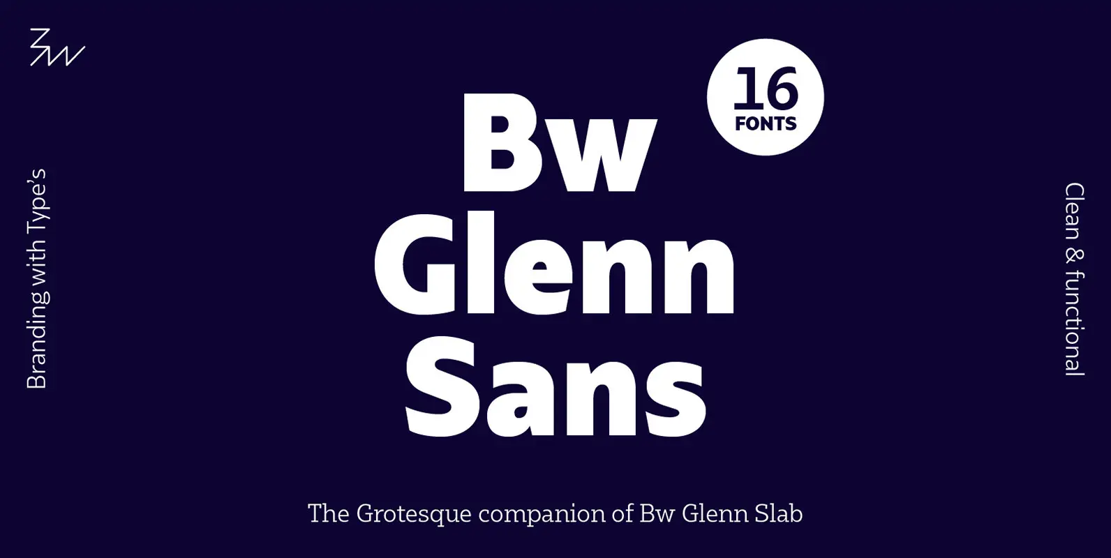
Bw Glenn Sans Font

Bw Glenn Sans is the result of mixing a grotesque skeleton with traits of the British sans serif tradition. The result is a modern and clean sans serif family that speaks with clarity and authority. Its contained width makes it

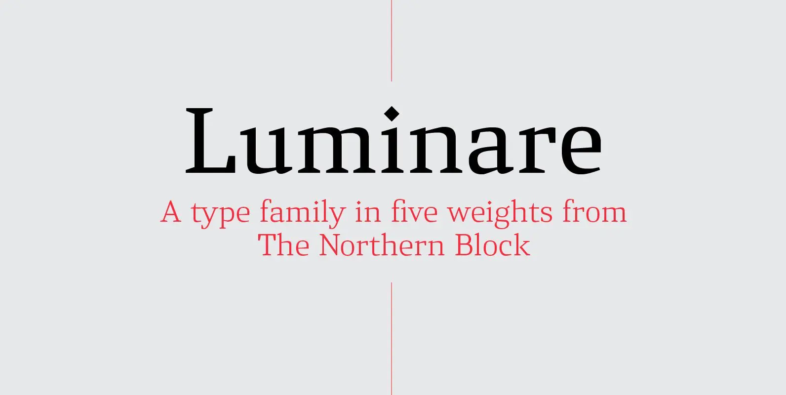
Luminare Font

Luminare is a serif type family with a strong rhythmical structure, clean cut serifs and balanced proportions. Luminare began life as a personal and academic enquiry into stencilled lettering. The key sources of this research where found in liturgical manuscripts

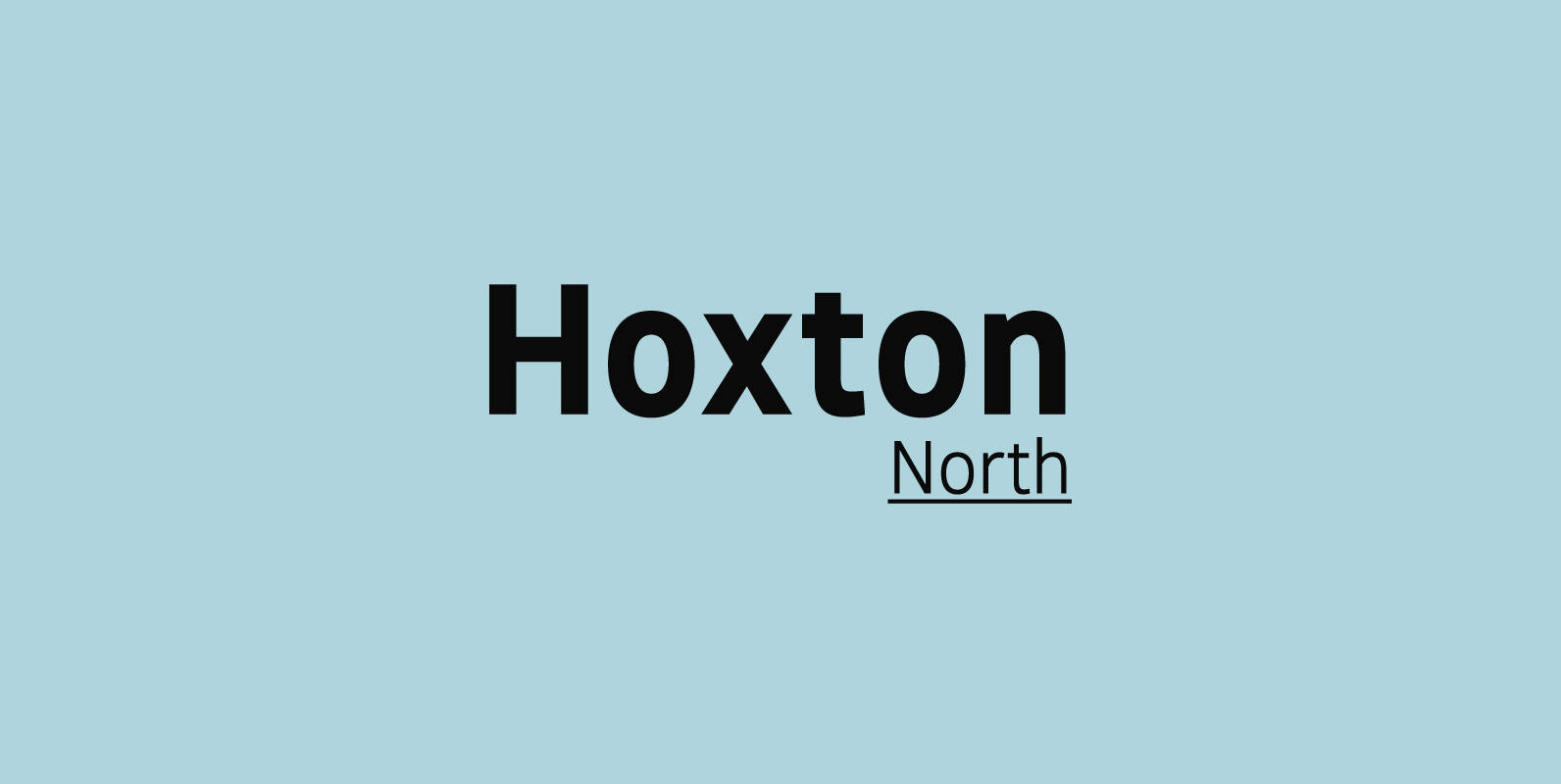
Hoxton North Font

Hoxton North came out of the concept to create something distinctly British, drawing on modernist influences such as Edward Johnston's typeface for the London Underground and Gill Sans. A humanistic san serif typeface with a British modern quality. Open forms

Prenton RP Font

Born of an award winning pedigree, Prenton is an elegant and meticulously drawn sans serif typeface by Roy Preston of Great Britain. Perfect for intricate text settings, it is an extensive family of typefaces containing twenty-one weights in all. The

Darjeeling Font

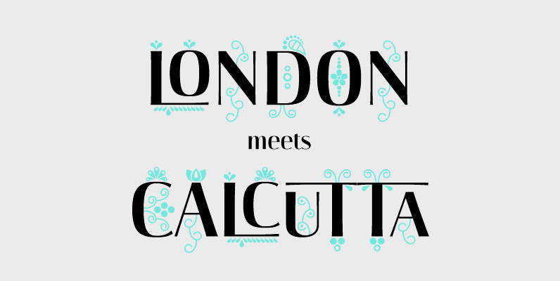
Darjeeling combines British Elegance and Indian Flavor. It is flared like Optima, with a scent of Bodoni. By layering Regular and Ornaments over each other You will create astounding pieces of colorful typography. Additionally there is a Regnaments style which