Tag: bodoni
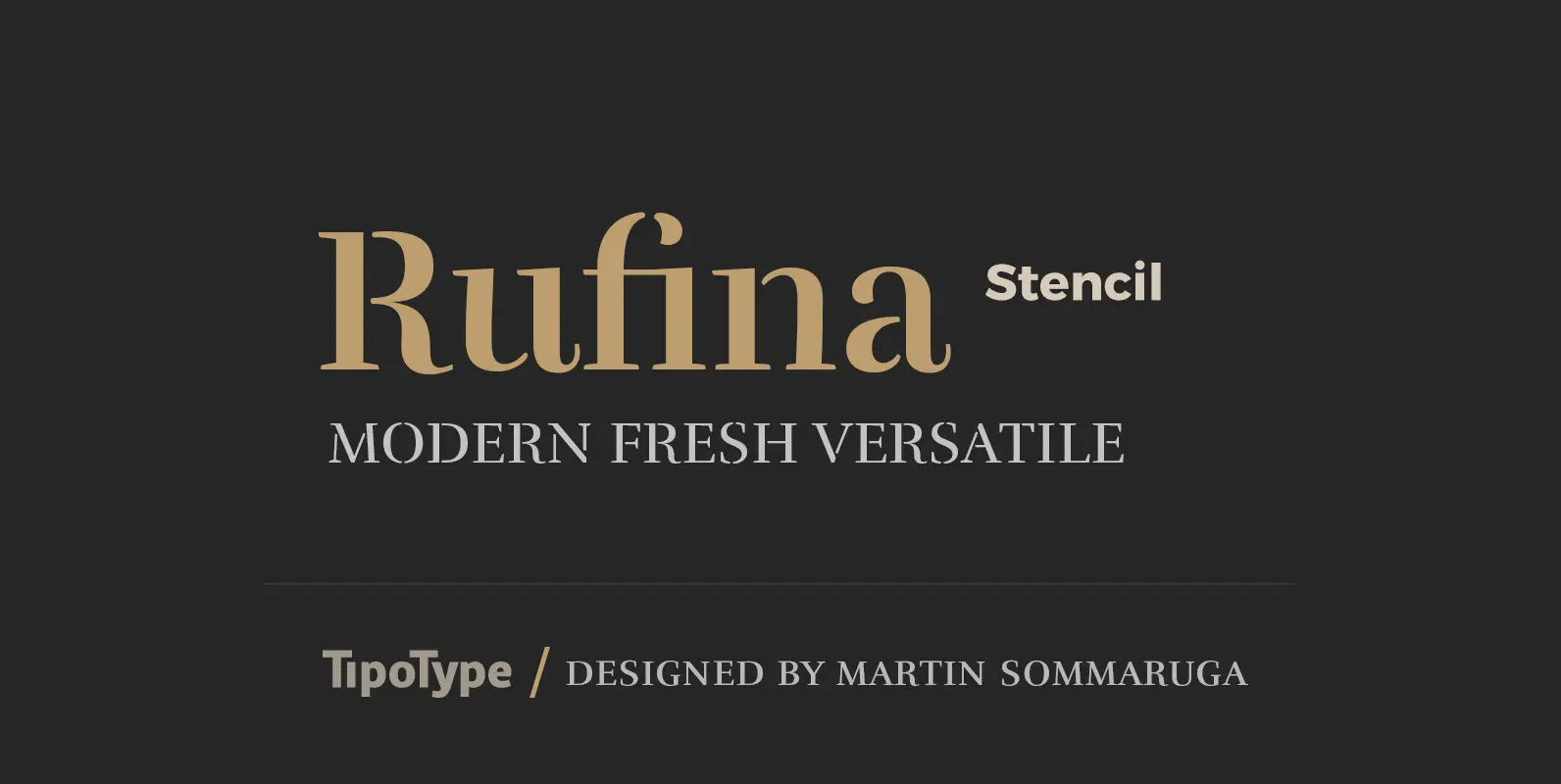
Rufina Stencil Font
Simplicity, delicacy and elegance are the words that best characterize Rufina. Based on an idea that was conceived long before its “birth”, Rufina was created from dark-text on light-background combinations. Refined and at the same time distant, Rufina seduces the

Isabel Font
Isabel was made out of necessity to create a new font for children and teenagers, that could be enough friendly and versatile for text in words or even easy-to- read long texts. The purpose of Isabel is to combine all
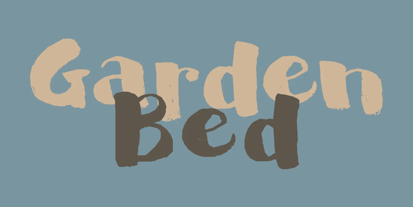
Garden Bed Font
A couple of weeks ago, I found my ink well, which I thought I had lost. I decided (there and then) to create a bunch of inky brush fonts, which resulted in Dirrrty and Scrawny Cat. And now, Garden Bed.
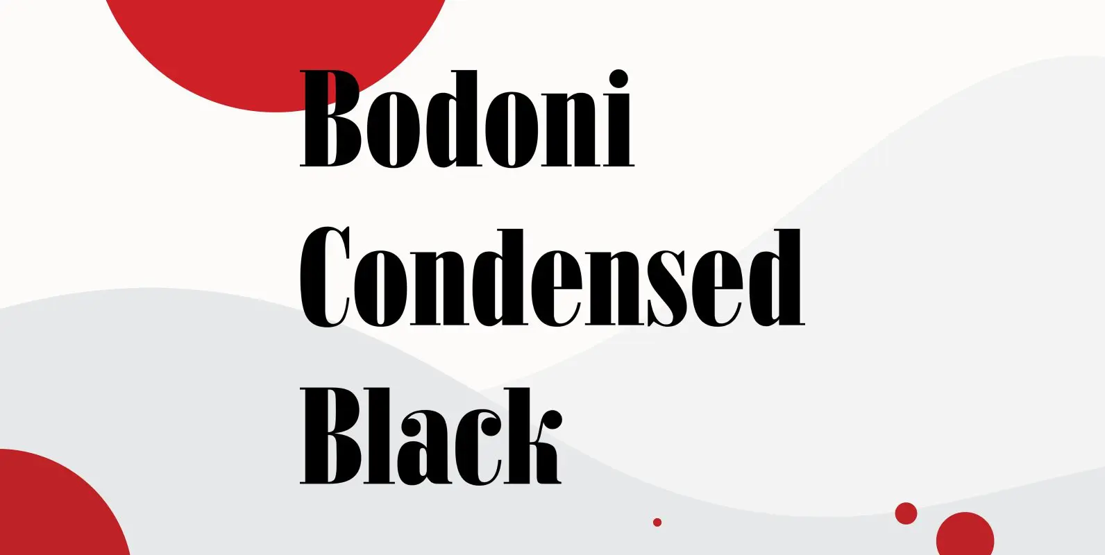
Bodoni Condensed Black Font
Bodoni Condensed Black was designed by R.H. Middleton for Ludlow, circa 1930. Digitally engineered by Steve Jackaman. Published by Red RoosterDownload Bodoni Condensed Black
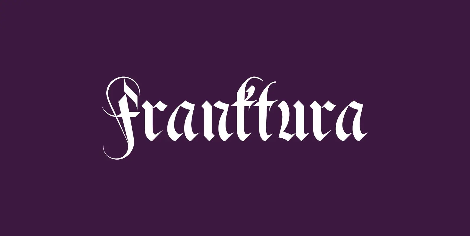
Fraktura Font
“Fraktura” and “Fraktura Plus” is a set of classical Fraktur (Blackletter) in a modern interpretation. The two fonts differ in the amount of embellishments and can and should be mixed. I only sell the pair, but for a fair price.
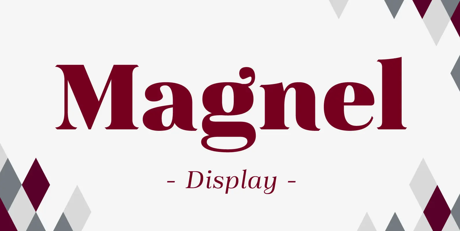
Magnel Display Font
A display Didone of four weights plus italics. The defining stylistic features are large x-height and asymmetric legs that give feminine, oriental, floral look. Includes accented swashes, decorative ligatures and oldstyle numerals. Published by Eimantas PaskonisDownload Magnel Display
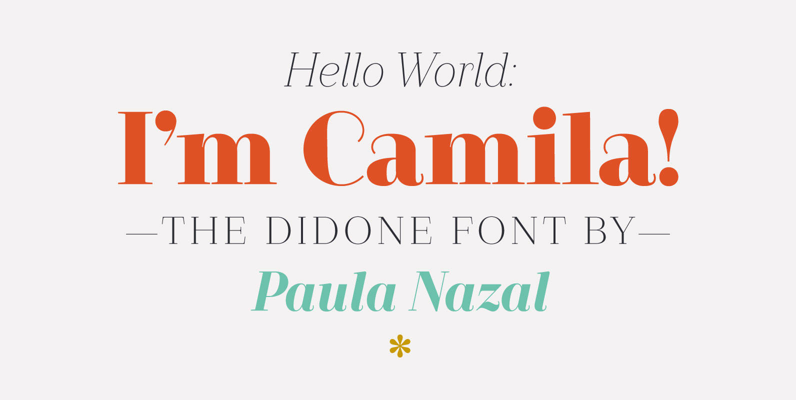
Camila Font
Camila is a delicate and smooth Didone typeface designed by Paula Nazal. The family is inspired by concepts such as elegance, simplicity, femininity, and primarily based on Coco Chanel. A remarkable feature of this font is that it lacks of
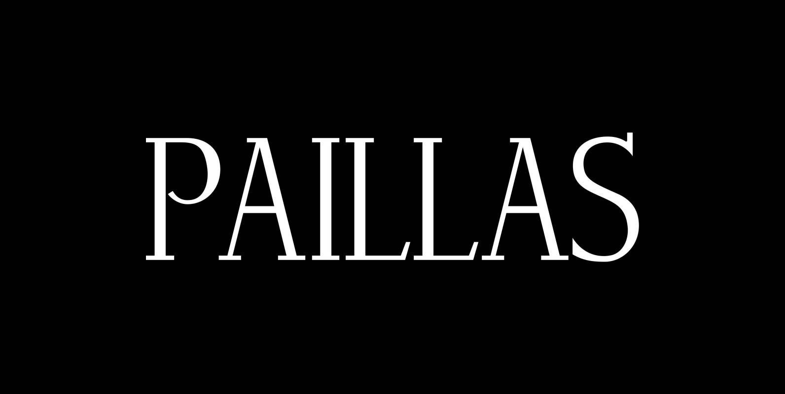
Paillas Font
“Paillas” is a very elegant and unusual Antiqua typeface I have been working on during the last three years. So far I just have the normal and oblique cuts, but eventually I will design a bold version as well. Published
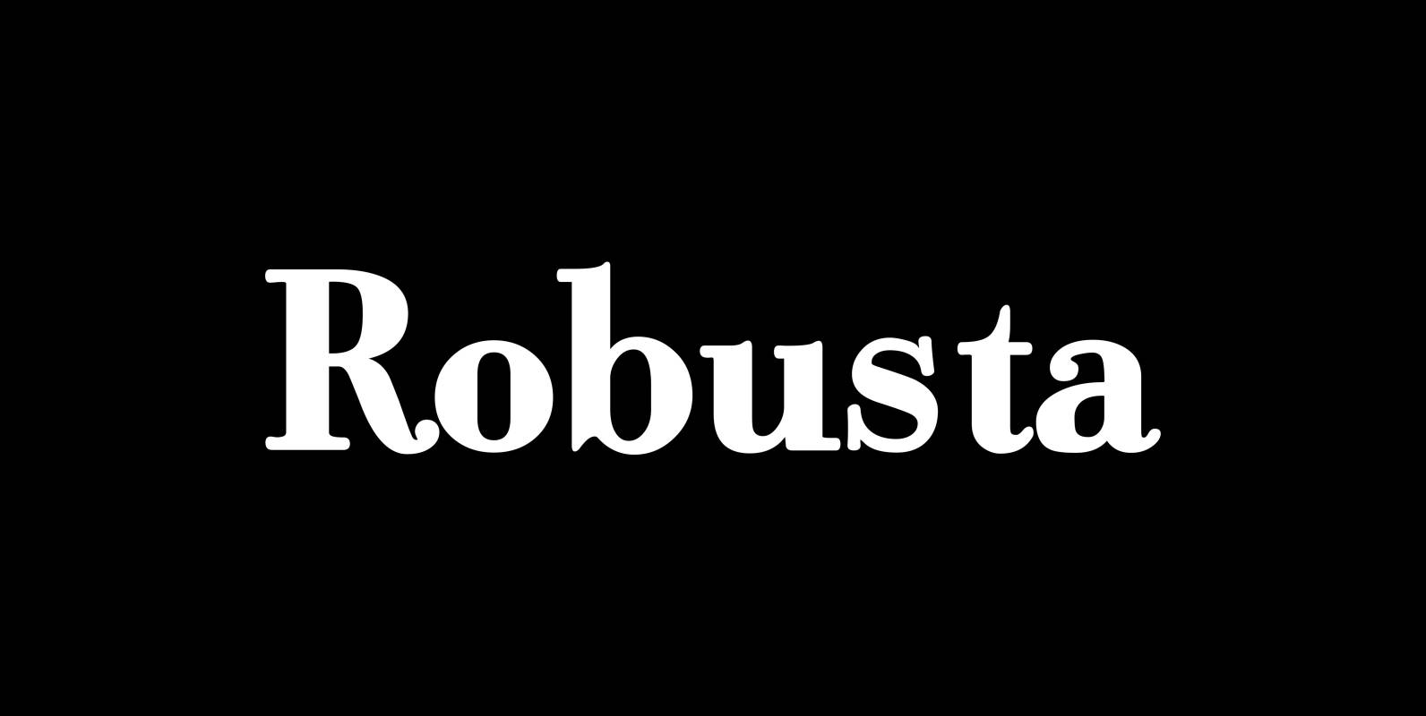
Robusta Font
“Robusta” is somehow more elegant than Courier and sturdier than Bodoni. Published by Wiescher DesignDownload Robusta
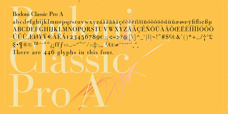
Bodoni Classic Pro Font
This is my new, completely worked over and fine-tuned Bodoni Classic for Europe (no Greek and Cyrillic). I have added a set of elegant Swashes (B) and 2 alternating uppercase swirly Initials (C) as well as two lowercase end-letters (D).
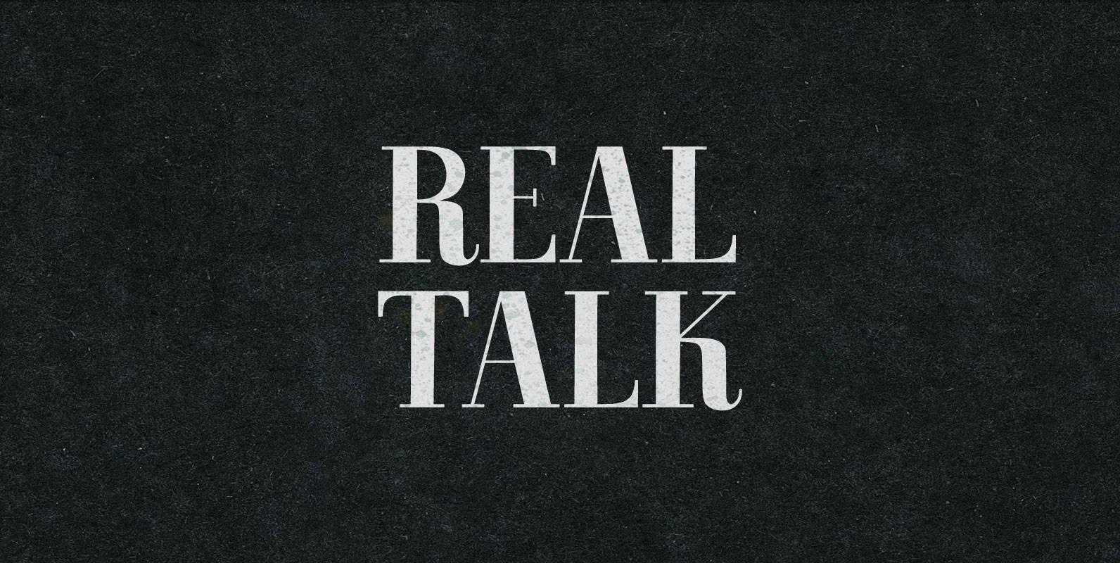
Real Talk Font
Real Talk packs the same lip flapping smacks and pharyngeal grunts as any old nonsense. But while a baby can only babble, a grown man can mean something. Put words in perspective, located on the axes of breadth and depth,
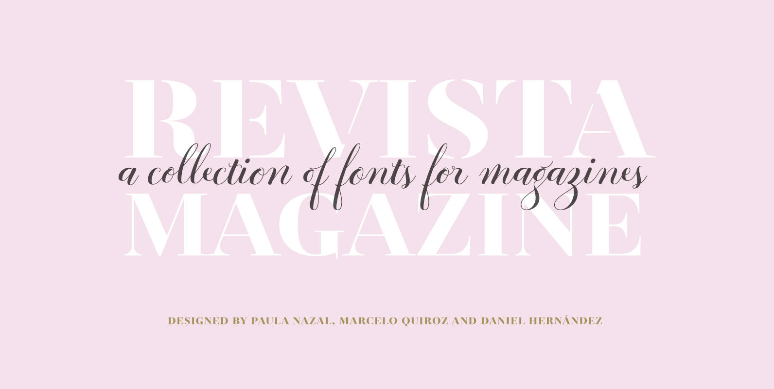
Revista Font
Revista is a typographic system that brings together all the features to undertake any fashion magazine-oriented project. The font harmoniously blends different styles into a single big family, which consists of a Didone uppercase and small caps family—including 4 variants
Bodoni Sans Font
Bodoni Sans is a new classic built on the foundation of two centuries of history. Fresh and contemporary, while feeling familiar. Stylish and sophisticated, confident and elegant. Bodoni Sans is more than just chopping off the serifs. The classical proportions
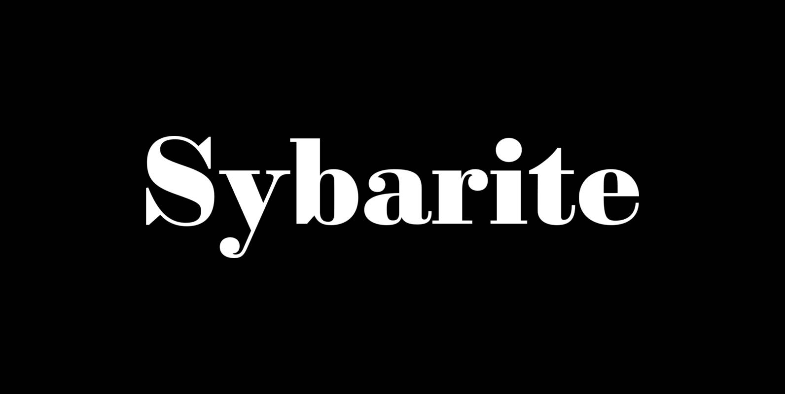
Sybarite Font
Sybarite is a fat face that works at any size. Capitals with sweeping curves and sharp unbracketed serifs command attention while charming minuscules expose the amiable side of its demeanor. Sybarite is James Puckett’s revival of the fat face type
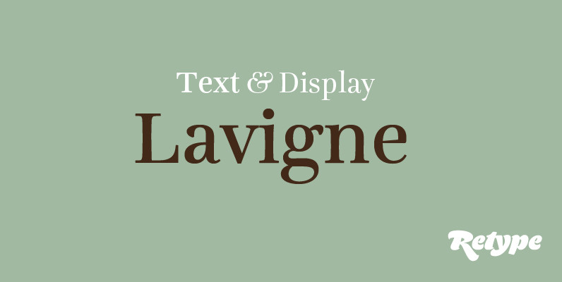
Lavigne Font
Lavigne is a type-family aimed at publications such as interior design and women magazines—anywhere a touch of distinction is to be desired. In the opinion of its designer, glossy magazines have been setting the same type families for years, with
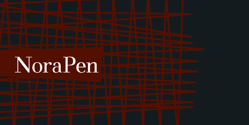
NoraPen Font
It takes influence from Walbaum, and that image was always floating around in the back of my mind as I was designing it. I tried to leave slight traces of that image behind while slightly going against it at the
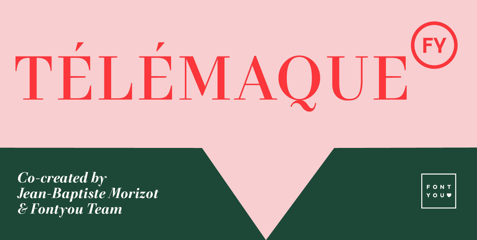
Telemaque FY Font
Télémaque FY is a contemporary didone style typeface with a lot of personality. Both rigid and elegant with its modern sharped terminals and its generous curves, this 4 weights font family will be for sure your new typographic companion for

Didoni Font
Designed by Phil Martin in 1969, Didoni is a serif font release by URW. Contains language support for West, East, Turkish, Baltic, and Romanian. Published by URW Type Foundry GmbHDownload Didoni