Tag: Authority
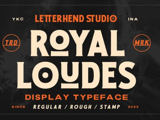
Royal Loudes Font
Bold and powerful, Royal Loudes is a top-of-the-line display font that commands attention. Its impeccable quality is evident in its flawless execution, with each letter carefully crafted to perfection. Available in three unique styles – regular, rough, and stamp –

Rahere Slab Font
Part of the extended Rahere typeface family, Rahere Slab is a humanist slab serif (or Egyptian) in six weights from light to extra bold with corresponding italics. Rahere Slab – like its siblings Rahere Sans & Rahere Informal – features
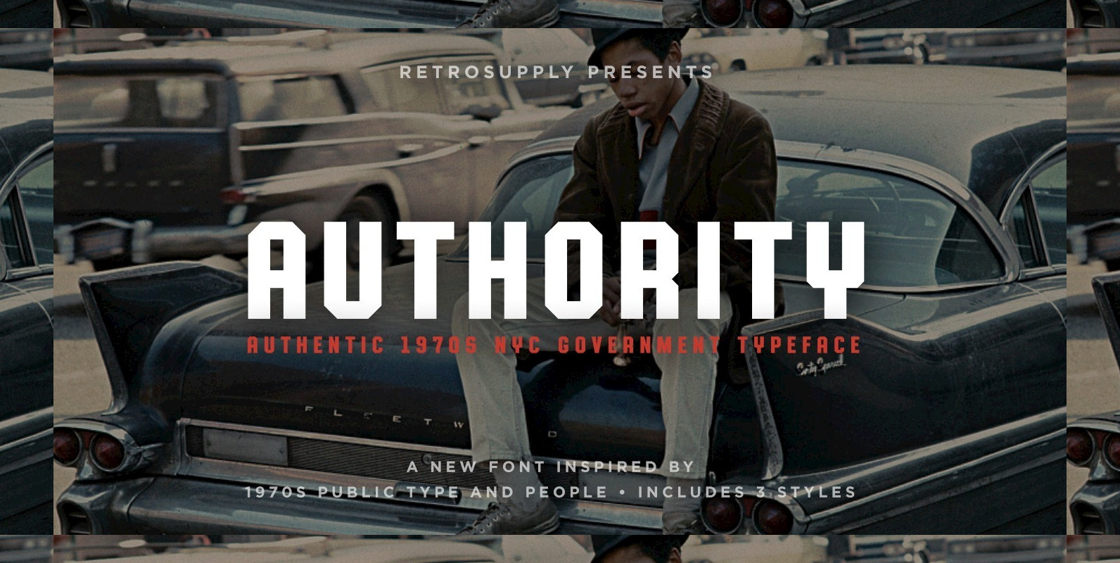
Authority Font
• Authentic and inspired by 1970s New York government typography used in schools and transporation • Includes 6 typefaces and 3 styles (Standard, Rounded and Distressed) • Language support for 75 western languages • 3 styles included to simulate the
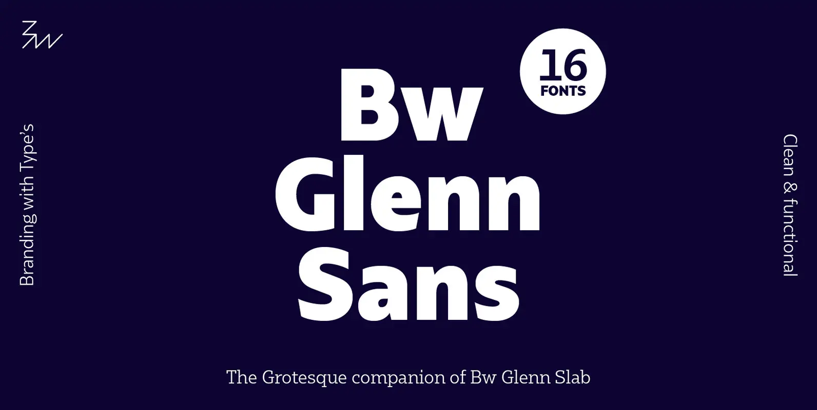
Bw Glenn Sans Font
Bw Glenn Sans is the result of mixing a grotesque skeleton with traits of the British sans serif tradition. The result is a modern and clean sans serif family that speaks with clarity and authority. Its contained width makes it
Impact Font
Impact is a realist sans-serif typeface designed by Geoffrey Lee in 1965 and released by the Stephenson Blake foundry. Its ultra-thick strokes, compressed letterspacing, and minimal interior counterform are specifically aimed, as its name suggests, to “impact.” Impact has a
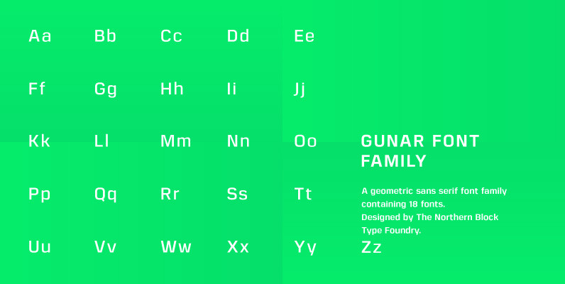
Gunar Font
A geometric sans serif with a square chiseled appearance. Precise curves are met with straight lines and tapered angles to produce a fresh, technical typeface. It’s large x-height and neutral width give it good legibility at small point sizes. These
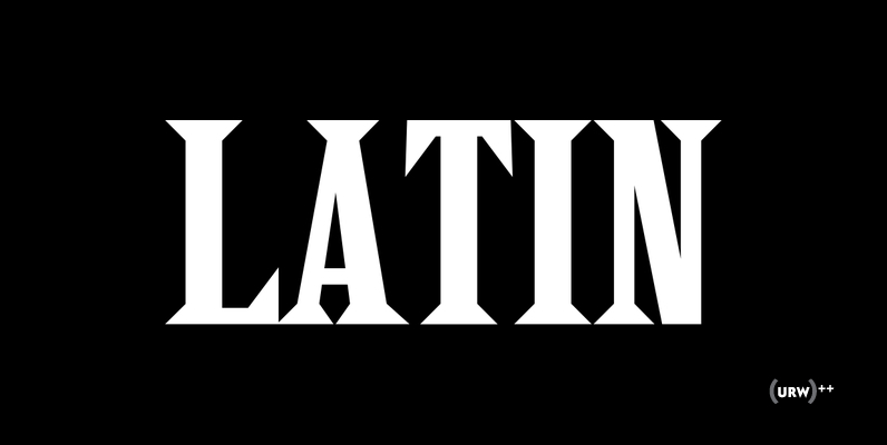
Latin Font
Latin is a retro, vintage and decorative styled serif type design. It works beautifully when used in headlines for posters, but can also be spiced up to work in fashion and branding projects as well. Latin was designed by Achaz
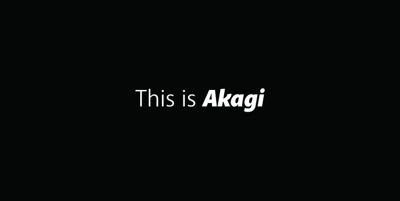
Akagi Complete Font
Akagi started as a rough sketch while on a really long plane ride to Tokyo in 2007. I wanted to develop a sans that was a complete departure from my successful Aaux Pro (now Aaux Next) sans serif family. Whereas

YWFT Jute Font
YWFT Jute is a masculine, military, sans-serif design that was realized through a series of revisions to another typeface design called Flier. The constant reworking of Flier gave it a completely different look and feel, and thus was YWFT Jute
Cynapse Font
Several years ago I was faced with a project that required very small type to be used in a directory. In general, there was a need for a lot of ‘fine print’. Faced with this, all of the tests I