Tag: 40s
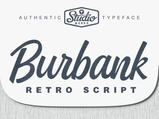
Burbank Script Font
StudioWorks proudly presents •• B U R B A N K •• — a commercially elegant retro script typeface! Inspired by the hand-cut lino scripts of mid-century advertising, Burbank commands attention with its playful display of connective letterforms. The slightly
Nazare Font
It all started with a Portuguese soap packaging from the first half of the 20th Century. The 5 uppercase letters that spell NAZARÉ were sufficient to drive the creation of this design. Nazaré fits in a semi-serif category and it

Catorze27 Style 1 Font
Catorze27 is a typeface inspired by northern Portuguese modernist lettering. Wrought iron is a widely used element on Portuguese architecture and, as such, the typeface started after collecting several photographs of modernist iron signage in several cities in the north
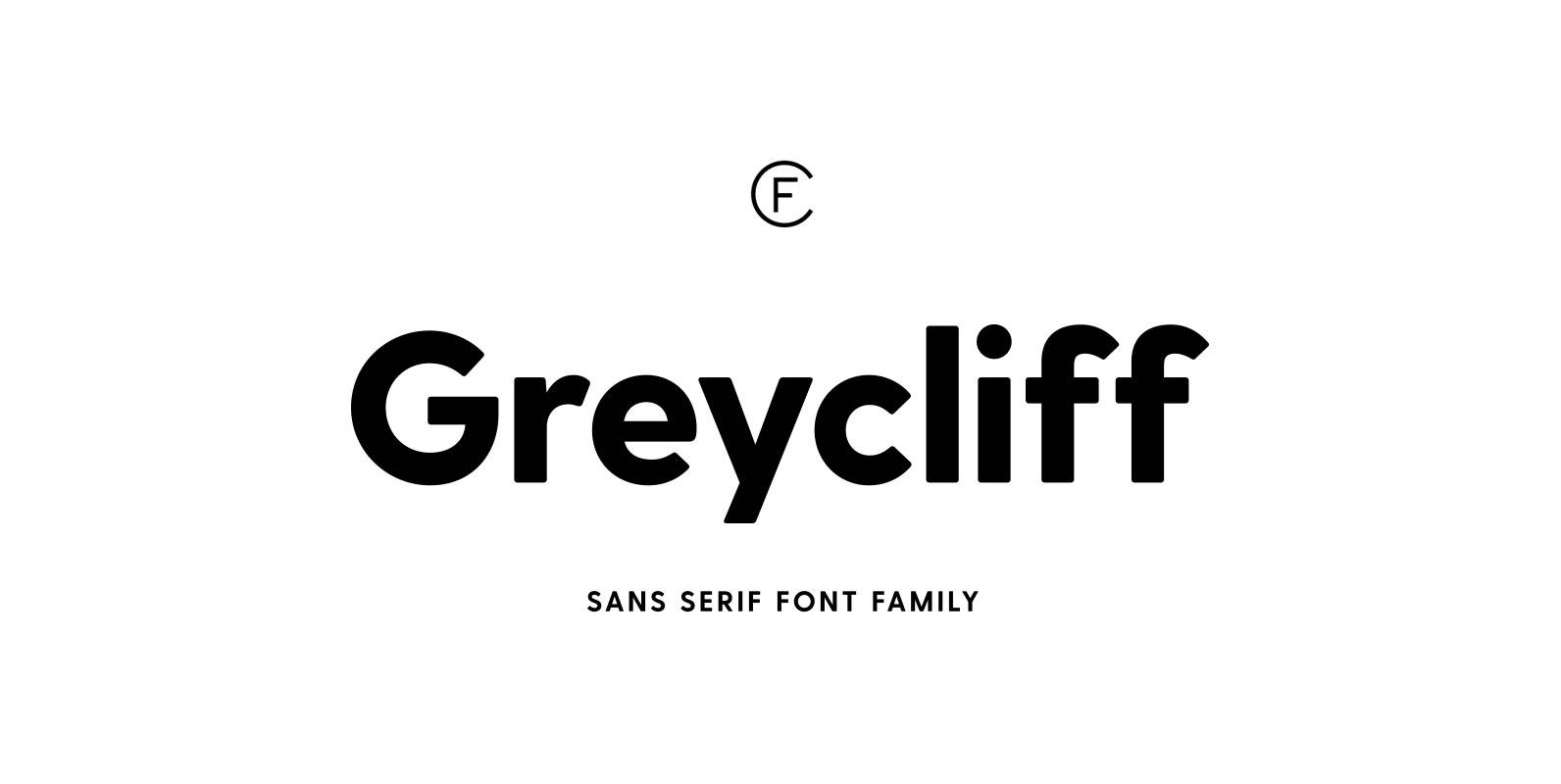
Greycliff CF Font
Rugged, hearty, and warm, Greycliff© CF is a versatile font family. Strong capitals and a smooth, open lowercase are effective in a variety of applications. The geometric, near-monoline construction lends Greycliff a classic durability, tempered by softened edges and vibrant
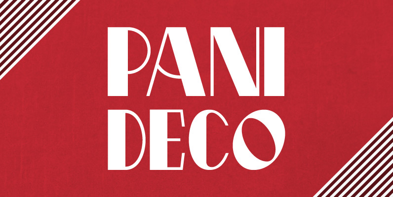
Pani Deco Font
Pani Deco is a typeface based on a poster designed in 1928 by Polish artist Anna Harland-Zajczkowska. It is part of a series inspired by the aesthetics of Poland, circa 1908 to 1939. Published by Brendan CieckoDownload Pani Deco
YWFT Tapscott Font
YWFT Tapscott is an Opentype font named for Horace Tapscott, the great jazz pianist, composer and founder of the Pan Afrikan Peoples Arkestra. The font was inspired by Tapscott’s signature sound, with a tip of the Malo hat to the
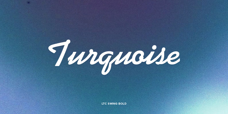
LTC Swing Bold Font
This mono-weight script face evokes advertising of the 1930s & 40s. LTC Swing Bold, was based on Kaufmann Bold, which was released by ATF (American Type Founders) in 1936. Kaufmann proved extremely popular in its day. For that reason ATF
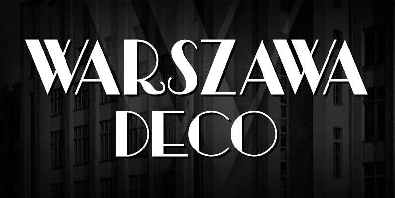
Warszawa Deco Font
Warszawa Deco is a typeface based on Polish Art Deco and modernism of the Interwar period and is part of a series inspired by the aesthetics of Poland, circa 1908 to 1939. Published by Brendan CieckoDownload Warszawa Deco

Metallophile Sp8 Font
Metallophile Sp 8 is a faithful facsimile of an 8 point sans serif typeface as set on a 1940s vintage hot metal typesetting machine and printed on coated paper stock. The effect is very different from its modern cousins, which
Ministry Script Font
Ministry Script was designed to be a time capsule that marks both the American ad art of the 1920s, and the current new-millennium acrobatics of digital type. Ministry’s OpenType features include contextual and stylistic alternates, swash characters, and a galaxy