Tag: 30s
Nazare Font
It all started with a Portuguese soap packaging from the first half of the 20th Century. The 5 uppercase letters that spell NAZARÉ were sufficient to drive the creation of this design. Nazaré fits in a semi-serif category and it
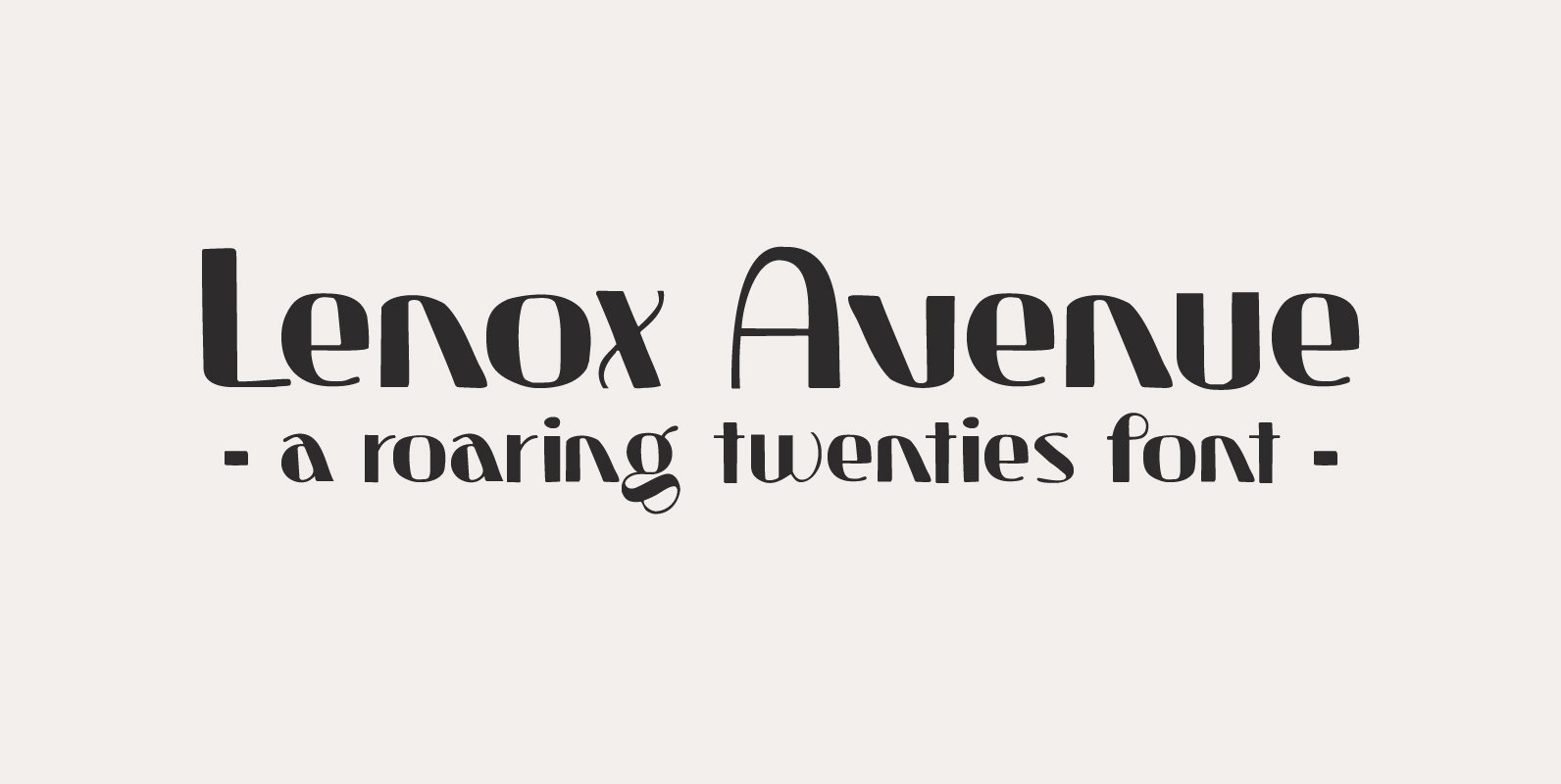
Lenox Avenue Font
I came across an old book called ‘Studio Handbook Letter And Design For Artists And Advertisers’ by Samuel Welo. Samuel Welo was an American advertising calligrapher, typographer and lettering artist, who was most active during the roaring twenties. Lenox Avenue
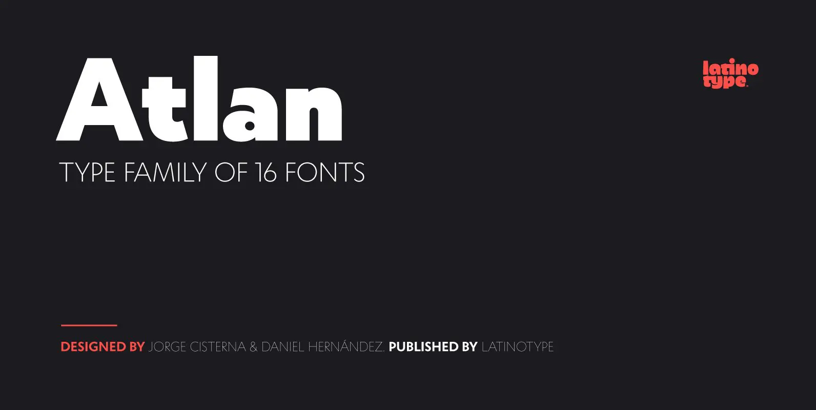
Atlan Font
Atlan—a Latin ’spin-off’ of classic geometric sans typefaces. Remembering typefaces like ‘Kabel’ by Rudolf Koch while paying attention to current design needs was the starting point for ‘Atlan’—a simple, elegant and appealing font. This typeface is based on highly expressive
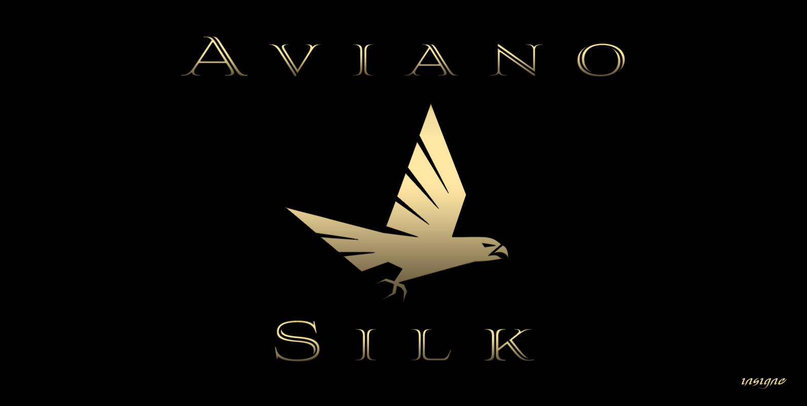
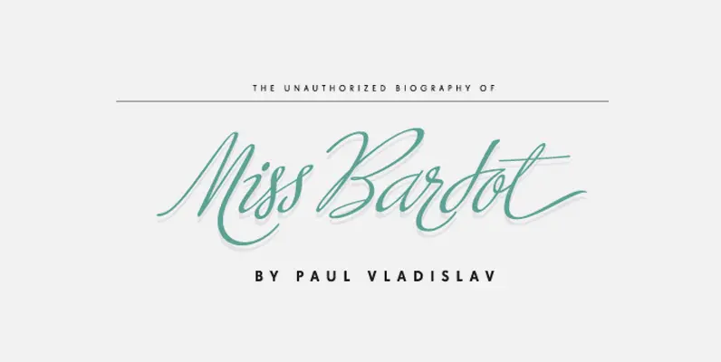
Aviano Silk Font
As part of insigne’s annual tradition in adding to the Aviano family, this modern development of a timeless font was selected the clear leader in a poll of insigne design’s social media followers. Silk refers to the smooth, flowing feel
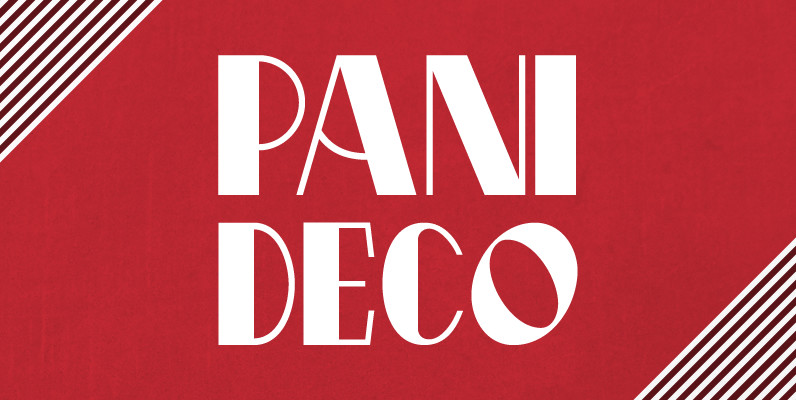
Pani Deco Font
Pani Deco is a typeface based on a poster designed in 1928 by Polish artist Anna Harland-Zajczkowska. It is part of a series inspired by the aesthetics of Poland, circa 1908 to 1939. Published by Brendan CieckoDownload Pani Deco
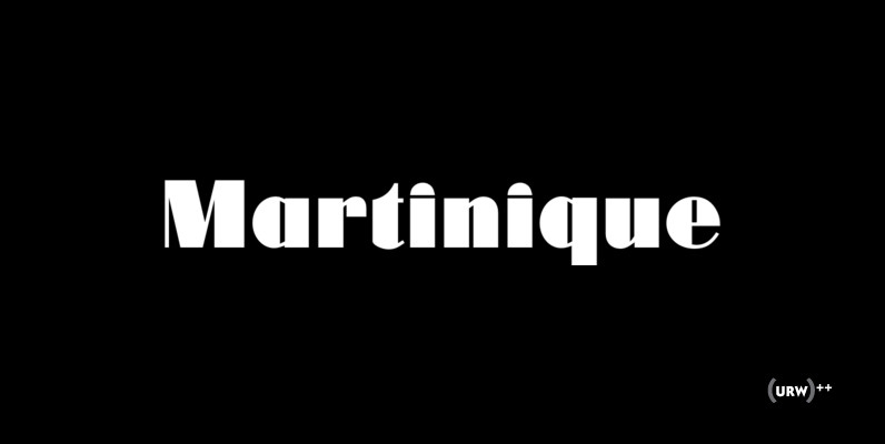
Martinique Font
Designed by Phil Martin in 1970, Martinique is a clean, heavy and fresh art deco style font design. Published by URW Type Foundry GmbHDownload Martinique

Memphis Font
Memphis is a modern and fashionable slab-serif originally designed by Rudolf Wolf, brought to us by the german type foundry URW. Contains a simple but powerful family set with options from extra-light to bold. Memphis works great in an a
Raleigh Gothic Condensed Font
In 1932, the great American type designer, Morris Fuller Benton was busy directing the creative departments of ATF and designing type. Big on his plate during that period was the development of the Bank Gothic® family among other typefaces like
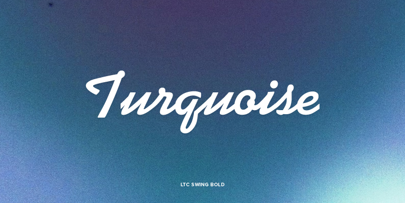
LTC Swing Bold Font
This mono-weight script face evokes advertising of the 1930s & 40s. LTC Swing Bold, was based on Kaufmann Bold, which was released by ATF (American Type Founders) in 1936. Kaufmann proved extremely popular in its day. For that reason ATF
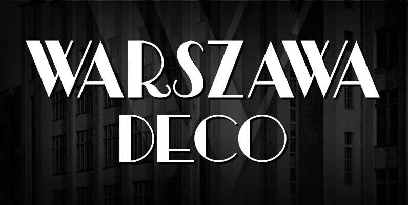
Warszawa Deco Font
Warszawa Deco is a typeface based on Polish Art Deco and modernism of the Interwar period and is part of a series inspired by the aesthetics of Poland, circa 1908 to 1939. Published by Brendan CieckoDownload Warszawa Deco
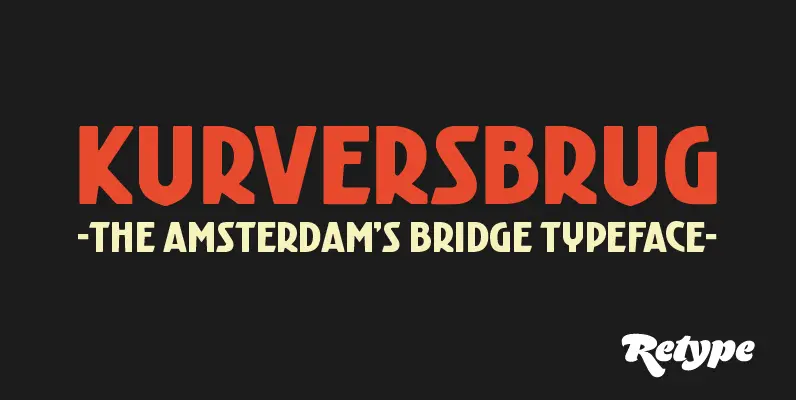
Kurversbrug Font
Since there is little or no true typographic expression of the 'Amsterdam School' of architecture, we have always felt there was a need for fonts that expressed this particular aesthetic. 'Kurversbrug' is a revival of the Amsterdam's bridge letters. The
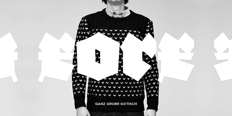
Ganz Grobe Gotisch Font
Ganz Grobe Gotisch is an intense and masculine blackletter font originally designed by F.H. Ernst Schneidler and Ralph M. Ungern. Works great in headline usage, for logos and poster design. Published by URW Type Foundry GmbHDownload Ganz Grobe Gotisch
Rhythm Font
I hate the idea of revivals. I have publicly said I choose not to do revivals because they make me uncomfortable. This is as close as I have been to crossing my own line. To be direct, Rhythm is based
Ministry Script Font
Ministry Script was designed to be a time capsule that marks both the American ad art of the 1920s, and the current new-millennium acrobatics of digital type. Ministry’s OpenType features include contextual and stylistic alternates, swash characters, and a galaxy