Tag: 1920
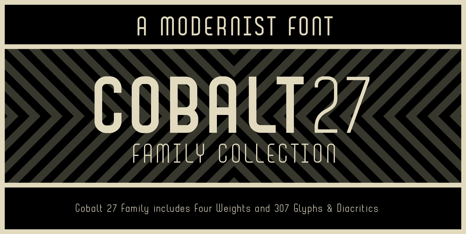
Cobalt 27 Font
Cobalt 27 was inspired by early and mid 20th century typography and graphic art movements, notably Constructivism and 60’s modernism. The family consists of three weights and one alternate text version that have been designed to be used with and
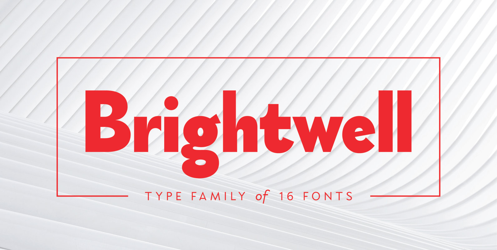
Brightwell Font
Brightwell is a sans-serif typeface consisting of 6 upright weights and 6 italics. Initially following the grotesque-geometric forms popular during the 1920’s, Brightwell’s structure has evolved into a different one, with narrower and more organic proportions, increased contrast and smaller
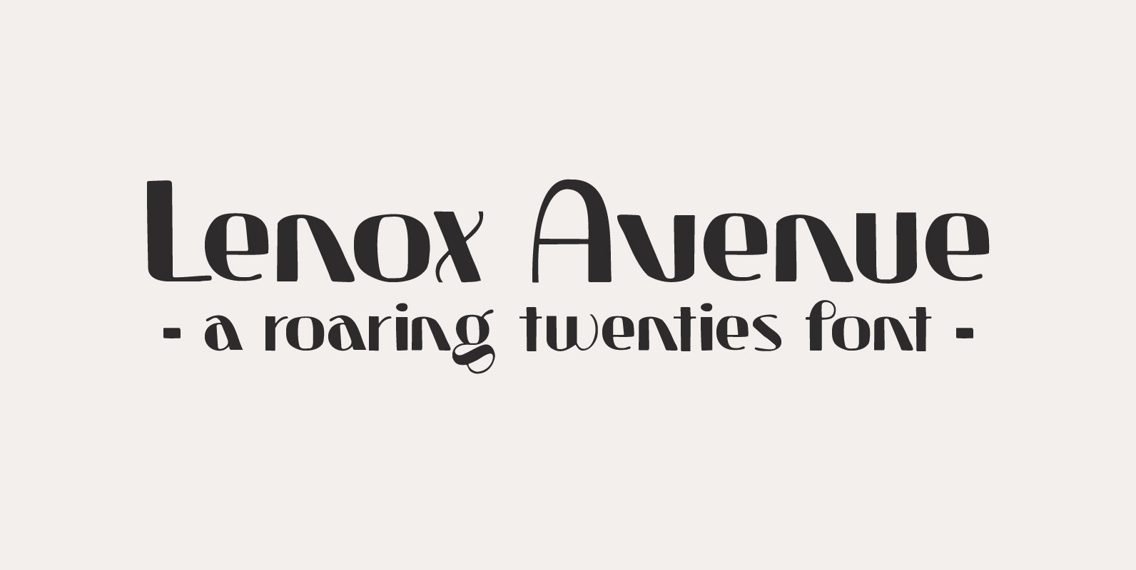
Lenox Avenue Font
I came across an old book called ‘Studio Handbook Letter And Design For Artists And Advertisers’ by Samuel Welo. Samuel Welo was an American advertising calligrapher, typographer and lettering artist, who was most active during the roaring twenties. Lenox Avenue
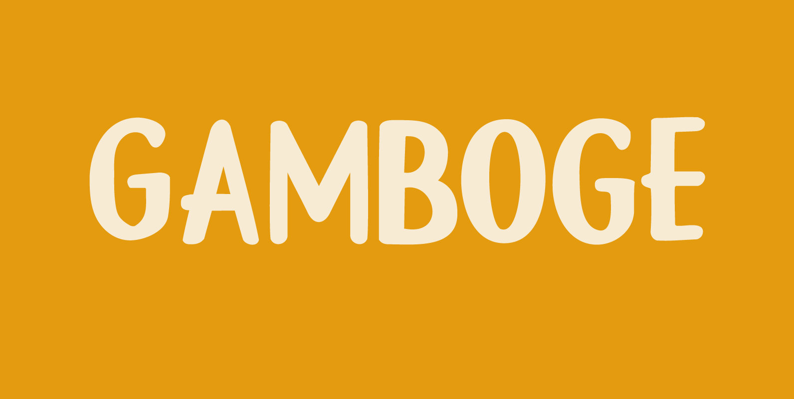
Gamboge Font
Gamboge is a deep saffron to mustard yellow pigment which is extracted from a tree. Its name comes from gambogium, the latin word for the pigment. Gambogia font is a beautiful all caps typeface with a pre-war feeling to it.
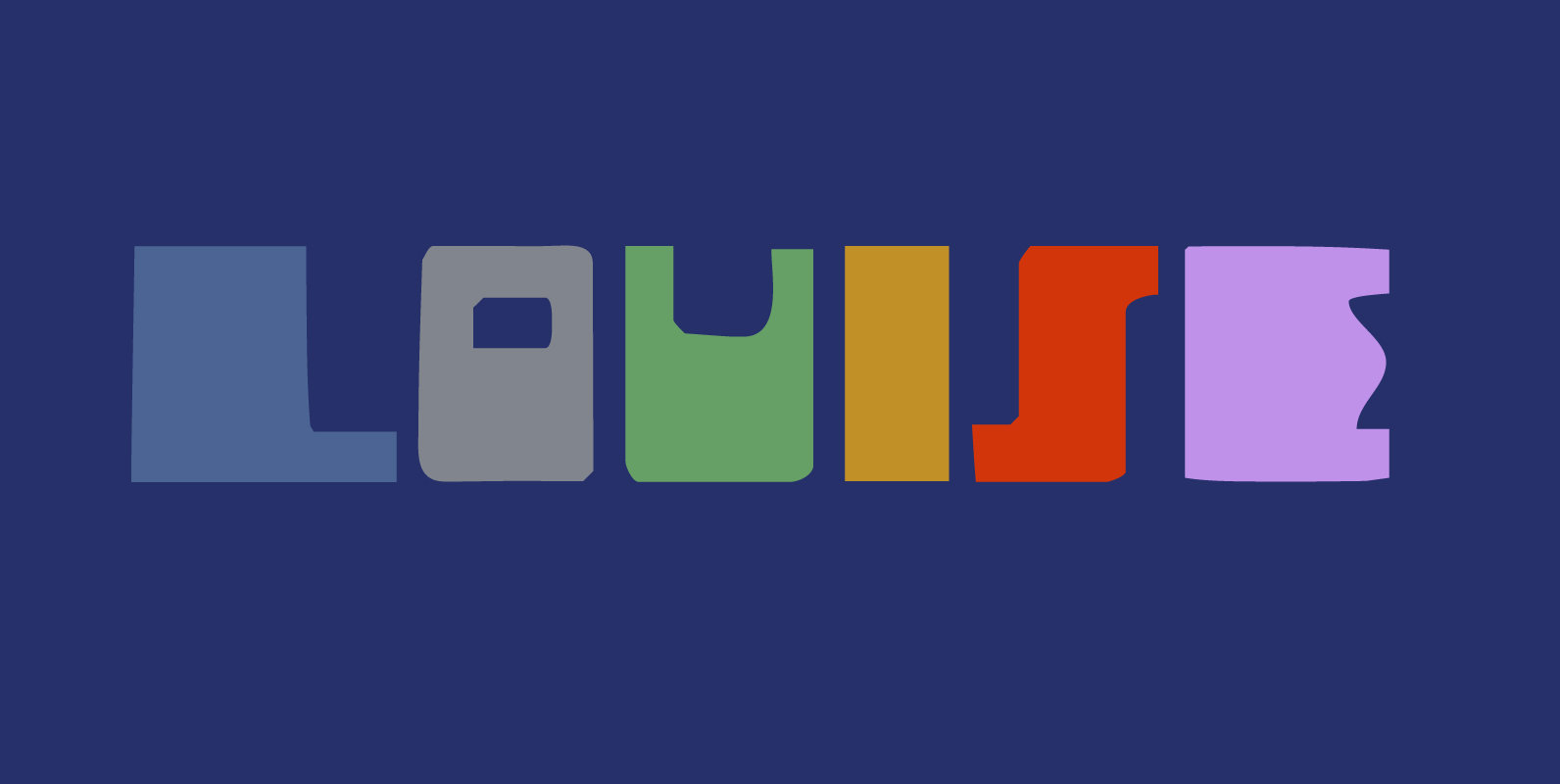
Louise Font
Louise font was based on the art of Louise Marie (lou) Loeber, a Dutch painter. She was born in Amsterdam in 1894 and flirted with several styles like De Stijl, Cubism and Bauhaus. Her artworks are characterized by a sober
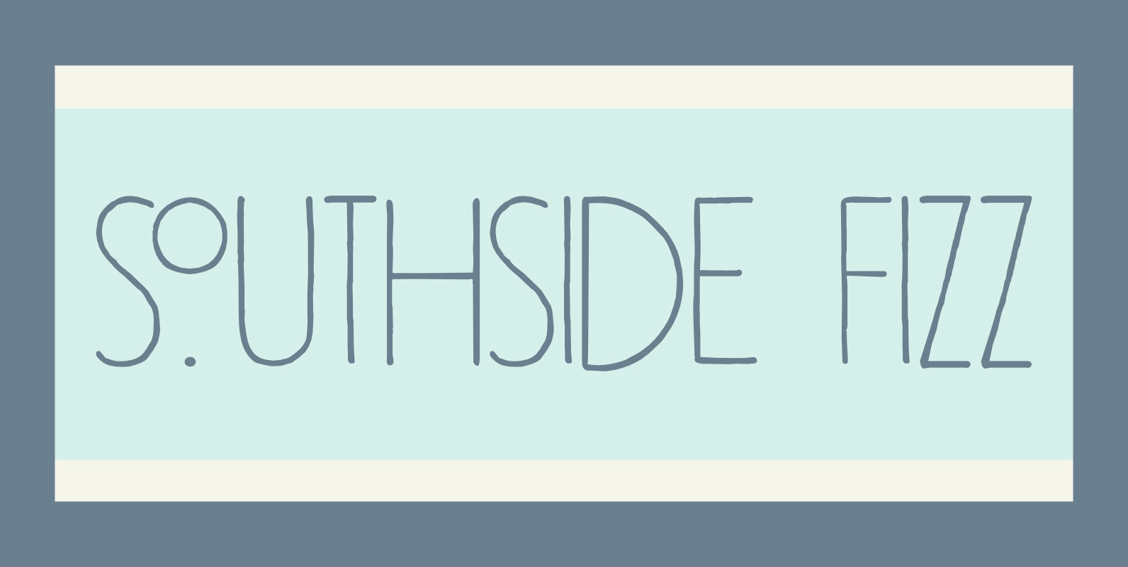
Southside Fizz Font
Southside Fizz is a cocktail (made with gin, lime, mint and soda). Southside Fizz font was based on a single word in a 1930’s advertisement and my Palembang font. I did not have that many glyphs to work with, so
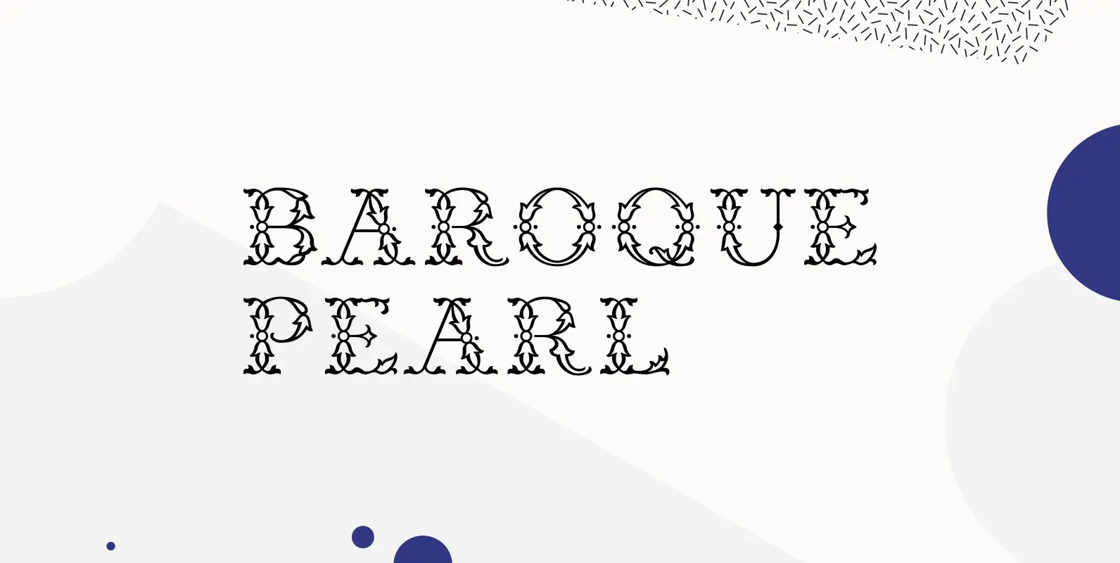
Baroque Pearl Font
Inspired by Demeter’s Geperle Fournier, Baroque Pearl is a highly ornate display font of the same style which was carefully extended with Baltic, Turkish and Central European character sets. Published by RMU TypedesignDownload Baroque Pearl
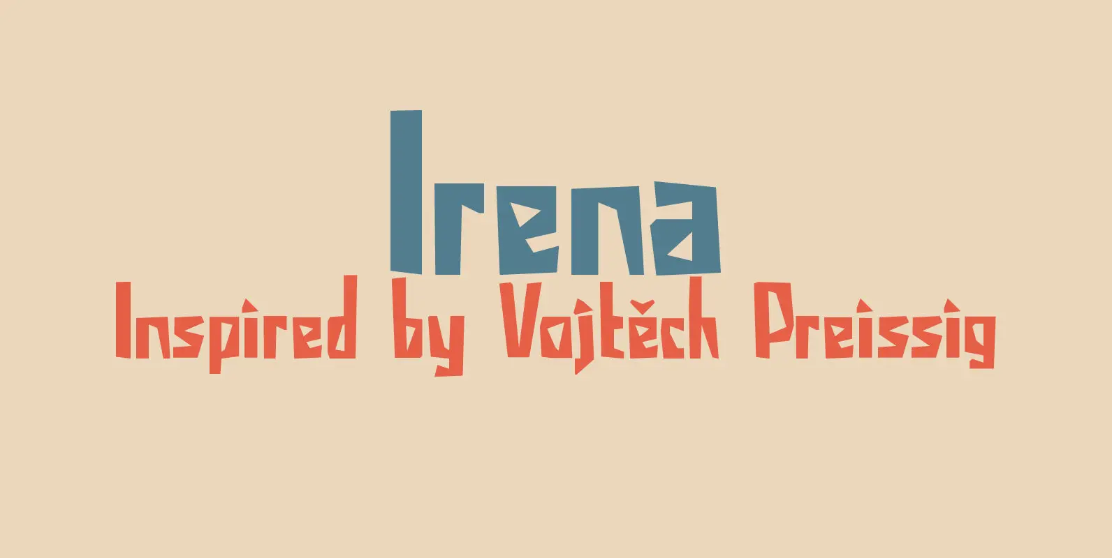
Irena Font
Irena is a cubist/expressionist font inspired by Vojtěch Preissig. Preissig (1873-1944) was a Czech typographer, printmaker, illustrator and teacher, whose work was influenced by Japanese Art and Symbolism. During WWII, Preissig supported the Czech resistance and he was arrested in
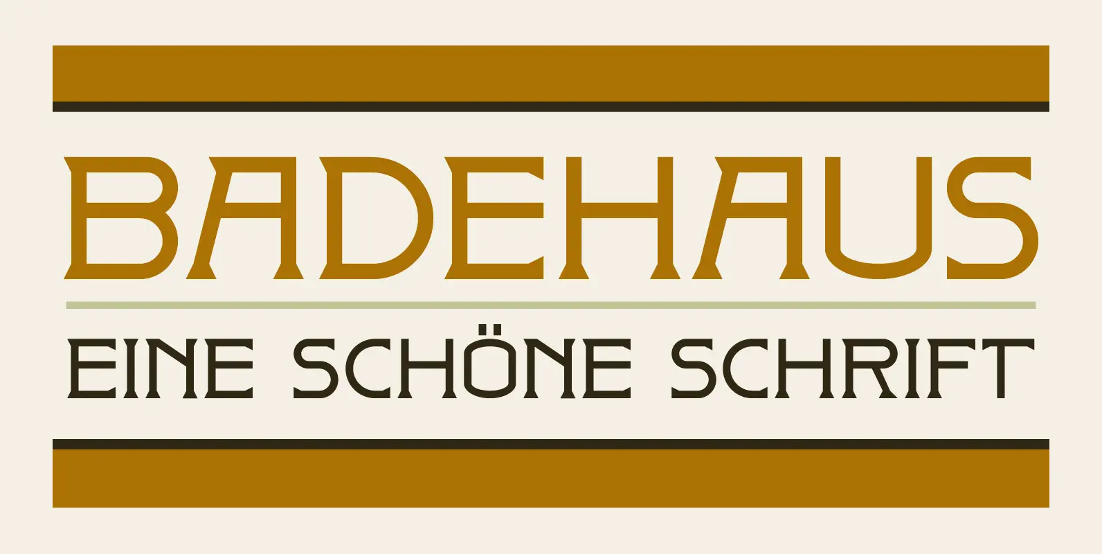
Badehaus Font
In the German city of Bad Neuenahr you can visit a spa called Thermal Badehaus. This beautiful art deco building has an even more beautiful art deco lettering covering its facade. I had to work with only a couple of
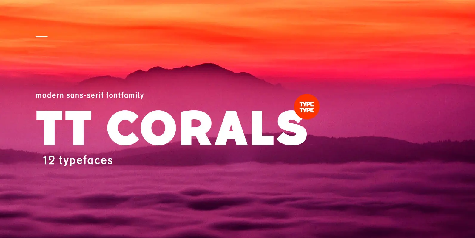
TT Corals Font
TT Corals is a modern humanistic sans-serif which has many typical traits of the beginning of the 20th century. For an increased functionality of the font family we’ve created 6 typefaces of various weights: Thin, Light, Regular, Bold, Extrabold, Black.
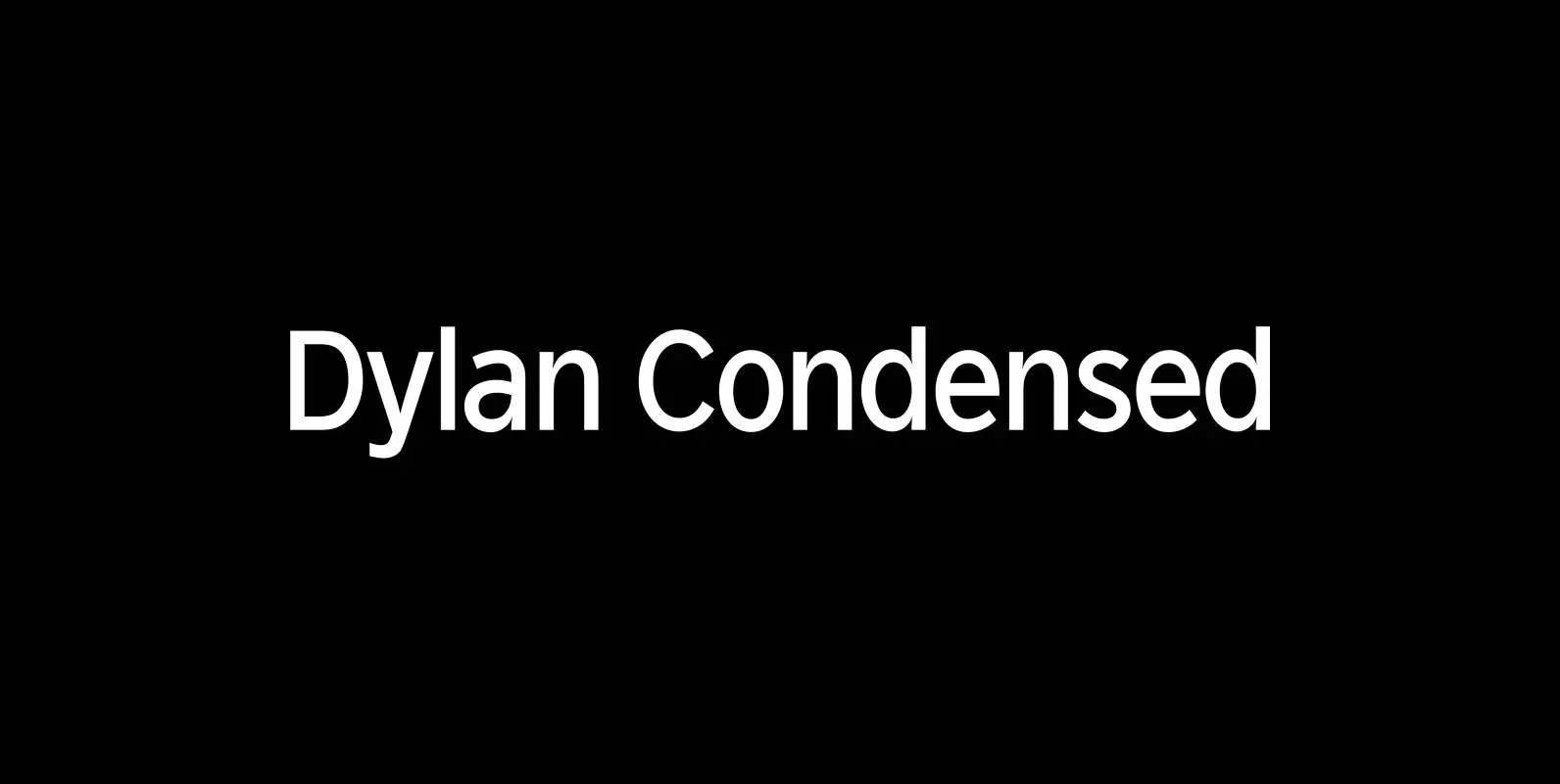
Dylan Condensed Font
Dylan is a Sans typeface in the best American tradition. In order to keep corners open and to make the font more readable in small sizes it has deep cuts where curves join straights. I designed 8 finely tuned weights
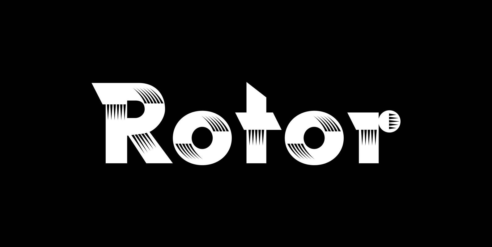
Rotor Font
“Rotor” is a speedy font. In 1929 K. Sommer designed a typeface for Linotype called »Vulcan«, some years later they re-published the typeface and called it “Dynamo”. The early Vulcan design inspired me to do this new, faster typeface in
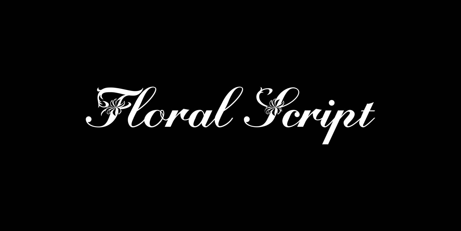
Floral Script Font
“Floral script” is an english copperplate script decorated with flowers and curly leaves. Published by Wiescher DesignDownload Floral Script
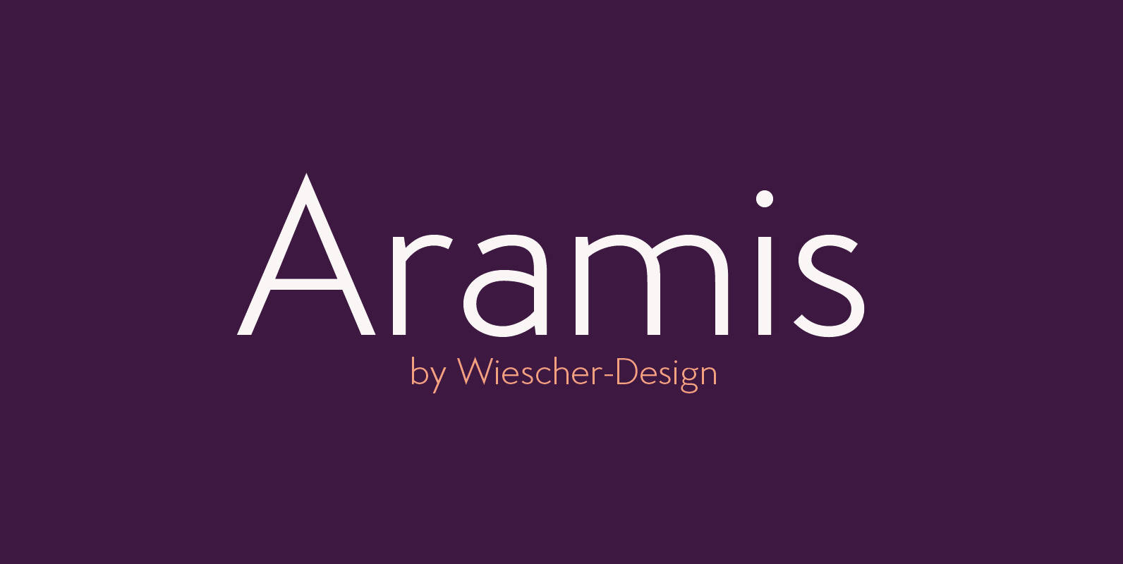
Aramis Font
“ARAMIS” is a new linear Sans with a French touch– designed by Gert Wiescher in 2014 and 2015 – has 7 weights with corresponding italic cuts. The small contrast in the linear Sans makes it not quite so linear and
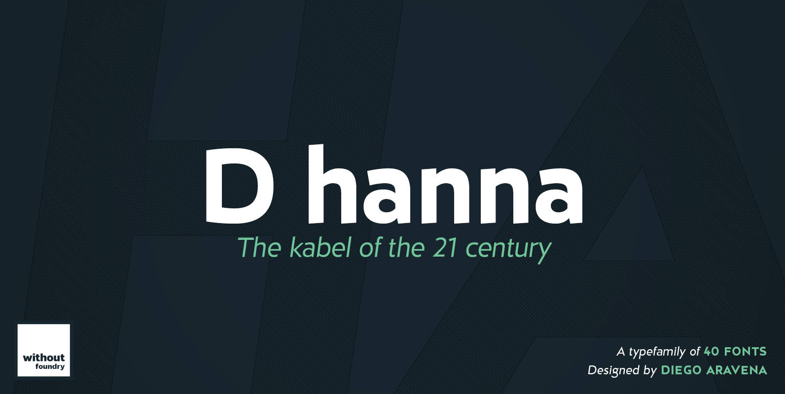
D hanna Font
D Hanna is a typeface that has 22 variants. It’s inspired by 1920s German modernism as well as by the neohumanist typeface of the ‘90s. It has a rigid structure but also an ink drawn ductus, which softens the form.
Kaapeli Font
I’ve had mixed feelings about Kabel; It is a brilliant headline font with a lot of character, but it’s the characters I have problems with. The versions of all big foundries have the same flaws (in my opinion), especially lowecase