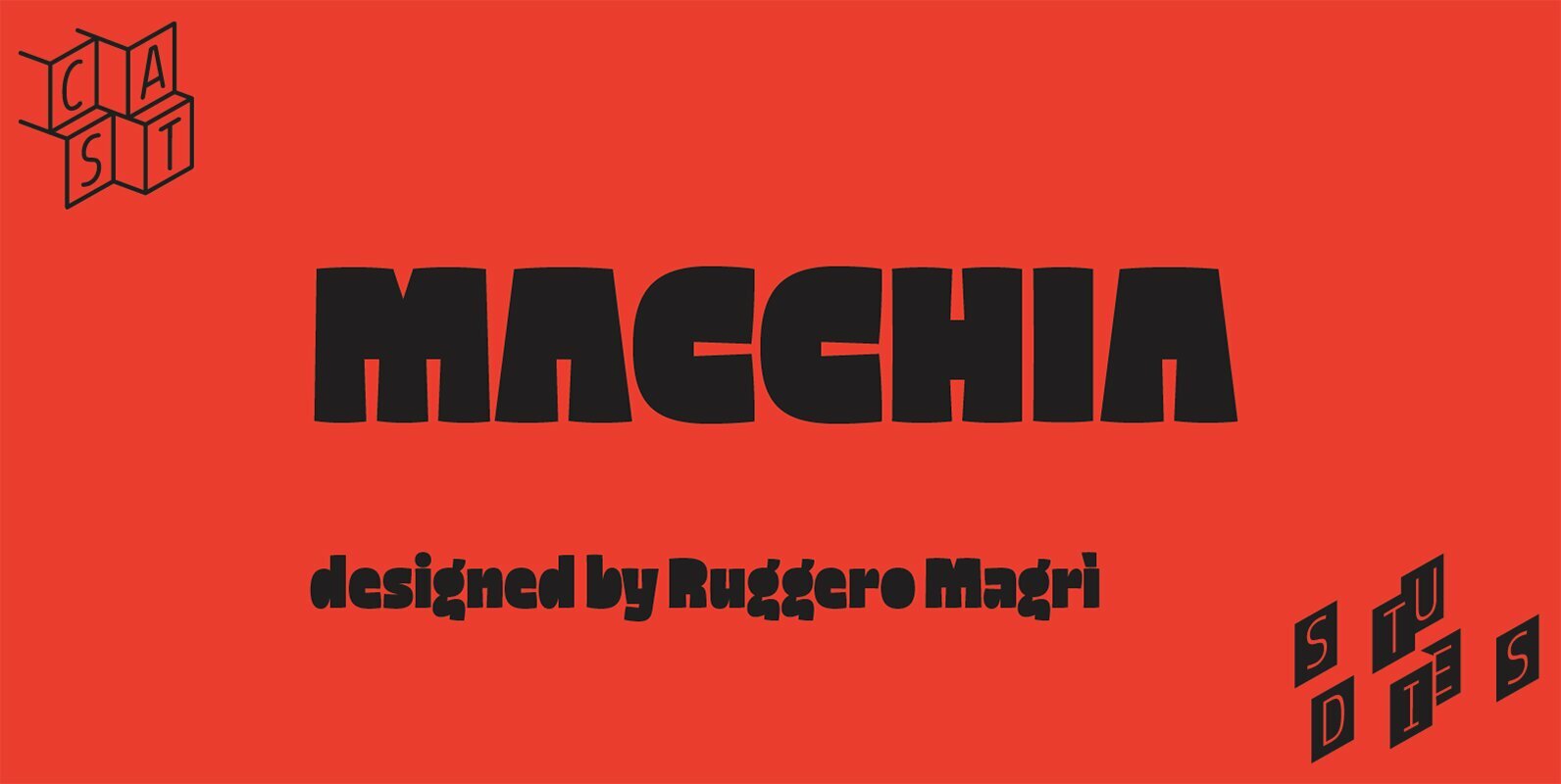
Some typefaces are heroes; Macchia (‘blot’) is an inky villain. With a name stolen from an Italian dictionary, blotted counters and dark forms that kidnap whitespace and ransom it for attention, it is exactly what you need from a display typeface. Macchia combines ‘masculine’ forthrightness with a comic’s touch.
Macchia: the power of contrast
Emerging from Ruggero Magrì’s extreme experiments in broad-nib calligraphy, Macchia is an unorthodox sans and a high-powered display face conceived for publishing but suitable for branding. Tight fitting and a big x-height create compact headlines and titles — making easy work of loud book jackets and posters. In the whoosh, bang and boom of typesetting onomatopoeia, Macchia shows off how it can combine exclamation with playfulness.
Back to the 1930s
Macchia is a funky upgrade — in both upper and lowercase — of Italian counterless sans of the 1930s, a style popular in Italy as a potent expression of art déco and modernism now seeing a comeback in digital type.
As the best examples of modernist lettering of the time, they were used by a Fascist regime which likely saw in those monolithic and ‘masculine’ letters the fatuous virtues of its infamous ideology. But counterless sans were used in all kinds of graphic works; magazine mastheads, book covers, almanacs and ads; and they were included in Fortunato Depero’s special variations of sans serifs. Architects rarely applied this style to their public buildings but they used it in lettering the names of the deceased on funereal monuments. Still to be seen in many Italian cemeteries, relief stone-cut counterless sans were not an uncommon choice.
Like blots on the page
If historical counterless sans only included capitals, Macchia offers a droll interpretation of them by adding a brand new lowercase set. In his typeface Magrì combines the ‘masculine’ forthrightness of the counterless letterforms with a comic’s touch: tapering apertures and rounding terminals. The result is a display face – definitely for shouting rather than whispering – featuring a strong inner consistency, where no single letter stands out from the crowd. But the typeface and its texture are designed to stand out.
Macchia’s letters are like blots on the page, yet look carefully and you will see that, rather than interfering, they exalt what flows around them, highlighting colours, brilliance and dimensions.
The dark side of Macchia
Macchia toys with sacred typographic criteria, like the delicate relationship between black and white, full and empty, content and space. Macchia will extend its black across a sheet of paper, greedy for more white. The contrast of white and black, light and darkness, day and night, has a long tradition. These metaphors may go back as far as human history and appear in many cultures, including both the ancient Chinese and the ancient Persians.
In Western culture as well as in Confucianism, the contrast symbolises the moral dichotomy of good and evil. Black and white have always been symbolic of contradiction.
For Alain Badiou, the author of Black: The Brilliance of a Non-Color, it’s clear that in the post-ideological era we no longer think in contrasts. In today’s consumer society, products cannot be black or white, they have to explore the whole range of colours in order to stimulate new desires and simulate new needs. For this reason, the post-marxist French philosopher claims those who recognise the contrast between black and white are animated by convictions; those who reject it, moving in the so-called freedom of colours, can only express opinions.
Macchia is intuitively aware of Badiou’s lesson and proudly draws on the power of contrast.
The ink villain
Everyone avoids blots – both on page and reputation. Macchia doesn’t care. It acts like the villain of the page, the nemesis of scribes. Not by chance is its name reminiscent of the fiend Macchia Nera, aka Phantom Blot (Floyd Gottfredson, 1939). A redoutable rival of Mickey Mouse, he is the smartest and most dangerous of the villains in Disney’s comics. Identified by an iconic all-black outfit, he signs the messages he leaves at the scenes of his crimes with a blot. Just like that devious malfeasant, that colossus of crookery, Macchia must be approached carefully. The bold style of its black alphabet can break or make the balance of an eye-catching typographic composition.
Bold typography is what Macchia was made for: Macchia didn’t adopt boldness, it was born in it.