The Storied History of Helvetica
Helvetica, a name synonymous with modern design, wasn’t always the ubiquitous font we recognize today. Born in 1957 in the Swiss-design crucible, its original name was Neue Haas Grotesk. Max Miedinger, its creator, had a vision: to design a typeface that encapsulated the spirit of the modernist design movement, one that was neutral, clear, and had great readability.
The 1960s saw its name change to Helvetica, a nod to its Swiss origins (Helvetia being the Latin name for Switzerland). This was more than just a rebranding; it was a strategic move to capture a wider international market. And it worked. By the late 60s and 70s, Helvetica was everywhere. From corporate logos to subway signs, its neutral and clean design made it the go-to choice for a modern, post-war world looking to express itself.
Its rise wasn’t just due to its design. The advent of phototypesetting and later digital typesetting systems played a significant role. Helvetica was there at the right time, ready to be disseminated across the globe. It became not just a font, but a symbol of a new age, an embodiment of the International Typographic Style.
However, its very ubiquity became a double-edged sword. As more and more brands adopted Helvetica, it started losing its unique appeal. The very neutrality and clarity that made it popular also made it, paradoxically, generic in an ever-evolving design landscape.
Helvetica’s Iconic Moments in Design
Helvetica’s influence is undeniable, and its footprint can be seen in various facets of our daily lives. Let’s journey through some of its most iconic uses:
Corporate Logos: From American Airlines to Toyota, many global brands have chosen Helvetica for its no-nonsense, straightforward appeal. It communicates trustworthiness and reliability, essential for businesses aiming to establish a strong rapport with their audience.
Public Transport Systems: If you’ve ever navigated the New York City subway or checked a bus schedule in many major cities, you’ve encountered Helvetica. Its legibility and neutrality make it an ideal choice for conveying information clearly and without ambiguity.
Tech Industry: Apple, Microsoft, and even Google at one point, have all used variations of Helvetica in their software interfaces. Its clean lines and balanced proportions make it easy on the eyes, especially when users are staring at screens for extended periods.
Fashion: Brands like Uniqlo and Lululemon have incorporated Helvetica into their branding, emphasizing modernity and simplicity.
Music & Entertainment: Album covers, movie posters, and streaming platforms have all seen Helvetica grace their designs. Its versatility allows it to convey a range of emotions, from the starkness of a punk rock album to the elegance of a classic film.
While these examples showcase Helvetica’s widespread adoption, it’s essential to remember that design is ever-evolving. What was once avant-garde can become commonplace, and as the world moved forward, designers began seeking alternatives to Helvetica, fonts that retained its clarity but offered a fresh perspective.
Top 5 Helvetica Alternatives from YouWorkForThem
In the vast world of typography, Helvetica has long been a cornerstone. Its neutral and clean design has made it a go-to for decades. However, as design evolves, so does the need for fresh typefaces that offer similar clarity and versatility. Here are five standout alternatives from YouWorkForThem that capture the spirit of Helvetica while offering their unique characteristics:
Radnika Next
Radnika Next is a typeface rooted in Grotesk typology with features drawing from Bauhaus and the early Swiss type foundries. Its geometric structure provides a modern aesthetic, making it an excellent choice for branding, web design, and print. The font’s versatility shines in both headers and body text. Explore Radnika Next on YouWorkForThem.
TT Interphases Pro
TT Interphases Pro is a neo-grotesque sans-serif with a functional design. It’s meticulously crafted to work harmoniously in a variety of settings. The font’s balanced x-height and open counters make it highly legible, ideal for UI/UX design and digital platforms. Dive into TT Interphases Pro’s features here.
Armin Grotesk
Armin Grotesk is a homage to the 19th-century typefaces, blending classic design with modern elements. Its strong, yet friendly character makes it suitable for a wide range of applications, from branding to editorial design. Discover the charm of Armin Grotesk today.
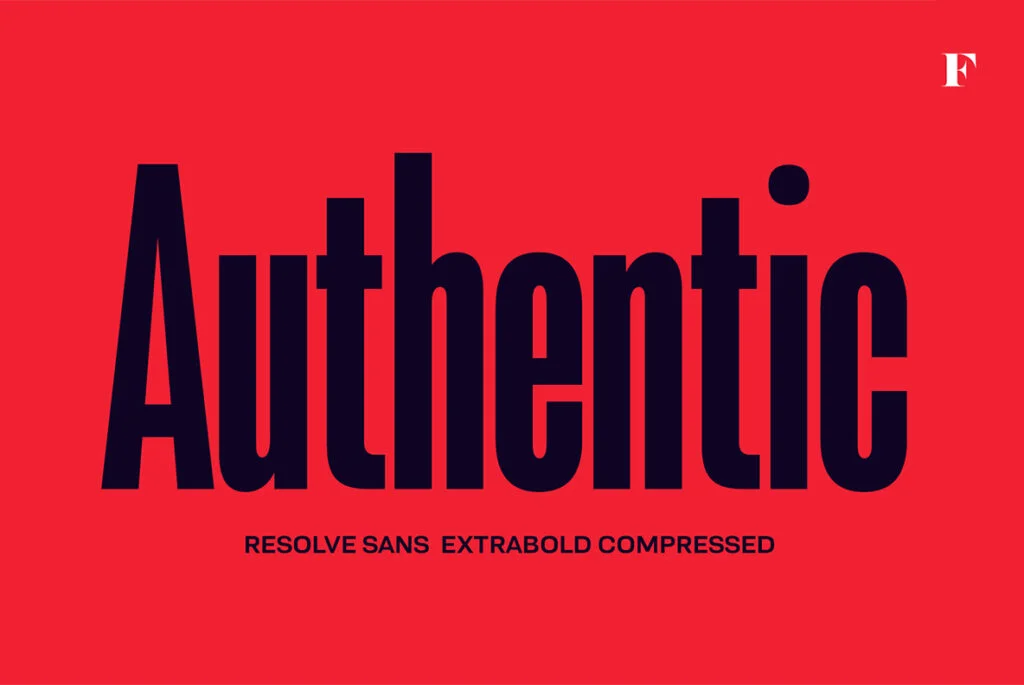
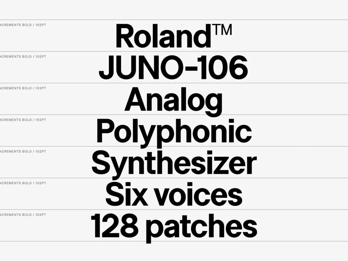
II Increments Sans Font
II Increments Sans is a contemporary typeface with a geometric foundation. Its minimalist design, combined with subtle details, offers a fresh take on the sans-serif genre. This font is perfect for modern branding projects and digital designs that require clarity and distinction. Experience II Increments Sans on YouWorkForThem.
Sterling Font
Sterling is a versatile typeface that combines the best of classic and modern typography. Its well-balanced weights and thoughtful design make it a reliable choice for a myriad of projects, from corporate branding to digital media. The font’s adaptability ensures that your message stands out with elegance and authority. Check out Sterling’s versatility on YouWorkForThem.
In the ever-evolving landscape of design, these Helvetica alternatives offer a fresh perspective. They not only pay homage to the timeless classic but also provide designers with new tools to articulate their vision. Make sure to review YouWorkForThem’s Top 50 Helvetica Alternatives collection for even more design options.
The Modern Need for Helvetica Alternatives
Helvetica’s reign in the design world is undisputed. Its omnipresence is a testament to its adaptability and universal appeal. However, as the digital age progresses, the need for distinctiveness in branding and design has become paramount. With the rise of digital platforms, businesses and designers are constantly on the lookout for fonts that can set them apart, while still retaining the clarity and neutrality of Helvetica.
1. A Shift Towards Individuality:
In today’s saturated market, brands are vying for attention. Using a font that’s different from the norm can be a game-changer. It’s not about rejecting Helvetica but about embracing alternatives that offer a fresh perspective.
2. Licensing and Flexibility:
While Helvetica is universally accessible, its licensing can be restrictive for certain uses. Platforms like YouWorkForThem offer a plethora of fonts with flexible licensing options, catering to a wide range of needs, from web to print, personal to corporate and beyond.
3. Supporting Designers:
Opting for paid fonts means directly supporting the designers behind them. This not only fuels more creativity in the typography world but also ensures that designers are compensated for their hard work and innovation.
4. Diverse Design Needs:
Different projects call for different typefaces. A brand might need a font that resonates with its ethos, or a digital platform might require a typeface optimized for screen readability. The vast collection at YouWorkForThem ensures that designers and brands find the perfect fit for their unique requirements.
5. Beyond Just Fonts:
YouWorkForThem’s commitment to the design community extends beyond fonts. Their extensive collection of stock graphics, and other design resources makes it a one-stop-shop for creatives. Their two-decade-long legacy in the industry stands as a testament to their dedication to quality and innovation.
While Helvetica will always hold its ground as a design classic, the modern design landscape calls for diversity and adaptability. Platforms like YouWorkForThem are at the forefront of this shift, offering a treasure trove of Helvetica alternatives that cater to the contemporary designer’s every whim.