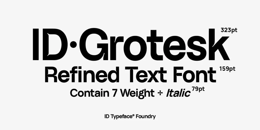
The captivating world of design continues to evolve at a rapid pace, with digital and graphic designers striving for innovative products and bold ideas to infuse their creations with a unique touch. The requirement for typography, in particular, stands paramount in all domains of digital aesthetics. The Internal Display font, a distinguished product of Type Hill, serves as an immaculate instance of sans serif meeting the optimistic future of design.
Unraveling the Beauty of Sans Serif
Sans serif fonts, those devoid of the characteristic tiny projections or ‘serifs’, have grasped the attention of designers across the globe. In the multitude of sans serif designs, the Internal Display font stands impressively for its minimalist yet potent appeal. Intriguingly versatile, the charm of this font rests not merely in its sans serif roots, but in how it applies this symmetry to foreground content and impart meaning while providing an aesthetic appeal.
Internal Display – A Breakthrough
The magic woven by the Internal Display font lies in its fusion of traditional elements with the new-age milieu. Specially designed for high-impact use, this typeface creates a striking balance between utility and beauty, making it a popular choice among graphic and digital designers. The cutting-edge design not only commands attention but also contributes to the readability of the content, ensuring the visual message is perceived effectively and efficiently.
Digital Design and the Role of Typography
Typography continues to play a pivotal role in the realm of digital design, functioning as a bridge between the viewer’s eyes and the creator’s message. The choice of font, in particular, has a subconscious influence on how the associated content is interpreted. In such a dynamic paradigm, the Internal Display font emerges as a popular choice for its consistent emphasis on readability and aesthetic appeal. By neatly fitting within the boundaries of lucidity and charm, this font breathes life into any digital canvas it adorns.
Graphic Design gets a Subtle Edge
Graphic designers aiming to amplify their visual narratives find the Internal Display font as a powerful ally. Its crisp, clean lines, craft a bold statement without overpowering the entirety of the design. Whether it be for a bold headline or a subtle piece of information, the versatile characteristics of this font enhance visual communication in an elegant yet striking manner.
To encapsulate, the Internal Display font has not merely emerged as a choice, but an unspoken norm among modern designers, owing to its harmonious blend of readability and aesthetics. Elevating the meaning and intention of the content it hosts, the font is a testament to the evolution of typography in a digital space, transcending the barriers of design norms. The exploration and subsequent incorporation of this font into design reflect the seamless union of tradition and innovation behind every digital and graphic design creation. Available for download exclusively at YouWorkForThem, this font instills within each designer the ability to concoct creations that are nothing short of a visual treat.

