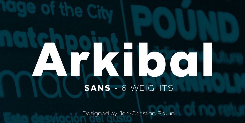
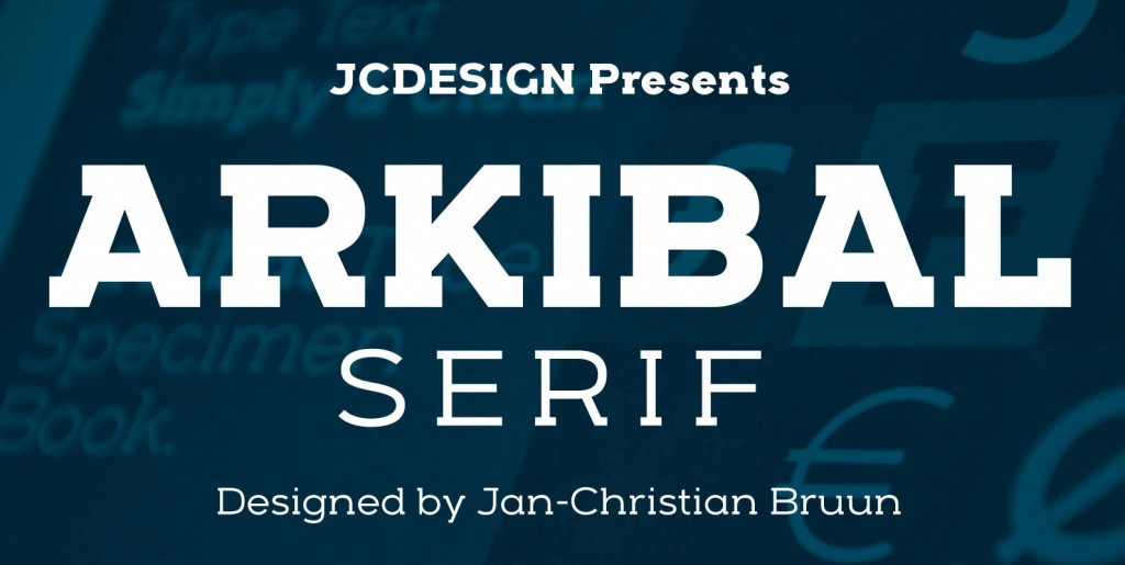
Display version is a little different from Sans family, where “a” is the center of the whole font. And letters “l, b, d, p, q and t” is the moved slight angle. The idea was to make two versions with different selection of letters. It provides good dynamics and structure of display version.
The inspiration comes from some old documents and store signs from my great-grandfather’s old gold list factory from 1838. He delivered hits for many artists of that time, and various museums in Copenhagen.
I priority increases to make a mixture of the classic letter with a modern lift. Seems it was interesting to try to reproduce some of the old characters and make a new font. Uppercase “G” was the first letter of the starting point. G stands for in danish “Guldramme”, which means “Gold Frame”. Arkibal is coming from an almost old danish traditional name “Arkibald”, only without “d”.

