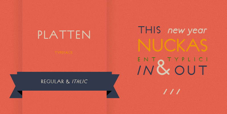
The P22 Platten font family has been revisited and expanded by designer Colin Kahn. Platten is based on lettering found in German fountain pen practice books from the 1920s (you may have seen the similar Speedball books in the US). This round tip pen lettering is comparable to the basic forms used in grammar school teaching alphabets, but with a few original characteristics. The Italic version has even more of these unusual features. Geometric & simple yet casual & timeless. Perfect for many uses.
P22 Platten Neu includes 6 Pro fonts (Light, Regular & Demibold) with many alternates and ligatures (over 500 glyphs in each font) in Roman & Italic with expanded Central European language coverage and Small Caps (Roman only).
Roman OpenType Pro Features:
# Oldstyle Numerals
# Superior Figures
# Scientific Figures
# Fractions
# Numerators
# Denominators
# Slash Zero
# Ligatures
# Discretionary Ligatures
# Small Caps
# Stylistic Alternates (ss01)
# Historical Forms
# Stylistic Sets:3
# Access all Alternates
# Glyph Count:678
Stylistic Set 1: Alternate ‘a’, ‘e’, ‘g’
Stylistic Set 2 (only for Regular and Demi): One story ‘a’
Stylistic Set 9: Same as Historical Forms
Italic OpenType Pro Features:
# Oldstyle Numerals
# Superior Figures
# Scientific Figures
# Fractions
# Numerators
# Denominators
# Slash Zero
# Ligatures
# Titling
# Historical Forms
# Stylistic Sets:1
# Access all Alternates
# Glyph Count:552
Stylistic Set 9: Same as Historical Forms
Titling has the eight caps alternates – ‘E’, ‘ H’, ‘M’, ‘T’, ‘V’,
‘X’, ‘Y’, ‘Z’
Designed by Colin Kahn.

