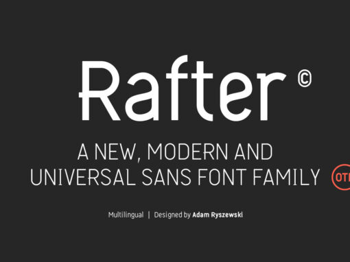
Tag: Universal

Shaping Narratives in Design: The Elegance of Uto Typography

Whether it’s chiseling away at a digital pixelated sculpture or meticulously drafting the blueprint of a sophisticated website, graphic designers are synonymous with the masters of design. Every bit of their work, from their choice of color palette to the

Premis Font

Do you often find yourself looking for a font that is universal and neutral on the one hand, and distinctive and special on the other? Here's one for you. Premis is a fairly broad font family that is suitable for

Moucha Font

Moucha is a geometric super family offering the proportions of all subgenres. Find a vintage and a modern variant and play with all the sea foam that happens in between. The variable font is your typographic toolbox with the perfect

BB Strata Pro Font

BB Strata Pro is the first font with only octagon angles (±45°), polyspacing (same width in every weight), optical shape and monoline variants for any type of use. The ideographic system was created for an exhibition in 2015 to visualize

Enriq Sans Font

Enriq Sans is a sans serif font design published by Kurt Harahap Published by Kurt HarahapDownload Enriq Sans

Temper Wide Font

Temper Wide was designed in 2018 by type designer Jeschke in Berlin. The font consists of many cuts from light to bold and is formally based on its predecessor, Sequel 100. A characteristic feature of the Temper Wide is the

Dopis Font

Dopis (Допис on Cyrillic) is neo grotesque family available in four weights and in two widths. It is universal and neutral typeface, fully applicable in every situation. Contains extended Latin character set with Cyrillic support. Published by Tour de Force

Blond Font

Blond is modern sans serif family with 22 members – 11 weights from Thin to Heavy with matching Italics. Distinctive, recognizable and uniform, Blonde family is well balanced typeface that will find appliance in any situation – from editorial design

Laqonic 4F Font

Laqonic 4F is a geometric modular grotesque with a technological character, perfectly suited for signage, logos and loud headlines. Published by Sergiy TkachenkoDownload Laqonic 4F

Sequel 100 Wide Font

Sequel 100 Wide was designed in 2018 by type designer Jeschke in Berlin. It is based on the sans-serif typefaces of the early 19th century. A characteristic feature of the Sequel 100 is the almost equal thickness of the vertical

Mymoon Stencil Font

Mymoon Stencil is an extension of the Mymoon font family. It comes in 3 weights: UltraLight, Regular and Heavy. Contains extended Latin character set with OT features such as OldStyle and Tabular numerals and fractions. Published by Tour de Force

Mymoon Font

Mymoon is geometric modern sans serif family that comes in 22 weights. Aimed for universal use, in any size and in any media. It has slight retro characteristics and mostly neutral overall impression. With wide range of thickness, from Thin

Sequel Rounded Font

Unfortunately we rarely meet typefaces which still show the formal quality of the time of our grandfathers or even the technical progress in their interior with the design of their exterior. A rare example is Sequel Rounded whose shapes combine