Tag: unicase
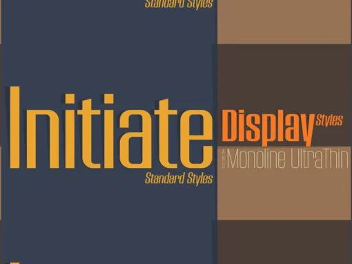
Initiate Font
A Stylish Technology Sans Serif Initiate began as a digitization of a film typeface from LetterGraphics in the early 70’s known as “Kent”. The original specimen was only in a Black weight with a tall x-height and included standard Capitals,
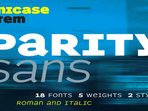
Parity Sans Font
There is a lot to choose from in this unicase megafamily, with roman and italic, six weights, text and display styles, and both proportional and monowidth versions! Published by ShinntypeDownload Parity Sans
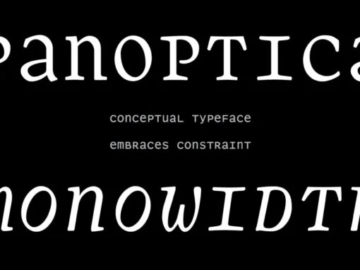
Panoptica Font
Monowidth, unicase: the alphabet imprisoned in cell blocks. With current concern over surveillance and identity as backdrop, Shinn suggests that there are no exemptions, the universality of this proposition indicated by the diversity of genres to which the Panoptic effect
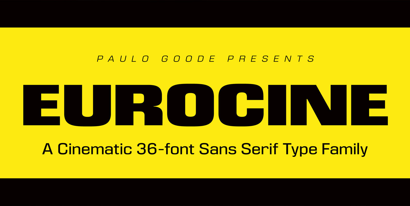
Eurocine Font
Eurocine is an expansive display typeface – a square sans serif that’s perfect for titling, headlines, logotype and branding. This 36-font family is packed with features to make it supremely versatile. This typeface attempts to capture the mood of movie
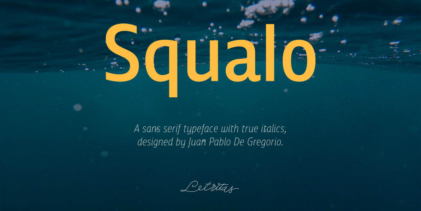
Squalo Font
Squalo, the genesis The idea of this new project called Squalo bumped into my mind when when I was working up with excitement to my sketches, chasing for a strong typographical character, that for me has to be crystallized in
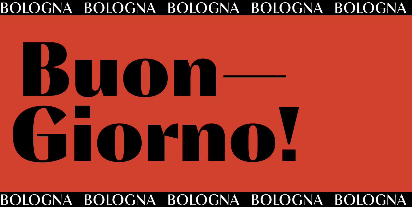
Bologna Font
Inspired by pointed pen calligraphy and modulated sans serif typefaces used for advertising in the 1920´s, Bologna is a high contrasted sans serif with a modern and fashionable look. Bologna comes in three weights: Regular, Bold and Black. The Regular
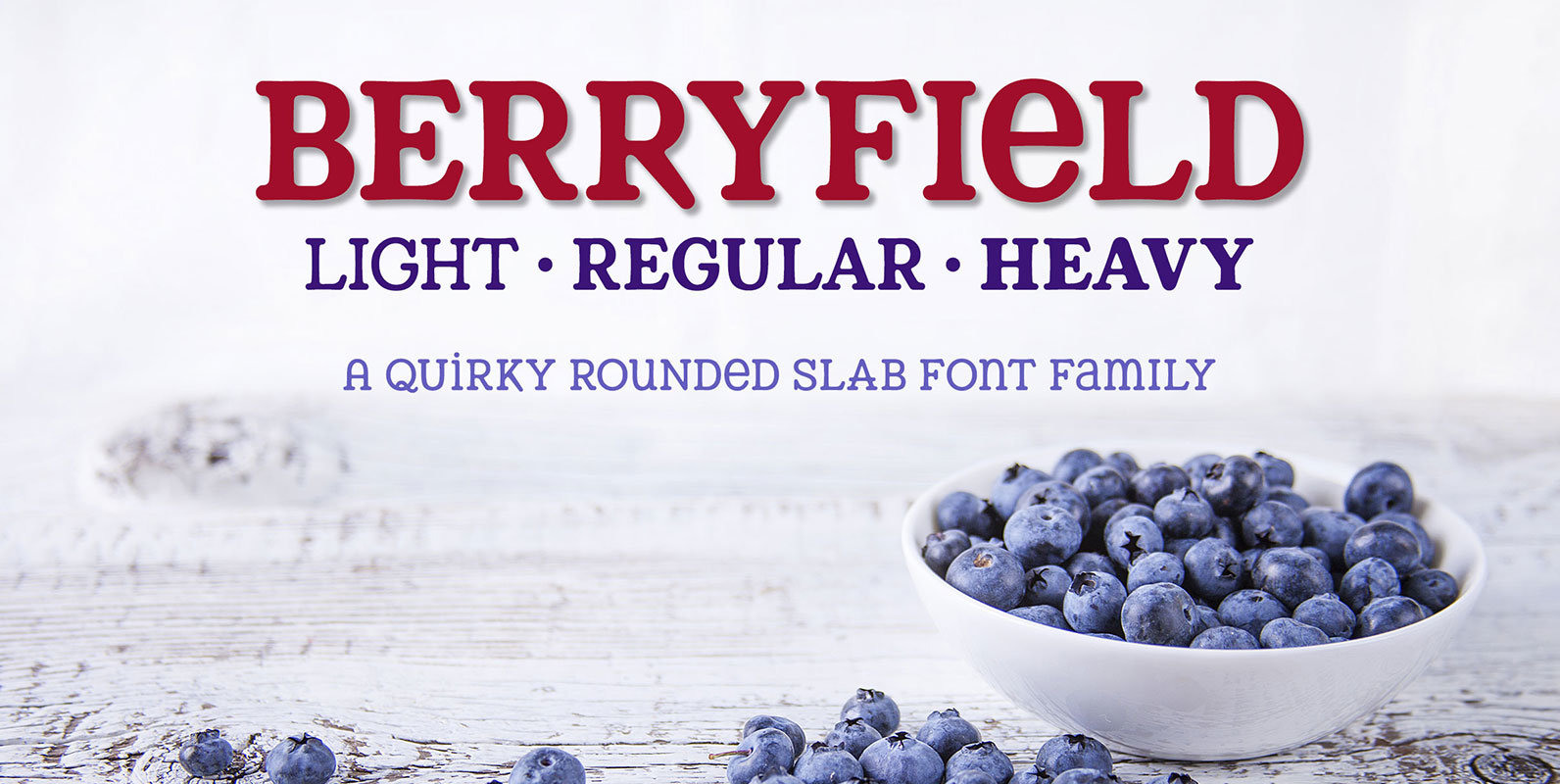
Berryfield Font
Berryfield started as an experiment: making a font entirely out of geometric shapes. It started with a couple of circles and a couple of rectangles, and was constructed entirely from those parts, and parts made from those parts! For the
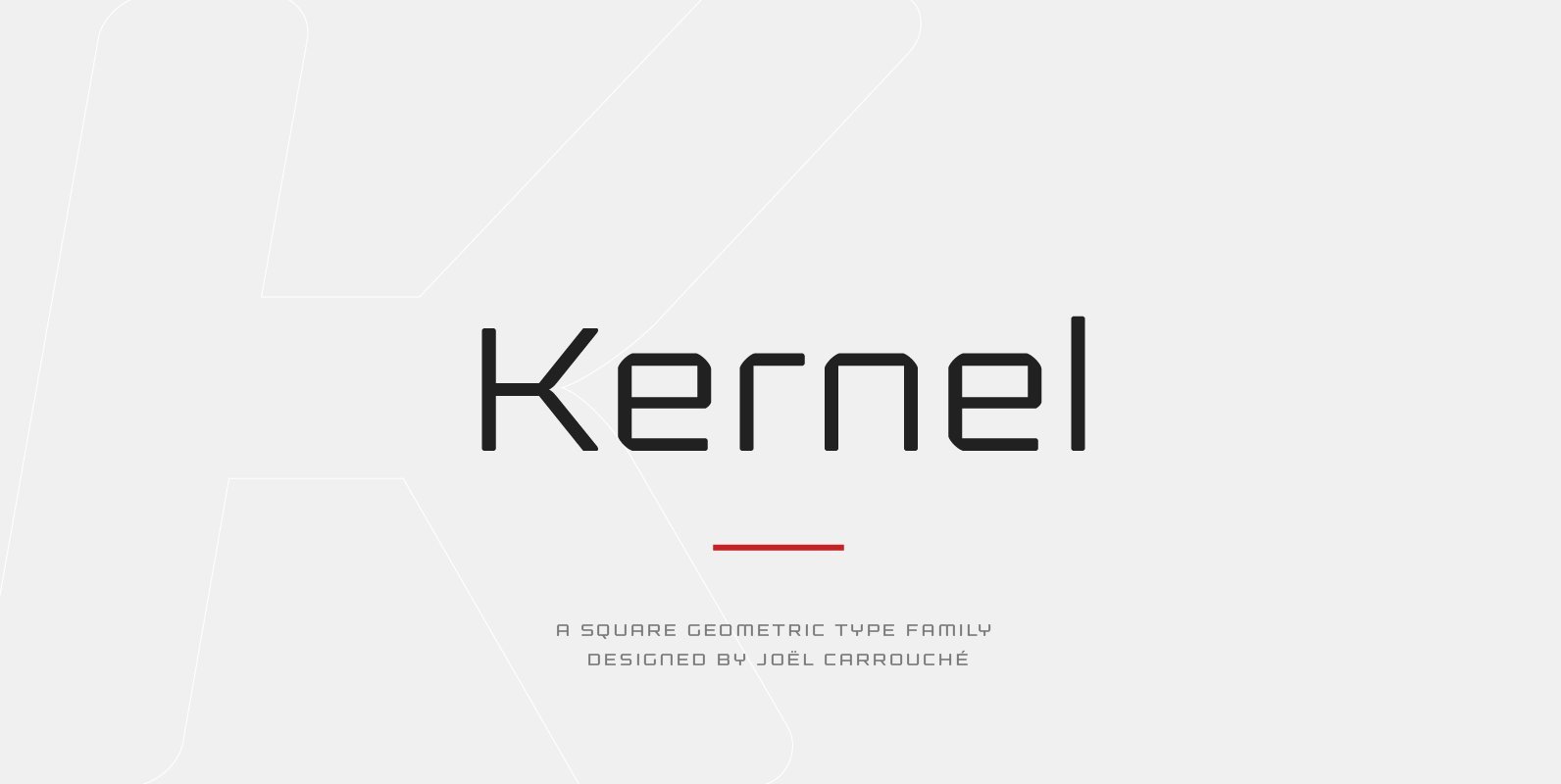
Kernel Font
Kernel is a square geometric type family in six weights with matching obliques and small caps. The design mixes slightly rounded terminals and shoulders with square counterforms, giving the shapes a strong masculine and futuristic look, great for applications like
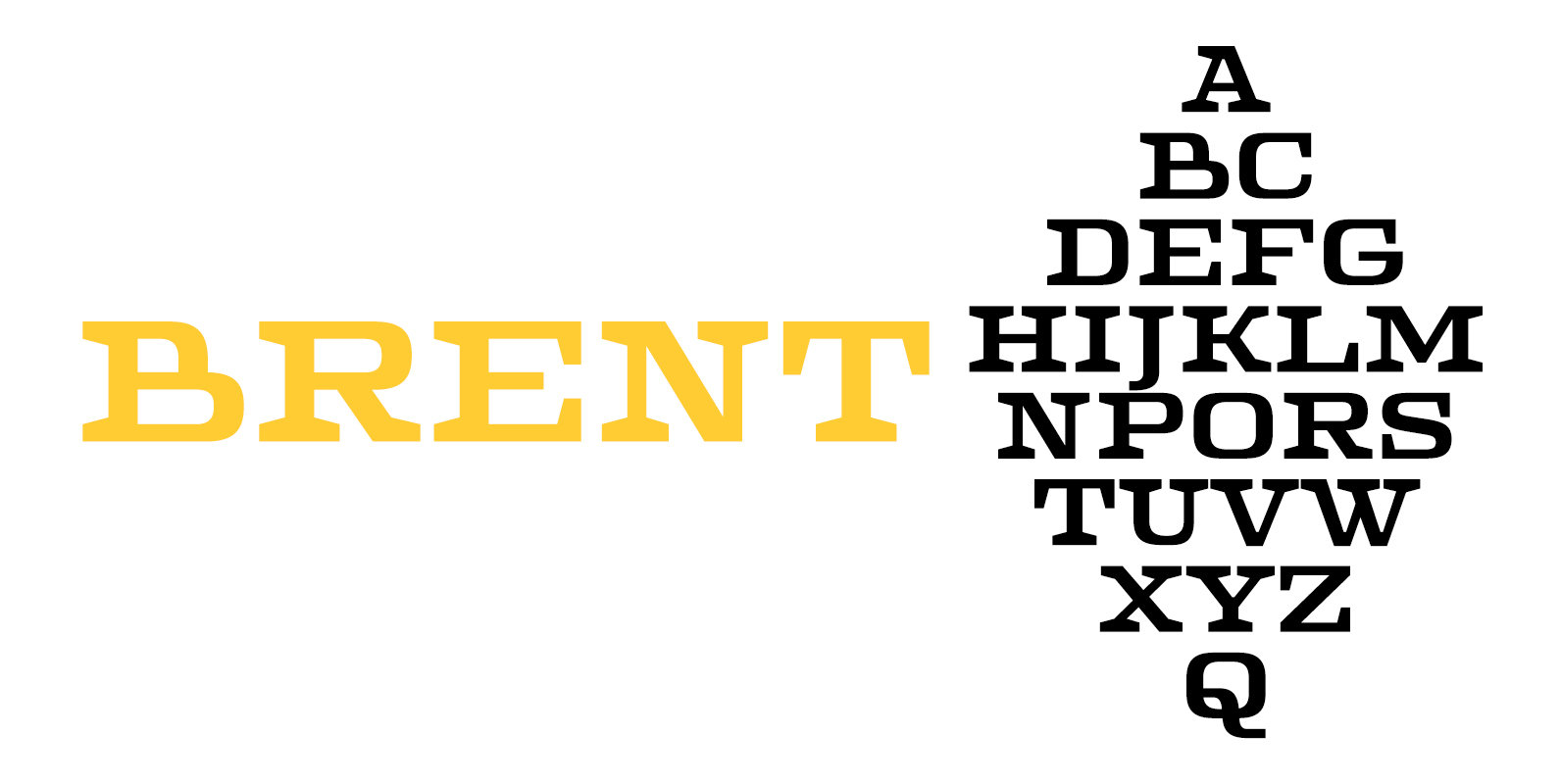
Brent 4F Font
Brent 4F is a serif font design published by Sergiy Tkachenko Published by Sergiy TkachenkoDownload Brent 4F
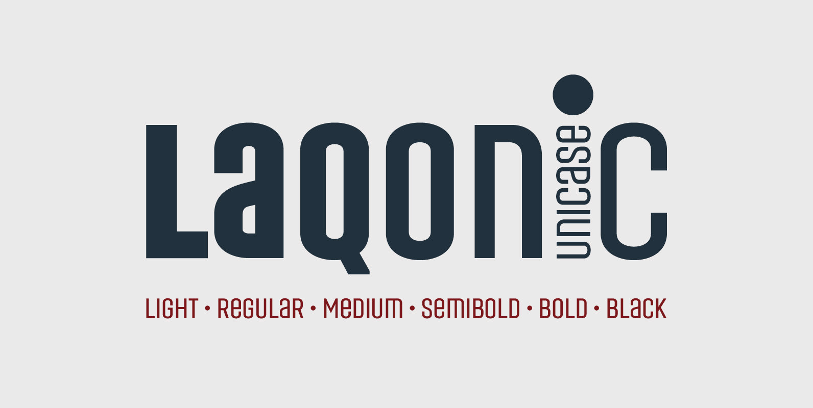
Laqonic 4F Font
Laqonic 4F is a geometric modular grotesque with a technological character, perfectly suited for signage, logos and loud headlines. Published by Sergiy TkachenkoDownload Laqonic 4F
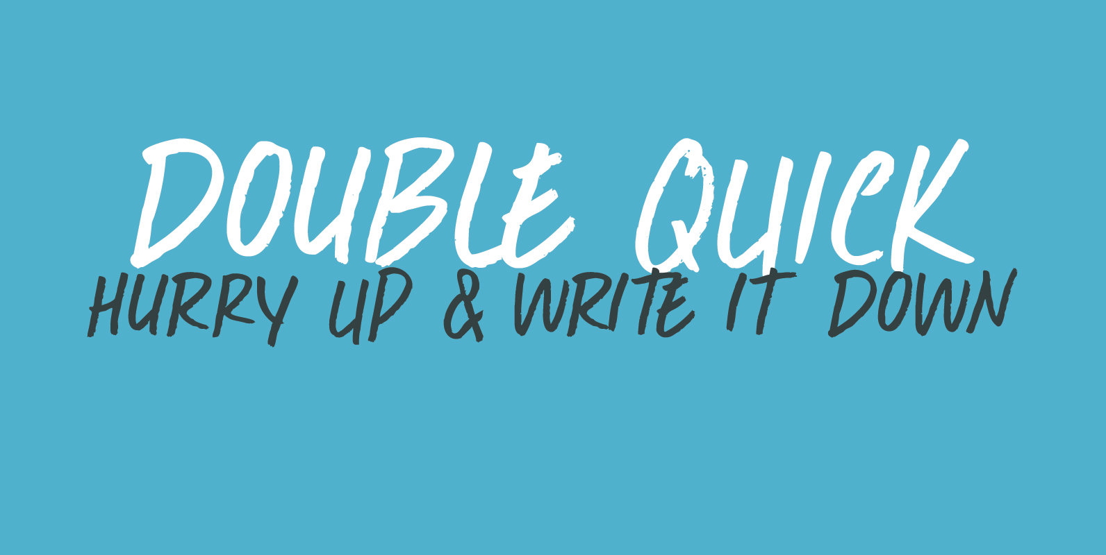
Double Quick Font
Double Quick is a fast, handwritten font with excellent legibility. It was designed to look like a quick grocery list, a hasty ‘I Love You’ note penned down on a Post-it or a home improvement to-do list. Comes with extensive
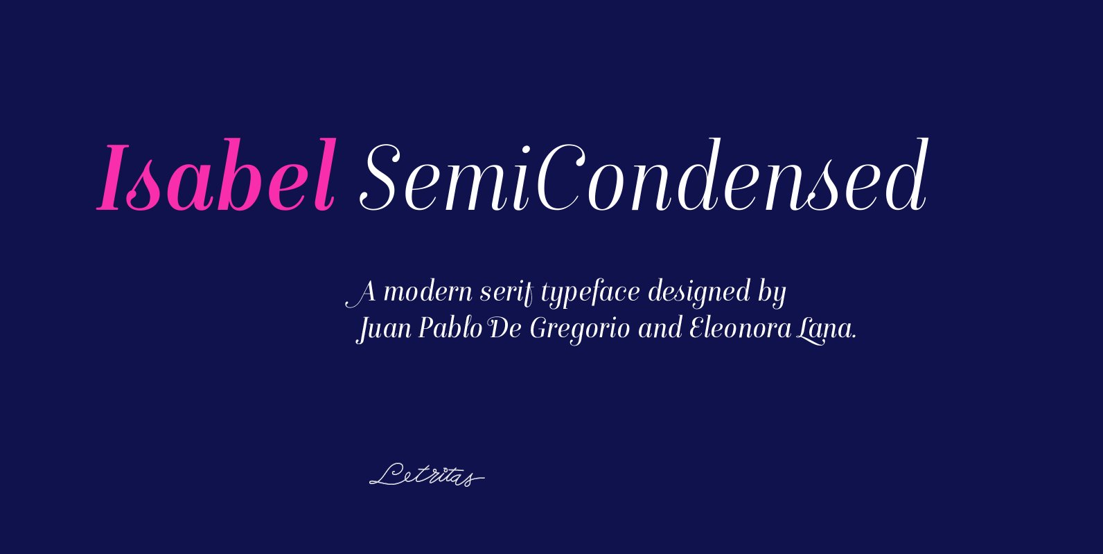
Isabel SemiCondensed Font
Isabel SemiCondensed, together with Isabel Condensed and Isabel were made out of necessity to create a new font for children and teenagers, that could be enough friendly and versatile for text in words or even easy-to- read long texts. The
YWFT Pudge Font
Extreme girth is the name of the YWFT Pudge game. This thing is a monster. An Opentype font design set in super overweight style with a hand-drawn touch, YWFT Pudge is perfect for the biggest and fattest of headlines. Not
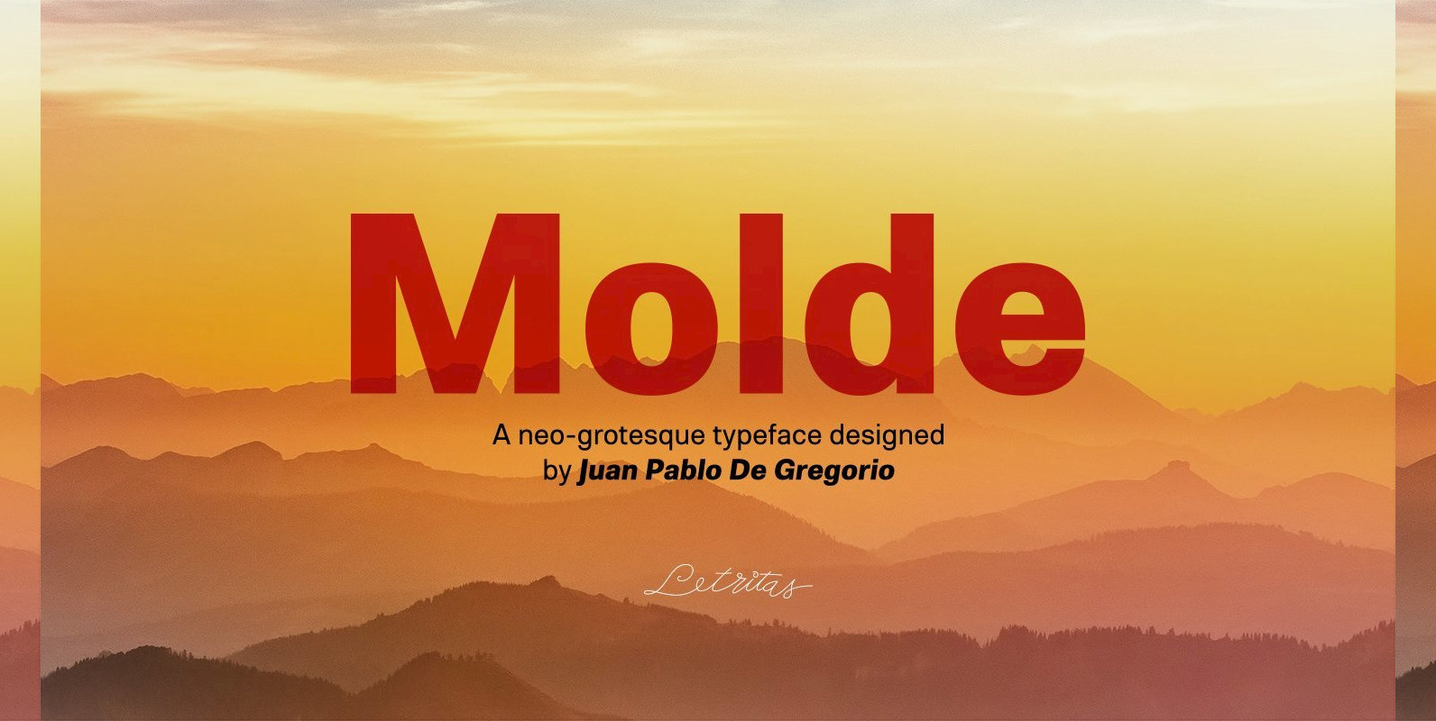
Molde Font
Molde is a super sans serif font family, belonging to the neo-grotesque style. Formally, Molde was inspired by the extreme sobriety of famous post-Bauhaus Swiss Movement of the mid-twentieth Century. The masters of this style are famous for eliminating all
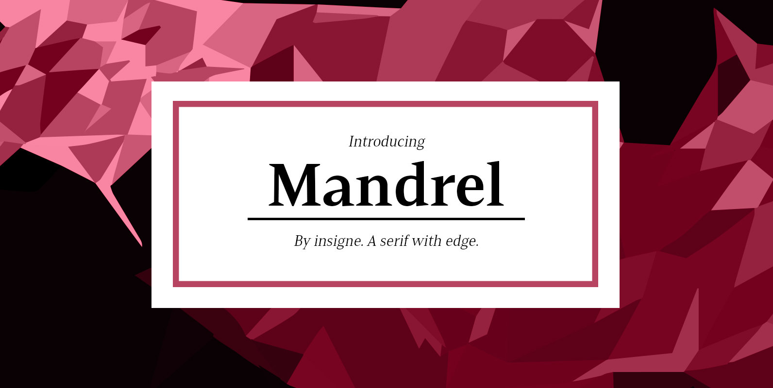
Mandrel Font
From the realm of insigne, a new family has risen. By name, Mandrel. Courtly in character and elegant in appearance, the face finds great favor among those with whom it seeks audience. With confident air, Mandrel carries itself gracefully before
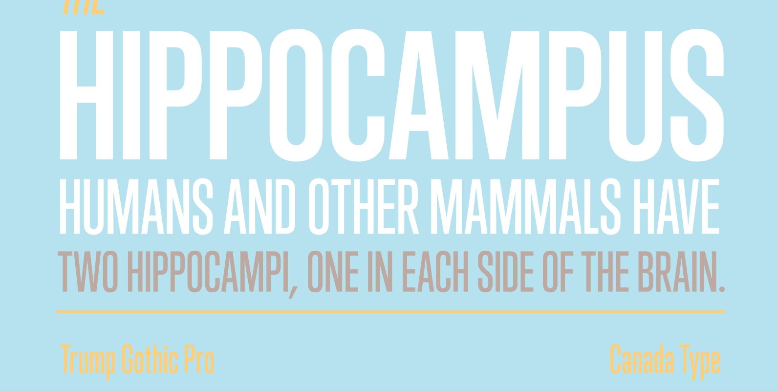
Trump Gothic Pro Font
Trump Gothic is a reconception of ideas from Georg Trump's seminal 1955 Signum typeface and its later reworking (Kamene) by Czech designer Stanislav Marso. Originally cobbled together for a variety of film projects in the late 1990s and early 2000s,
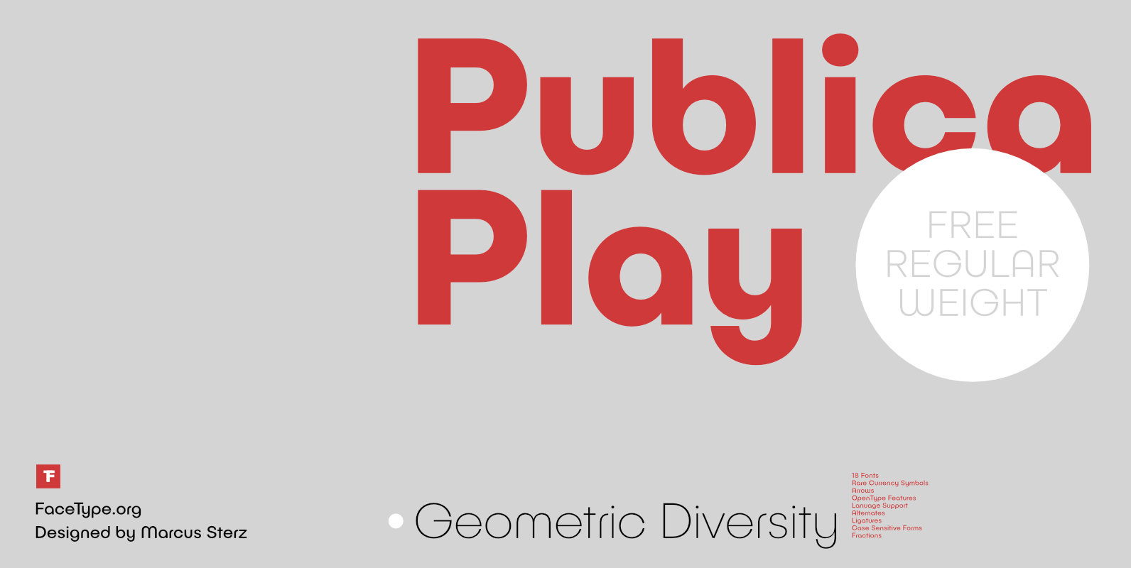
Publica Play Font
Publica Play is Publica Sans’ playful sister. It comes with loads of subtle open type features, tabular options, rare currencies signs and symbols and arrows – ‘Publica Play’ has everything you need for playful design tasks. Take a close look
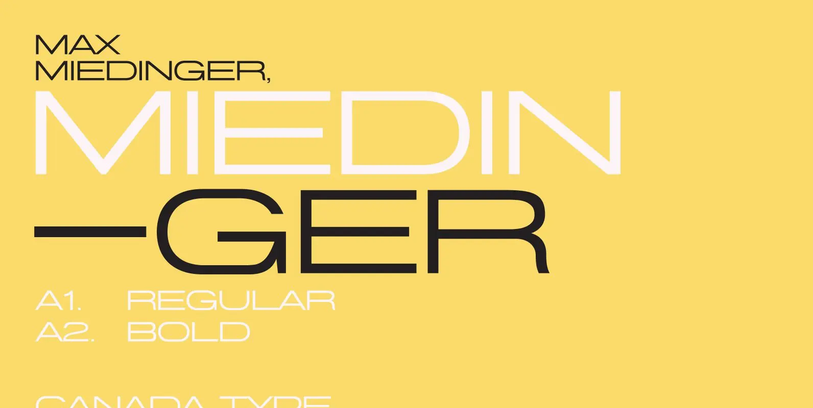
Miedinger Font
The great hype of Swisspalooza ’07 prompted a look at Max Miedinger, the designer of Neue Haas Grotesk (later renamed to Helvetica). Surprisingly, what little biographical information available about Miedinger indicates that he was a typography consultant and type sales