Tag: super
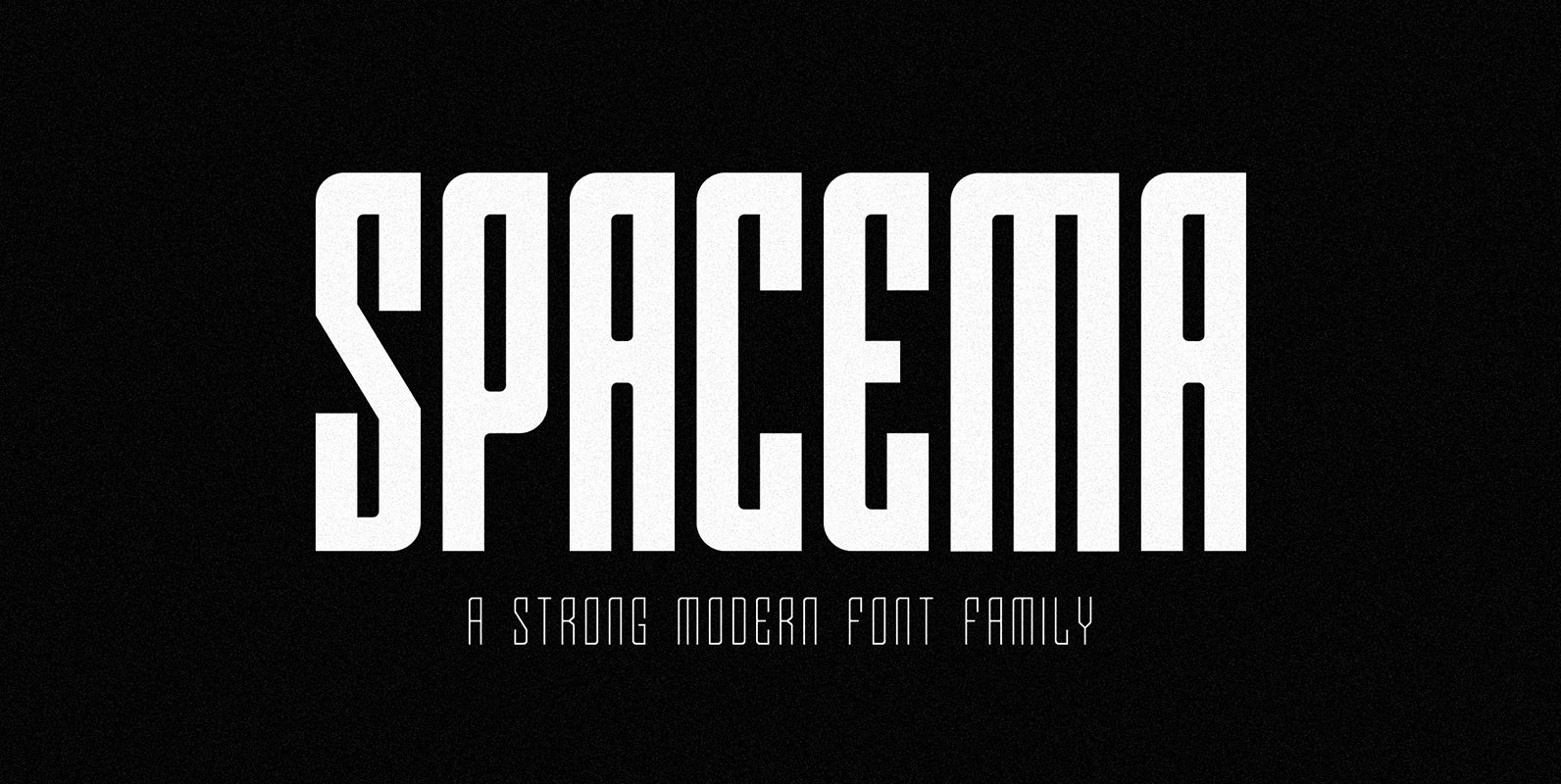
SPACEMA Font
Spacema is a modern condensed typeface with a strong vertical emphasis while maintaining prominent geometric quality to it. With a balance of hard lines and smooth curves, Spacema is an eight-weight typeface which includes uppercase, numerals, extended characters and accents.
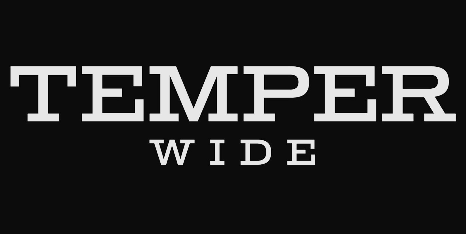
Temper Wide Font
Temper Wide was designed in 2018 by type designer Jeschke in Berlin. The font consists of many cuts from light to bold and is formally based on its predecessor, Sequel 100. A characteristic feature of the Temper Wide is the
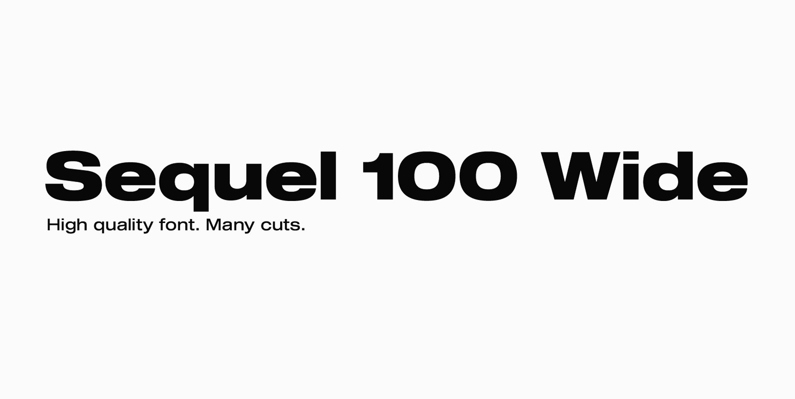
Sequel 100 Wide Font
Sequel 100 Wide was designed in 2018 by type designer Jeschke in Berlin. It is based on the sans-serif typefaces of the early 19th century. A characteristic feature of the Sequel 100 is the almost equal thickness of the vertical
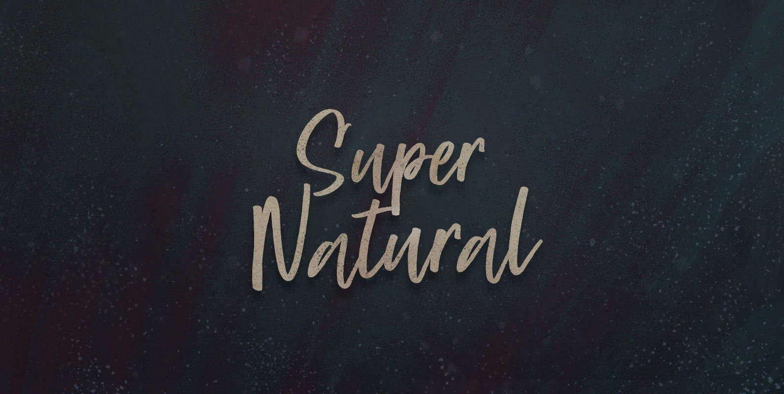
Super Natural Font
Selected and standardized to supply functional food to overstuffed and starving masses: Taking food like medicine, synthesized in sterile labs like the farm in pharmacology. Super Natural nutrition isolating supplements from senses, vitamins from vitality, and flavonoids from flavour. Published
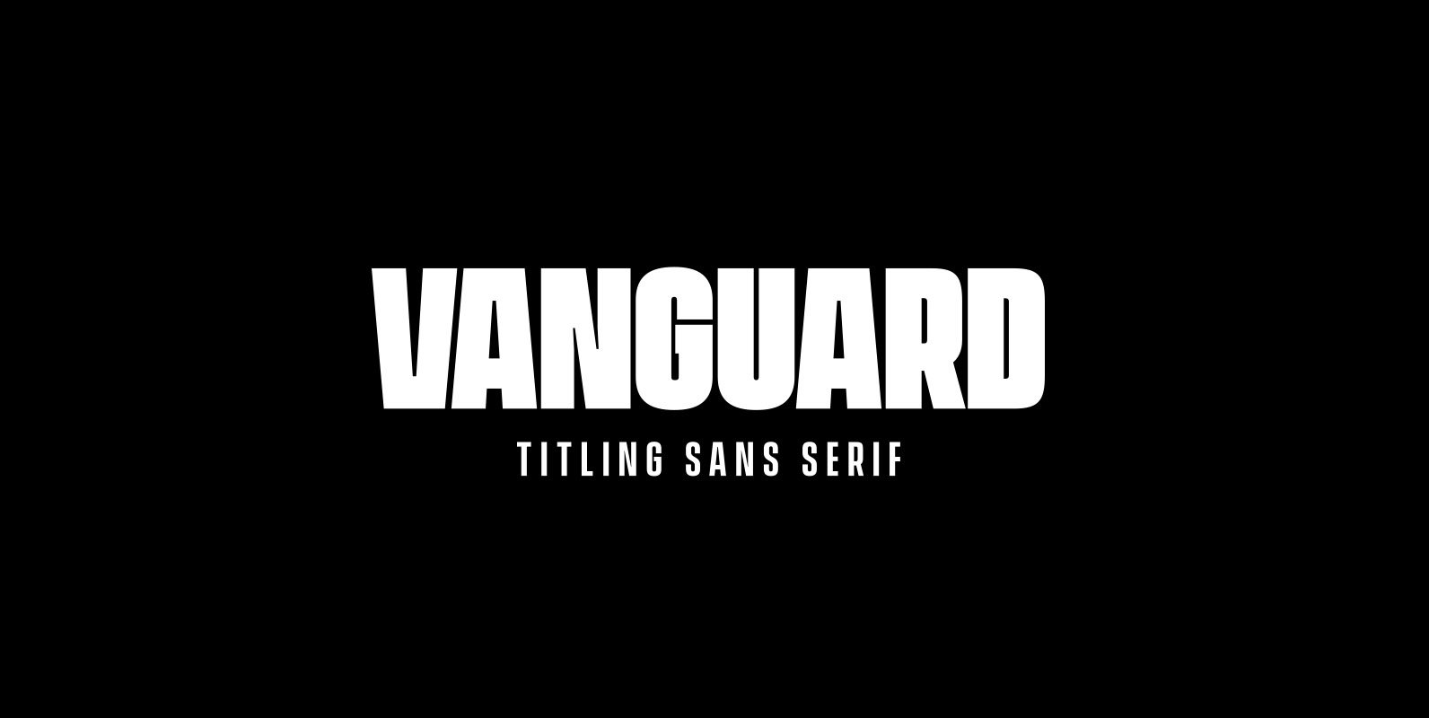
Vanguard CF Font
VANGUARD CF is a powerful and elegant display typeface, constructed to maximize horizontal space. Built from sketches originally drawn in 2012, Vanguard’s eight weights span an elegant Thin to an arresting Heavy, with accompanying obliques. As with its sibling Integral
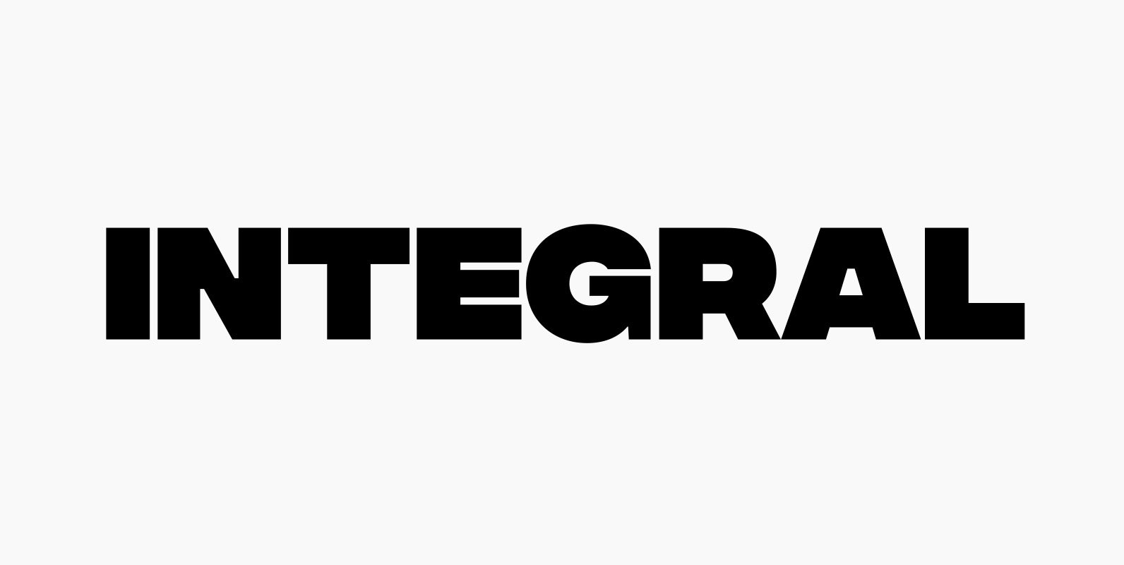
Integral CF Font
INTEGRAL CF is designed for maximum visual and emotional impact. Its six weights excel in posters, social media, headlines, titling, large-format print – and anywhere else you want to be noticed. Hidden among the straight lines and corporate confidence is
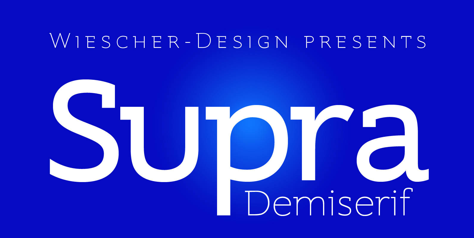
Supra Demiserif Font
“Supra Demiserif” is the demi serif addition to the Supra family. I am no fan of slab serif fonts, so I designed this one with half serifs, that makes the serifs less important. Then I found, that the italic does
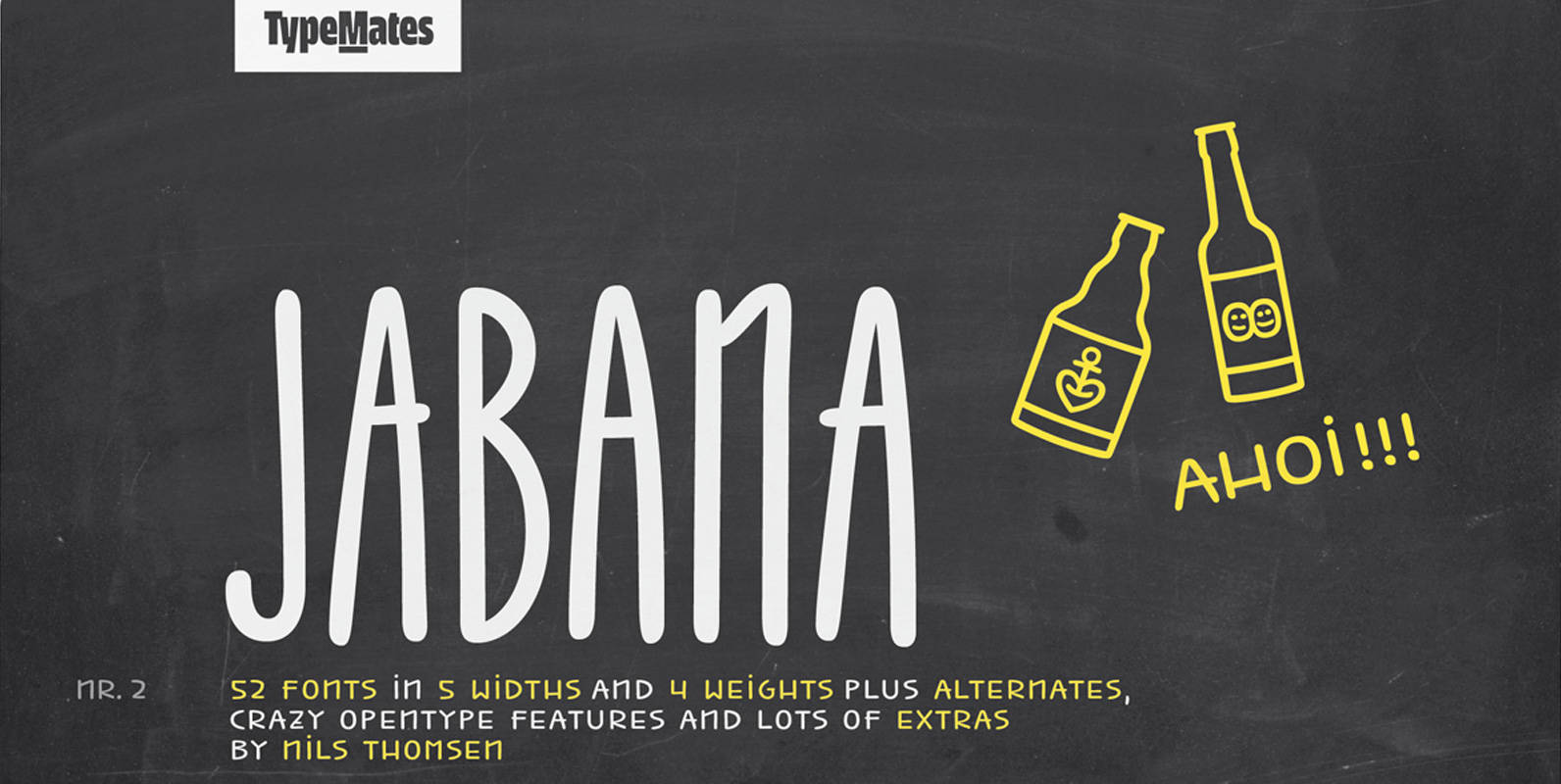
Jabana Font
Inspired by having a ’Schorle’ in Hamburg’s coffee bars, Jabana’s smooth handwritten marker curves come in 20 styles across 5 widths: from the super-compressed to the extended. A particularly wide range of OpenType features define Jabana. Each letter, numeral and
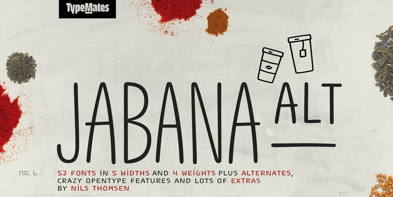
Jabana Alt Font
Jabana Alt is Jabana’s slightly less crazy sibling. Inspired by having a ’Schorle’ in Hamburg’s coffee bars, Jabana Alt’s smooth handwritten marker curves come in 20 styles across 5 widths: from the super-compressed to the extended. A particularly wide range
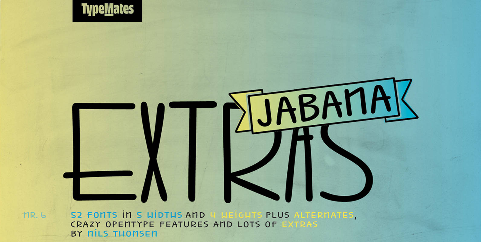
Jabana Extras Font
Jabana Extras is a set of awesome specials to get a fast and easy design. It is developed for the font families Jabana and Jabana Alt, but also works with other fonts very well. Banners / Arrows / Ornaments /
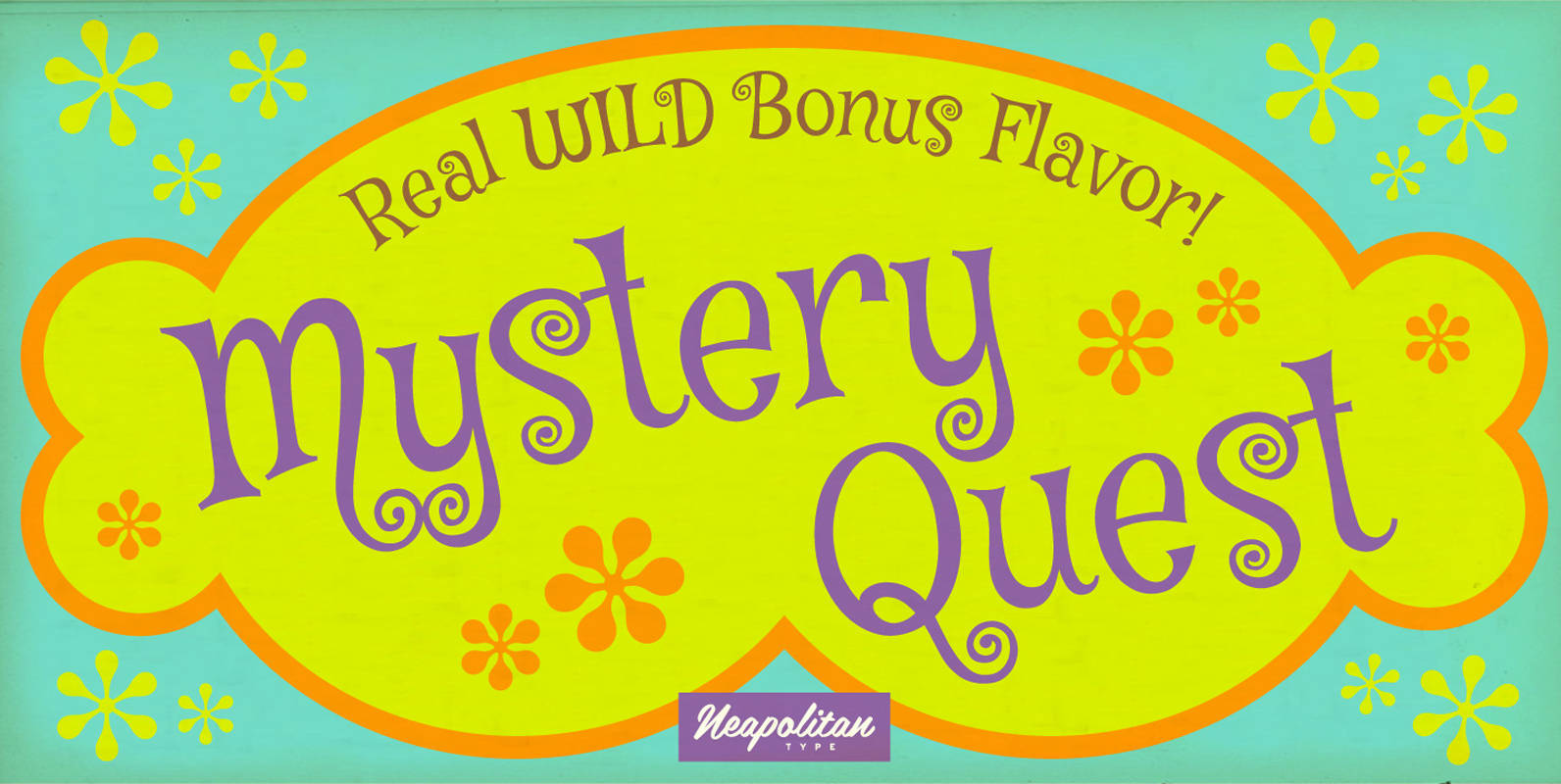
Mystery Quest Pro Font
Grab your gear! Check your nerves! Get ready for Mystery Quest! This far-out funky font brings danger with every curve! You never know what this playful 1960s mod inspired typeface will bring and design adventure is just around the corner!
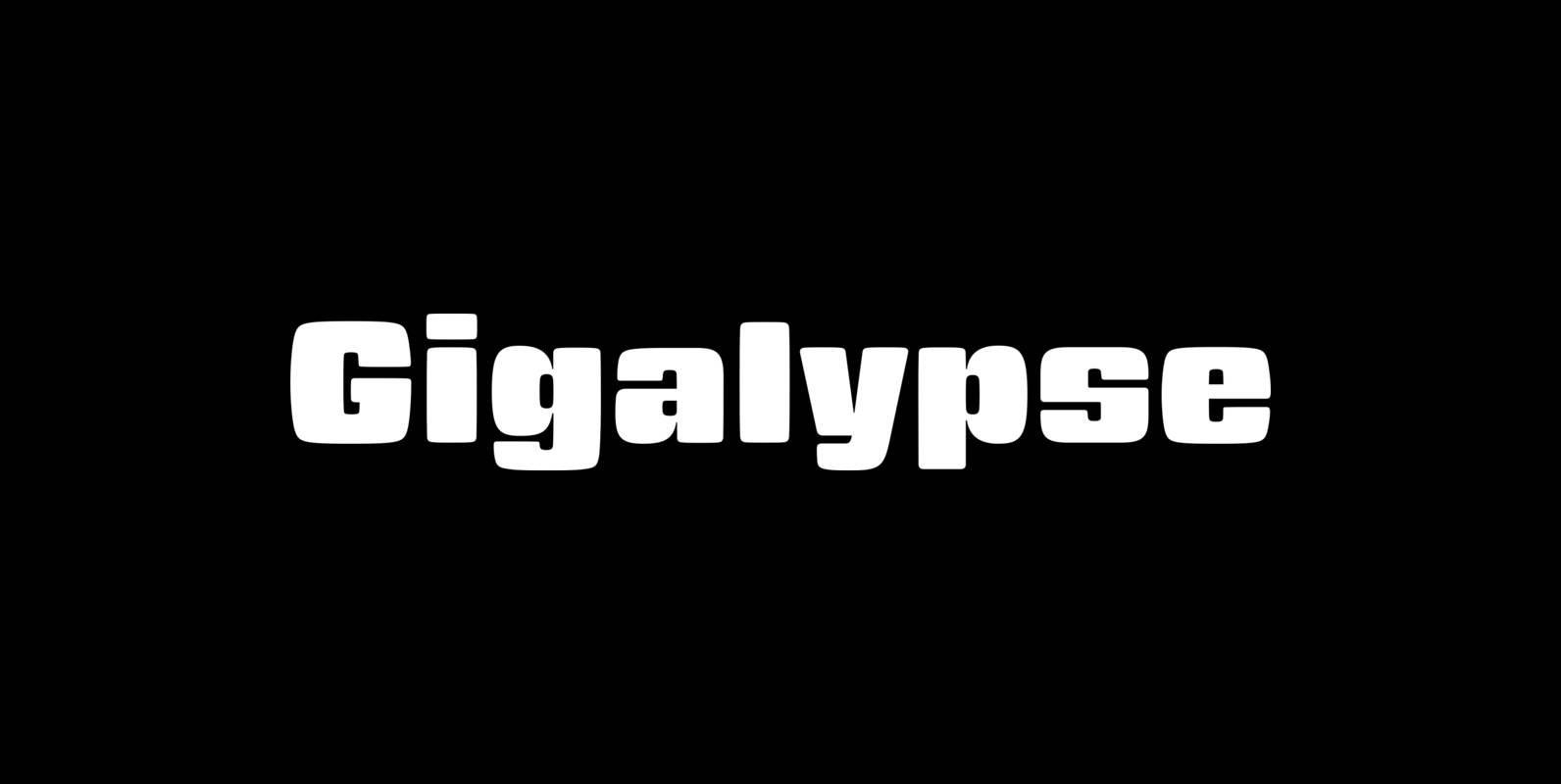
Gigalypse Font
Gigalypse is a one-weight workhorse. As a square sans Gigalypse can look smart, serious, and even futuristic. Round corners and curved sides add warmth and humor tempered by sophisticated geometry. This soft sophistication makes Gigalypse work whenever heavy display type
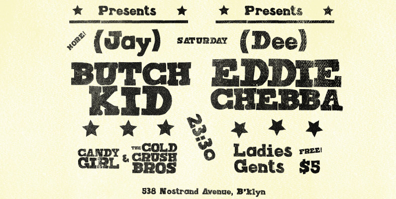
Joseph Font
Joseph is a brand new slab-serif face designed by TOMO. With a wood type look – letterpress print technic, this fatty come in handy when is time to design an informal —yet strong—looking communication piece. Ideal for promotion-matter. Published by
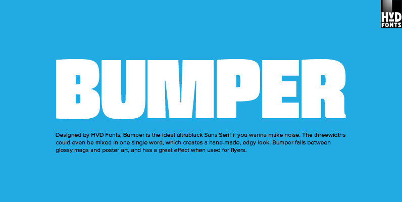
Bumper Font
Bumper is the ideal ultrablack Sans Serif if you wanna make noise. The three widths could even be mixed in one single word, which creates a hand-made, edgy look. Bumper falls between glossy mags and poster art, and has a
Air Superfamily Font
In B-movie awesomeness, Air began as Grotesk vs. Grotesque. I was trying to unify the prevailing traits of German and English Grotes(que/k)s in order make something different but familiar. I am NOT trying to reinvent Helvetica (snore), so get that
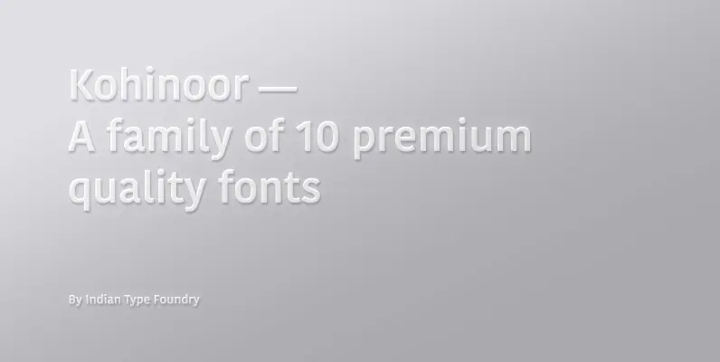
Kohinoor Font
Kohinoor is an elegant, low contrast humanist sans-serif typeface suitable for both body and the display text. Kohinoor comes in 5 upright styles with their complementary italics. Published by Indian Type Foundry (ITF). Download Kohinoor