Tag: spanish
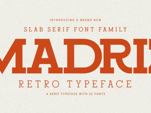
Imbuing Modern Designs with Madriz: A Journey Through Time in Typography
The realm of graphic design and digital creativity is a constantly evolving one, requiring a rich palette of resources for inspiration and refined creation. Amidst the plethora of design tools available, the central role and impact of typography cannot be
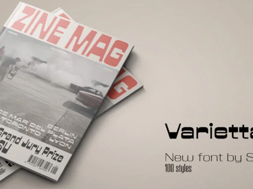
Varietta Font
Varietta is the result of my fascination with photographing the type designs of some marquees in Spanish markets. In them you can see many letter designs with reversed contrast and in different widths, probably based on the possibilities of photocomposition.
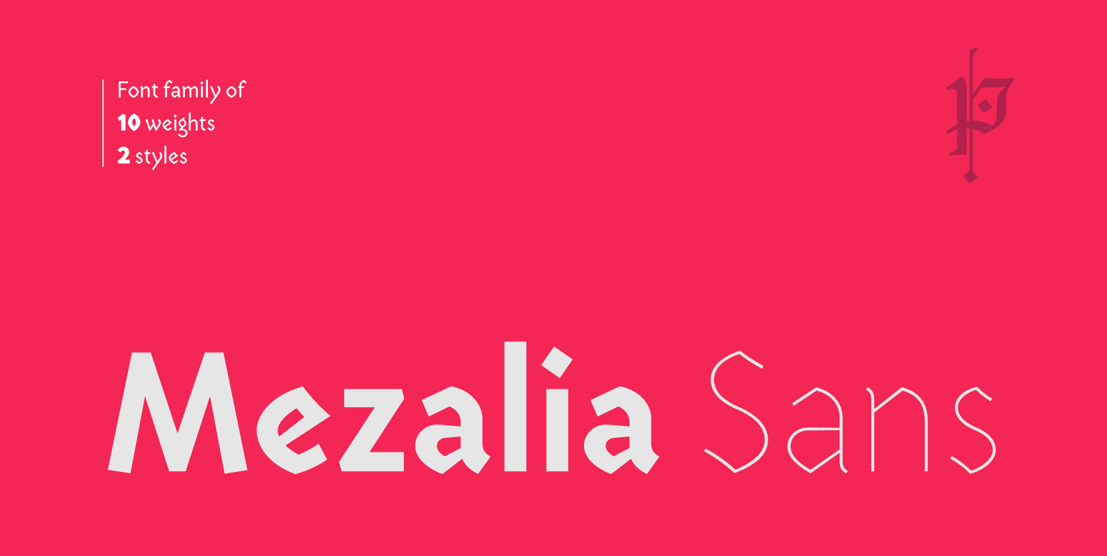
Mezalia Sans Font
Mezalia Sans is a logical continuation of the Mezalia family. Its shapes are based on medieval calligraphic style: the Bastarda. This time the evolution is taken a step further, as these classic shapes are merged with the straightforwardness of a
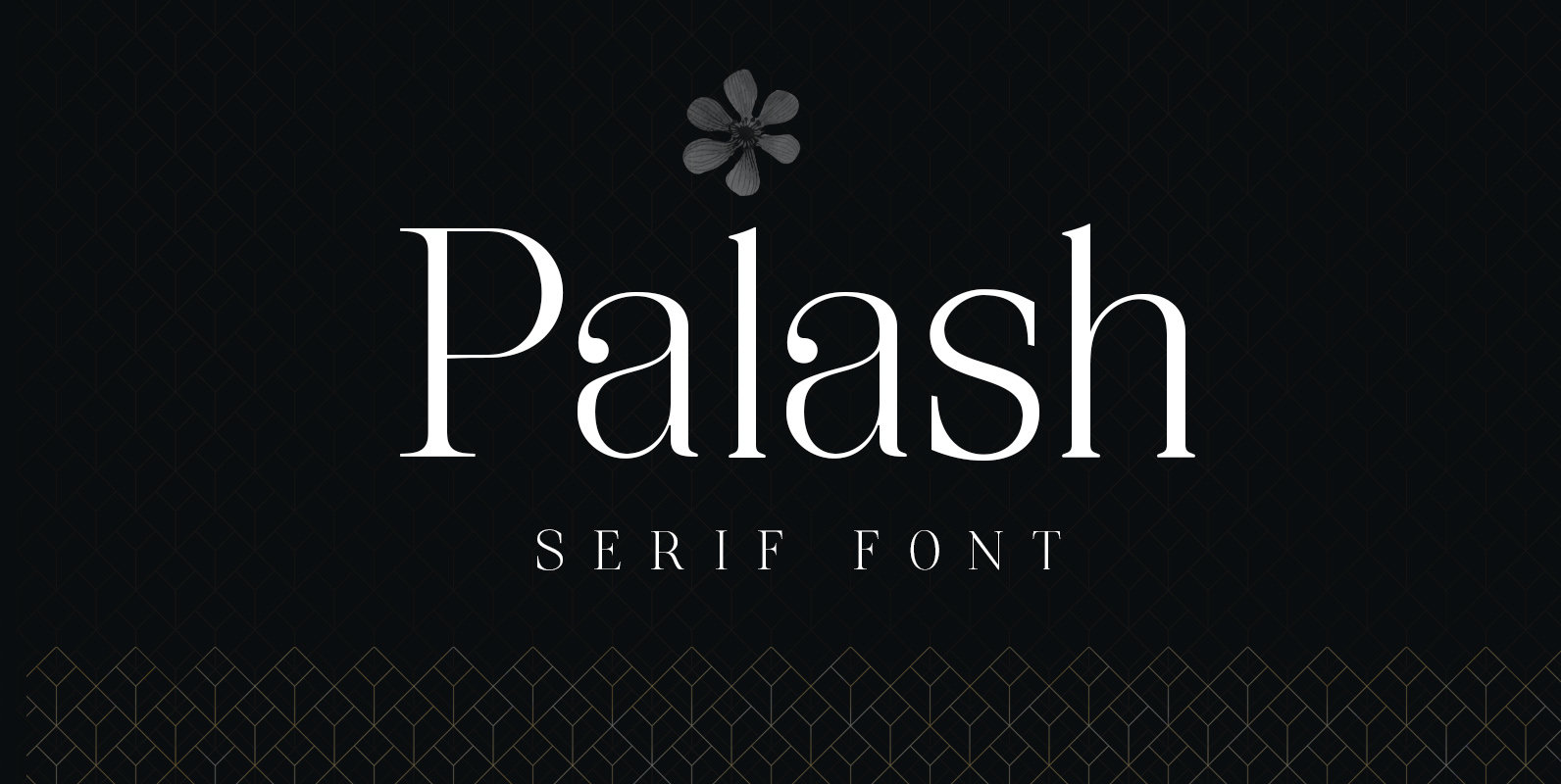
Palash Font
Palash is a great typeface for creating beautiful and elegant headlines and logo designs. It works best with large sizes and features Uppercase and Lowercase. It also works really well with wide spacing. Published by Sergio Haruo HattoriDownload Palash
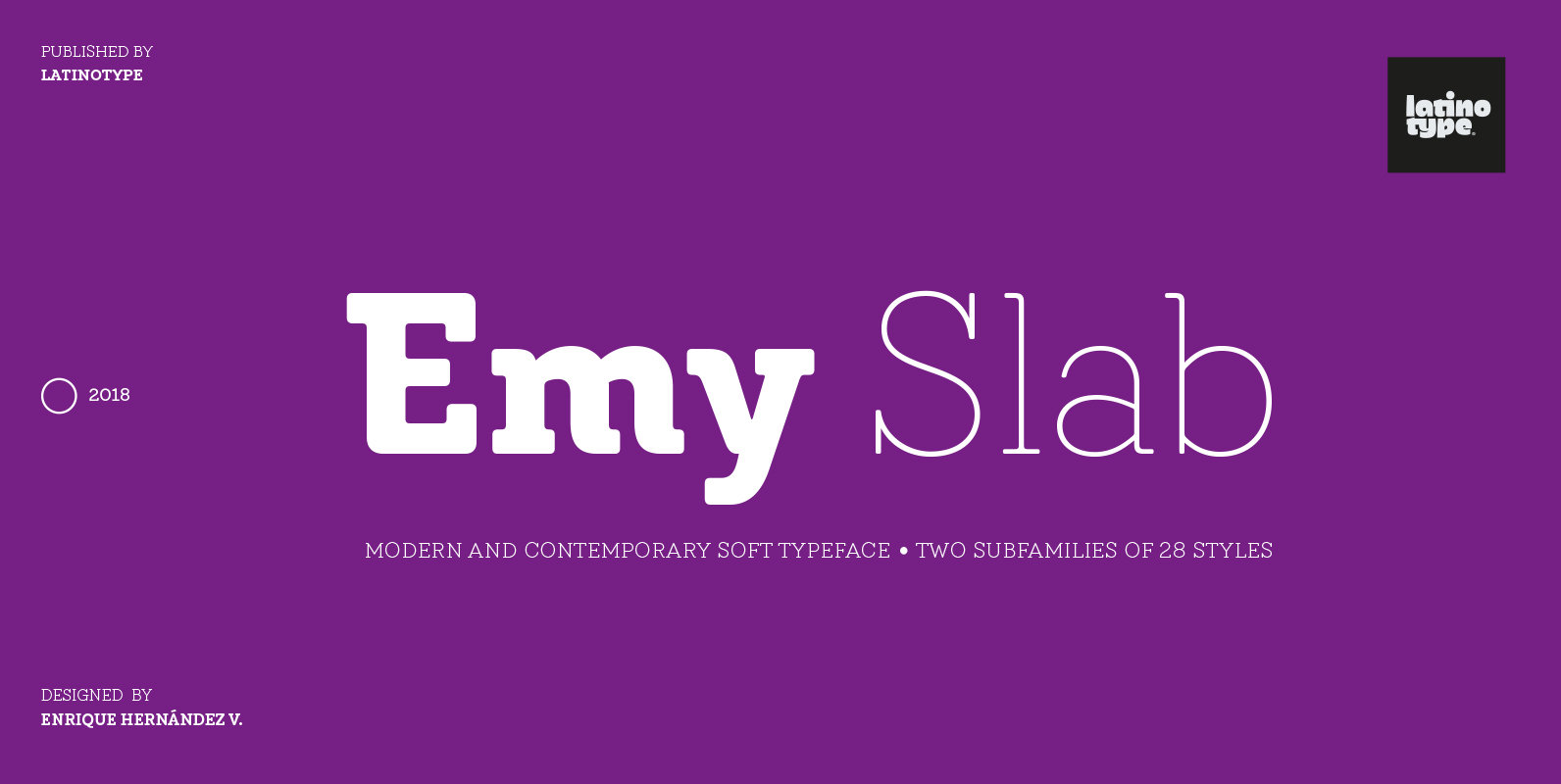
Emy Slab Font
Emy Slab is a slab serif based on the classical proportions of Egyptian typefaces but with soft terminals that give the font a more friendly and modern look. Emy Slab consists of two subfamilies of 7 weights, ranging from Thin
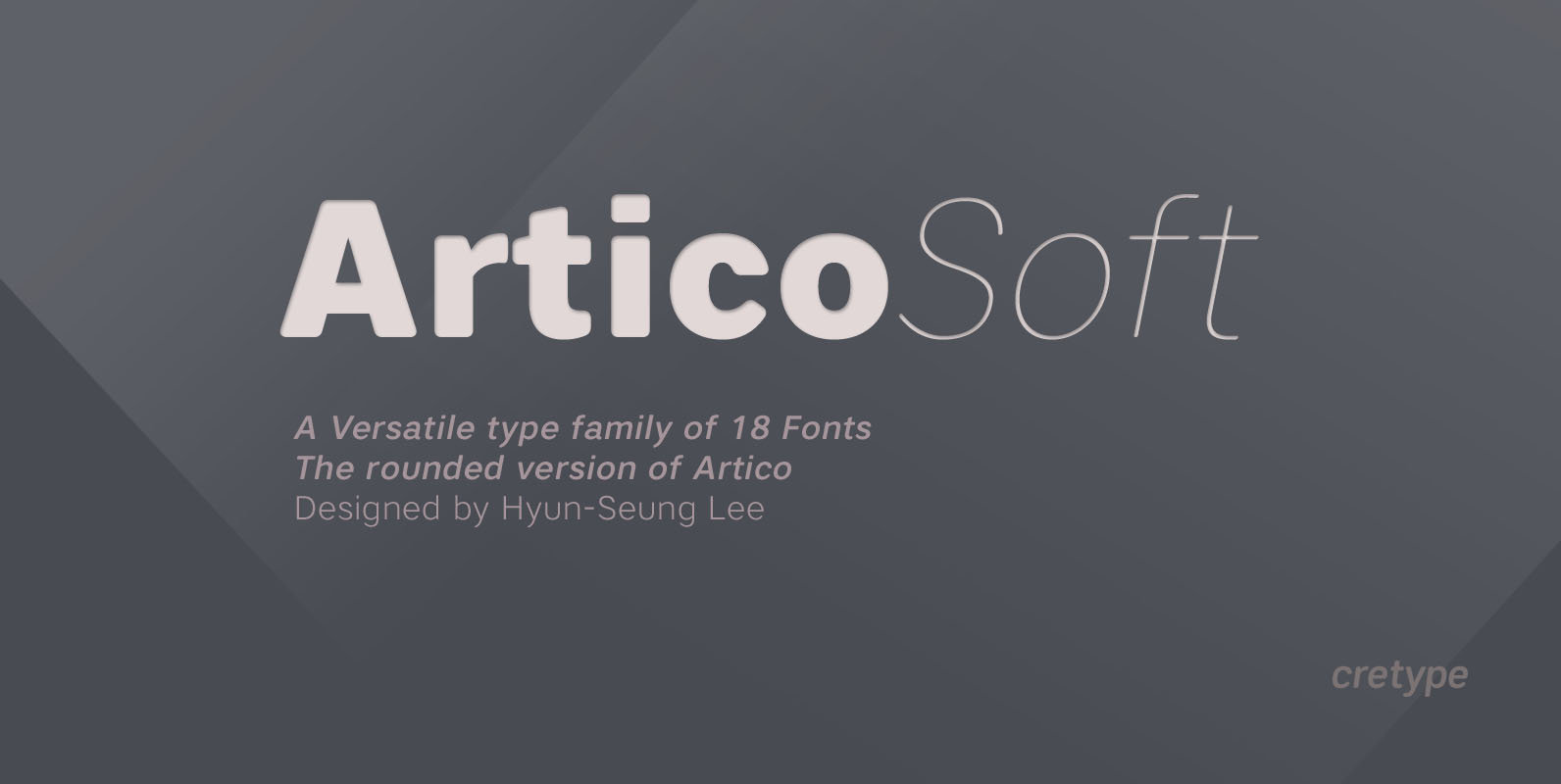
Artico Soft Font
Artico Soft is the rounded version of Artico. Artico Soft Family is a modern sans-serif typeface that is clean, simple and highly readable. Letters in this type family are designed with genuine neo-grotesque and neutral shapes without any decorative distractions.
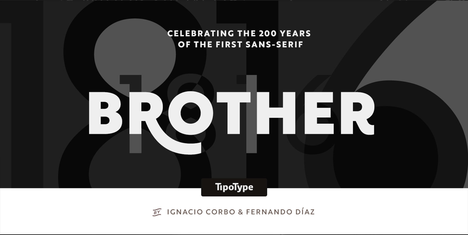
Brother 1816 Font
This year we commemorate the 200th anniversary of the first sans-serif typeface. and what better way to celebrate, than to design our own sans-serif! Brother 1816 is a very flexible, multifaceted and solid typeface, mixing Geometric shapes with Humanistic strokes
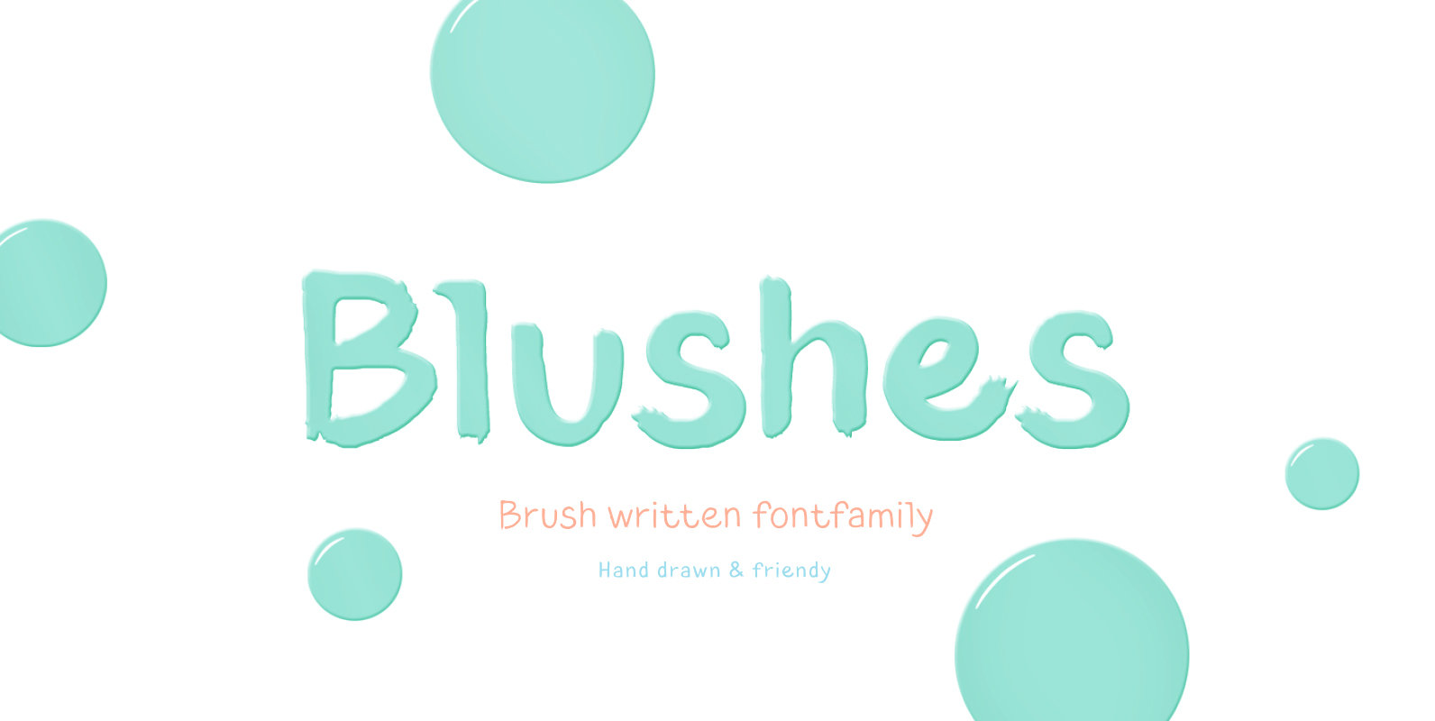
Blushes Font
Glitter, flashing cameras and fame – now you know how to deal with this stuff! Freshness and brightness is what defines the Blushes font family, which is created for beauty and fashion industries. Blushes is a vibrant part of you
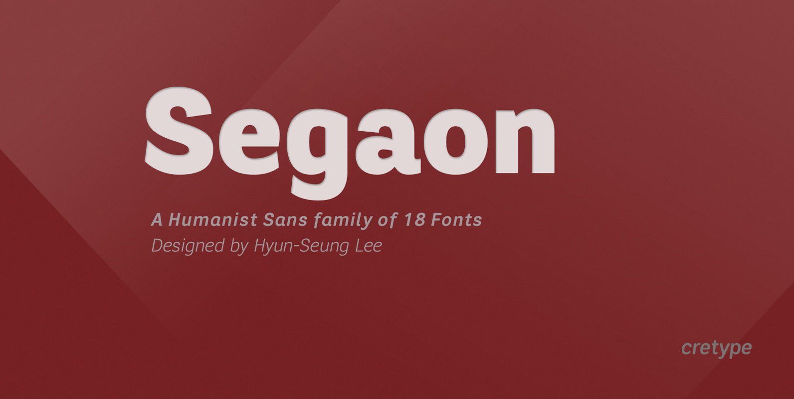
Segaon Font
Segaon Family is a humanist sans-serif typeface that is clean, simple and highly readable. The spaces between individual letter forms are precisely adjusted to create the perfect typesetting. Segaon is versatile type family of 18 fonts. Segaon family consists of
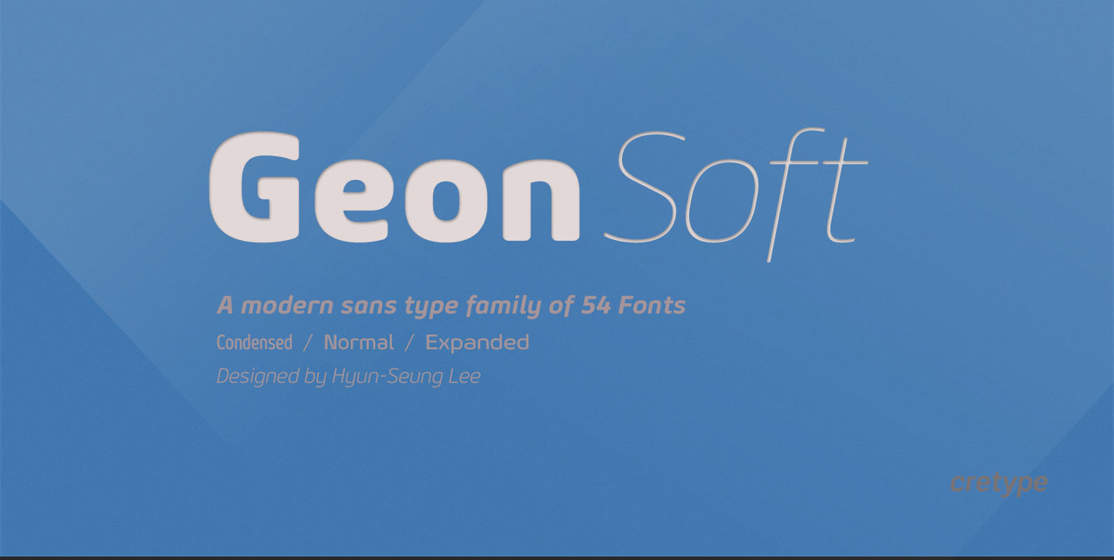
Geon Soft Font
Geon Soft is the rounded version of Geon. Geon Soft Family is a modern sans-serif typeface that is clean, simple, soft and highly readable. Letters in this type family are designed with geometric shapes without any decorative distractions. The spaces
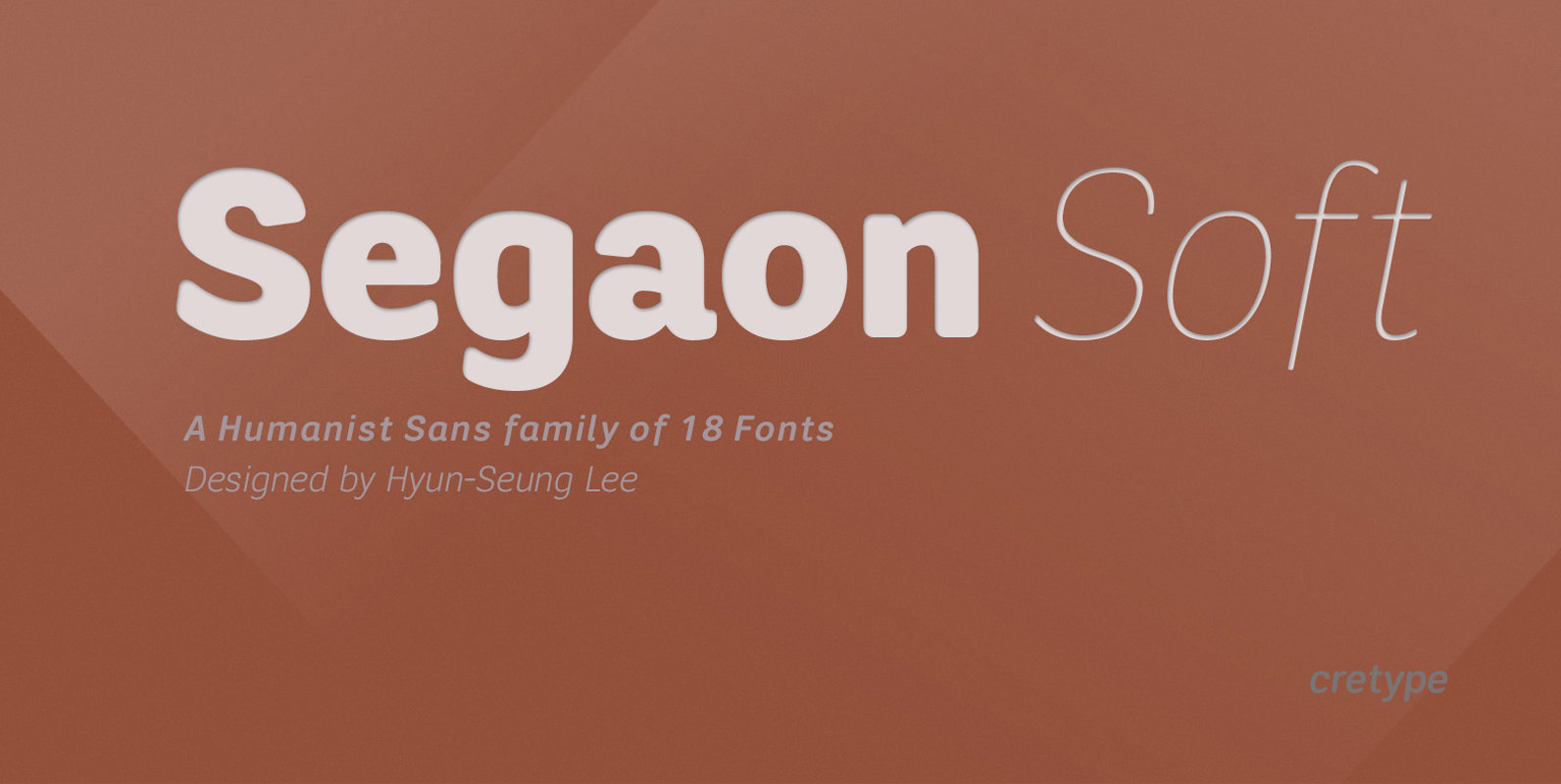
Segaon Soft Font
This family is the rounded version of Segaon family. Segaon Soft Family is a humanist sans-serif typeface that is clean, simple and highly readable. The spaces between individual letter forms are precisely adjusted to create the perfect typesetting. Segaon is
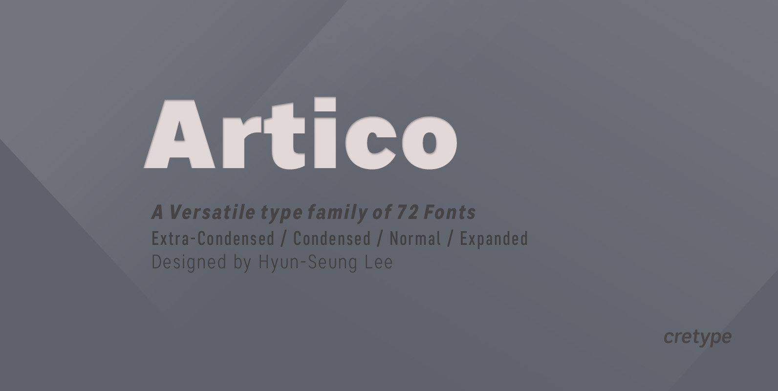
Artico Font
Artico Family is a modern sans-serif typeface that is clean, simple and highly readable. Letters in this type family are designed with genuine neo-grotesque and neutral shapes without any decorative distractions. The spaces between individual letter forms are precisely adjusted
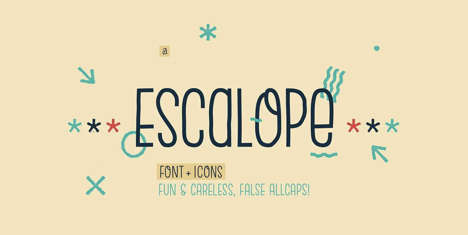
Escalope Font
Escalope is a hand-drawn layered font with a crazy & unique personality: the low midline, the false-All Caps style, all the fun & playful Stylistic Sets will give your projects a new and fresh look! There are many Open-Type features
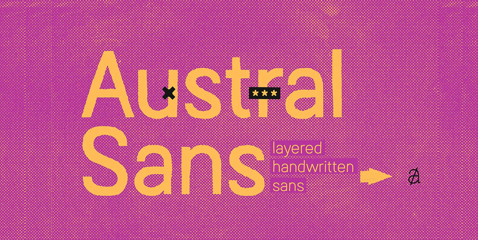
Austral Sans Font
Austral Sans is a hand-drawn layered font designed by Antipixel. Based in the Slab version, it is part of the Austral type family. This sans makes your work unique & noteworthy, because the possibilities of combinations of textures & styles
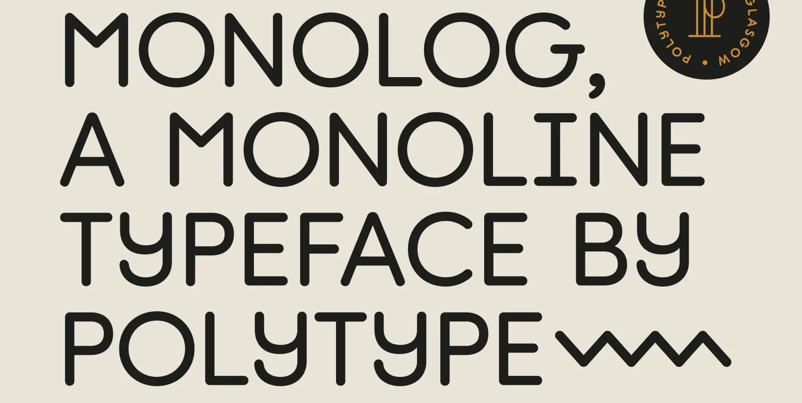
Monolog Font
Monolog is an especially monolinear rounded display typeface, designed to work great alongside monoline illustrations, logos and icons, while still performing well in some text settings. A number of contemporary quirks in its construction establish visual interest, while Monolog’s clean,
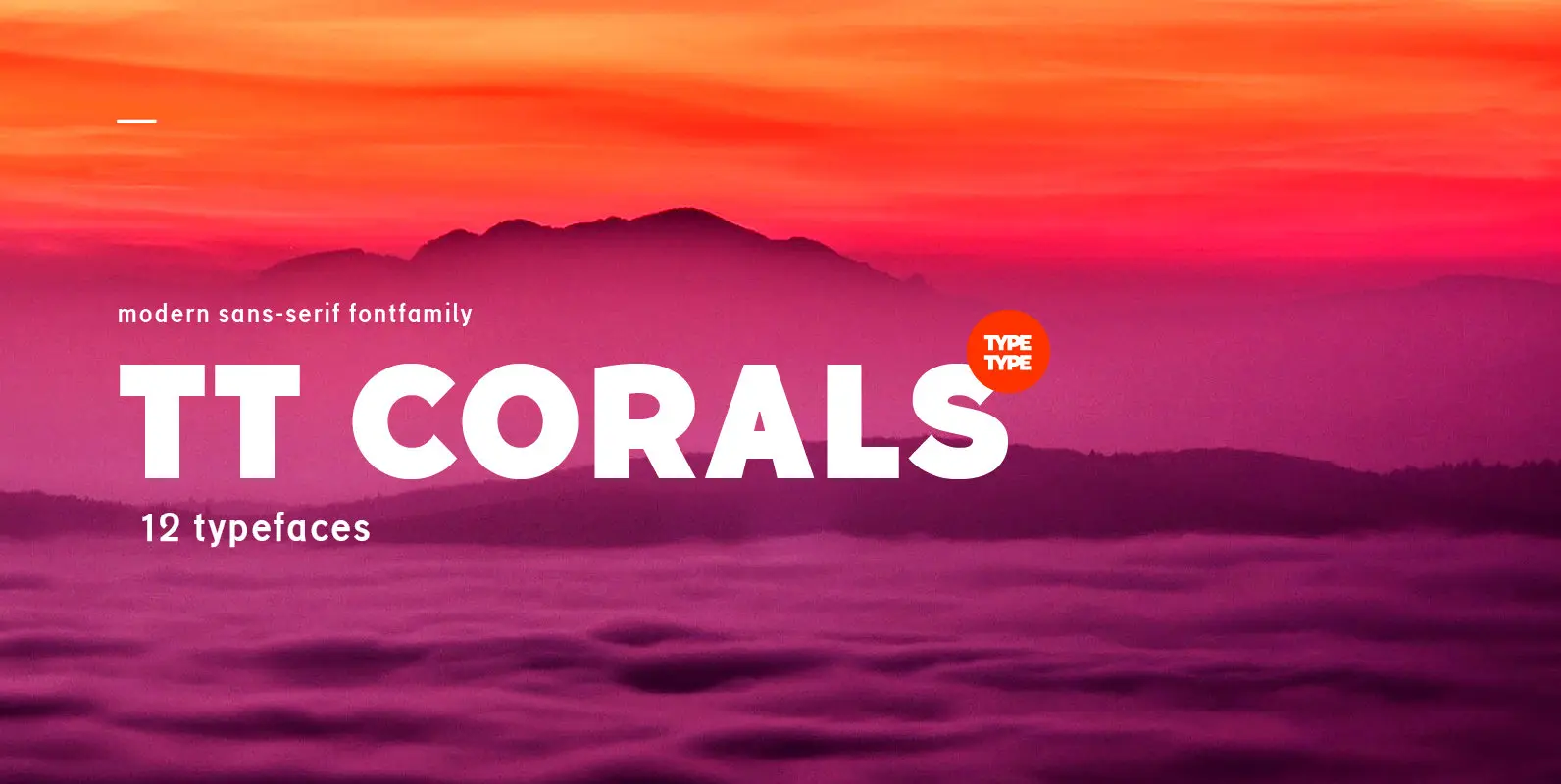
TT Corals Font
TT Corals is a modern humanistic sans-serif which has many typical traits of the beginning of the 20th century. For an increased functionality of the font family we’ve created 6 typefaces of various weights: Thin, Light, Regular, Bold, Extrabold, Black.

TT Supermolot Condensed Font
TT Supermolot Condensed is the narrow version of the TT Supermolot font family. Thanks to its open forms, TT Supermolot Condensed fits perfectly into any contemporary technological design and navigation systems. We've already seen this fontfamily in the sports theme
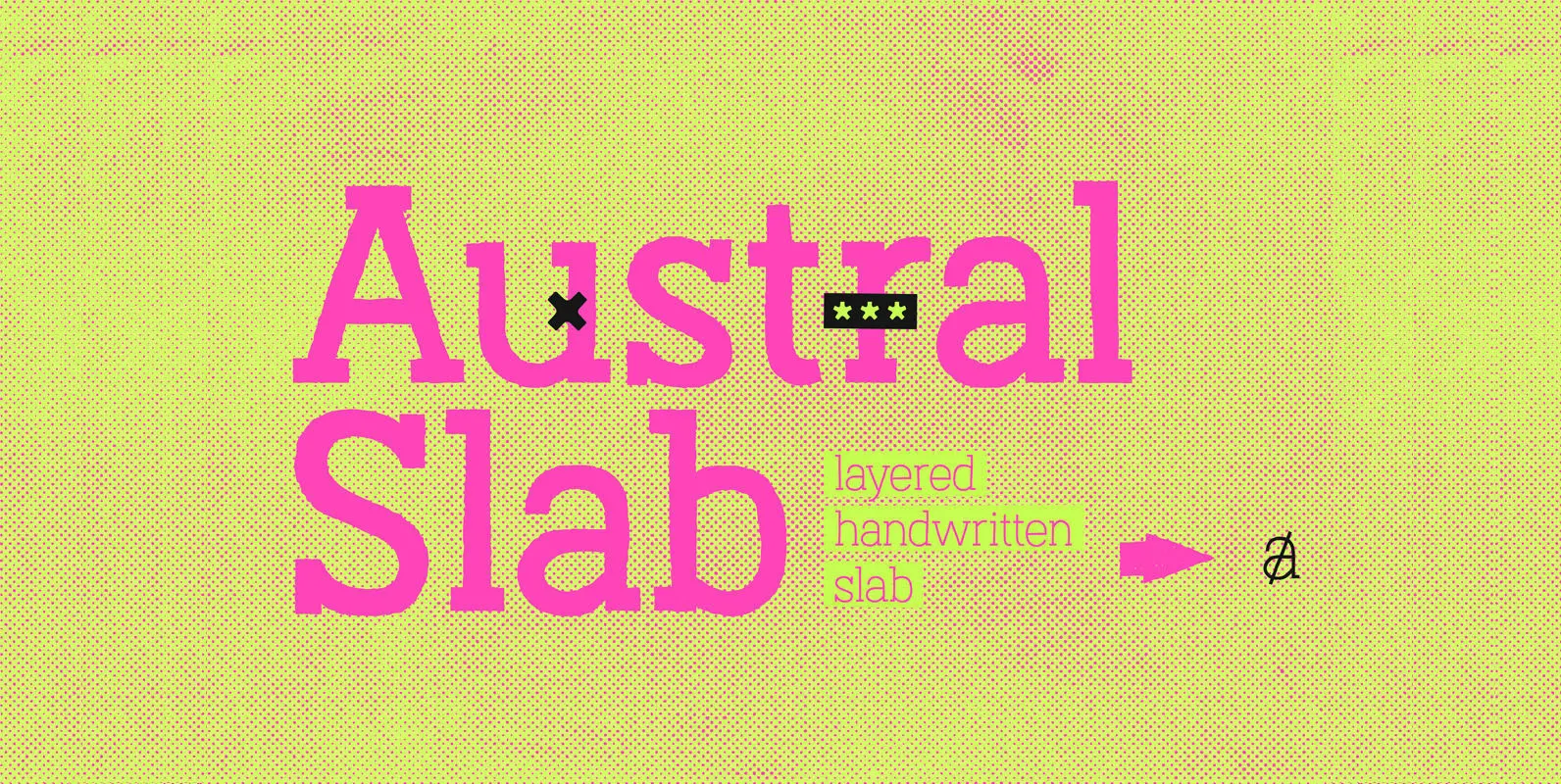
Austral Slab Font
Austral Slab is a hand-drawn layered font designed by Antipixel, with unique textures & styles that combine giving your work a distinctive impression. This font comes in three weights, Regular, Light & Thin, with irregular outlines and uneven/crooked strokes, giving