Tag: sensible
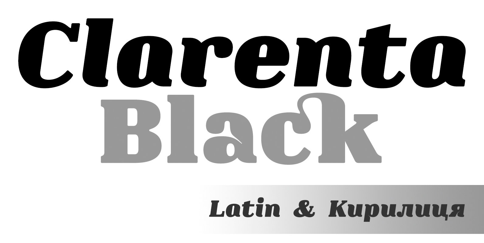
Clarenta 4F Font
Clarenta 4F is a serif font design published by Sergiy Tkachenko Published by Sergiy TkachenkoDownload Clarenta 4F
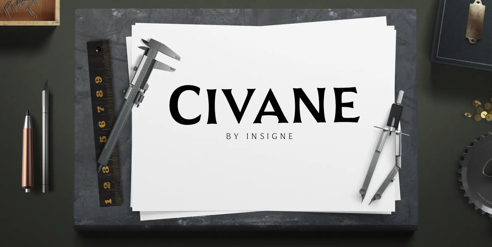
Civane Font
High atop the mountain of fonts, a new structure has been raised–one solid and strong against the challenges of time. Civane is a victorious conqueror among fonts, standing above the clutter and the mundane. Its firm structure joins effortlessly with
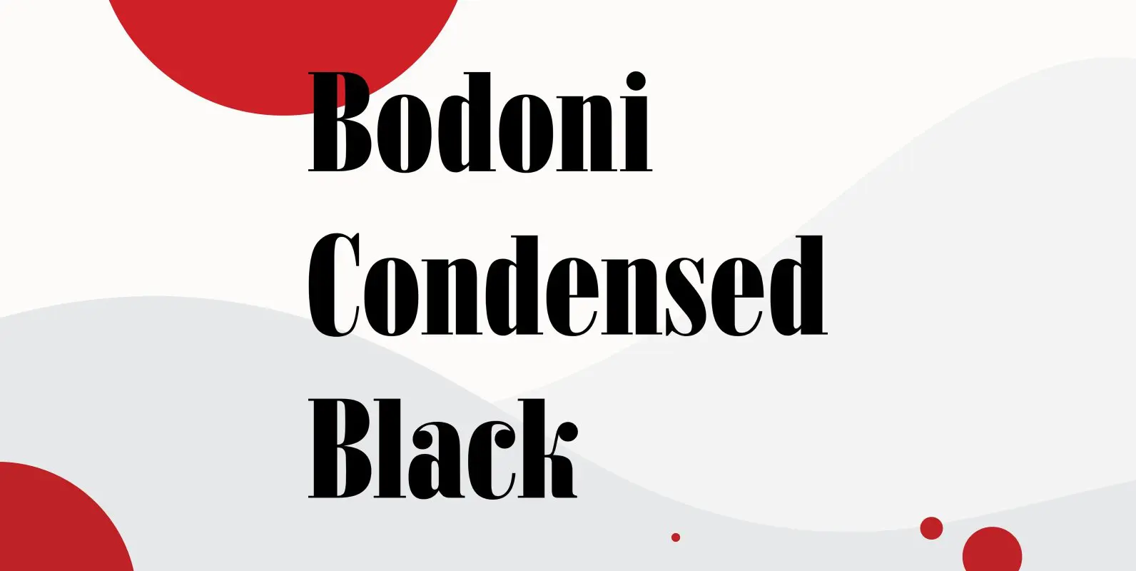
Bodoni Condensed Black Font
Bodoni Condensed Black was designed by R.H. Middleton for Ludlow, circa 1930. Digitally engineered by Steve Jackaman. Published by Red RoosterDownload Bodoni Condensed Black

Stanhope Font
Designed by Les Usherwood. Digitally engineered by Paul Hickson. Les based the design on a turn-of-the-century typeface of the same name. The foundry is believed to be Soldans & Payvers, circa 1904. Published by Red RoosterDownload Stanhope

Dundee Font
Designed by A. Pat Hickson, Dundee is a new design inspired by the various mastheads used in children’s comic books in England, published by D.C. Thompson of Dundee, Scotland. Published by Red RoosterDownload Dundee

Administer Font
Designed by Les Usherwood. Digitally engineered by Steve Jackaman. A few weights were originally released by another foundry; but this complete version of the family is a better match to Les original drawings! Published by Red RoosterDownload Administer

Veronese Font
Designed by Steve Jackaman, Veronese is based on the early original Monotype design, you can definitely see the influence of Italian Old Style, Jenson and Morris Golden Type. Published by Red RoosterDownload Veronese

Silverado Font
Designed by Steve Jackaman, Silverado is based on a classic serif type design called Eldorado. Published by Red RoosterDownload Silverado

Leighton Font
Designed by Paul Hickson, Leighton is a clean serif based on Lectura, a design by Dick Dooijes of the Amsterdam Foundry (1966). Published by Red RoosterDownload Leighton
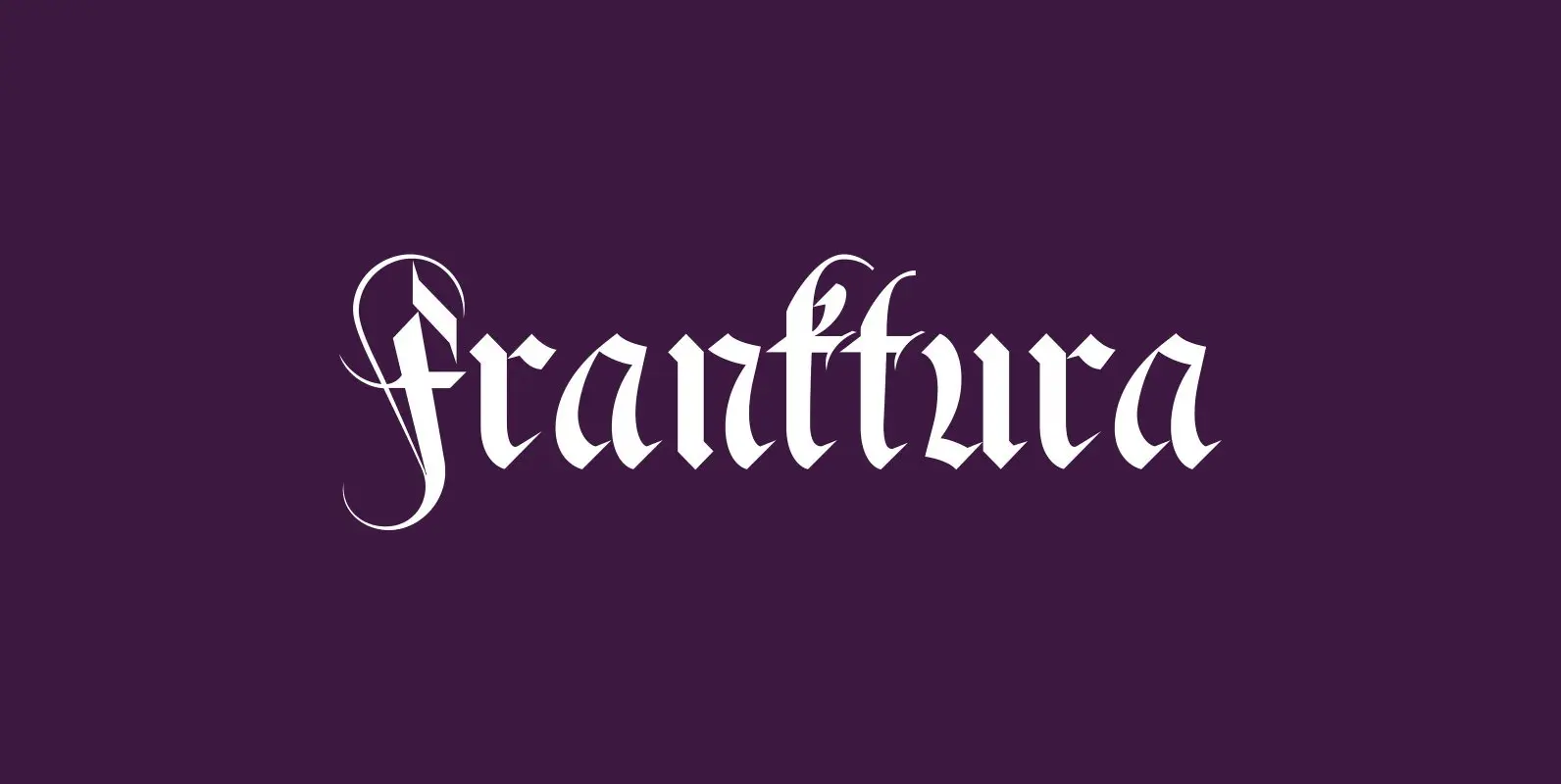
Fraktura Font
“Fraktura” and “Fraktura Plus” is a set of classical Fraktur (Blackletter) in a modern interpretation. The two fonts differ in the amount of embellishments and can and should be mixed. I only sell the pair, but for a fair price.
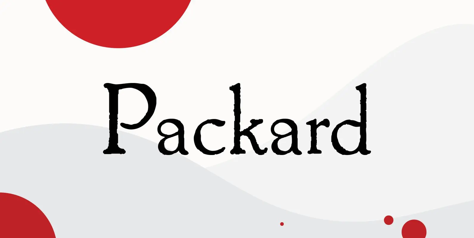
Packard Font
Designed by Steve Jackaman & Ashley Muir. Packard Old Style is based on lettering drawn by Oswald Cooper for the Packard Motor Company (ATF 1913). The bold weight is credited to Morris Fuller Benton (ATF 1916), but it is highly
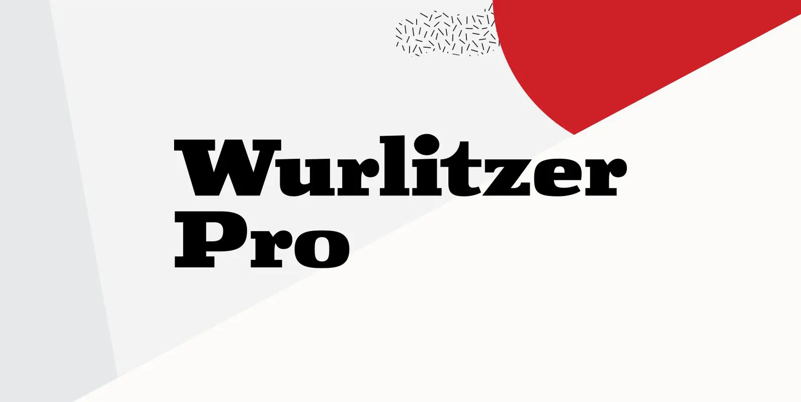
Wurlitzer Pro Font
Designed by Steve Jackaman & Ashley Muir. This design was inspired by an early 20th century woodtype. Wurlitzer contains all the high-end features expected in a quality OpenType Pro font. Published by Red RoosterDownload Wurlitzer Pro
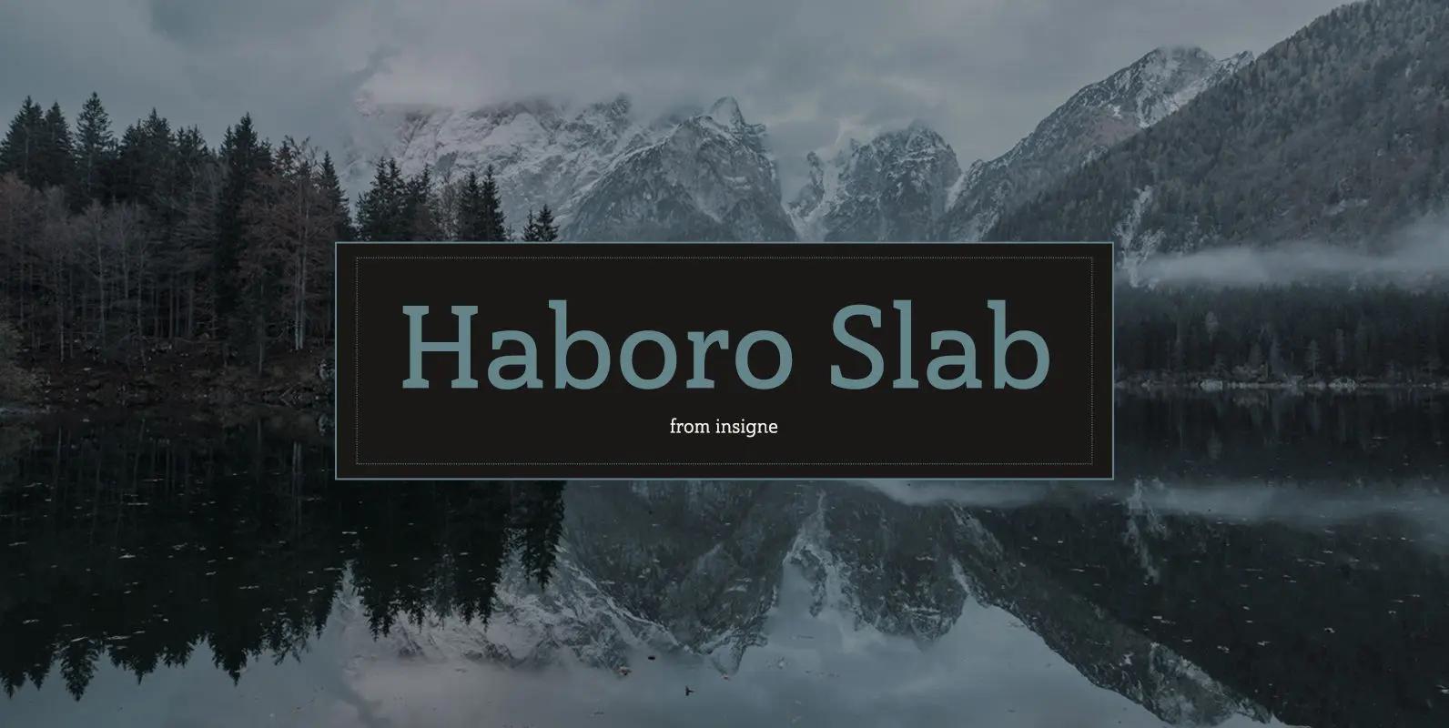
Haboro Slab Font
Haboro Slab. It’s a nose-to-the-grindstone kind of font like the first of its family. This slab serif pushes through the clutter powerfully in editorial and corporate work such as business websites and software. The Haboro hyperfamily as a whole is
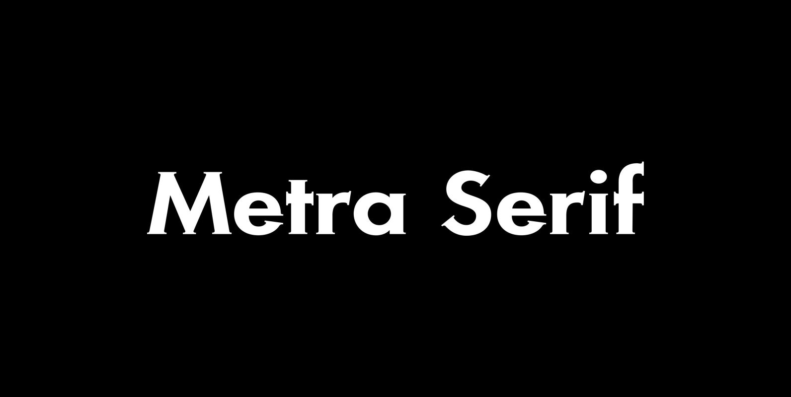
Metra Serif Font
“Metra” has the clarity of a classical Sans font and the charm and elegance of a Gothic Copperplate. I designed it because for some purposes one needs a Serif with that cool “Sans” look. I sell the font in 5
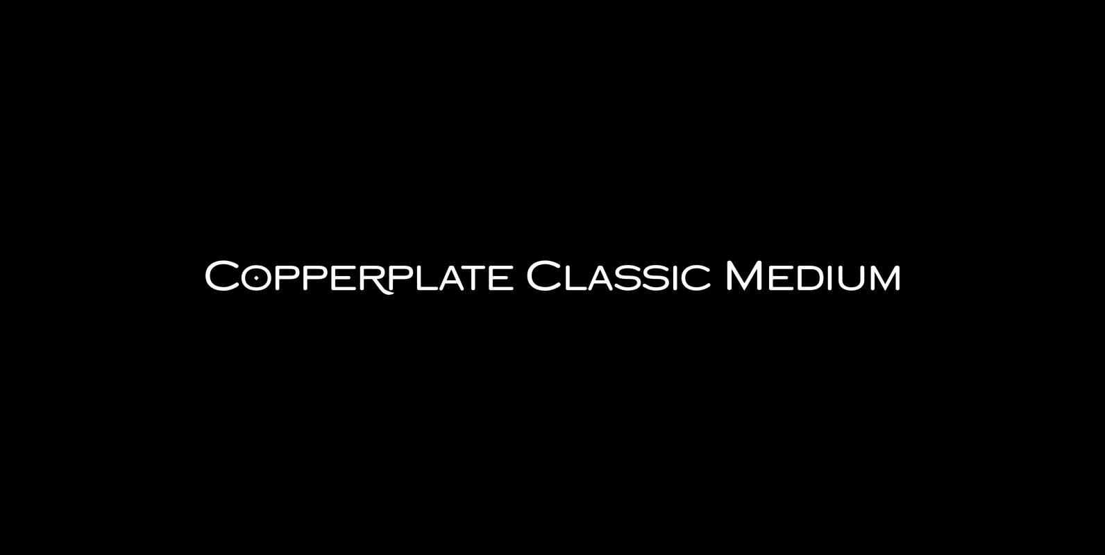
Copperplate Classic Medium Font
“Copperplate” was the classic nineteenth century engravers typeface, consisting of capitals and small caps only. Among others (for example Deberny & Peignot) F. W. Goudy’s cut for ATF around 1901 is probably the most widely known. Copperplate typefaces are traditionally
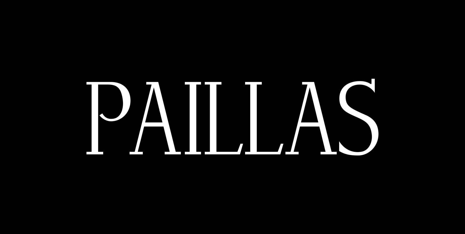
Paillas Font
“Paillas” is a very elegant and unusual Antiqua typeface I have been working on during the last three years. So far I just have the normal and oblique cuts, but eventually I will design a bold version as well. Published
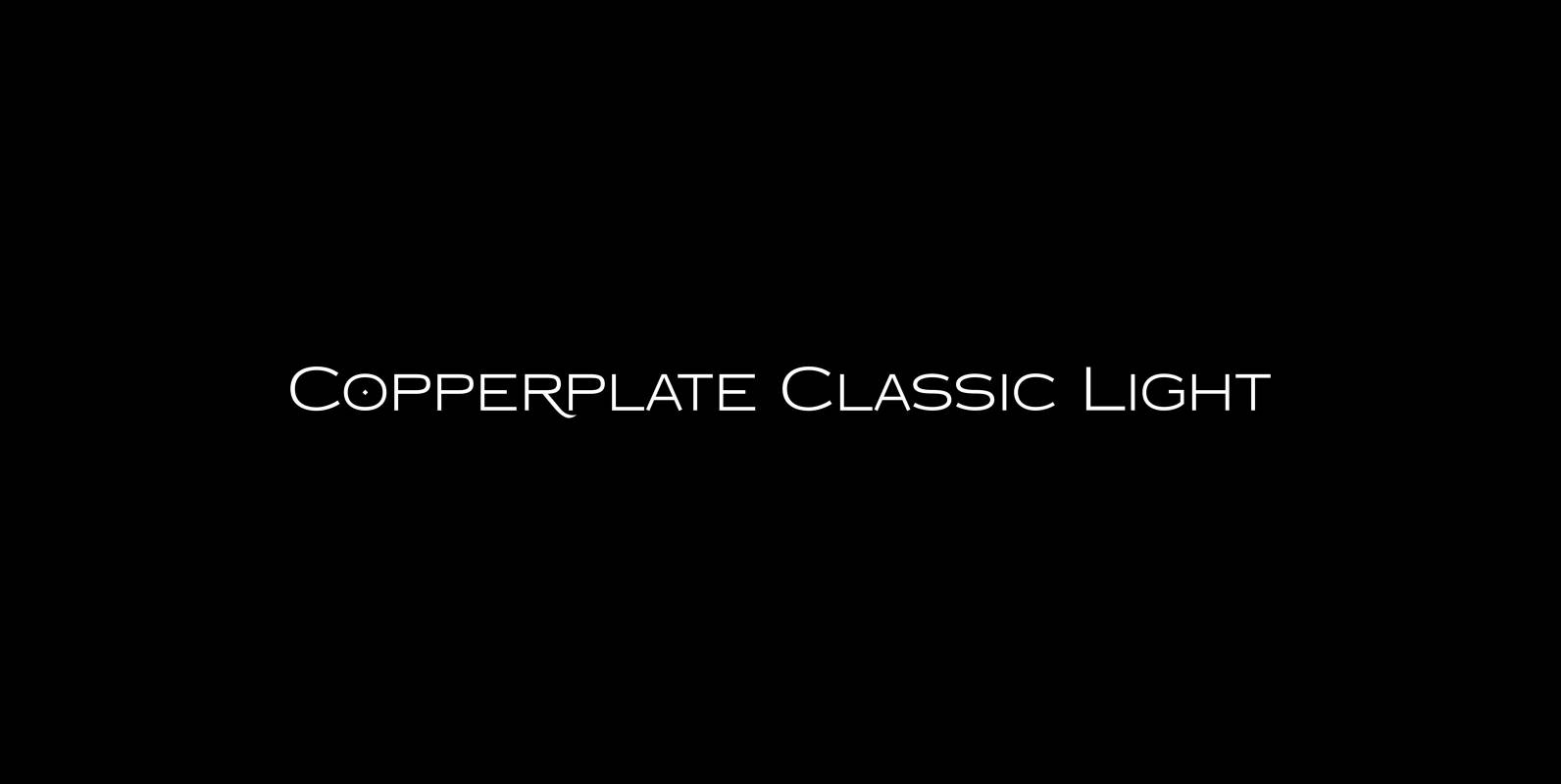
Copperplate Classic Light Font
“Copperplate” was the classic nineteenth century engravers typeface, consisting of capitals and small caps only. Among others (for example Deberny & Peignot) F. W. Goudy’s cut for ATF around 1901 is probably the most widely known. Copperplate typefaces are traditionally