Tag: modernist
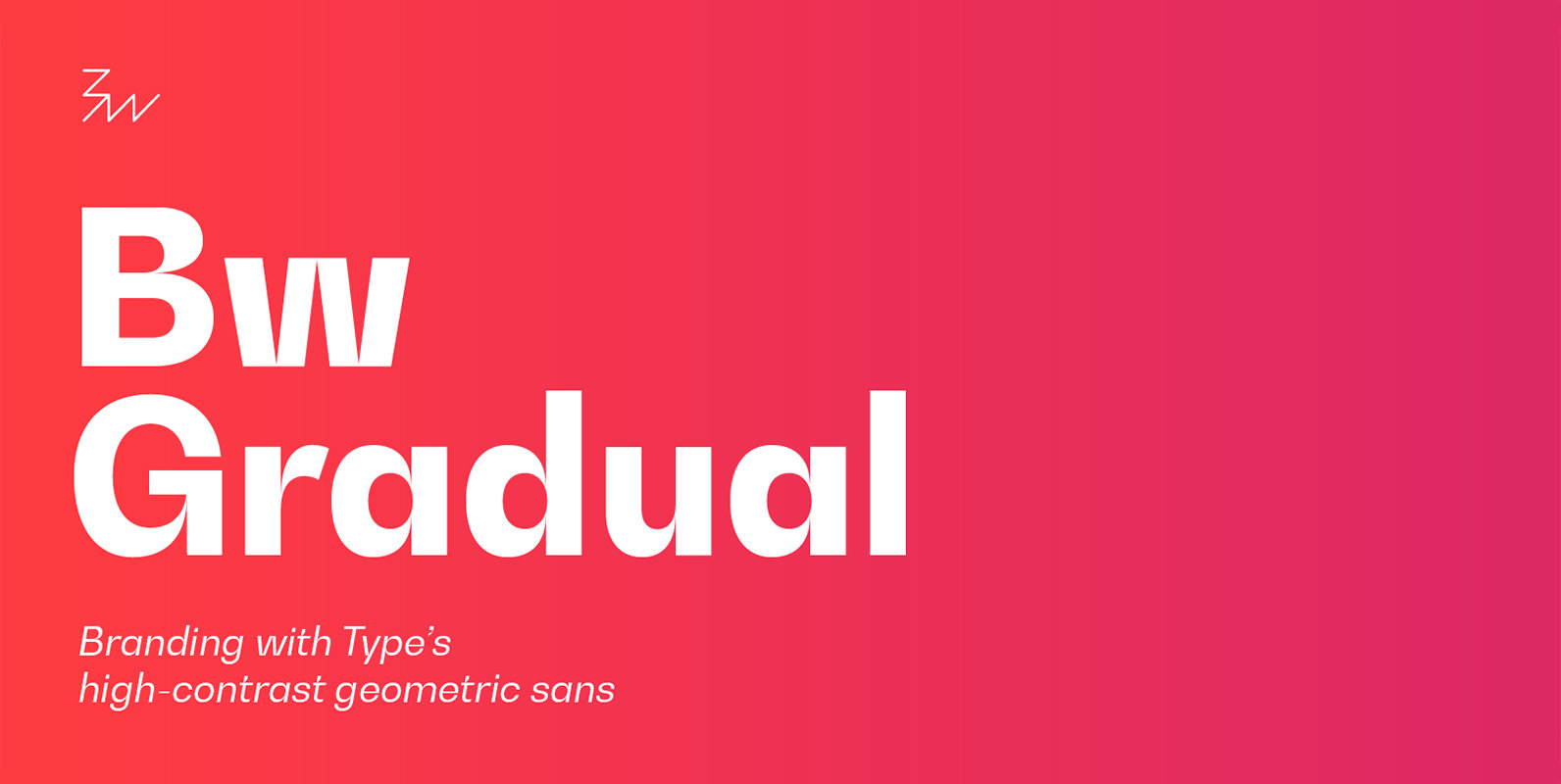
Bw Gradual Font
Bw Gradual brings together the pragmatic feel of the geometric grotesque genre with the visual appeal of its very deep joins. Pure shapes and fast curves coexist on this versatile font family that claims for attention when used large, but
Catorze27 Style 1 Font
Catorze27 is a typeface inspired by northern Portuguese modernist lettering. Wrought iron is a widely used element on Portuguese architecture and, as such, the typeface started after collecting several photographs of modernist iron signage in several cities in the north
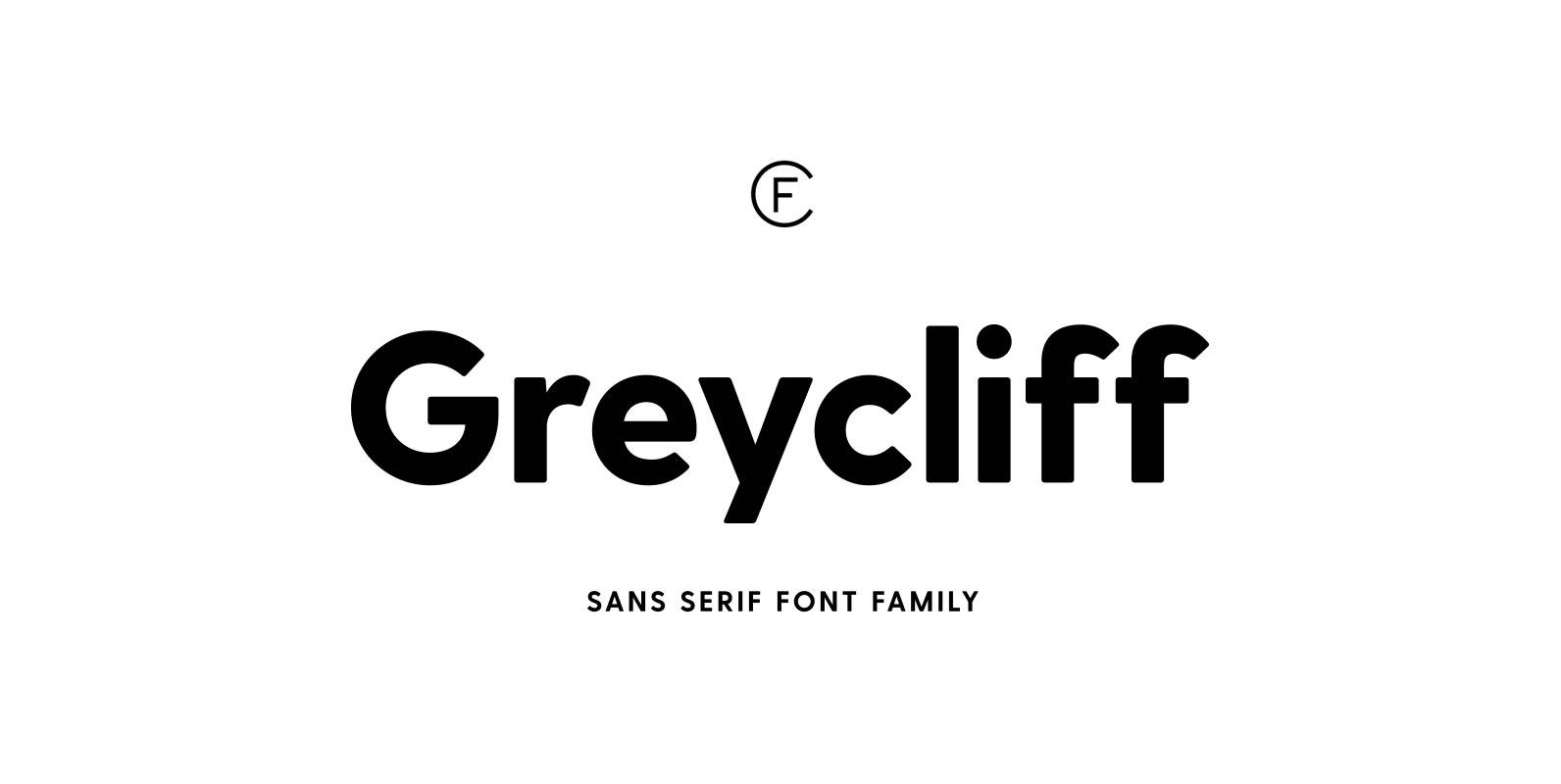
Greycliff CF Font
Rugged, hearty, and warm, Greycliff© CF is a versatile font family. Strong capitals and a smooth, open lowercase are effective in a variety of applications. The geometric, near-monoline construction lends Greycliff a classic durability, tempered by softened edges and vibrant
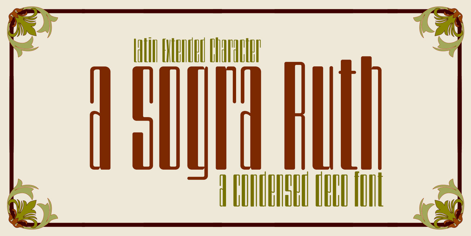
a sogra Ruth Font
Sans-serif style art deco condensed ultra high contrast between antlers and rounded at the corners. Font display to save space on long or advertising pieces which seeks a modernist style titles. The Commercial version includes: OTT & TTF font Latin-Extended
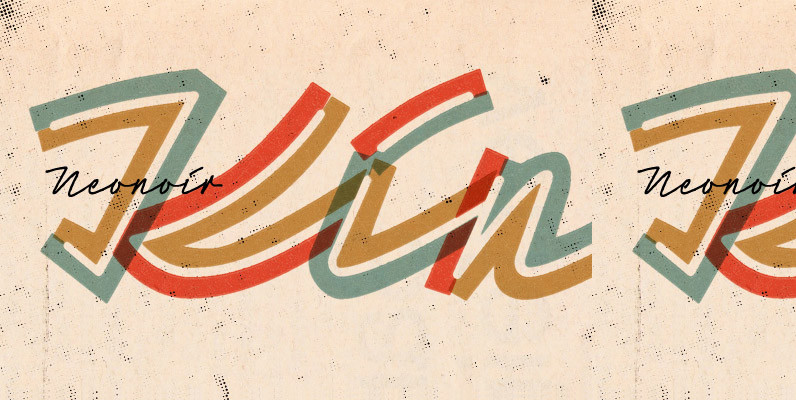
Neonoir Font
Neonoir is a homage to neon lettering craftsmanship of the mid 20th century. All the beautiful futuristic grace of wall-sized bent-glass hand-writing is destilled into a three-weight connected script. Published by phosphoDownload Neonoir
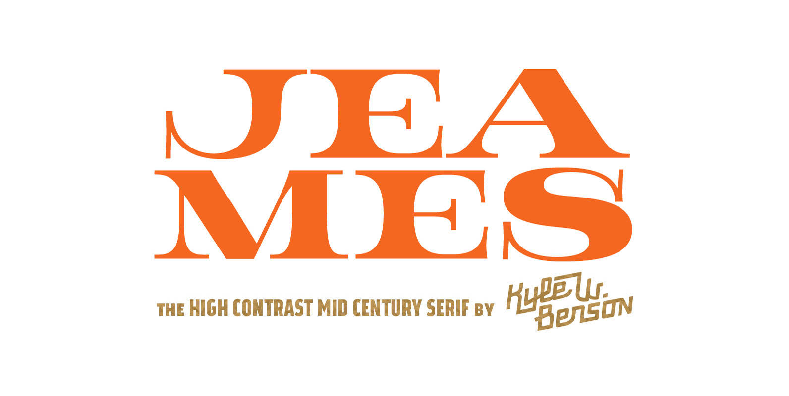
Jeames Font
Jeames brings familiarity to the often detached feeling extended serif genre. The curved, heavy, joints let the letters bounce along while the proportions and contrast keep your eyes grounded. This mid century inspired family of three weights is intended for
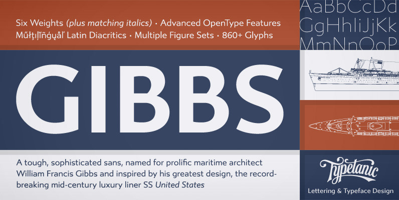
Gibbs Font
Gibbs is a tough, sophisticated sans, named for prolific maritime architect William Francis Gibbs and inspired by his greatest design, the record-breaking mid-century luxury liner SS United States. Taking various cues from the unique cast aluminum signs found on board,

Voyeur Font
Since you like to look, Angel Koziupa and Alejandro Paul bring you Voyeur, an entirely different direction from their usual collaborations. This typeface attracts two opposite design theories by mixing bold and blocky modernism with delicate ornamentals. The unlikely mix
Ealing Font
The Ealing font is a clean, geometric design inspired by the historic modular designs of the 30’s. With a large weight contrast, this font ranges from a refined light cut to a chunky, black style. Published by Michael ParsonDownload Ealing
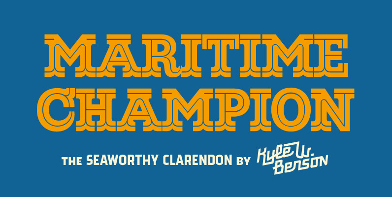
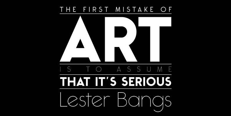
Maritime Champion Font
Make no mistake, Maritime Champion is not simply seaworthy. This peacoat grubbing, all hands on decking, accordion serenading font is not for the faint of heart. He’s all caps all the time. Even the lightest of his six weights is
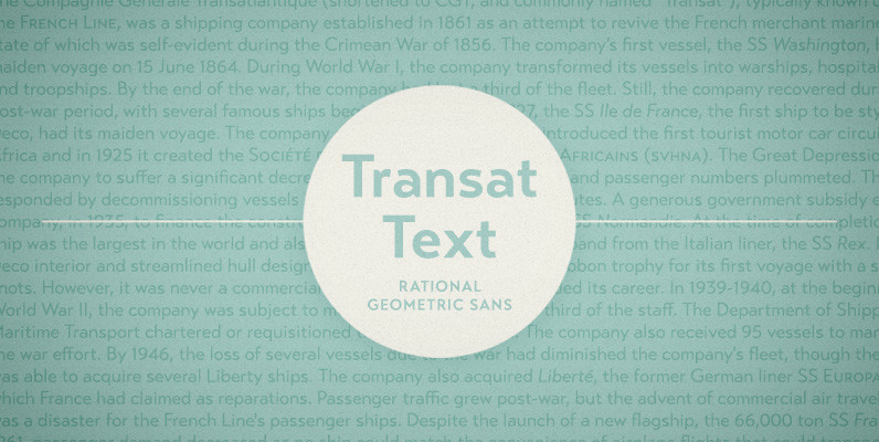
Transat Text Font
Transat Text is a geometric sans serif typeface, and is the more rational sibling to the unabashedly Art Deco “Transat”. Transat Text has a slightly taller x-height than its counterpart, making it easier to read at small sizes, but also
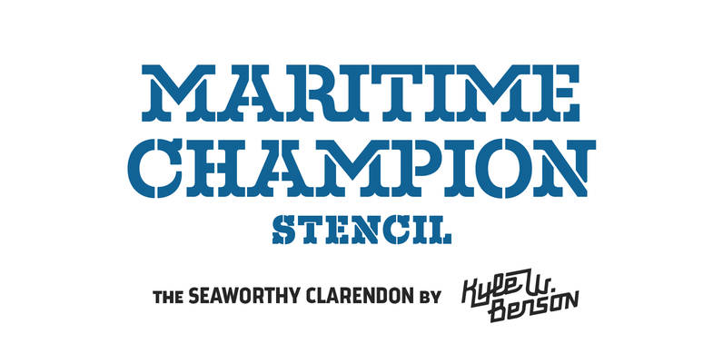
Maritime Champion Stencil Font
Make no mistake, Maritime Champion is not simply seaworthy. This peacoat grubbing, all hands on decking, accordion serenading font is not for the faint of heart. He’s all caps all the time. Even the lightest of his six weights is
Ticketbook Font
Univers and Helvetica Compressed are most often used for movie posters, but they lack variants. Therefore, the Suomi Type Foundry made a compressed family with seven weights for more versatility. Published by Suomi Type FoundryDownload Ticketbook
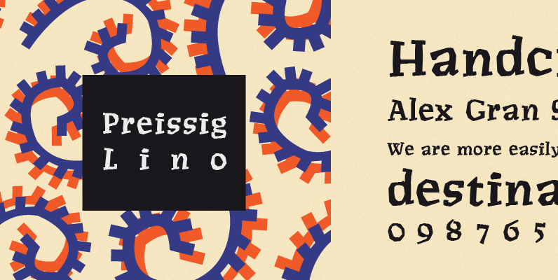
P22 Preissig Lino Font
Type designs of Vojtech Preissig show a great affinity for hand-craftmship and a distinct attempt to avoid appearing too clean. Legend has it Pressig hand cut fonts in linoleum, which served as the basis for this font, dating about 1912.
Heldustry Font
Designed in 1978 by Phil Martin, Heldustry is a clean, modern and great type design for corporate and or minimal type layouts. Published by URW Type Foundry GmbHDownload Heldustry
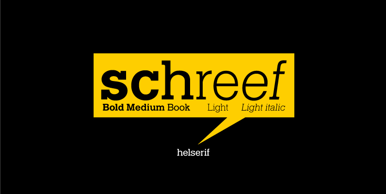
Helserif Font
Designed in 1978 by Phil Martin, Helserif is a clean, modern and great slab design that works as a viable solution for numerous design projects. Published by URW Type Foundry GmbHDownload Helserif

Tide Sans Condensed Font
Tide Sans Condensed is fresh, carefree, and just as good looking as its extended brother, Tide Sans. The Tide Sans family includes beautiful italics and an overall affable look lost somewhere between a humanist and a neo grotesque. Tide Sans
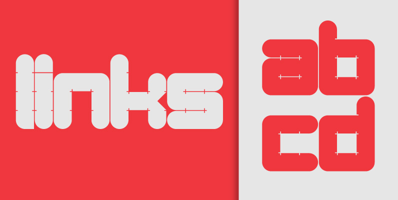
Links Font
Links was built adhering to a strict grid of ‘linked’ squares; and comes with special “Grid Glyphs” that line up perfectly with all characters. These grid Glyphs can be used to create an invisible grid for your layout or as