Tag: hairline
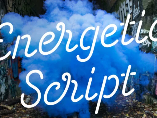
Energetic Script Font
Energetic Script is a script font design published by Sjoerd Kulsdom Published by Sjoerd KulsdomDownload Energetic Script
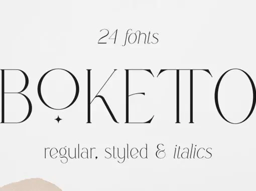
Boketto Font
Boketto is a serif font design published by Vladimir Fedotov Published by Vladimir FedotovDownload Boketto
Point Soft Font
Point Soft is more than the rounded edges version of Point, it is a reinterpretation of what a geometric soft font should look like. Clean, simple, and above all: huggable. Point Soft conveys that warm and soft feeling. With 20
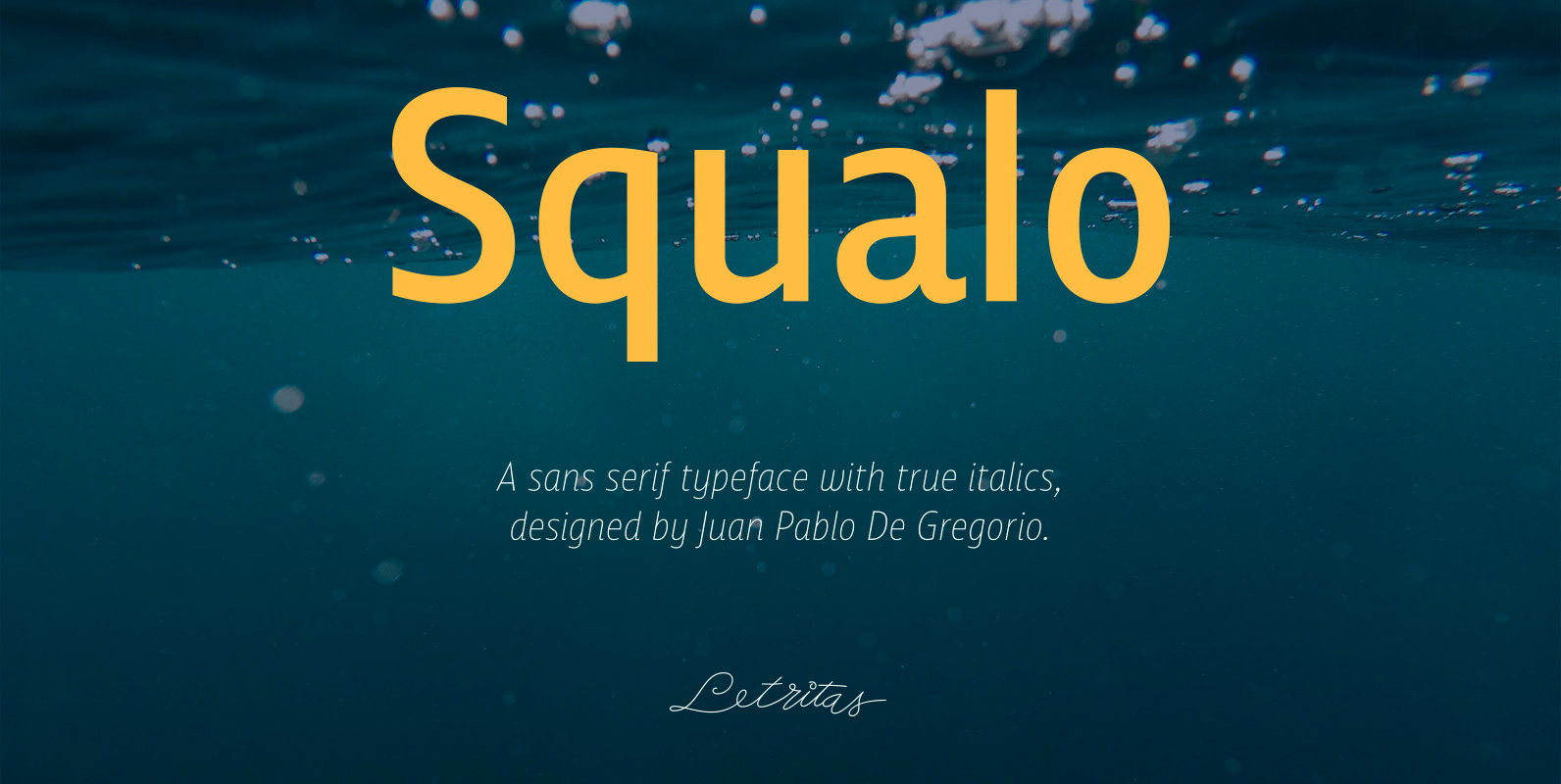
Squalo Font
Squalo, the genesis The idea of this new project called Squalo bumped into my mind when when I was working up with excitement to my sketches, chasing for a strong typographical character, that for me has to be crystallized in
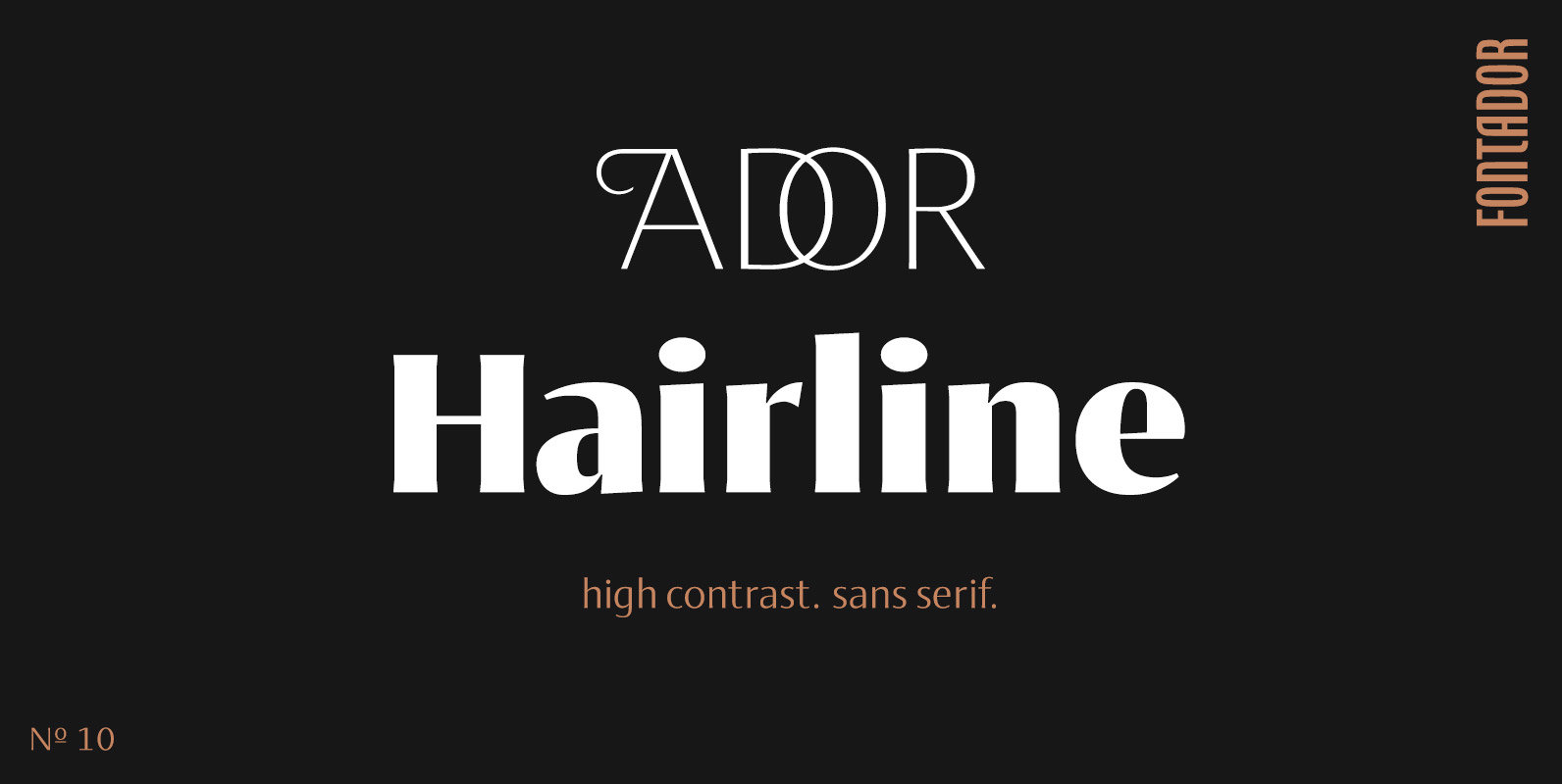
Ador Hairline Font
Ador Hairline is the high contrast version of Ador. A humanist sans serif that falls in the “evil serif” genre, especially designed for contemporary typography and comes up with 7 weights from extralight to black plus true italics and 293
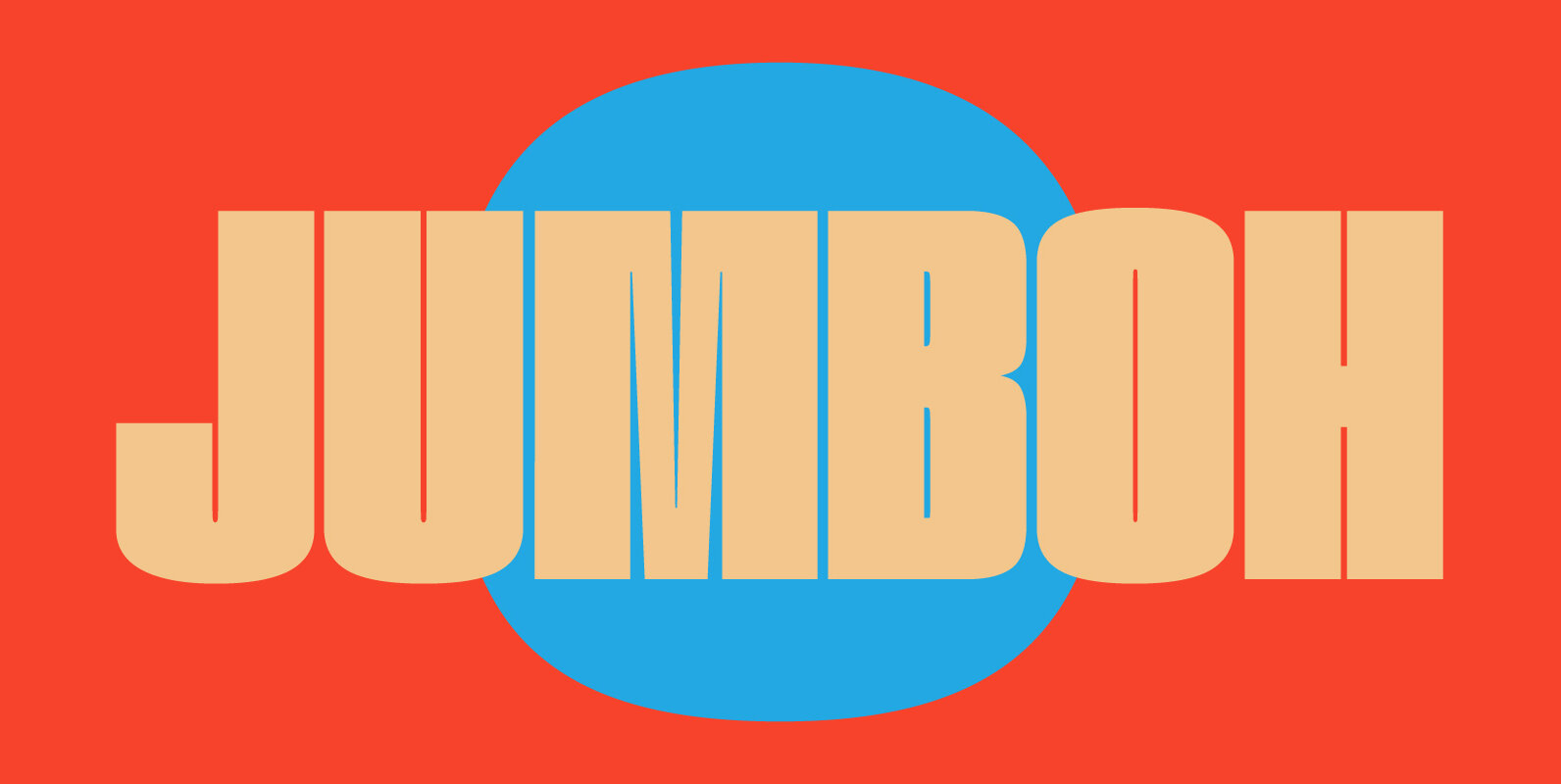
Jumboh Font
If you're aiming to save horizontal space, look no further! Jumbo is extra condensed across a variety of weights, making sure that your UPPERCASE or lowercase text will stand out. Published by Tyler Finck Download Jumboh
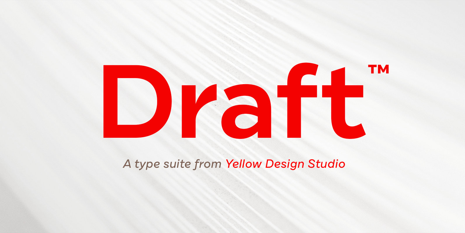
Draft Font
Draft from Yellow Design Studio is a 144-font powerhouse type suite that’s smooth and confident with a decidedly modern edge. It features nine weights (Hairline to Black) and eight widths (A to H) for ultimate flexibility and fine-grain control. With
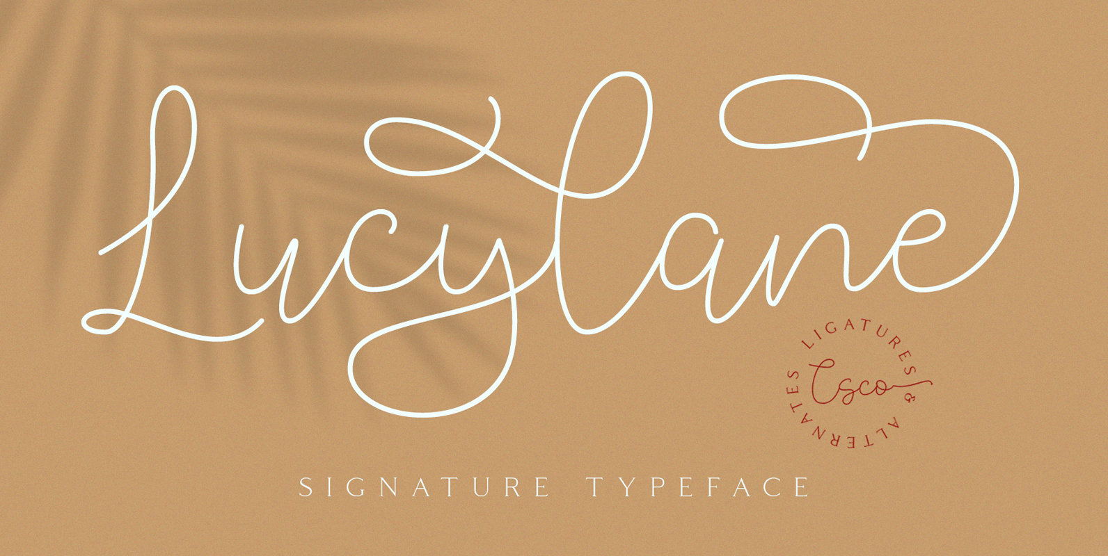
Lucylane – Signature Typeface Font
Lucylane – Signature Typeface is a free-flowing monoline, the two style typeface exploits the common letter-to-letter transitions of the typical cursive hand by utilizing two style points controlled within the machinations of OpenType Contextual Alternates. It can be used to
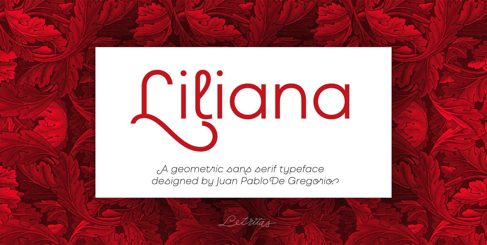
Liliana Font
Liliana is a geometrical typeface, born throughout comprehensive formal studies while testing new ways of displaying certain words and sentences. The essential structure of Liliana is very conservative: It can look similar to other geometrical typographies, however, it has unique features
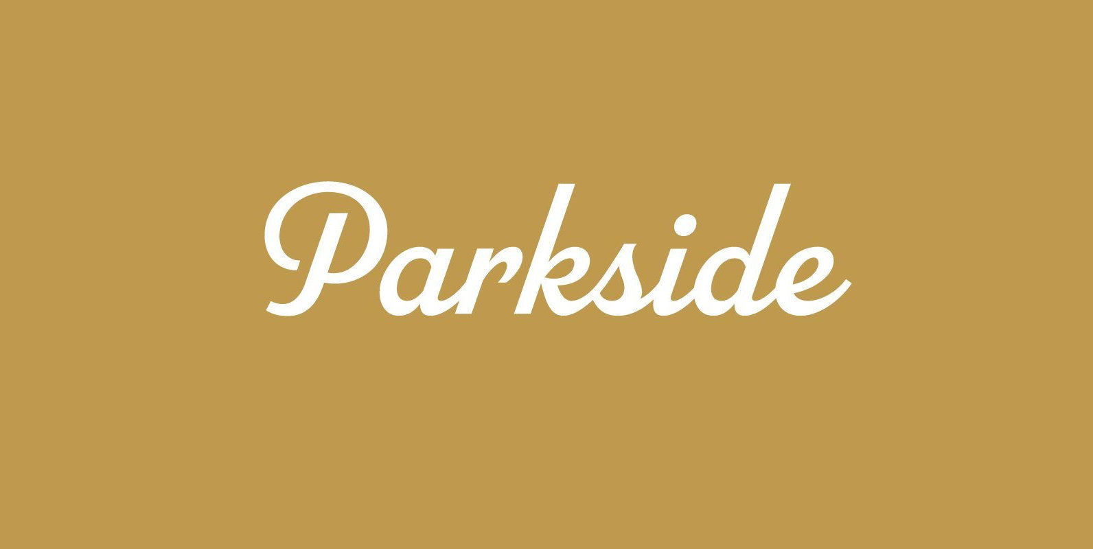
Parkside Font
Parkside (2018) is a script typeface inspired by typefaces and lettering of the 1930s and 1940s. Unlike metal typefaces from that era, it takes advantage of modern digital typography, where letter may overlap and automatically change shape to better flow
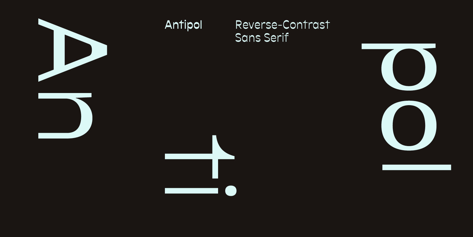
Antipol Font
Antipol is a Sans Serif design that reverses the conventions of a regular Latin Sans Serif. With a weight emphasis on the horizontals and its vertical terminals Antipol radiates a 1970s charisma known from the like of Antique Olive. Its
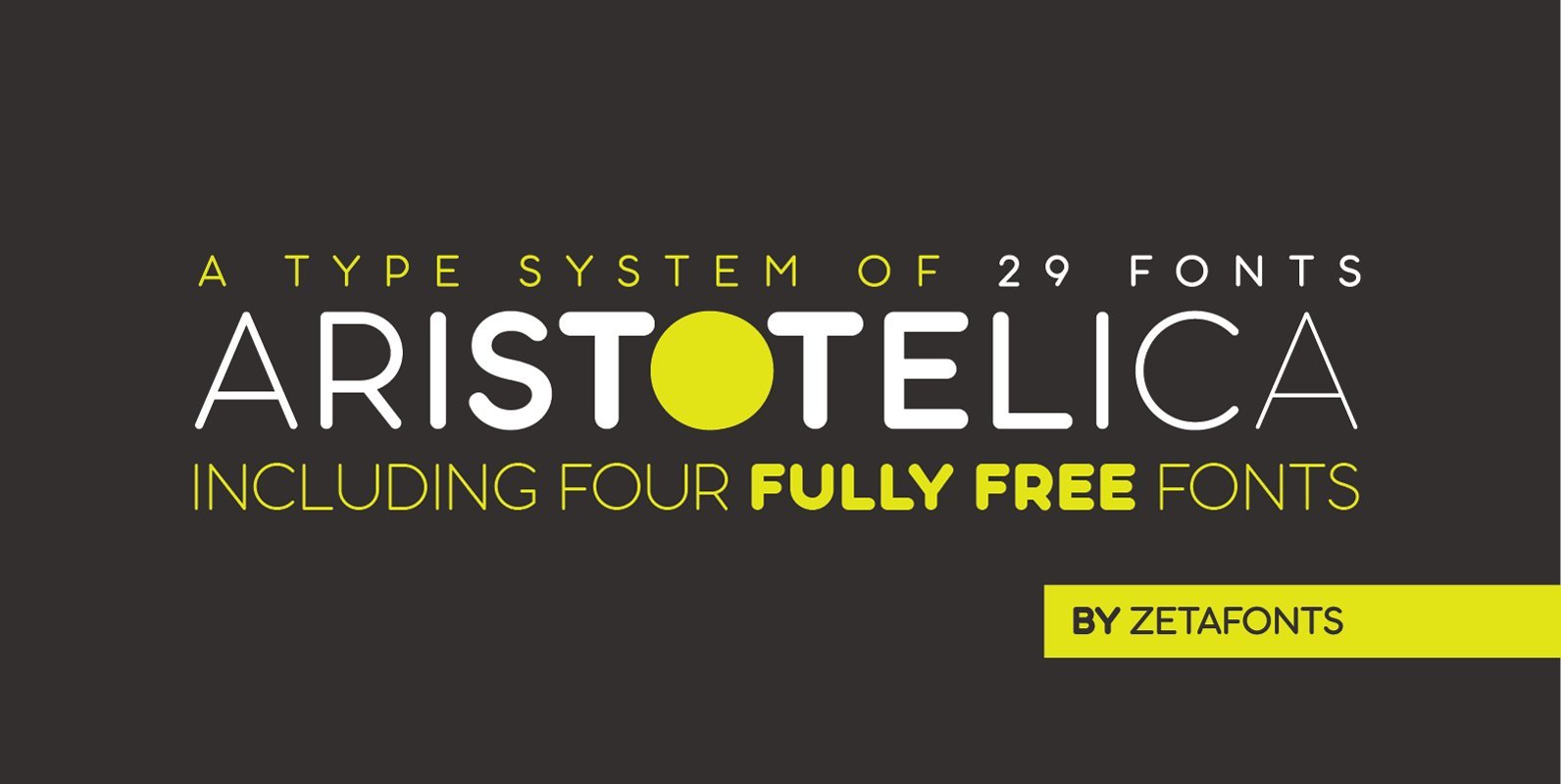
Aristotelica Font
Aristotelica is a sans serif rounded geometric type family. This font shows its strengths mostly in display uses and logo design. A text variant, Aristotelica Text, has been developed for 7 out of the 8 display weights, applying slight corrections
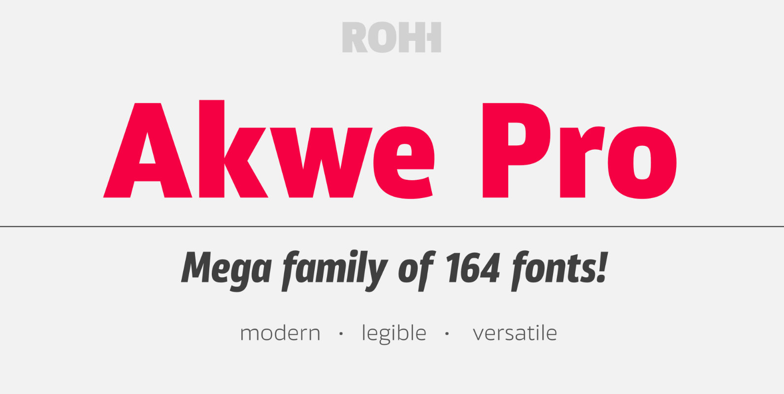
Akwe Pro Font
Akwe Pro is a professional, ultra versatile sans serif typeface characterized by excellent legibility and modern design perfect for all design purposes. It is designed for use in long and short paragraphs of text, headlines and user interfaces. Its distinctive
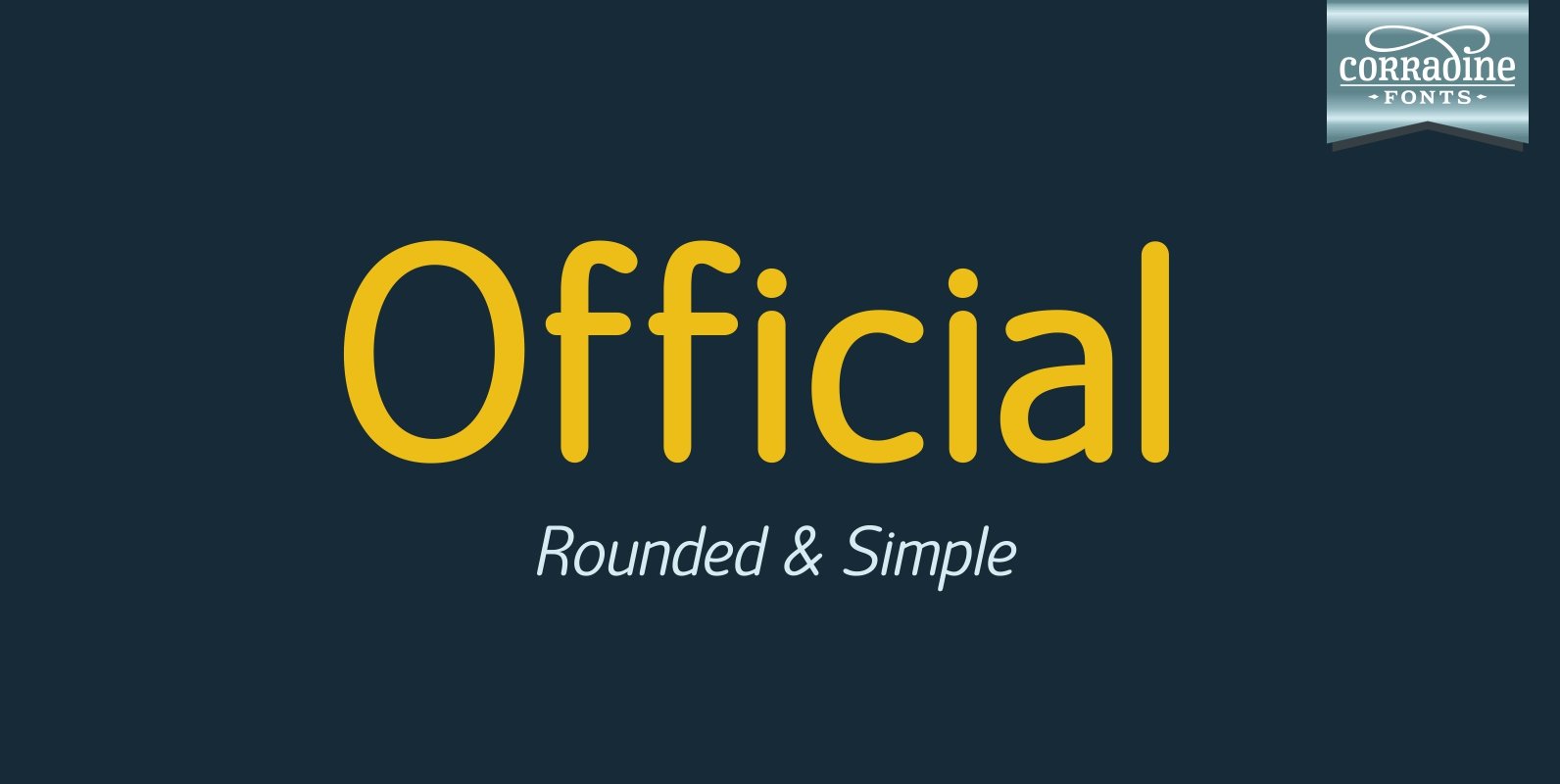
Official Font
Official is a very clear and legible font family of 14 fonts. Its simplicity makes Official an ideal style to use in any project you could imagine. Published by Corradine FontsDownload Official
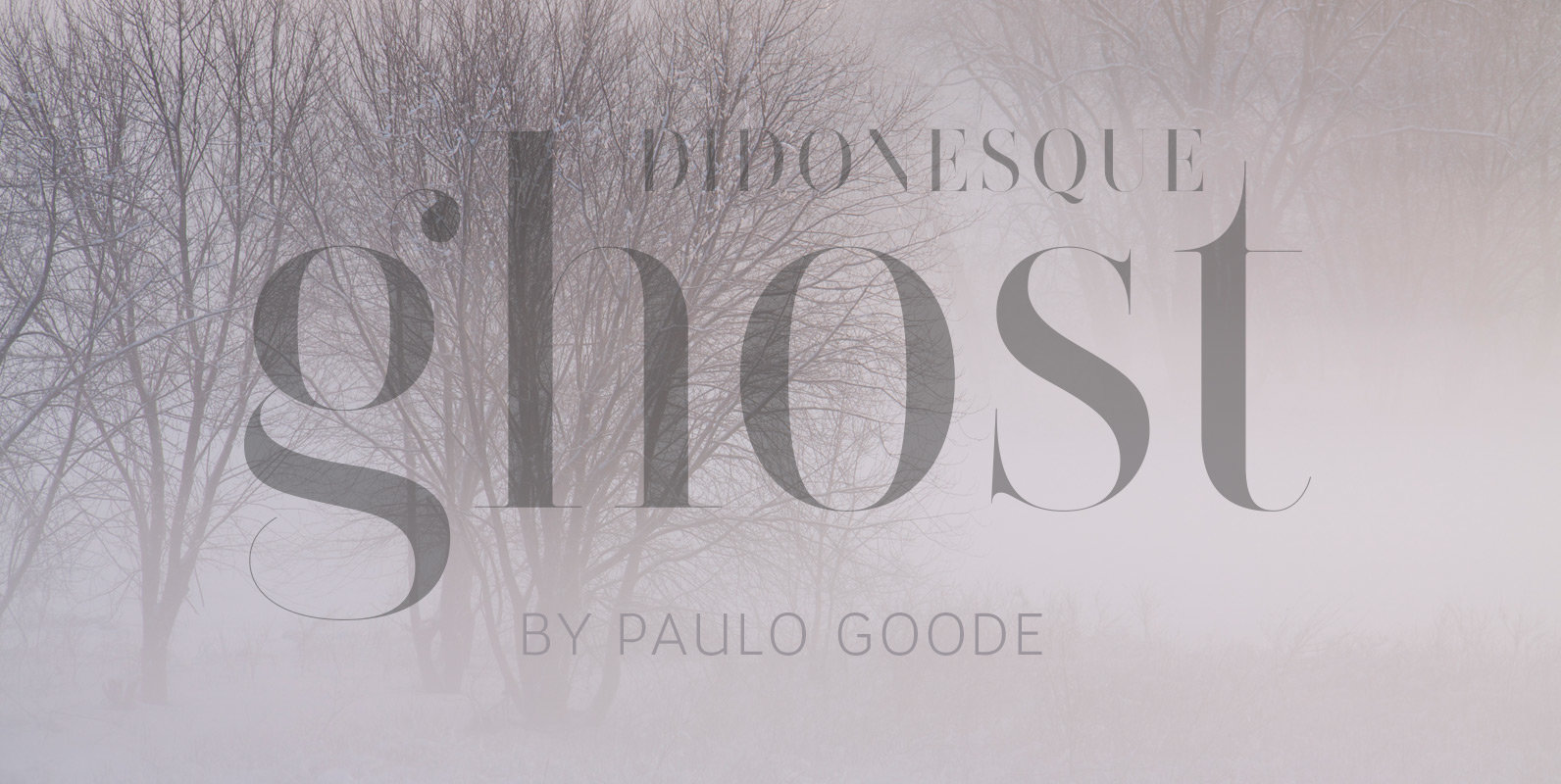
Didonesque Ghost Font
The extreme contrast in Didonesque Ghost makes for a highly fashionable style that is sure to capture attention whenever it is used. This family of 10 fonts will enhance any project that requires a touch of class. These fonts turn
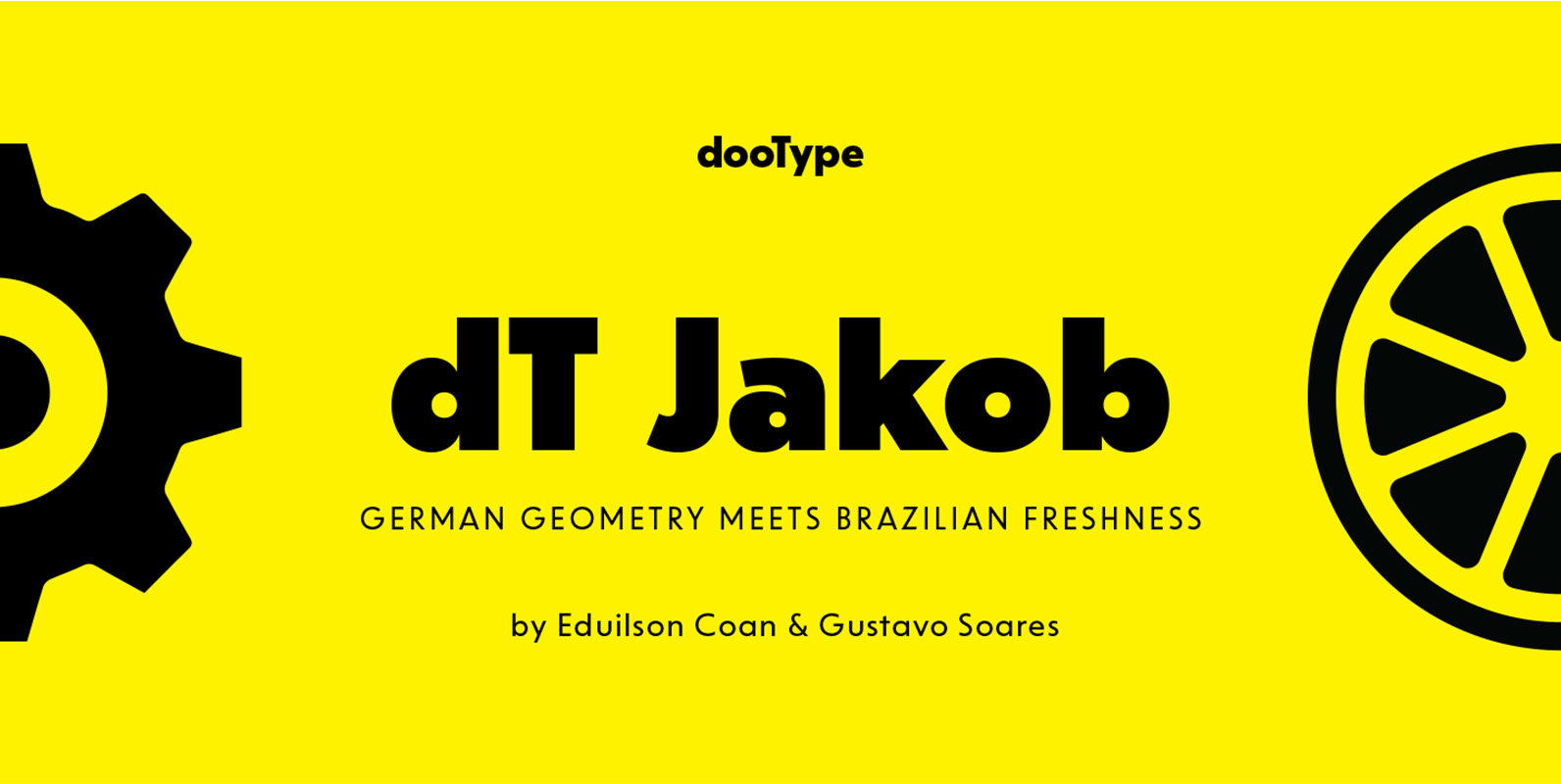
dT Jakob Font
dT Jakob started as a revival by Gustavo Soares for Paul van der Laan’s class at the Type and Media Masters, in The Hague, NL – back in 2007. There are quite a few excellent geometric sans typefaces available, but
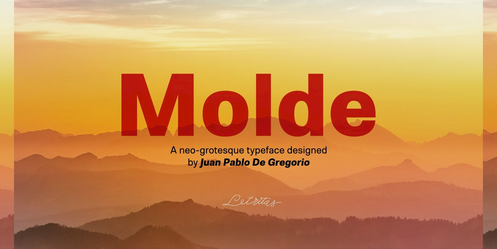
Molde Font
Molde is a super sans serif font family, belonging to the neo-grotesque style. Formally, Molde was inspired by the extreme sobriety of famous post-Bauhaus Swiss Movement of the mid-twentieth Century. The masters of this style are famous for eliminating all
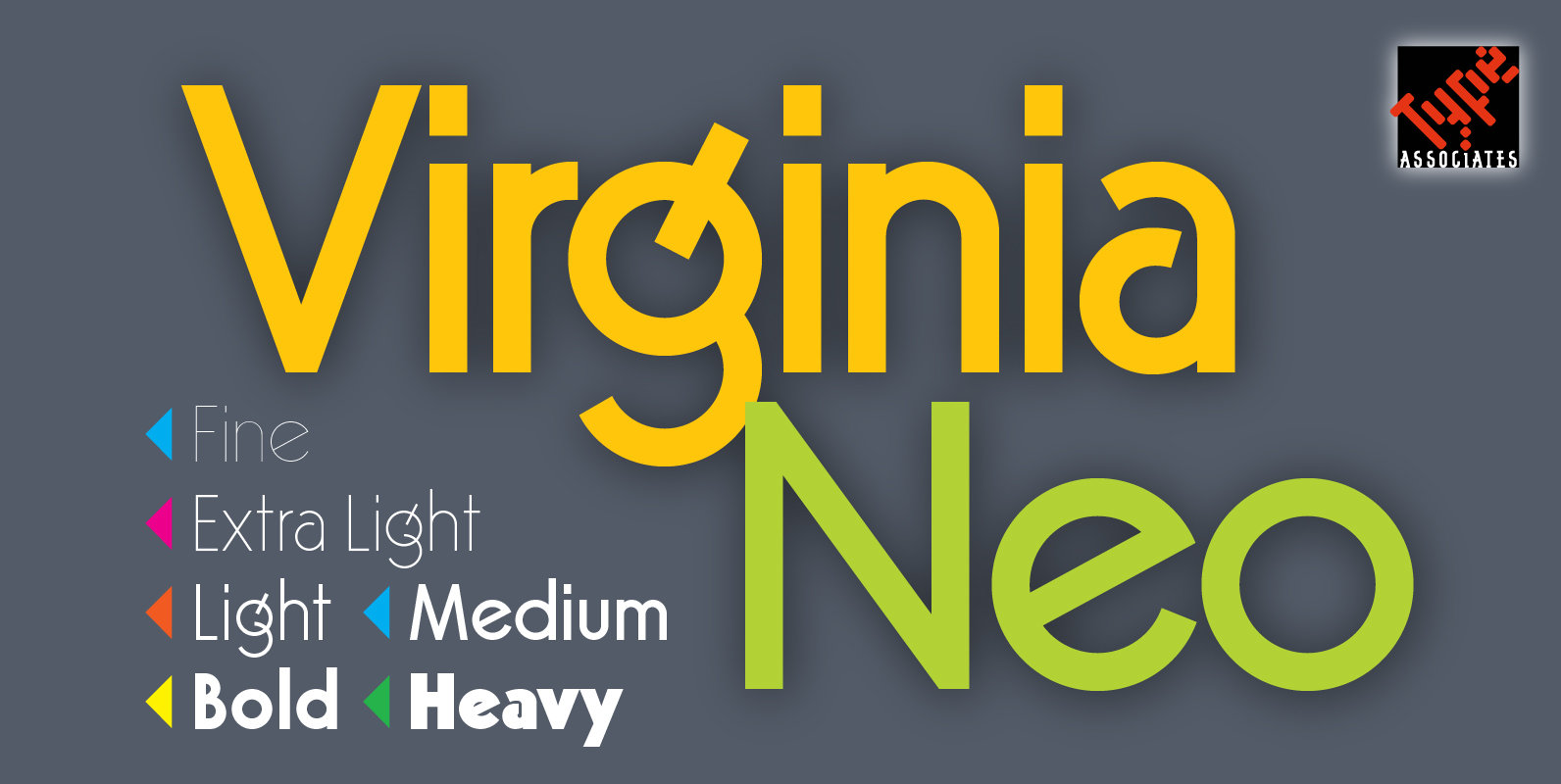
Virginia Neo Font
Virginia Neo is a completely redrawn version based on the original 1970 design, which won its designer first place ahead of 5,000 other submissions to the Lettergraphics International Typeface Design Competition that year. The original typeface family comprised 5 weights,