Tag: didone
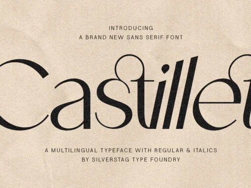
Castillet Typeface: Harmonizing Tradition and Modernity in Digital Design
For those with a discerning eye, deeply engrossed in the realm of digital and graphic design, the vision is one of harmony. For years, there exists a longing for Castillet, a typeface that flawlessly combines the timeless elegance of classic
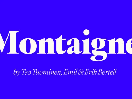
Exploring Timelessness in Typography: An Ode to Montaigne Fonts Sophistication
Immerse yourself in the vista of timelessness and sophistication in digital design and typography with the Montaigne Font. As a graphic or digital designer, there’s nothing more rewarding than stumbling upon a font that effortlessly encapsulates the rich tapestry of
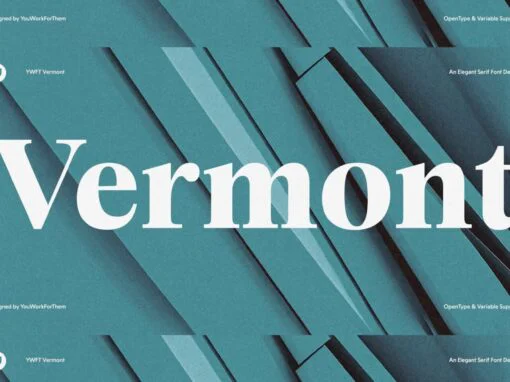
Revitalizing Historical Elegance: An Exploration of the YWFT Vermont Typeface
Amongst the plethora of digital fonts emerging in the world of graphic design and digital design, one serif typeface stands out for marrying the historical charm of American typography with modern design sophistication: YWFT Vermont. This exclusive font breathes new
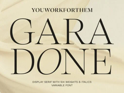
YWFT Garadone: A Harmonious Bridge from Typographic Tradition to Digital Diversity
As our world delves deeper into the digital age, the manifestation of typography transforms right along with it. It is within this context that we introduce the YWFT Garadone, an extraordinary digital typeface, intrinsically harmonizing the timelessness of Garamond with
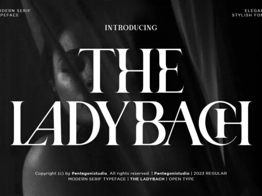
The Ladybach Font
The Ladybach is a serif font design published by Pentagonistudio Published by PentagonistudioDownload The Ladybach
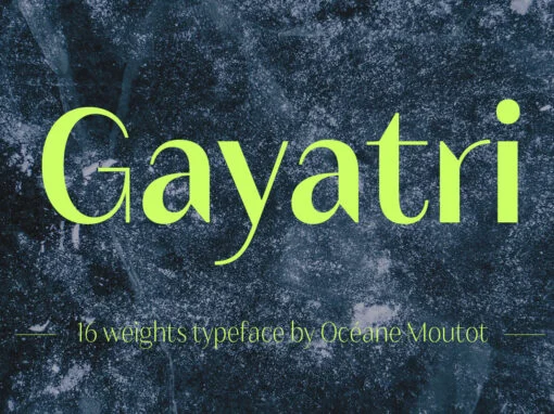
Gayatri Font
Gayatri is a sans serif font design published by Oceane Moutot Published by Océane MoutotDownload Gayatri
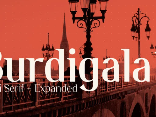
Burdigala Font
The Burdigala essentials pack consist of extra light, regular and bold styles, both in the standard and the expanded version, plus italics; a total of 12 styles. The standard version is great for print jobs, while the expanded versions are
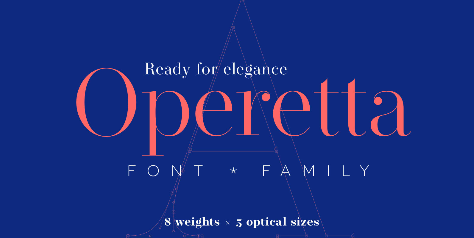
Operetta Font
Operetta is a neo-didone display font family inspired on Bodoni, Didot (early 18th century) and Walbaum (19th century). Despite of this heritage, Operetta’s design meets contemporary taste and typesetting needs. Five optical sizes give you control over the font’s readability
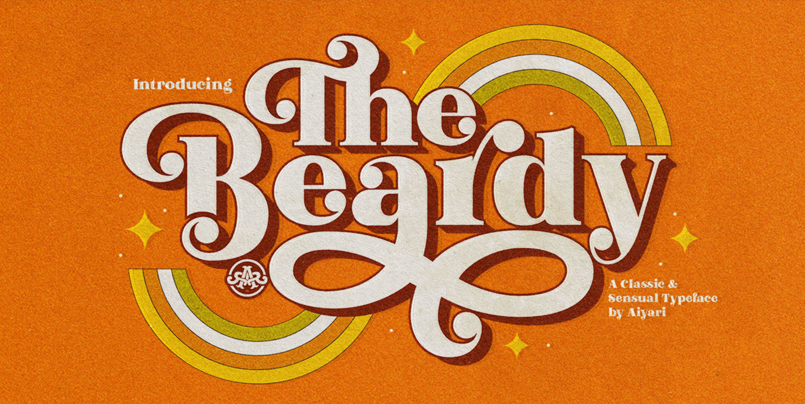
The Beardy Font
The Beardy is a retro font design published by Aiyari Published by AiyariDownload The Beardy
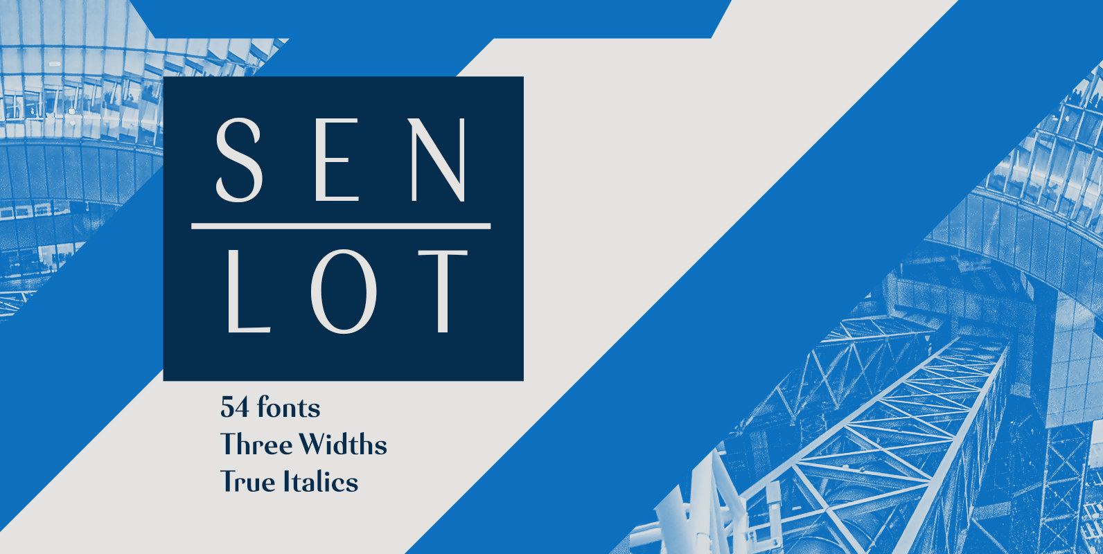
Senlot Font
Steal the spotlight with Senlot. A high contrast sans serif, Senlot’s figure is perfect for enrapturing your audience. The font shows off a unique calligraphic stress, which–with the contrast–makes the face quite usable in luxury and high quality design work.
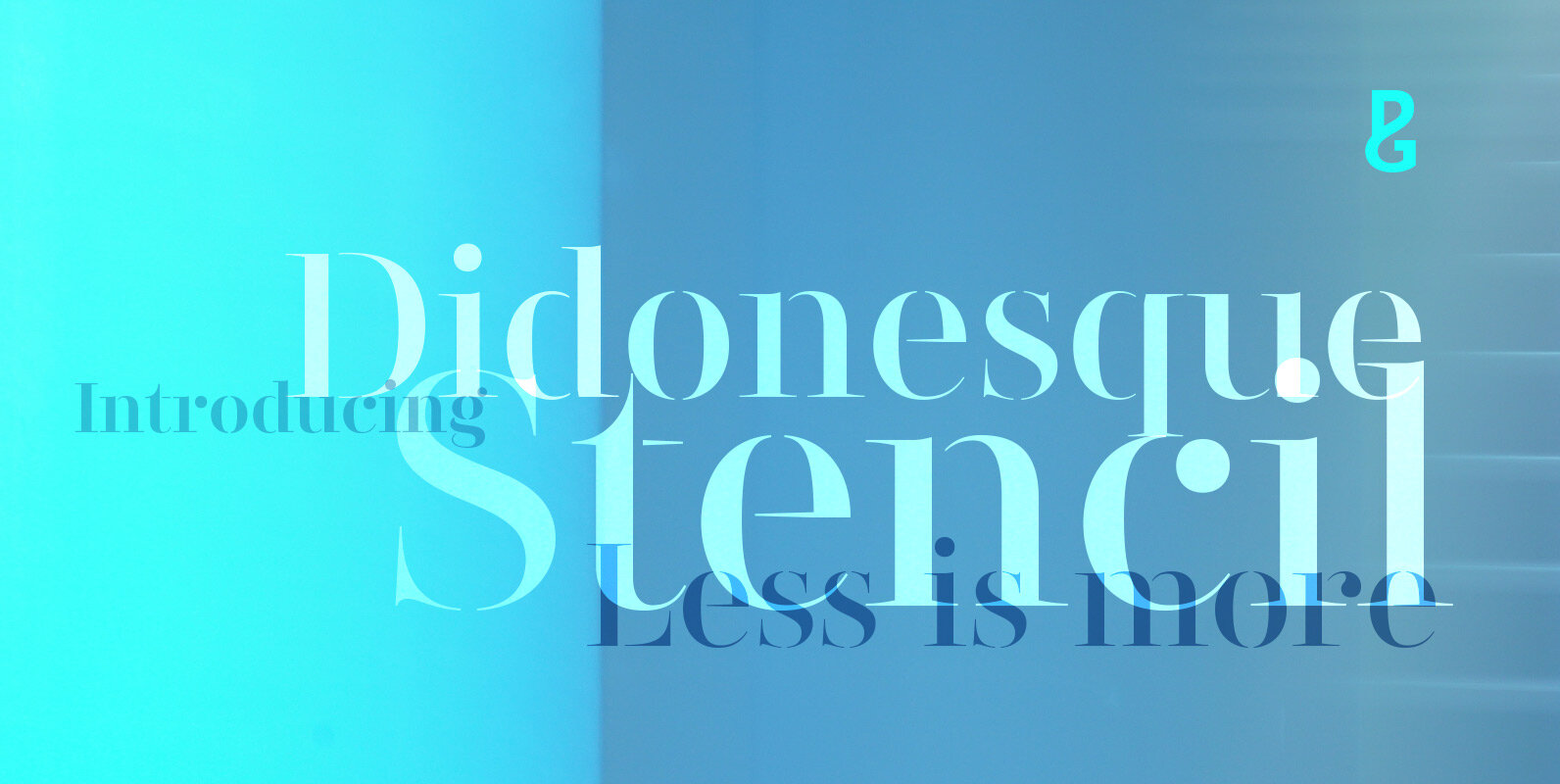
Didonesque Stencil Font
Less is More. This stencilled version takes away some of Didonesque’s structure, while adding another level of distinguished style and supreme elegance. The “Elegante” fonts epitomise the style required for high-end fashion and beauty applications with their crisp curves combined
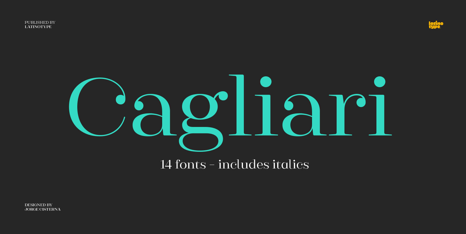
Cagliari Font
An elegant, stylish and easy-to-use typeface. Just as a nice hat makes you look good, Cagliari brings beauty to your designs—through the traditional flavor of Didone faces, and the simplicity of Modern and neo-Grotesk fonts. The font is based on
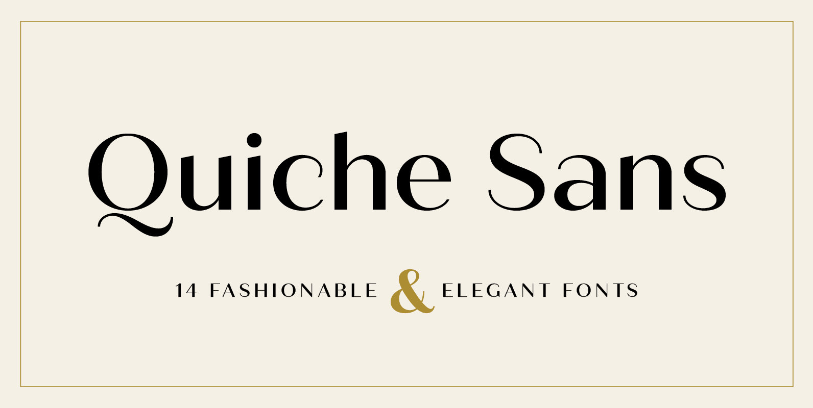
Quiche Sans Font
Quiche Sans is a high-contrast, sans serif typeface with monoline stroke endings, angled stems, and geometric proportions. A sibling to the Quiche family, with the ball terminal endings removed. With weights ranging from thin to black and matching italics, there
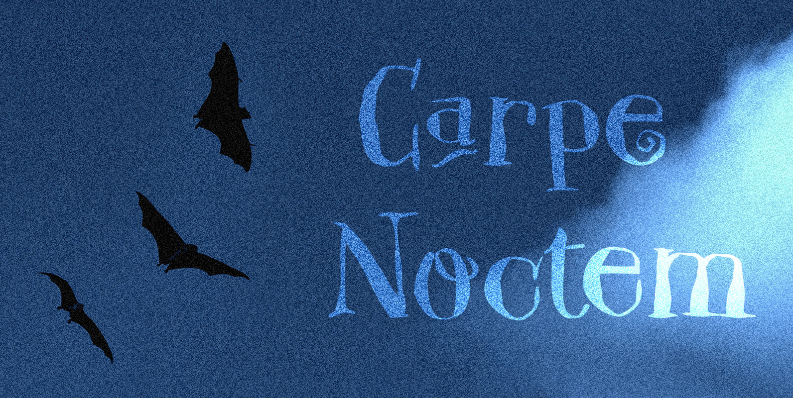
Carpe Noctem Font
Carpe Noctem (Latin for ‘Seize The Night’), was a bit of a surprise. Someone asked me if I could create a lower case for my Closet Skeleton font. I began working on it and lo and behold, a beautiful font
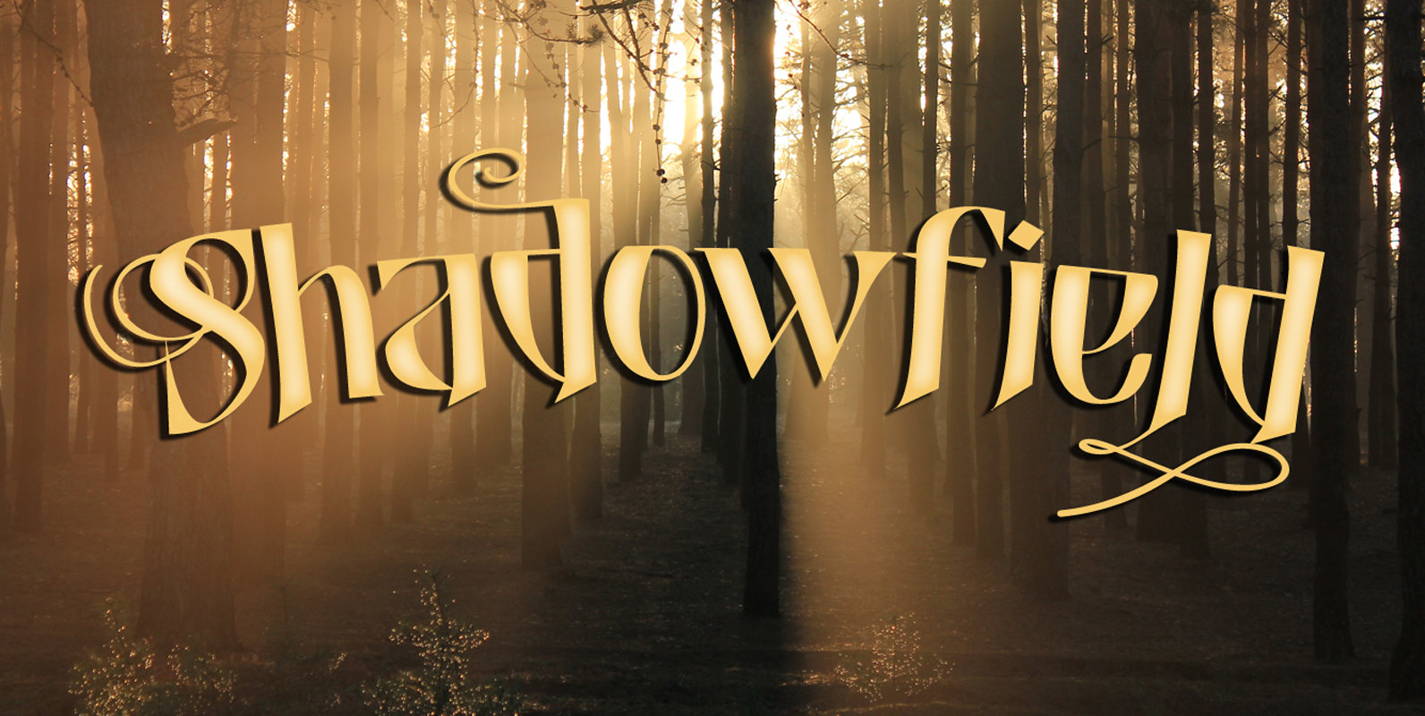
Shadowfield Font
Shadowfield is a fantasy font which was inspired by the hand lettering on the Spiderwick movie posters (which itself was apparently based on Hand Skript One). Every glyph was drawn by hand, using a gel pen on 160 grams paper.
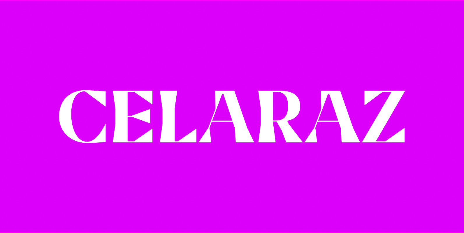
Celaraz Font
Celaraz is a serif design with structural forms that pushes the stroke contrast. The idea evolved from Didone serif forms to have contrast remain visible and consistent on each character. To avoid a dark spot, several characters were adjusted by
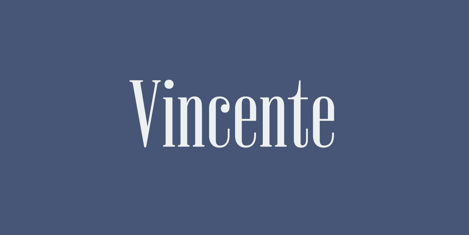
Vincente Font
Vincente is a contemporary but Didone-look serif with condensed proportion. Inspired by vintage iron works and antique botanical pictorial book. Very simple and orthodox letter forms with some charming accent such as can be seen in “y”. Sophisticated curves but
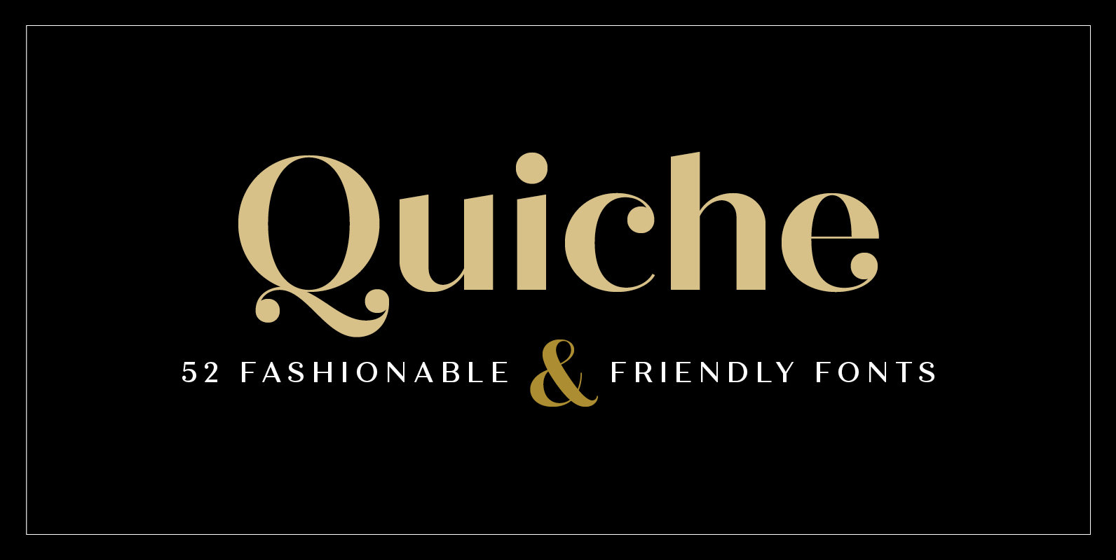
Quiche Font
Quiche is a high-contrast, sans serif typeface featuring ball terminals and angled stems. This 52 font superfamily is a complete branding suite. The 4 subfamilies—Display, Fine, Stencil, and Text—were created to work harmoniously together based on the need. With weights