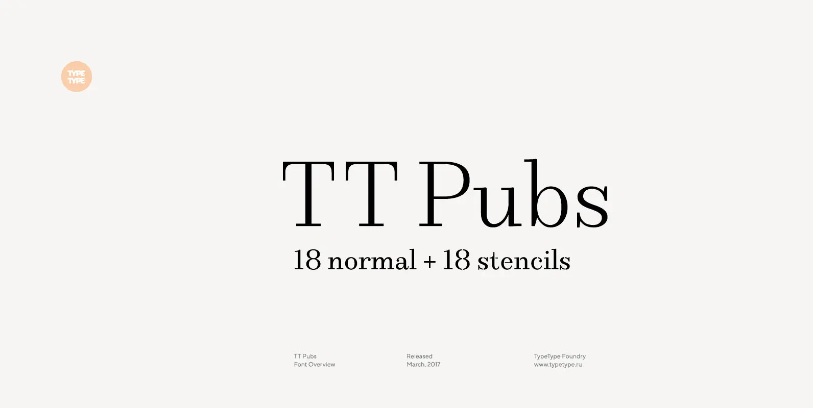
Tag: ball terminals

Clarenta 4F Font

Clarenta 4F is a serif font design published by Sergiy Tkachenko Published by Sergiy TkachenkoDownload Clarenta 4F

Pedrera Font

Pedrera is a serif font design published by Etewut Foundry Published by Etewut FoundryDownload Pedrera

Bw James Font

Designed by Moritz Kleinsorge, Bw James is a friendly and playful sans serif: The angled stems, branching spurs and ball terminals all contribute to a personable and friendly mood, while the mono-linear body makes the typeface appear fresh and modern.

Moon Star Soul Font

Based on retro vinyl records in the early and middle of 20th century. The mixture of funky, hippie and mid-century’s futuristics. Published by Dharma TypeDownload Moon Star Soul

Encorpada Classic Compressed Font

Encorpada Classic, designed by Eduilson Coan, brings the best features of the Didone genre, but with a 21st century look and feel. With smooth details Encorpada Classic is an elegant choice for your type library. Published by dooTypeDownload Encorpada Classic

Encorpada Classic Condensed Font

Encorpada Classic, designed by Eduilson Coan, brings the best features of the Didone genre, but with a 21st century look and feel. With smooth details Encorpada Classic is an elegant choice for your type library. Published by dooTypeDownload Encorpada Classic

Yourz Truly Font

Yourz Truly is a happy little serif font that doesn’t take itself too seriously. It is a headline font with a full character set. Yourz Truly is second in the Love Letters Series following Dearest John. It was in the

Sybarite Font

Sybarite is a fat face that works at any size. Capitals with sweeping curves and sharp unbracketed serifs command attention while charming minuscules expose the amiable side of its demeanor. Sybarite is James Puckett’s revival of the fat face type

Mussica Font

Mussica is an ornamental hybrid font derived mainly of transitional and Didone styles but including some script and uncial quirks too. Its proportions and measurements aren’t conventional giving a very special look. The family consists of two fonts which could

Coquette Font

Coquette is an unconnected script combining elements of the traditional French script and geometric sans serif styles. The result is at once novel and familiar, evoking both vernacular and commercial lettering of the mid-20th century without being derived from any

ATC Rosemary Font

ATC Rosemary is a didone print-font comprised of over 315 characters, producing extreme contrast between abrupt and thin serifs at large sizes. The luxurious feel of Rosemary utilizes not only hairlines and ball serifs, but expresses similarities to Romantic fonts

Ratio Modern Font

Designed in 1923 by Friedrich Kleukens for the Stempel foundry, Ratio was one of the first metal faces to bring the Didone genre to the forefront of industrial mass publishing as a headline and magazine face. Though essentially modern in

Kari Display Pro Font

Kari Display is the product of a long standing idea I had to give the well-received Positype typeface, Kari, plastic surgery. Just referring to giving a typeface plastic surgery, or letter lipo, stuck in the back of my head until

Spire Extra Light Font

Originally designed by Sol Hess for the Lanston Monotype Foundry in 1938 as a fat face, this extra light revival was designed by Ann Pomeroy in the early 90s. Spire is extra condensed with a very retro look. Published by