Biwa is a new straight-sided family of formally nuanced grotesk typefaces. Biwa’s lighter weights feel subdued, cool in tone, and neutral, while the heavier weights are more robust and full of personality.
Biwa is, in essence, the son of the bestselling typeface Vaud—similar, but different, and fills in the gap left behind by Vaud.
Developed over the past few years by Ian Lynam and James Todd, the 14-member Biwa family and the accompanying 14-member Biwa Display family are paeans to the immediate moment when phototype arrived on the global scene — partially smooth and partially machined. Biwa and Biwa Display are neutral in tone, have enlarged x-heights, and look amazing on-screen and in print.
Weights & Styles:
Biwa
Biwa Thin & Biwa Thin Italic
Biwa Light & Biwa Light Italic
Biwa Regular & Biwa Regular Italic
Biwa Medium & Biwa Medium Italic
Biwa Bold & Biwa Bold Italic
Biwa Black & Biwa Black Italic
Biwa Ultra & Biwa Ultra Italic
Biwa Display
Biwa Display Thin & Biwa Display Thin Italic
Biwa Display Light & Biwa Display Light Italic
Biwa Display Regular & Biwa Display Regular Italic
Biwa Display Medium & Biwa Display Medium Italic
Biwa Display Bold & Biwa Display Bold Italic
Biwa Display Black & Biwa Display Black Italic
Biwa Display Ultra & Biwa Display Ultra Italic
Each weight is designed to be highly readable in print and on-screen. The italic variations are true italics, having a single-storied italic a and have been designed for smooth, fluid reading and text-setting. Lovingly spaced and kerned, the Biwa family works equally well for text typesetting and for display design work.
Languages supported include Western European, Central, and South European.
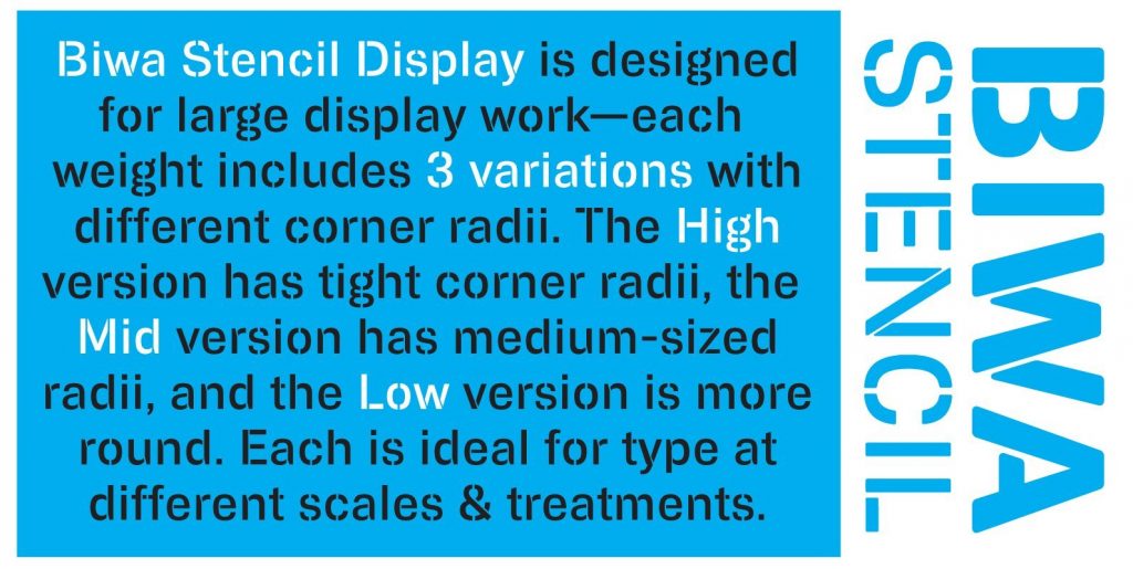
The entire family is comprised of a range of weights and a matching display family that features rounded terminals for large-scale display work.
An Agate version of Biwa Black is provided for free, just for you.
Sans serif fonts, no matter how neutral they feel, are ultimately formally nuanced. We wanted to add to this legacy, but bring in elements of the grotesks of the Stephenson Blake foundry to add humanizing features, creating a formal and conceptual interplay to delight the senses.
The lighter weights are slightly slimmer than the regular and bold weights to give the typeface more of a vertical feel, inviting readers’ to rapidly read typeset text with a maximum of contrast and a minimum of optical dazzle.